Method 1 – Utilizing a Filled Map Chart to Create a Map in Excel
Example 1 – Creating a Map of Countries
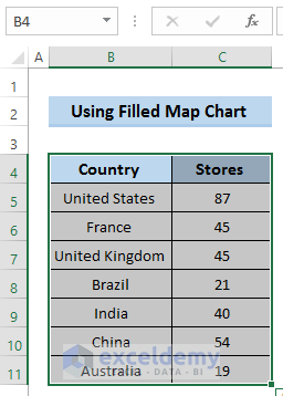
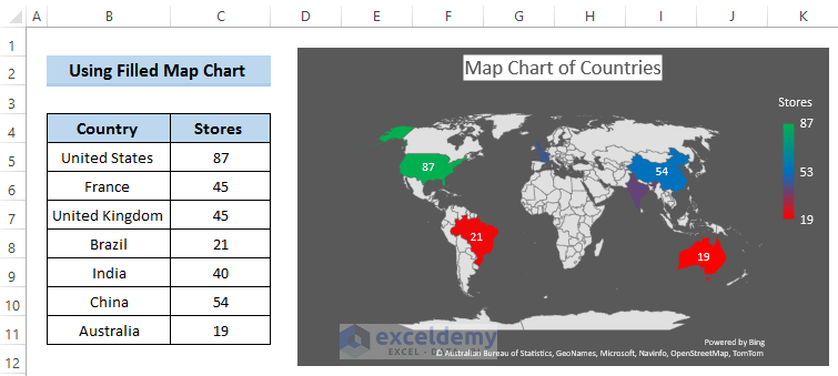
Here’s a dataset of countries and the number of stores in them.

Steps
- Select the range of cells B4 to C11.
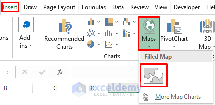
- Go to the Insert tab in the ribbon.
- From the Charts group, select Maps.
- Select the Filled Map from the drop-down list.
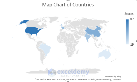
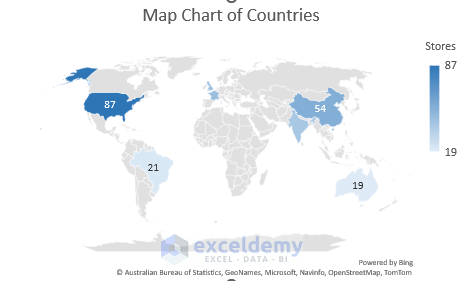
- This will provide the following map chart of countries.
- Click the plus (+) sign beside the map chart. It will open up Chart Elements.
- Select Data Labels.
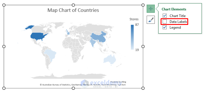
- This will show the scores of every country.
- Go to Chart Style below the Elements and select any chart style. We put Style 3.
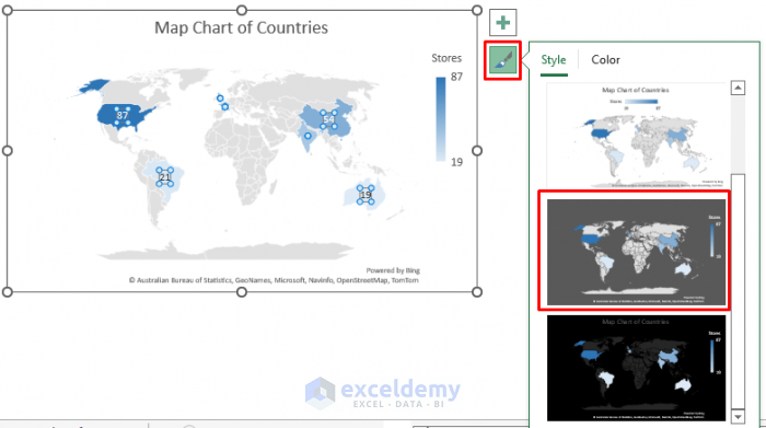
- Here’s how the map looks now.
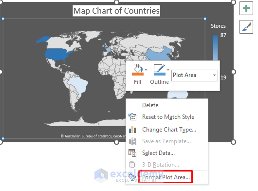
- Right-click on the chart area.
- From the context menu, select Format Plot Area.
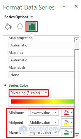
- Format Data Series dialog box will appear.
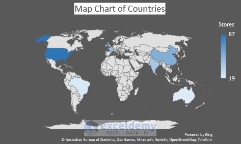
- In the Series Color section, select Diverging (3-color).
- Select your preferred minimum, maximum, and mid-point colors.
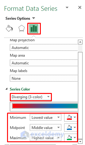
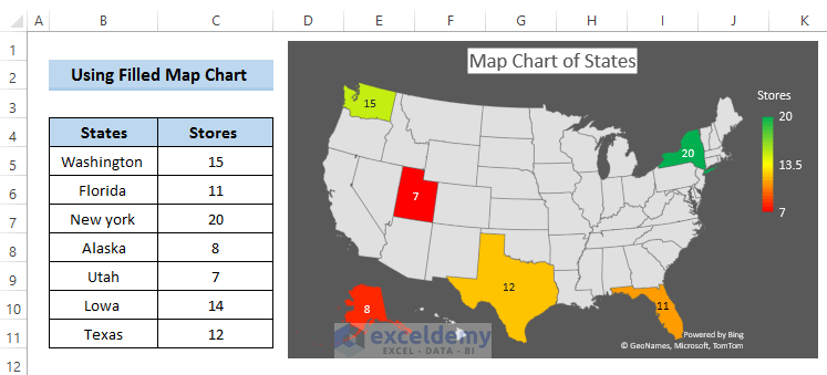
- For our example, the highest-scoring country is marked in green and the lowest is marked in red.
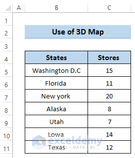
Example 2 – Creating a Map of States
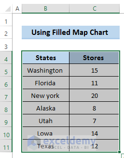
We can make a similar concept map with U.S. states.

Steps
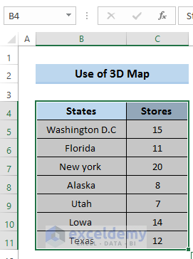
- Select the range of cells B4 to C11.
- Go to the Insert tab in the ribbon.
- Select Maps.
- Choose Filled Map from the drop-down list.

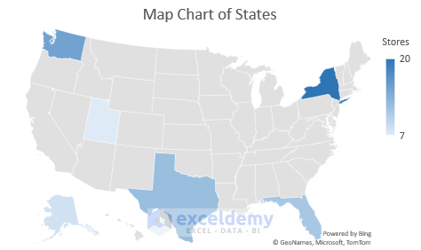
- This will provide a U.S. state map.
- Click the plus (+) sign beside the map chart. It will open up Chart Elements.
- Select Data Labels.
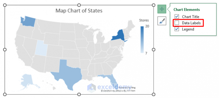
- As a result, it will show the total number stores of in every given country.

- Go to Chart Style and select any chart style. We chose Style 3.
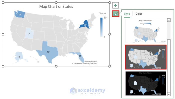
- Here’s the result.
- Right-click on the chart area.
- From the context menu, select Format Data Series.
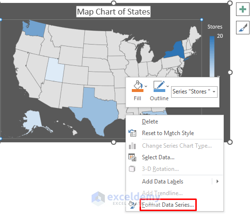
- The Format Data Series dialog box will appear.
- In the Series Color section, select Diverging (3-color).
- Select your preferred minimum, maximum, and mid-point colors.
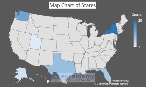
- Here’s the result for our example.
Read More: How to Map Data in Excel
Method 2 – Use a 3D Map to Create a Map in Excel
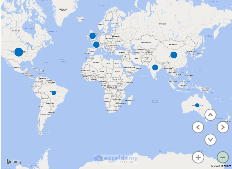
Example 1 – Creating 3D Map of Countries
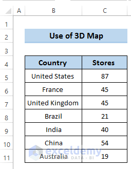
To show the countries in a 3D map, we’ll take a similar dataset that includes the number of stores of a certain country.
Steps
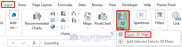
- Select the range of cells B4 to C11.
- Go to the Insert tab in the ribbon.
- Select 3D Map.
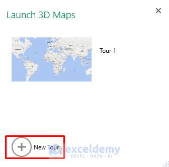
- Select Open 3D Maps.

- Launch a 3D map by clicking Tour 1.
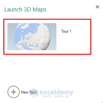
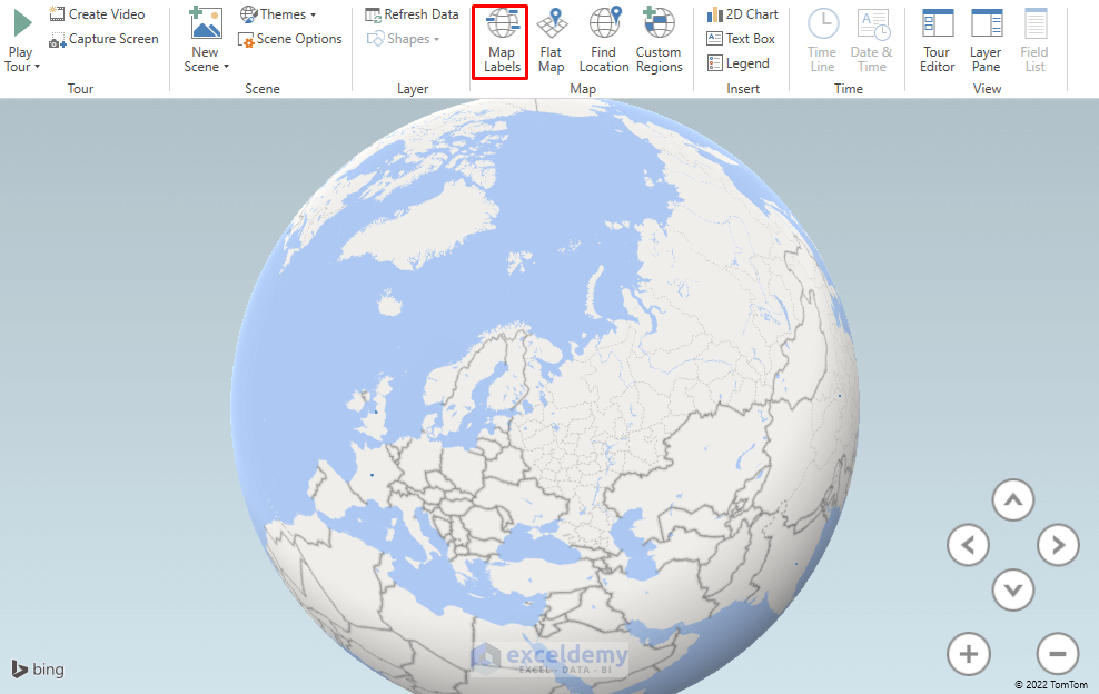
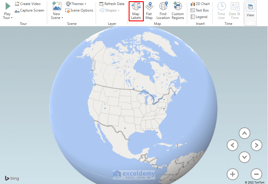
- Our required 3D map will appear.
- Click on Map Labels to label all the countries on the map.
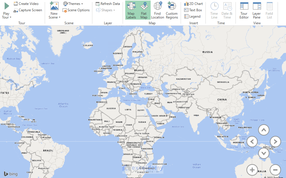
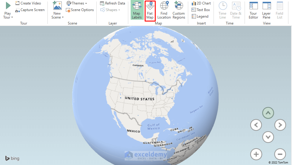
- Select the Flat Map option for better visualization.
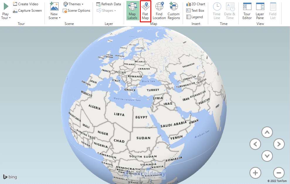
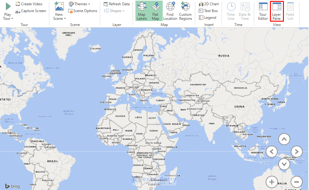
- We will get the following Flat Map.
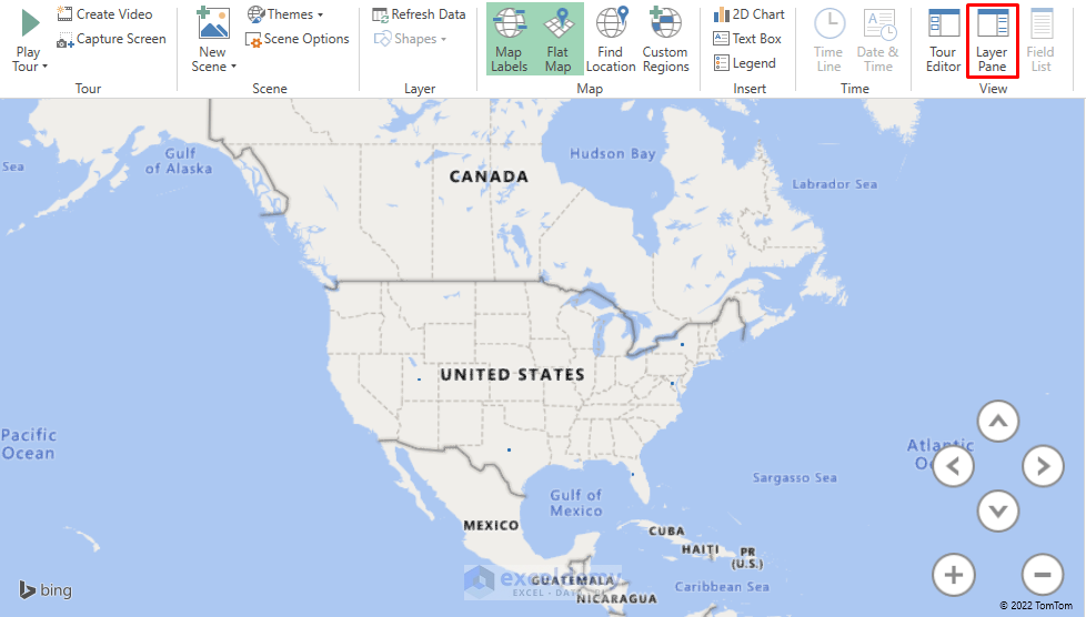
- Select Layer Pane from the View group.
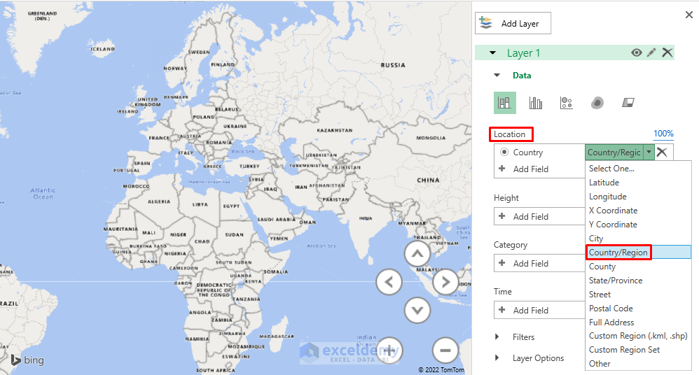
- In the Layer Pane, go to the Location section.
- In the Location section, select Country/Region.
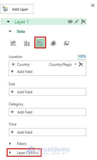
- Select Change the Visualization to Bubble.
- Go to the Layer Options.
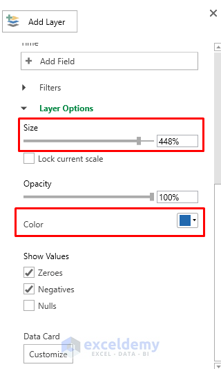
- Change the Size and Color according to your preference.
- Here’s a sample you can use.
- We get the following results where all the stores are marked properly.
Example 2 – Creating a 3D Map of States
We can do similar things with a U.S. state map.
Steps
- Select the range of cells B4 to C11.
- Go to the Insert tab in the ribbon.
- Select 3D Map.
- Select Open 3D Maps.
- Launch a 3D map by clicking New Tour.
- Click on Map Labels to label all the states on the map.
- Select the Flat Map option for better visualization.
- We will get the following Flat Map.
- Select Layer Pane from the View group.
- In the Location section, select State/Province.
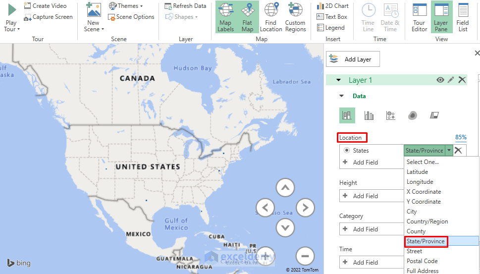
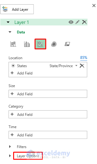
- Select Change the Visualization to Bubble.
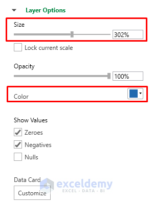
- Go to the Layer Options.
- Change the Size and Color according to your preferences.
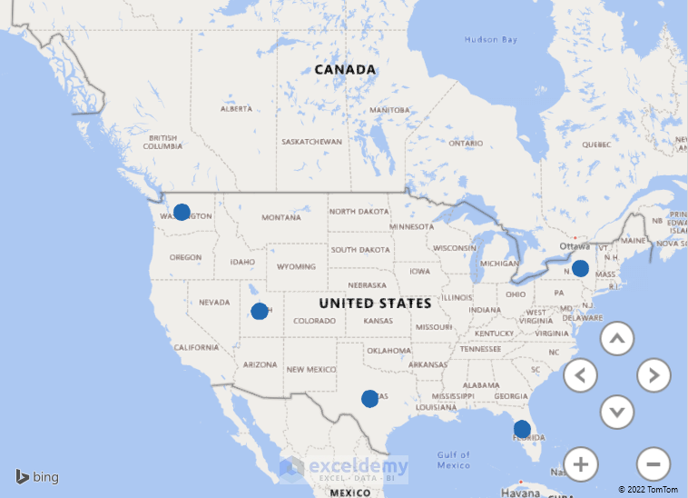
- Here are the results.
Read More: How to Plot Addresses on Google Map from Excel
Download the Practice Workbook
Related Articles
- How to Plot Points on a Map in Excel
- How to Plot Cities on a Map in Excel
- How to Make Route Map in Excel
- [Fixed!] Excel Map Chart Not Working
- How to Make a Population Density Map in Excel
- How to Create a Google Map with Excel Data
<< Go Back to Excel Map Chart | Excel Charts | Learn Excel
Get FREE Advanced Excel Exercises with Solutions!
