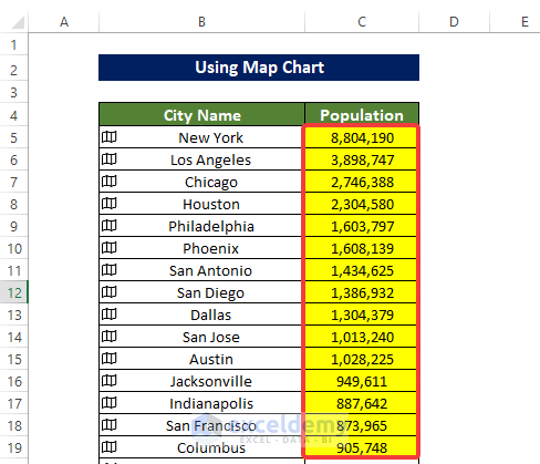
Scenario & Dataset Overview
We aim to visualize population data for cities across various states, including within the same state. However, before plotting this information, we need to transform the general data format into a geographic one. Our datasets consist of two lists:
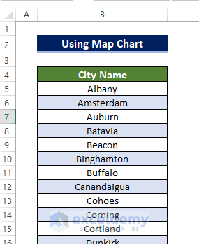
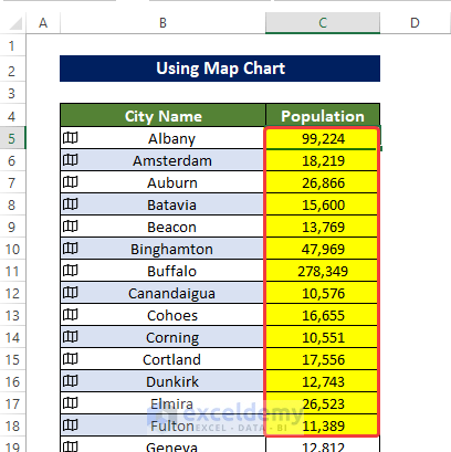
- The first dataset contains information on 280 cities located in different states.
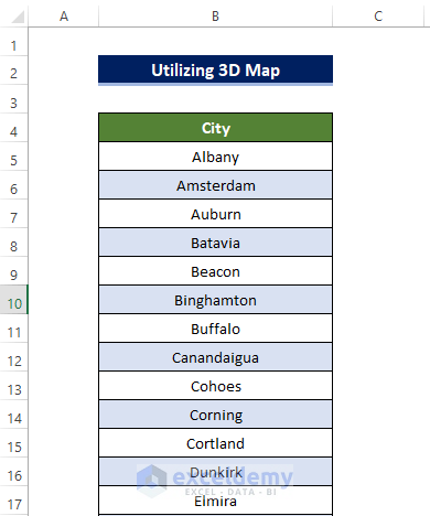
- The second dataset comprises 62 cities specifically from New York state.
Method 1 – Using a Filled Map Chart to Plot Cities
A Map Chart is a visual representation that displays geographical data on a map. It allows you to visualize data points in specific locations, such as cities, countries, or regions. These charts are useful for showing patterns, trends, or variations across different geographic areas.
Example 1 – Plotting Cities from Different States
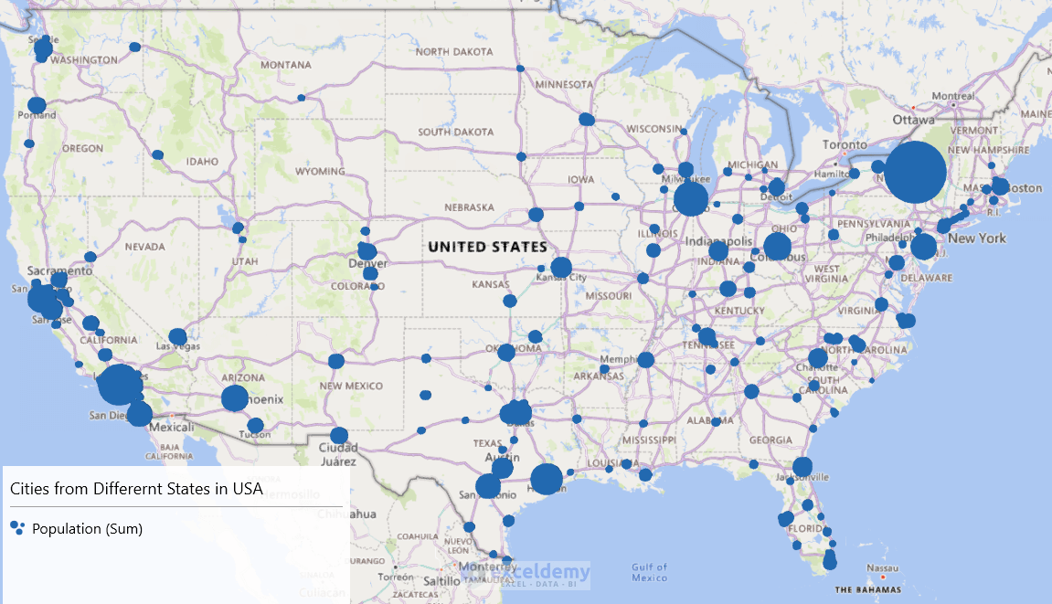
In this example, we will plot the population data of 280 cities from different states in a single chart using the Map Chart.
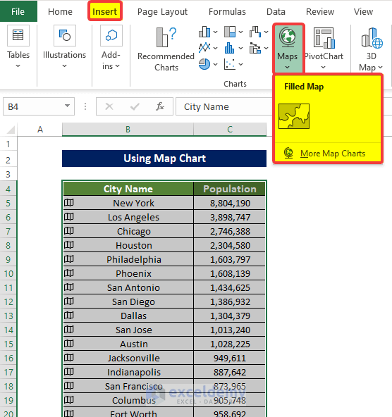
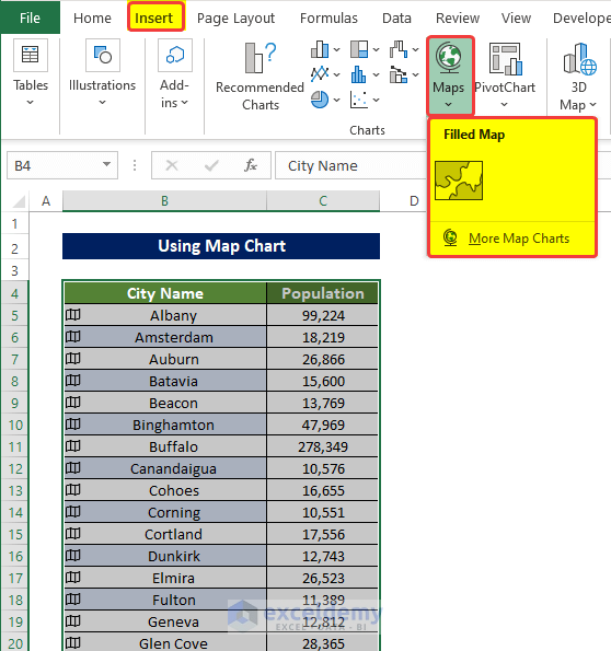
- Convert the dataset from the General data type to the Geographic data type:
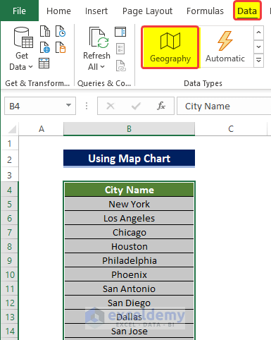
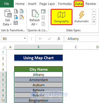
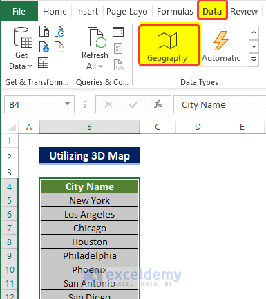
- Select the range of cells B5:B284 by pressing Shift+Ctrl+Down Arrow.
- Go to the Data tab and click on Geographic Data in the Data Types group.
-
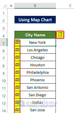
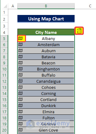
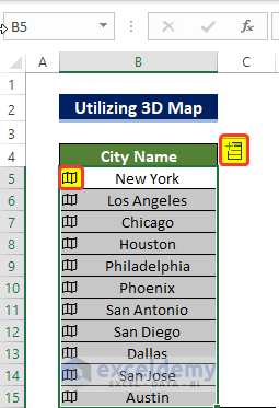
- An Insert Data sign will appear in the corner of the cell, along with a Geographic card sign on the left side of each cell.
-
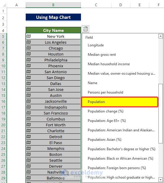
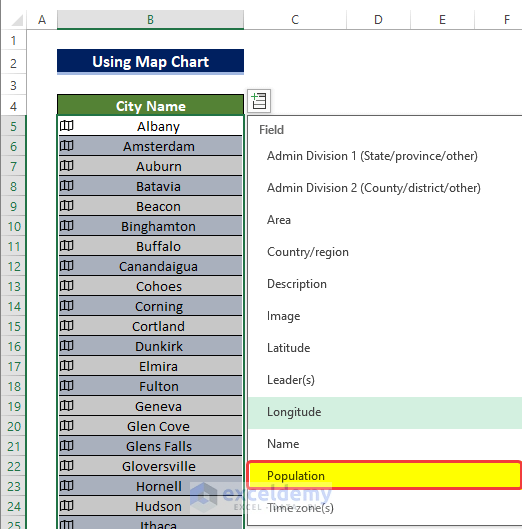
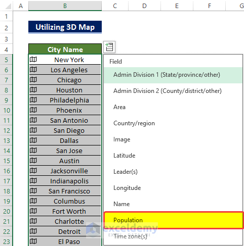
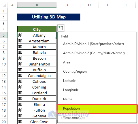
- Click the Insert Data sign and choose the Population option from the menu.
-
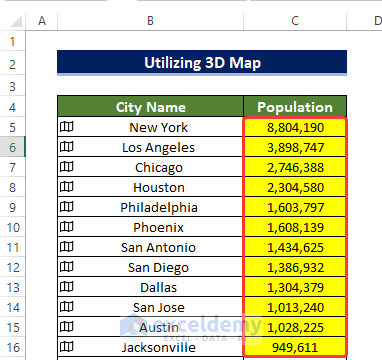
- The range of cells C5:C284 will be filled with population values for the cities listed in B5:B284.
- Create the Map Chart:
- Select both the population range (C5:C284) and the city names range (B5:B284).
- From the Insert tab, click on Maps in the Charts group.
-
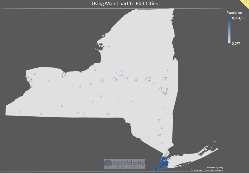
- The map of the United States will appear, with each city’s location highlighted and population values marked in the Data Legend.
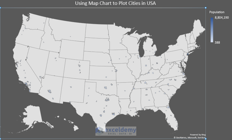
The color will shift towards darker blue for cities with higher populations.
Example 2 – Plotting Cities from the Same State
In this example, we will plot the population data of 62 cities from the same states in a single chart using the Map Chart.
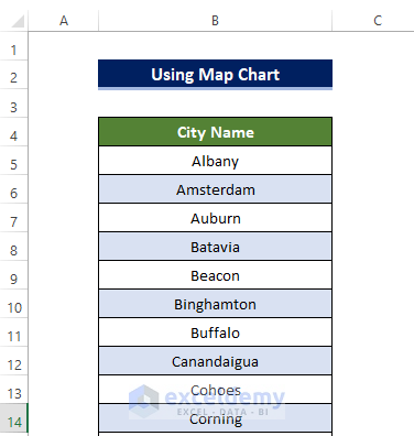
- Convert the dataset for New York state:
- Select the range of cells B5:B66 (cities in New York) by pressing Shift+Ctrl+Down Arrow.
-
- Go to the Data tab and click on Geographic Data in the Data Types group.
-
- An Insert Data sign will appear in the corner of the cell, along with a Geographic card sign on the left side of each cell.
-
- Click the Insert Data sign and choose the Population option from the menu.
-
- The range of cells C5:C66 will be filled with population values for the cities listed in B5:B66.
- Create the Map Chart for New York:
- Select both the population range (C5:C66) and the city names range (B5:B66).
- From the Insert tab, click on Maps in the Charts group.
-
- The map of New York State will appear, with city locations highlighted and population values in the Data Legend.
- Darker blue shades indicate higher population cities.
Read More: How to Make a Population Density Map in Excel
Method 2 – Utilizing 3D Map Chart in Excel
A 3D Map Chart is a powerful data visualization tool in Microsoft Excel that allows you to explore information in new ways. You can create animations, videos, and plot different types of data in 3D or 2D landscapes.
Example 1 – Plotting Cities from Different States
In this example, we will plot the population information of 280 cities from different states in a single chart using the 3D Map Chart.
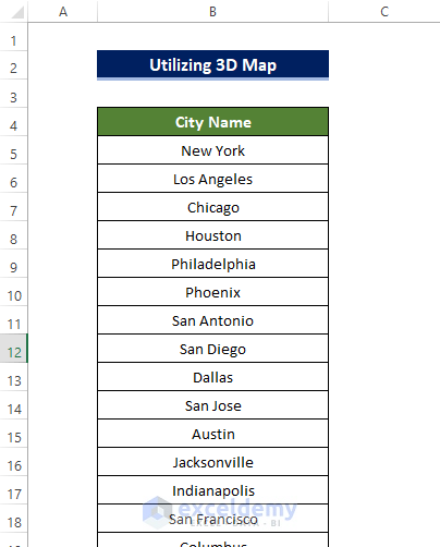
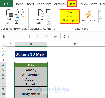
- Convert the dataset from the General data type to the Geographic data type:
- Select the range of cells B5:B284 by pressing Shift+Ctrl+Down Arrow.
-
- Go to the Data tab and click on Geographic Data in the Data Types group.
-
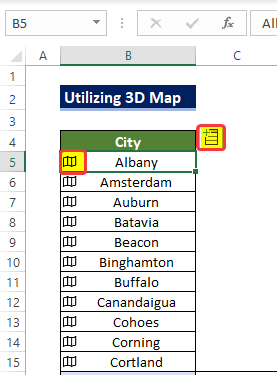
- Click the Insert Data sign, choose the Population option from the side menu.
-
- The range of cells C5:C284 will be filled with population values for the cities listed in B5:B284.
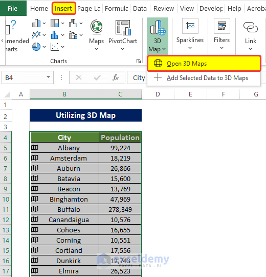
- Create the 3D Map Chart:
- From the Insert tab, click on 3D Maps in the Charts group.
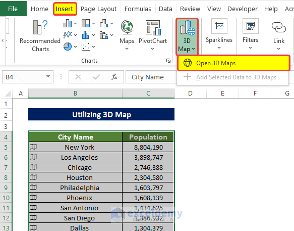
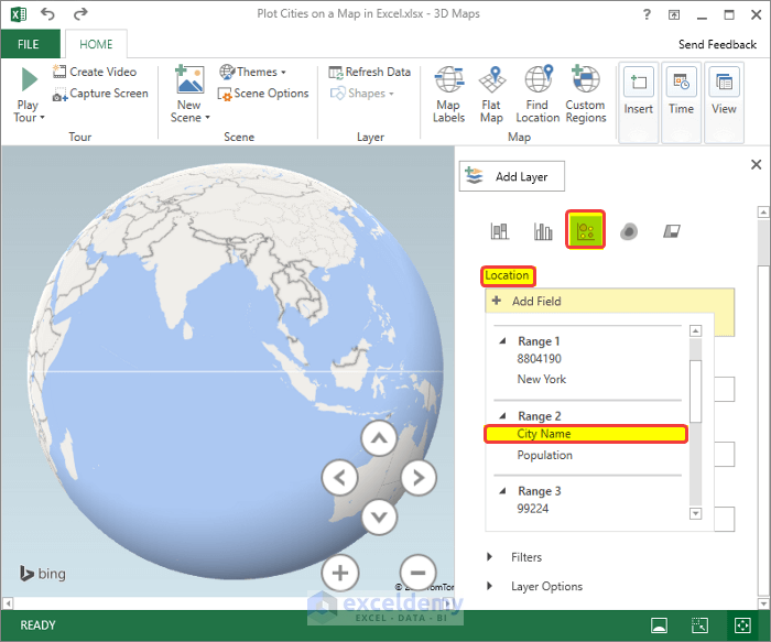
-
- In the Layer side panel, add the City Name field as the location.
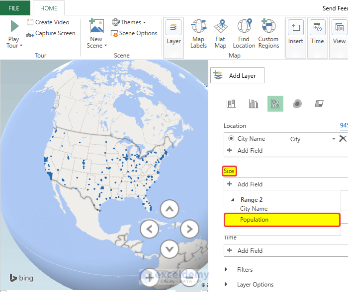
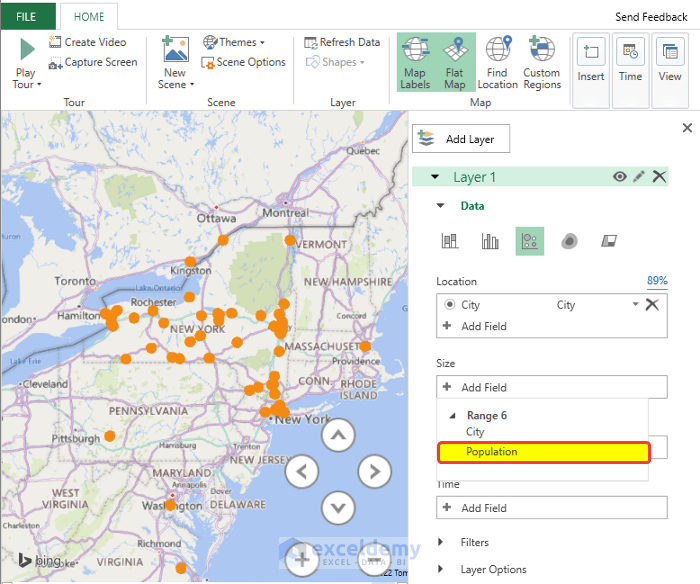
- Select the Bubble chart option under Add Layer.
-
- Add the Population field for bubble sizes.
-
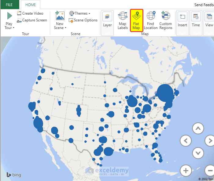
- Click Flat Map to switch from 3D to 2D.
-
- Enable the Map label to display location names.
- Make any other minor adjustments as needed.
Example 2 – Plotting Cities from the Same State
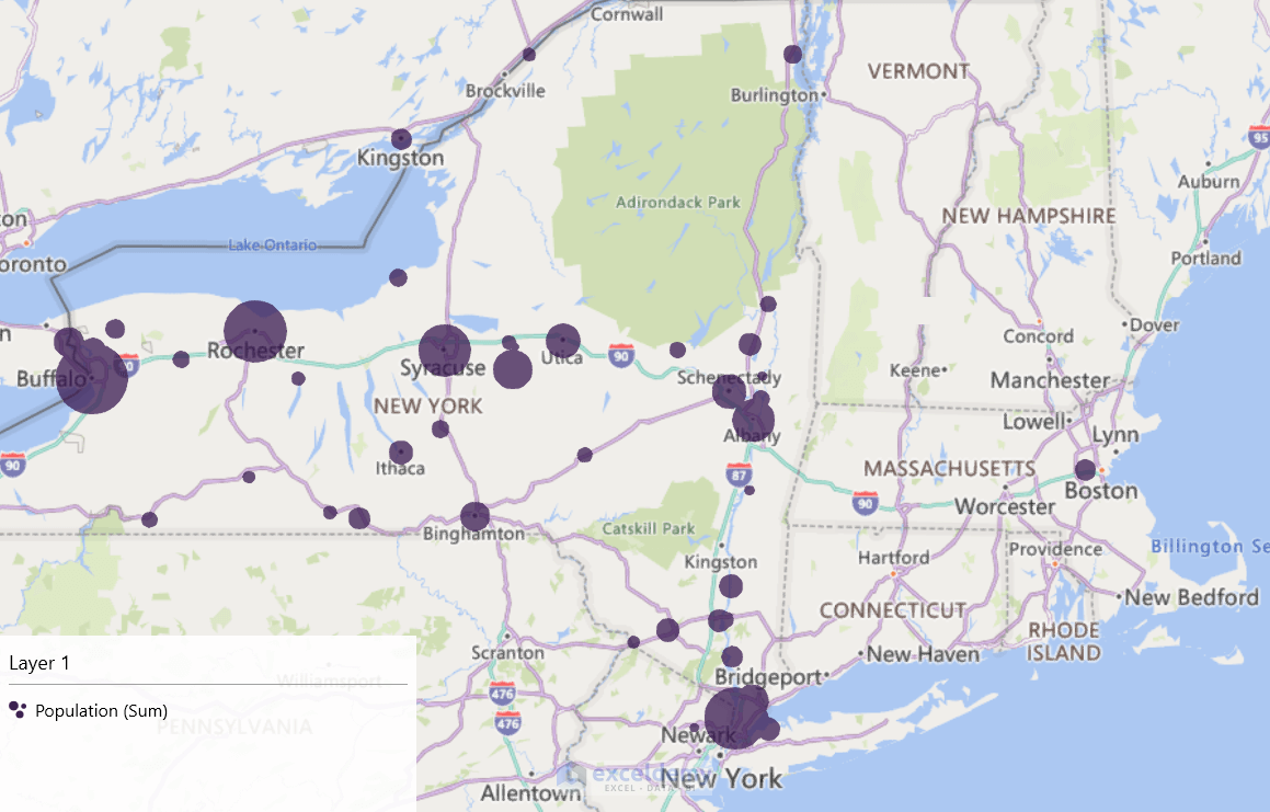
In this example, we will plot the population information of 62 cities in New York state in a single chart using the 3D Map Chart.
- Convert the dataset for New York state:
- Select the range of cells B5:B66 (cities in New York) by pressing Shift+Ctrl+Down Arrow.
-
- Go to the Data tab and click on Geographic Data in the Data Types group.
-
- Click the Insert Data sign, choose the Population option from the side menu.
-
- The range of cells C5:C66 will be filled with population values for the cities listed in B5:B66.
- Select both the range of cells B5:B66 and the range of cells C5:C66.
- Create the 3D Map Chart for New York:
- Click Open 3D Maps.
- In the new popup window, click New Tour.
- Add the City field under Location.
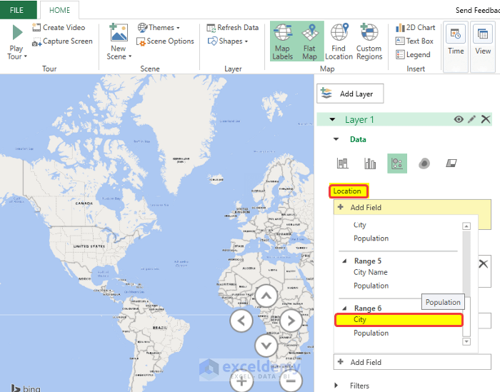
-
- The map will focus on New York State.
- Entry locations will be highlighted in orange bubbles.
- Add the Population field for bubble sizes.
-
- Adjust as needed to achieve the desired map appearance.
Read More: How to Plot Addresses on Google Map from Excel
Download Practice Workbook
You can download the practice workbook from here:
Related Articles
- How to Map Data in Excel
- How to Create a Google Map with Excel Data
- [Fixed!] Excel Map Chart Not Working
- How to Create a Map in Excel
- How to Plot Points on a Map in Excel
- How to Make Route Map in Excel
<< Go Back to Excel Map Chart | Excel Charts | Learn Excel
Get FREE Advanced Excel Exercises with Solutions!

I wanted to see the city names on the map, not an image where the city is located.
Hello Ernie Thackeray,
Thank you for your feedback. Only the location image may not fully meet the requirement if you want the city names displayed directly on the map.
In Excel, the built-in Map Chart mainly plots locations based on geographic data, but city name labels may not always appear clearly or automatically. To show city names, you can try enabling Data Labels from the Chart Elements option. If that does not work as expected, using 3D Maps is usually a better option because it provides more control over location labels and map visualization.
Reggards,
ExcelDemy