Population density refers to the population per unit area of land. A population density map gives us an idea of the worldwide population. It shows different colors with respect to the range of the population. This article will show you the process of making a population density map in Excel. Excel has some quick tricks to do so. So, without further delay, let’s begin.
How to Make a Population Density Map in Excel: 2 Quick Methods
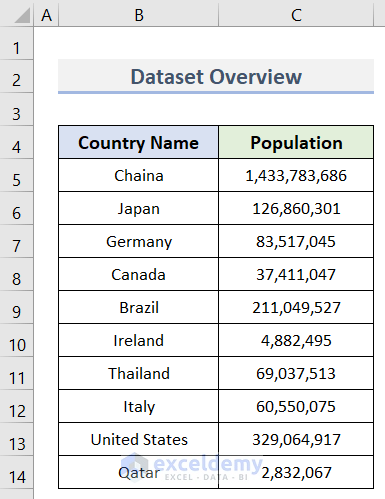
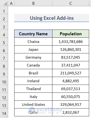
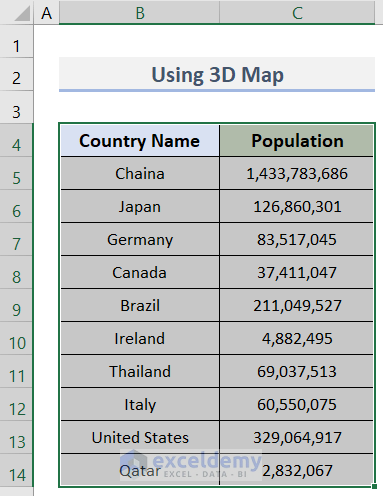
In this tutorial, we will learn 2 quick methods to make a population density map in Excel. In order to demonstrate the methods, we will use the dataset (B4:C14) below which contains some Country Names and their Population numbers. Let’s see the methods below to form a population density map using this dataset.
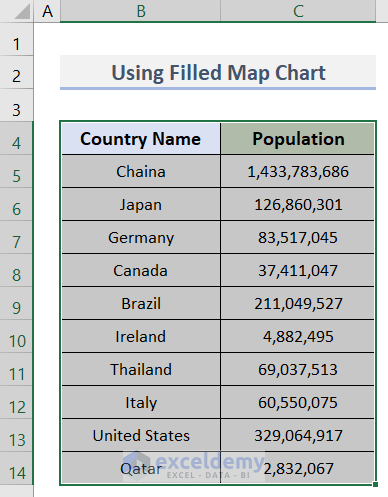
1. Make a Population Density Map with Filled Map Chart in Excel
In this method, we will create a population density map using the Filled Map feature in Excel. We can find this feature in the Charts group under the Insert tab. After inserting the map, we can also format or edit it as per requirements. The steps to create and format the map are below.
Steps:
- First of all, select the range B4:C14 (Country Name & Population columns).
- Next, go to the Insert tab > Charts group > Maps drop-down > Filled Map (see screenshot).

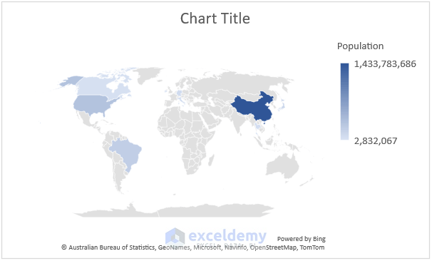
- In turn, you will get a map or chart like the following picture.
- If you want to format the map, go through the following steps.
- Now, click on Chart Title to insert the title of the map.

- After that, type ‘Population Density Map’ in the Chart Title box.

- Then, select the chart > click on the ‘Chart Styles’ symbol > go to the Style section > select any style for your map (we selected the second one).
- See the screenshot below for a better understanding.

- Consequently, you will get the map with the style you chose.
- In our case, we selected the second option and so we got the following style.

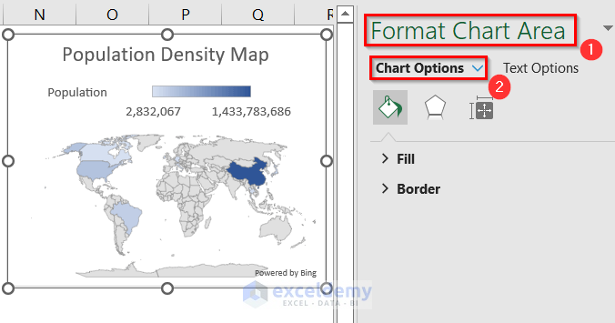
- Therefore, double-click on the chart.
- Hence, the Format Chart Area dialog box will appear on the left side of the worksheet.
- Afterward, click on the Chart Options drop-down.
- At this time, choose Series “Population” from the drop-down menu.

- As a result, the Format Data Series dialog box will open.
- Eventually, click on the Series Options icon (see screenshot) > left-click on Series Color > select Diverging (3-color) from the drop-down menu.

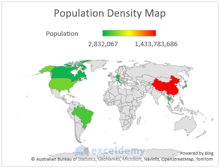
- Accordingly, choose the colors for the Minimum (Green), Midpoint (Yellow), and Maximum (Red) values.

- In this way, you can create a population density map easily.
- The following image shows the final look of our map.
Read More: How to Make Route Map in Excel
2. Generate a Population Density Map from Excel Add-ins
Here, we will learn to generate a population density map from the Add-ins option in Excel. We can get the Add-ins option under the Insert tab in Microsoft Excel. In order to insert the map, we will use the dataset (B4:C14) below containing some Countries and their Population. See the following steps to form the map.
Steps:
- To begin, open the worksheet where you want to create the map.
- Then, go to the Insert tab.
- After that, click on Get Add-ins in the Add-ins group.

- In turn, the Office Add-ins window will appear.
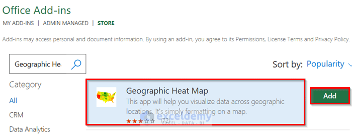
- Now, go to the STORE tab > type ‘Geographic Heat Map’ in the search bar > click on the search icon.

- Therefore, you will see the Geographic Heat Map option in the window.
- Consequently, click on Add to insert the map.
- Momentarily, a window will pop up showing the license terms and privacy policy.
- If you accept their terms and policy, click on the Continue button.

- Eventually, you will see another window named Geographic Heat Map add-in.
- At this time, click on the Get Started option to generate the map.

- Afterward, the Settings dialog box will open.
- Accordingly, select World from the Choose map drop-down > go to Choose data > click on Select.

- Hence, the Select Data window will pop up.

- Forthwith, select the range (B4:C14) for which you want to create the map.

- Thereupon, you will see the selected range with $ signs in the box of the Select Data window.
- Click OK.

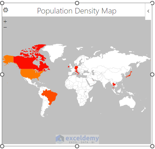
- Next, return to the Settings dialog box > go to Choose color theme > select the color theme you want from the drop-down (the first one is for the highest value & the second one is for the lowest) > give a proper title (Population Density Map) to the map > click on Save.
- See the steps in the following screenshot.

- Finally, you will get the desired population density map (see screenshot).
Read More: How to Plot Addresses on Google Map from Excel
How to Create Map with 3D Map Option in Excel
We can also create a map using the 3D Map option in Microsoft Excel. This tool is in the Tours group under the Insert tab. In this approach, we can not differentiate the values. Here, we can only plot the data. The steps are below.
Steps:
- Firstly, select the range of data (B4:C14) for plotting the map.
- Next, go to the Insert tab.
- Now, go to the Tours group.
- Therefore, click on the 3D Map drop-down.

- After that, select the Open 3D Maps option.

- In turn, a new window will open with 3D Map.
- Subsequently, go to the Home tab in the new window.
- Thereupon, click on Map Labels in the Map group to add the names of the countries on the globe.

- Eventually, go to the Map group again.
- Left-click on Flat Map.
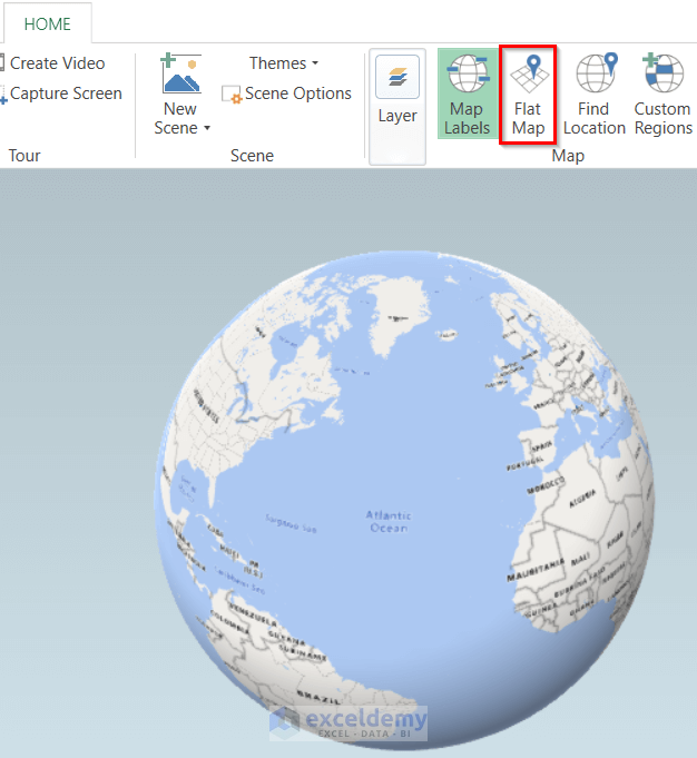
- As a result, the 3D globe will turn into a flat shape.
- Go to the Home tab again.

- Momentarily, go to the View tab.
- Click on Layer Pane.

- Consequently, a new dialog box will appear.
- Accordingly, go to Location and choose Other from the drop-down menu.
- It is because we want to plot the Population for the Country Names and we can not find any option like that in the list.
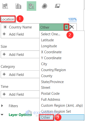
- At this time, click on the Change the visualization to Bubble option (see screenshot).
- Later, go to Layer Options.

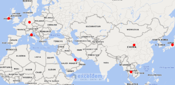
- Ultimately, select the Size and Color for the bubbles.

- Lastly, you will see the data points as bubbles in the map (see the screenshot below).
Read More: How to Create a Google Map with Excel Data
Download Practice Workbook
Download the practice workbook from here.
Conclusion
I hope the above tutorial will be helpful for you to make a population density map in Excel. Download the practice workbook and give it a try. Let us know your feedback in the comment section.
Related Articles
- How to Create a Map in Excel
- How to Plot Cities on a Map in Excel
- How to Plot Points on a Map in Excel
- How to Map Data in Excel
- [Fixed!] Excel Map Chart Not Working
<< Go Back to Excel Map Chart | Excel Charts | Learn Excel
Get FREE Advanced Excel Exercises with Solutions!
