Method 1 – Applying Pivot Chart to Group Dates in Excel
Inserting a Pivot Chart
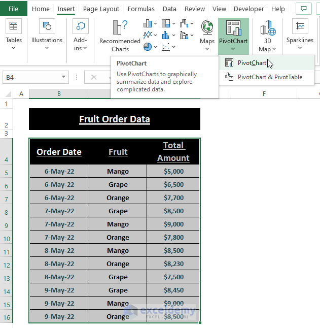
Step 1: Highlight the range then go to the Insert tab > Click on PivotChart (in the Charts section).
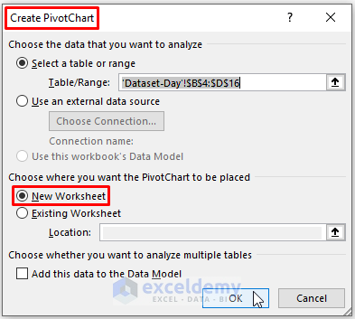
Step 2: The Create Pivot Chart window appears. Excel automatically selects the range. Mark New Worksheet as the Choose where you want the PivotChart to be placed option. Click on OK.
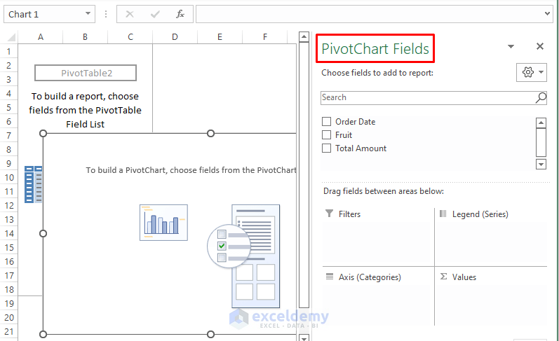
Excel takes a moment and displays the Pivot Chart and a Pivot Table. There can’t be any Chart without a Data Source. Excel automatically generates a Pivot Table to insert a Pivot Chart, as depicted in the picture below.
Grouping Dates in Excel Pivot Chart
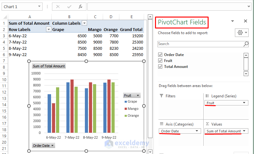
In the PivotChart Fields side window, tick all the fields. Afterward, place the Order Date in Axis Category, Fruits in Legend, and Sum of Total Amounts in Values.
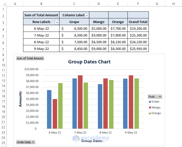
After placing all the fields in their respective areas, Excel displays the PivotTable and PivotChart.
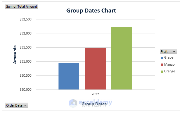
Final PivotChart
You can furnish the PivotChart according to your need, The final depiction of the PivotChart may look like the following picture.
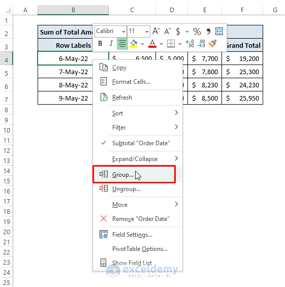
Further Grouping of the Dates in PivotChart
Step 1: Place the cursor in any date cell then right-click on it. The Context Menu appears. From the Context Menu, click the Group option.
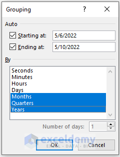
Step 2: Excel brings up the Grouping dialog box. In that dialog box, you get Grouping By options such as Days, Months, Quarters, and Years. Choose one of them to reorganize the PivotChart.
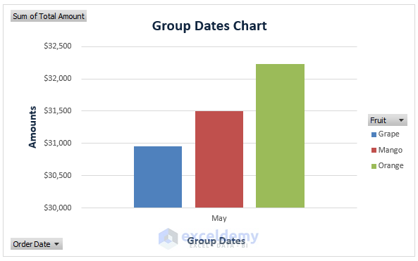
Depiction of the PivotChart Grouped By Months
As the data has only one month of date expansions, the PivotChart depiction is similar to the picture below.
Depiction of the PivotChart Grouped By Years
Similar to Months, the data contain entries within a single year. The representation will be the same as depicted below.
Method 2 – Group Dates Using Format Axis Options in Excel Chart
For Charts expanding to months or years, have the Date Axis option in their Axis Types. Users either have Charts or have the data for Charts and can group dates by months or years.
We inserted a 2D Column Chart, and we want to group dates in that Excel Chart. Follow the below instructions to do so.
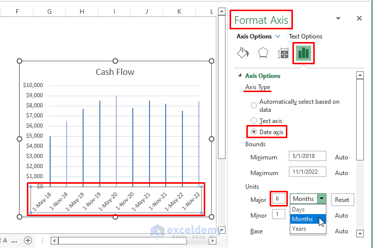
Steps: Double-click on the dates, Format Axis side window appears. From the options, select Date Axis under Axis Types. Type 6 in the Major Unit dialog box (as we have data that are 6 months apart). Choose any of the options (i.e., Days, Months, or Years). The Months option is chosen. The same option is chosen for the other 2 options such as Minor and Base.
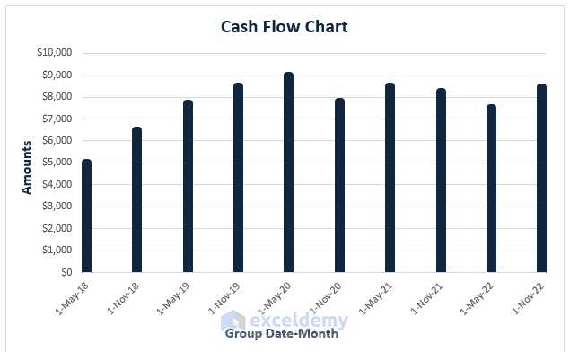
The monthly depiction of the data Chart resembles the image below.
If Years is chosen in the dialog boxes, the depiction changes to the following screenshot.
The final outcome of the chart depends on the options you choose in the Format Axis window. Depending on your data type, select your options and group dates in the Excel Chart.
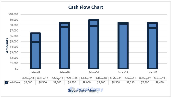
Method 3 – Using Grouped Data to Group Dates in Excel Chart
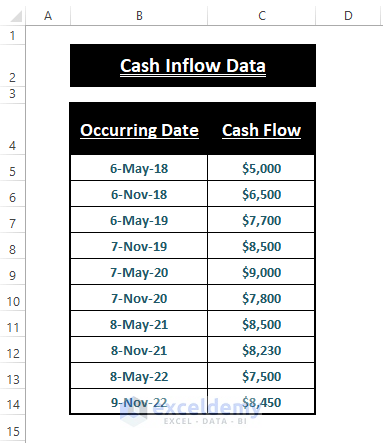
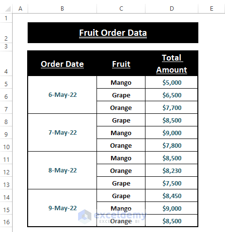
Some data types don’t allow grouping using Format Axis options. In those cases, users need to organize their data as grouped data and then be able to group dates in an Excel Chart. The sorted data of the used dataset may look like the image below.
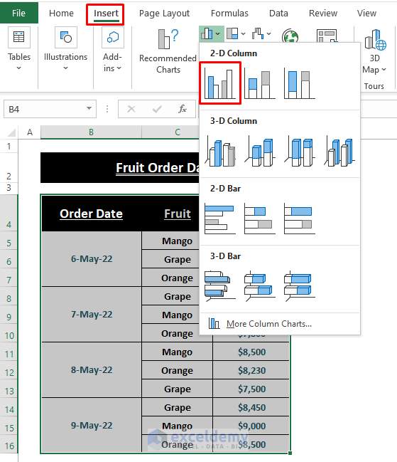
Steps: Select the desired range, move to Insert > Select 2-D Column Chart (from the Charts section).
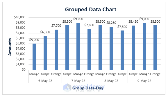
Excel inserts the 2D-Column Chart as shown in the image below.
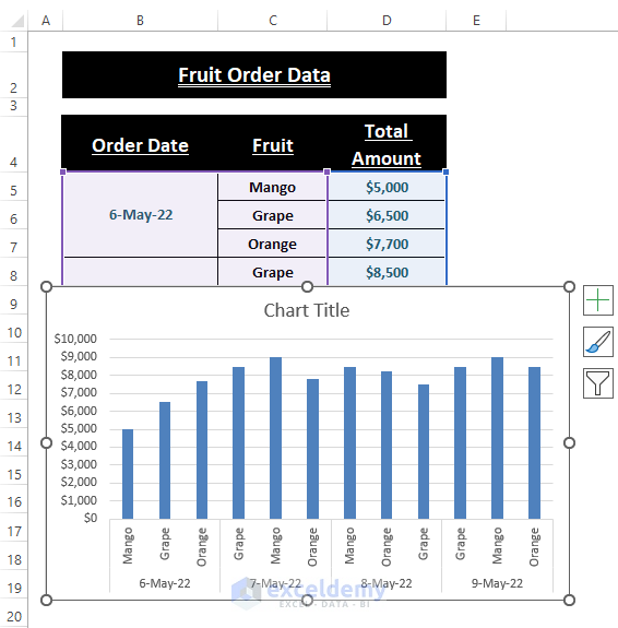
Furnish the Chart according to your priorities; you see Excel groups the data date-wise.
Any kind of grouped date data can result in grouped dates in an Excel Chart.
Download Excel Workbook
Related Articles
- Excel Pivot Table Group by Week (3 Suitable Examples)
- [Fix] Cannot Group Dates in Pivot Table: 4 Possible Solutions
- Excel Pivot Table Auto Grouping by Date, Time, Month, and Range!

