Method 1 – Showing Outliers in Box and Whiskers Chart
Steps:
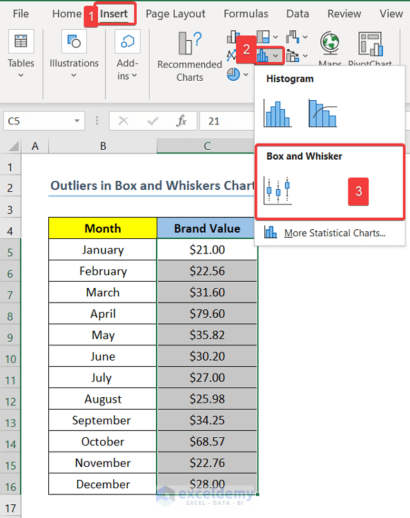
- Select range C5:C16.
C5 and C16 are the first and last cells of the Brand Value column.
- Click on the Insert tab, go to the Insert Statistic Chart and click on Box and Whiskers.
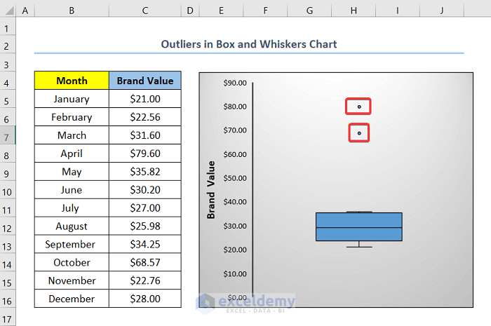
- You will get the Box and Whiskers Chart for the respective Brand Values.
- In the graph, you will see two points indicating Brand Values $79.60 and $68.57 are not in the box, they are away from the box in the graph.
- The Brand Values of $79.60 and $68.57 are outliers in this case.
Notes:
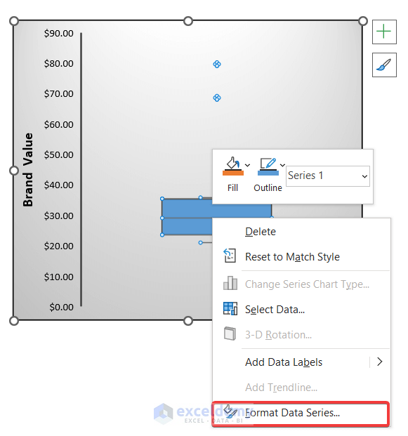
In case, you can not see the Outliers after plotting the Box and Whiskers Chart, you can use the following steps to solve your problem.
Steps:
- Right-Click on the plot area.
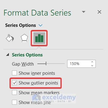
- Select Format Data Series and a box will pop up on the right side of the screen.
- Go to Series Options and check the Show outlier points box as shown in the following image.
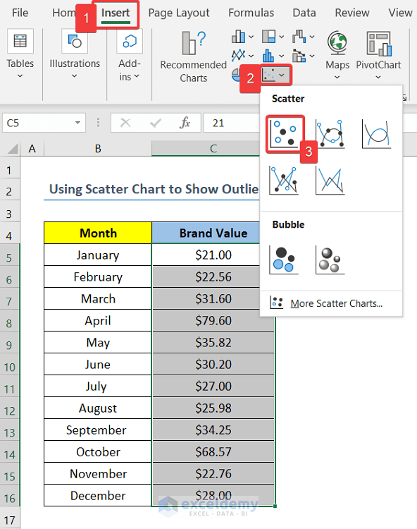
Method 2 – Using Scatter Chart to Show Outliers in Excel Graph
You can also show the Outliers using the Scatter Chart. Now, if you want to use the Scatter Chart to show the Outliers, you can follow the following steps.
Steps:
- Select range C5:C16.
- Select the Insert tab from the top of the page.
- Click on Insert Scatter (X, Y) or Bubble Chart and a drop-down box will appear.
- Select Scatter.
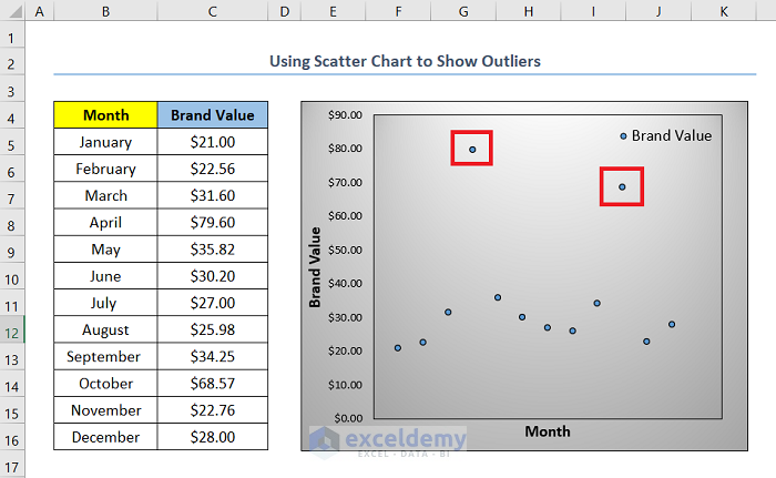
- You will get a Scatter Chart. In this chart, the points located away from the other points are the outliers. In this case, data points indicating Brand Values of $79.60 and $68.57 are the outliers.
Read More: How to Remove Outliers in Excel Scatter Plot
Download Practice Workbook
Related Articles
- How to Calculate Outliers in Excel
- How to Find Outliers Using Z Score in Excel
- How to Find Outliers in Regression Analysis in Excel
- How to Find Outliers with Standard Deviation in Excel
<< Go Back to Outliers in Excel | Excel for Statistics | Learn Excel

