Are you curious to establish a correlation between the variables in your data? Look no further! In this article, we’ll explore how to find the correlation coefficient in an Excel scatter plot.
With a correlation scatter plot, we can add visual clarity, perform data analysis, and interpret the results with ease.

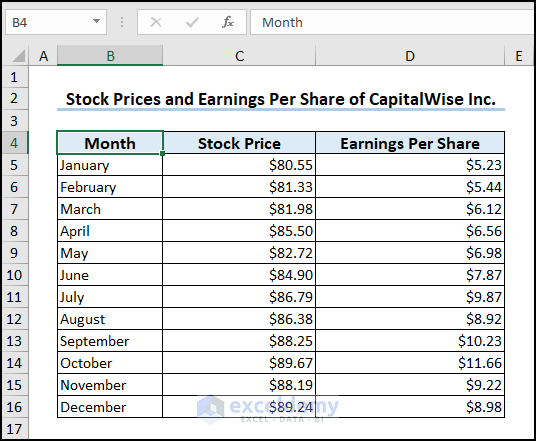
The above image is an overview of this article, which shows the correlation coefficient between the “Stock Price” and “Earnings Per Share” variables. In the following sections, we’ll learn more about its application and significance.
Here, we’ve used Microsoft Excel 365; You can use any version of Excel according to your wish.
What Is the Correlation Coefficient in Excel?
Correlation is a measure of how strong a relationship is between two variables. It also indicates whether there is a positive or negative relationship between the two variables.
Correlation Coefficient is a numerical value that measures the degree of correlation between two variables. The coefficient can have a value ranging from -1 to +1.
- An absolute positive correlation is represented by +1 while an absolute negative correlation is shown by -1.
- A coefficient of 0 means there is no correlation between the variables.
Pearson Correlation Coefficient
Pearson Correlation Coefficient measures the linear correlation between two variables. In simple terms, it is the ratio of the covariance and product of the standard deviation of the two variables.
The formula to calculate the Pearson correlation coefficient (r) for the two variables x and y is given below.

Interpreting Correlation Coefficient in Excel
The degree of correlation between two variables is the correlation coefficient.
Strength
The magnitude (absolute value) of the correlation coefficient determines the strength of the relationship.
| Correlation Coefficient | Strength |
|---|---|
| -0.3 to +0.3 | Weak |
| -0.5 to -0.3 or +0.3 to +0.5 | Moderate |
| -0.9 to -0.5 or +0.5 to +0.9 | Strong |
| -1.0 to -0.9 or +0.9 to +1.0 | Very Strong |
Source: Cohen, L. (1992).
Direction
The positive or negative sign of the correlation coefficient shows the direction of the relationship.
A positive coefficient results in a positive (upward) slope on a graph. In this scenario, as the “Revenue” variable increases the “Net Income” variable also increases.

A negative coefficient gives a negative (downward) slope on a graph. For example, as the “Interest” rate increases the “Bond Price” decreases.

A coefficient value of zero shows a line parallel to the horizontal axis, which indicates no correlation. Here, increasing the “Number of Employees” has no correlation to the “Gross Margin”.

It’s important to note that correlation only indicates the degree of association between two variables, and doesn’t establish a causal relationship. This means that we cannot conclude that changes in one variable cause the other variable to change.
How to Find Correlation Coefficient in Excel Scatter Plot: 3 Easy Steps
In this section, we’ll describe the steps on how to find the correlation coefficient in an Excel Scatter Plot.
Let’s consider the financial information of “CapitalWise Inc.” which contains the “Month”, “Stock Price”, and “Earnings Per Share” columns. Here, we want to plot a Scatter graph to find the correlation coefficient between “Stock Price”, and “Earnings Per Share”.
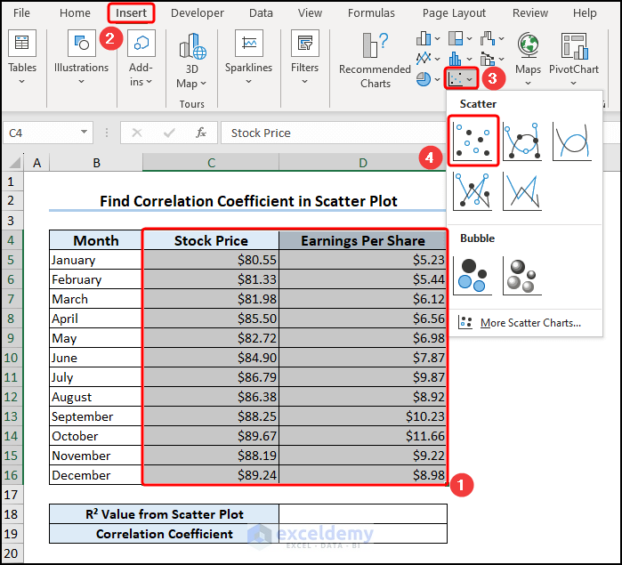
Step 1: Insert a Scatter Plot
Select the C4:D16 cells with the numerical data >> go to the Insert tab >> in the Charts group, and select the Scatter option.
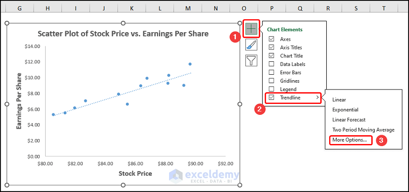
Step 2: Format the Scatter Plot
Now, we’ll format the Scatter plot using the Chart Elements option.
- In addition to the default selection, enable the Axes Title to provide axes names. Here, it is “Stock Price” and “Earnings Per Share”.
- Add the Chart Title, for example, “Scatter Plot of Stock Price vs, Earnings Per Share”.
- Disable the Gridlines option to give the chart a clean look.
- Finally, check the Trendline option.

Step 3: Add the Correlation Coefficient to the Excel Scatter Plot
After enabling the Trendline option, click on More Options.
In the Format Trendline pane, check the Display Equation on chart and Display R squared value on chart options.

In turn, enter the R squared value in the D18 cell >> use the SQRT function to get the value of R.
=SQRT(D18)
Here, the D18 cell contains the R squared value from the Scatter plot.

That’s it, we’ve made the scatter plot and calculated the correlation coefficient. Since this value is quite close to +1.0 we can conclude there is a very strong positive correlation between the “Stock Price” and “Earnings Per Share”.
Read More: How to Find Coefficient of Determination in Excel
How to Calculate Correlation Coefficient in Excel
Luckily, Excel has dedicated functions to calculate correlation coefficients. In this portion, we’ll discuss how to calculate the correlation coefficient using the CORREL and PEARSON functions.
1. Using CORREL Function to Calculate Correlation Coefficient
Overview of CORREL Function:
The CORREL function calculates the correlation coefficient between two sets of data.
Syntax:
=CORREL(array1, array2)
Argument Explanation:
| Argument | Required/Optional | Explanation |
|---|---|---|
| array1 | Required | A range of cell values. |
| array2 | Required | The second range of cell values. |
Return Parameter:
- The correlation coefficient ranges between -1.0 and +1.0.
Version:
- The CORREL function was introduced in Excel 2007 and is available in all versions after that.
📌 Steps:
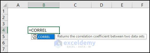
Enter the following expression in the D18 cell.
=CORREL(C5:C16,D5:D16)
In this case, the C5:C16 and D5:D16 arrays represent the “Stock Price” and “Earnings Per Share” columns.

We can see that the CORREL function returns approximately the same result as the Scatter plot.
2. Calculating Correlation Coefficient with PEARSON Function
Overview of PEARSON Function:
The PEARSON function returns the Pearson product-moment correlation coefficient (r).

Syntax:
=PEARSON(array1, array2)
Argument Explanation:
| Argument | Required/Optional | Explanation |
|---|---|---|
| array1 | Required | Values of the independent variable |
| array2 | Required | Values of the dependent variable. |
Return Parameter:
- Pearson product-moment correlation coefficient, (r) ranges from -1.0 to 1.0.
Version:
- The PEARSON function is available in all versions after Excel 2007.
📌 Steps:
Type the expression below into the D18 cell.
=PEARSON(C5:C16,D5:D16)
The PEARSON function also takes two array arguments and returns the same result as the CORREL function.

How to Make Correlation Matrix in Excel
So far we’ve checked for correlation between two variables. What if there are more than two variables? We can make a Correlation Matrix to easily test for correlation between two or more variables.
A correlation matrix displays the coefficients at the intersection of the respective rows and columns.
1. Use of Data Analysis Toolpak for Correlation Matrix
Excel’s Data Analyses ToolPak can find the correlation between two or more variables and generate a correlation matrix.
📌 Steps:
First, we have to activate the Data Analysis ToolPak. To do this click the File tab.

Select Options at the bottom.

This opens the Excel Options dialog box.
Choose the Add-ins option >> in the Manage drop-down, select Excel Add-ins >> hit Go.

Check the Analysis ToolPak option >> press OK.

Now, move to the Data tab >> click Data Analysis.

The Data Analysis tool can perform various statistical analyses. For our case, we’ll select Correlation and press OK.

In turn, enter the necessary parameters in the Correlation wizard.
- Select the C4:E16 cells for the Input Range.
- The Grouped By option is set to Columns since our data is grouped according to columns.
- Click on the Labels as the first row in our data contains the column headers.
- Choose the Output options. Here, we’ve chosen the B18 cell on the same worksheet.
- Hit the OK button.

Let’s interpret the results of the correlation matrix.
- We’ve already seen a very strong positive correlation between “Stock Price” and ”Earnings Per Share” which is shown by the value “0.917” (in 3 decimal places).
- The coefficient of “-0.908” indicates a strong negative correlation between the “Stock Price” and “Price to Earnings Ratio”

- Lastly, a coefficient value of “-0.980” (in 3 decimal places) indicates a significant negative correlation between the “Earning Per Share” and “Price to Earnings Ratio”.
2. Applying Excel Formula to Make Correlation Matrix
We can also make the correlation matrix by combining the CORREL, OFFSET, ROWS, and COLUMNS functions.
📌 Steps:
Jump to the C19 cell >> copy and paste the formula into the Formula Bar.
=CORREL(OFFSET($C$5:$C$16, 0, ROWS($4:4)-1), OFFSET($C$5:$C$16, 0, COLUMNS($C:C)-1))
Formula Breakdown
- OFFSET($C$5:$C$16, 0, ROWS($4:4)-1) → correlation coefficient between two sets of data.
- Here $C$5:$C$16 is the reference argument which is the “Stock Price” array.
- The 0 is the rows argument which tells the function to shift by 0 rows.
- The ROWS($4:4)-1 is the cols argument that returns 3 for the first row, 2 for the second row, and so on.
- Output → {80.55;81.33;81.98;85.5;82.72;84.9;86.79;86.383;88.25;89.67;88.19;89.24}
- OFFSET($C$5:$C$16, 0, COLUMNS($C:C)-1) → the second OFFSET function works in a similar style.
- One key difference is the COLUMNS($C:C)-1 which returns 3 for the first row, 2 for the second row, and so on.
- Output → {80.55;81.33;81.98;85.5;82.72;84.9;86.79;86.383;88.25;89.67;88.19;89.24}
- CORREL(OFFSET($C$5:$C$16, 0, ROWS($4:4)-1), OFFSET($C$5:$C$16, 0, COLUMNS($C:C)-1)) → returns the correlation coefficient of the two arrays.
- Output → 1

Drag the Fill Handle Tool from left to right >> then again use the Fill Handle Tool to copy the formula from the top to the bottom.

Lastly, we’ll get the correlation matrix as shown in the image below.

Correlation vs. Linear Regression in Excel
Correlation describes the strength and direction of the relationship between two variables.
Linear Regression estimates the value of the dependent variable based on the independent variable. The equation for linear regression is:

How to Get Correlation Coefficient in Excel Linear Regression
To obtain the correlation coefficient in linear regression we again apply the Data Analysis ToolPak. To enable the Data Analysis ToolPak follow the steps shown previously.
📌 Steps:
Go to the Data tab >> Click Data Analysis.

Select the Regression option and click OK.

Next, enter the required parameters for regression.
- Select the D4:D16 cells for the Input Y Range and the C4:C16 cells for the Input X Range.
- Check the Labels option since the first row of the source data contains column headers.
- Choose the New Worksheet Ply to display the output.
- Press OK.

In this situation, we’ll focus on the p-value which has a value of “2.598E-05” which is very less than 0.05. This means there is a significant correlation between “Stock Price” and “Earnings Per Share”.

Frequently Asked Questions
1. What is a strong correlation coefficient?
Typically, a correlation coefficient value of greater than 0.7 (positive or negative) is considered strong.
2. What is a weak correlation coefficient?
A correlation coefficient of less than 0.3 (positive or negative) is considered as weak.
3. What is the difference between correlation and causation?
Correlation establishes a statistical relationship between two variables. In contrast, causation implies that one variable is directly responsible for the changes to the other variable.
The reason correlation does not necessarily imply causation is because other factors may be involved.
Things to Remember
- The correlation coefficient indicates a linear relationship between two variables.
- The Pearson correlation can differentiate between independent and dependent variables.
- The Pearson coefficient is affected by any anomalous observation (outlier). In this case, it is better to use the Spearman Coefficient instead.
Download Practice Workbook
You can download the following practice workbook to practice by yourself.
Conclusion
In short, we started with a brief discussion about the correlation coefficient and what this value signifies. Next, we showed the steps to plot a scatter chart and get the correlation coefficient. In addition, we also looked at the dedicated CORREL and PEARSON functions.
Following this, we explored how to make the correlation matrix in case of two or more variables. Lastly, we compared correlation and linear regression and calculated the linear regression coefficient.
We hope this article has provided a solid understanding of how to find the correlation coefficient in an Excel scatter plot. If you have any suggestions or comments, don’t forget to share them with us.
Related Articles
- How to Calculate Spearman Correlation in Excel
- How to Calculate P Value for Spearman Correlation in Excel
- How to Calculate Intraclass Correlation Coefficient in Excel
- How to Show Relationship Between Two Variables in Excel Graph
<< Go Back to Correlation Coefficient in Excel | Excel Correlation | Excel for Statistics | Learn Excel
Get FREE Advanced Excel Exercises with Solutions!
