Understanding Correlation
- Correlation measures how strongly two variables are connected. It’s represented by a coefficient called the correlation coefficient.
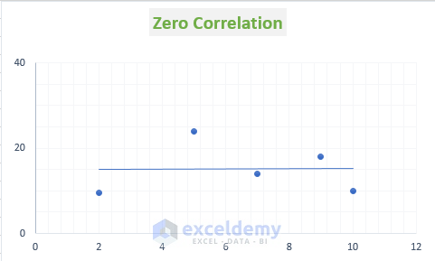
- If the correlation coefficient is 0, the variables are not correlated (no relationship). A graph of zero correlation appears as a straight line.
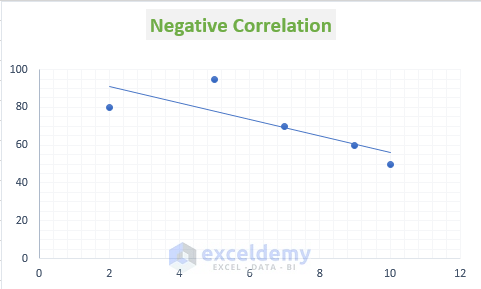
- When the correlation coefficient is between -1 and +1, the variables are related. Negative values indicate negative correlation.
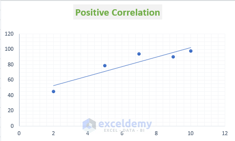
- Positive values indicate positive correlation.
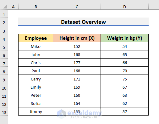
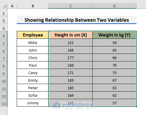
Dataset Overview
- Let’s work with a dataset containing information about the height and weight of employees.
- We’ll plot height (x-axis) against weight (y-axis) to explore their relationship.
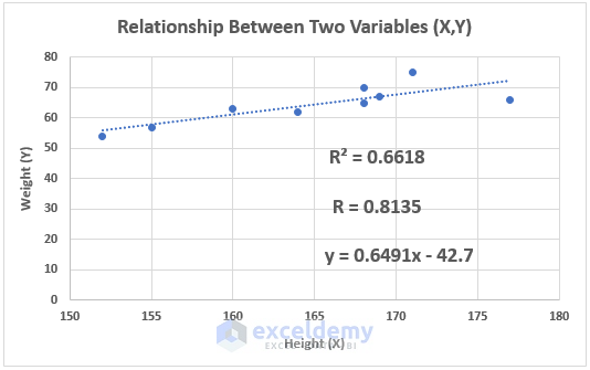
Step 1 – Creating a Scatter Plot
- Select the range containing height and weight data (e.g., C4:D13).
- Go to the Insert tab and choose the Scatter icon. Select the scatter plot type.
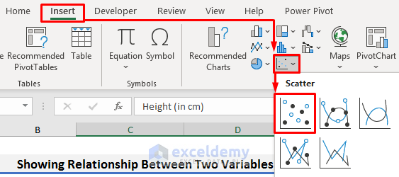
- The scatter plot graph will appear on your sheet.
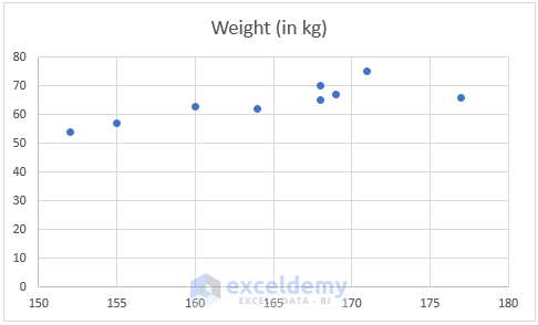
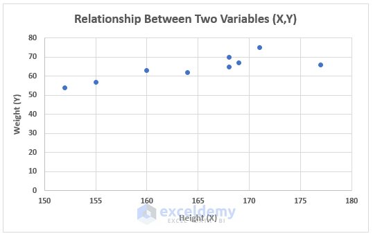
Step 2 – Customizing the Chart
- To make the graph more understandable:
- Change the chart title and axis titles.
- Adjust any other formatting as needed.
Read More: How to Find Correlation Coefficient in Excel Scatter Plot
Step 3 – Adding a Trendline
- Click on the scatter plot chart. A plus (+) icon will appear.
- Click the plus icon to see options and check Trendline.
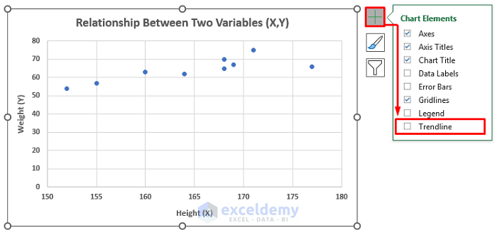
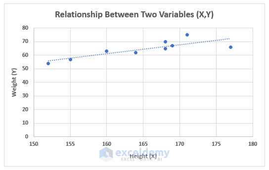
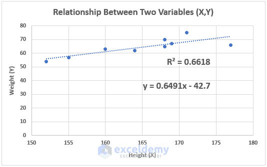
- A linear trendline will appear on the graph.
- The positive slope of the trendline suggests positive correlation.
Step 4 – Displaying R-Squared Value
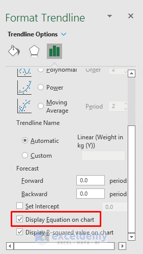
- Double-click the trendline to open the Format Trendline settings.
- Check Display R-squared value on chart.
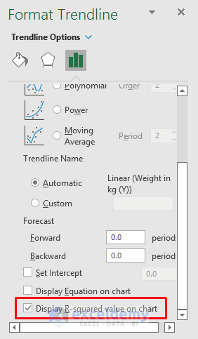
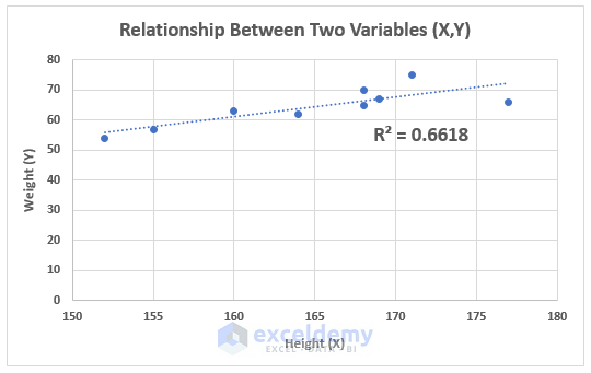
- The R-squared value will appear on the chart.
Step 5 – Showing the Trendline Equation
- In the same Format Trendline settings, check Display Equation on chart.
- The equation of the linear trendline will be visible.
Step 6 – Calculating the Correlation Coefficient R
- We already have the R-squared value (e.g., 0.6618).
- To find the correlation coefficient, R, use the SQRT function:
- Select a cell (e.g., D5) and enter the formula:
=SQRT(0.6618)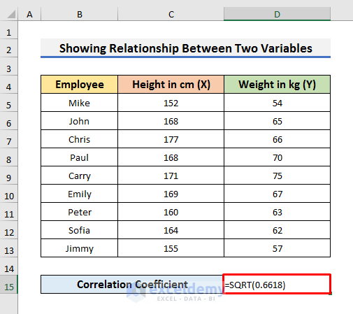
-
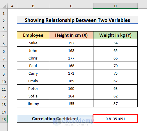
- Press Enter to get the result (e.g., 0.8135).
- This value indicates a positive correlation between height and weight.
Read More: How to Calculate Spearman Correlation in Excel
Step 7 – Checking the Correlation Coefficient
- To verify the result from the graph, we’ll calculate the correlation coefficient using the CORREL function.
- Select cell D16 (or any other empty cell where you’d like to display the result).
- Enter the following formula:
=CORREL(C5:C13,D5:D13)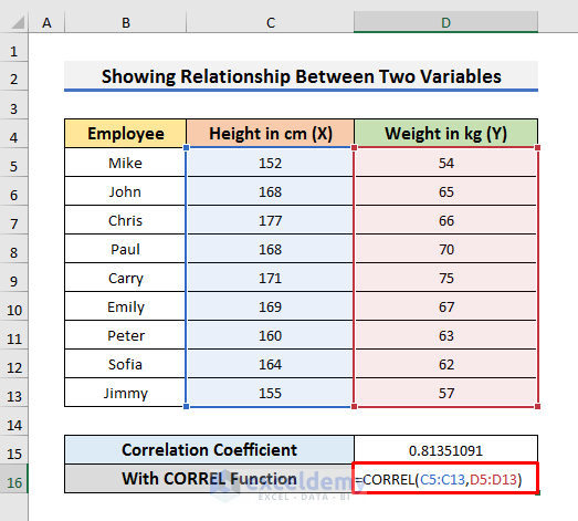
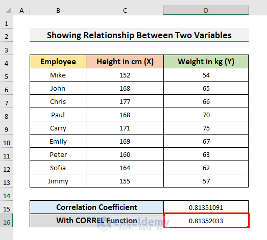
- Press Enter to see the result.
- You can see both values of the correlation coefficient are the same.
- Understanding the CORREL Function:
- The CORREL function calculates the correlation coefficient between two data series (X-variable and Y-variable).
- In the formula, C5:C13 represents the height data (X-variable), and D5:D13 represents the weight data (Y-variable).
Final Decision
- If both values of the correlation coefficient match, it confirms the accuracy of the graph’s trendline.
- Based on the positive slope of the trendline, we can conclude that the two variables have a positive correlation.
- Additionally, the strong positive correlation (indicated by the value of R) means that if one variable increases, the other also tends to increase.
Download Practice Book
You can download the practice workbook from here:
Related Articles
- How to Find Spearman Rank Correlation Coefficient in Excel
- How to Calculate Pearson Correlation Coefficient in Excel
- How to Find Coefficient of Determination in Excel
- How to Calculate Intraclass Correlation Coefficient in Excel
- How to Calculate P Value for Spearman Correlation in Excel
<< Go Back to Excel Correlation | Excel for Statistics | Learn Excel
Get FREE Advanced Excel Exercises with Solutions!
