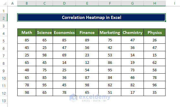
The dataset contains students’ marks in different Exams.
Step 1 – Enable the Data Analysis Tool
- In the Data tab, enable Data Analysis.
- Click File and choose Options.
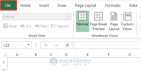
- Click Options.

- Go to Add-ins, select Excel Add-in in Manage.
- Click Go.
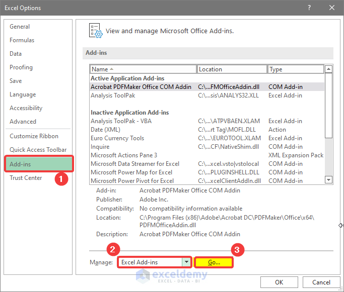
- In the new window, check Analysis ToolPak.
- Click OK.

Step 2 – Use the Data Analysis Tool to Create a Correlation Matrix
- Go to the Data tab and select Data Analysis.

- Select Correlation.
- Click OK.

- In the Correlation window, choose the input range: your dataset.
- Click Columns in Grouped By to group the data by columns.
- Check Labels in the first row if your data has table headers or labels.
- Choose where to place your output in Output Options. Here, a new worksheet: enter the sheet name.
- Click OK.

- A new worksheet will open. The dataset is displayed with the correlation values.

Read More: Find Correlation Between Two Variables in Excel
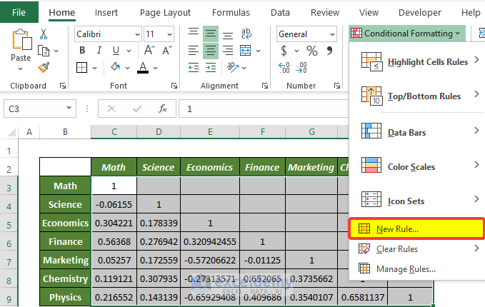
Step 3 – Using the Conditional Formatting to Create a Correlation Heatmap
- In the Home tab, select Styles.
- Click Conditional Formatting and select New Rule.

- In the new window select Format all cells based on their values in Select a Rule Type.
- Change Format Style from 2 to 3.

- In Minimum, select Number.
- In Values, enter -1.
- Choose Red.
- In Midpoint, select Number.
- In Values, enter 0.
- Choose White.
- In Maximum, select Number.
- In Values, enter 1.
- Choose Blue.
- Click OK.

A color-coded heatmap is displayed.

Read More: How to Make Correlation Graph in Excel
Step 4 – Output Interpretation
The correlation coefficient indicates how the variables relate to each other. The heatmap offers an overview of the coefficients distribution and their intensity.
The more positive the value towards +1, the better the relation between variables. If one of those values increases, the other value also increases. The color code is as blue: the bluer the cell, the better the symmetrical relation.
The more negative value toward -1, the worse the relation between variables. If a variable increases, the other is likely to decrease. The color code is red. The worse the correlation value, the redder the cell color. E4 and E9 show this type of negative relation.
Read More: How to Interpret Correlation Table in Excel
How to Create a Dynamic Correlation Heat Map in Excel
Step 1 – Create a Correlation Dataset
- Use the correlated dataset created in the previous method.

Step 2 – Add a Checkbox
- In the Developer tab, click Insert.
- Click the Check Box icon.

- A Check Box will be displayed.
- Edit and resize it.

- Select the box and right-click.
- Click Format Control.

- In the new window, enter the cell that will be linked to the box.
- Click OK.

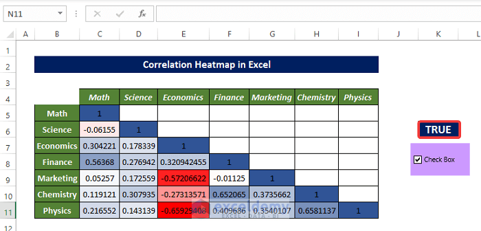
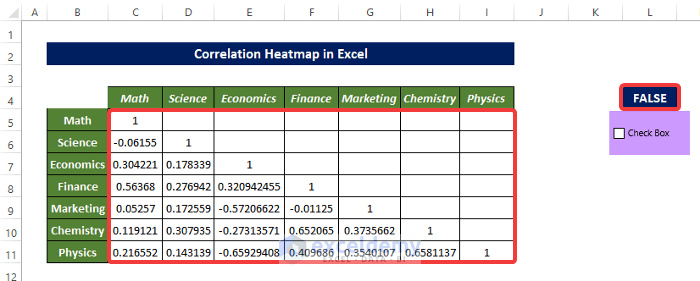
- “FALSE” is displayed
- Clicking the check box will toggle the value of L4 between TRUE and FALSE.

Step 3 – Apply the Conditional Formatting
- Select the dataset.
- In the Home tab, select Style.
- Click Conditional Formatting.
- Choose New Rule.
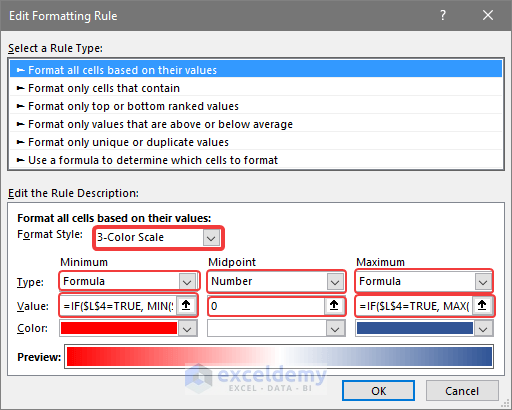
- In the new window, select Format all cells based on their values in Select a Rule Type.
- Change Format Style from 2 to 3.
- In Minimum, select Formula.
- Enter the following formula in Value (Minimum):
=IF($L$4=TRUE,MIN($C$5:$I$11),FALSE)- Choose Red
- In Midpoint, select Number.
- Enter 0 in Values.
- Choose White.
- In Maximum, select Formula.
- Enter the following formula in Value (Maximum):
=IF($L$4=TRUE,MAX($C$5:$I$61),FALSE)
- Choose Blue.
- Click OK.
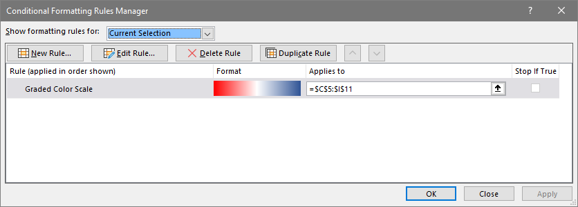
- The Conditional Formatting Rules Manager window shows an overview of all rules.
- Click OK.
Formula Breakdown
- MIN($C$5:$I$11): returns the minimum value in $C$5:$I$11.
- IF($L$4=TRUE, MIN($C$5:$I$11), FALSE): If the value of L4 is true, the minimum value of $C$5:$I$11 will be the input value. Otherwise, there will be no value available to input and no formatting.
- MAX($C$5:$I$61): returns the minimum value in $C$5:$I$11
- IF($L$4=TRUE, MAX($C$5:$I$61), FALSE): If the value of L4 is true, the maximum value in $C$5:$I$11 will be the input value. Otherwise, there will be no value available to input and no formatting.
Read More: How to Make a Correlation Matrix in Excel
Step 4 – Interpreting the Output
The Correlation Heatmap is dynamic. When the cell value of L4 is TRUE, conditional formatting will be displayed.
- Clicking the check box, will hide the heat map, as shown below.
Potential Problems with Correlation in Excel
There is only a linear relationship between two variables in the Pearson Product Moment Correlation. Your variables may be strongly related in another way (e.g. curvilinearly), and still have a correlation coefficient close to or equal to zero.
Pearson correlation cannot differentiate dependent from independent variables. If you have a correlation value of -0.413 ( indicating a negative correlation between variables), and shuffle the variable, the same correlation value is returned.
The Pearson correlation coefficient can provide a misleading overview of the relationship between two variables.
To rank two variable values, perform the Spearman Correlation Coefficient analysis.
Download Practice Workbook
Download the practice workbook.
Related Articles
- How to Make a Correlation Scatter Plot in Excel
- How to Calculate Cross Correlation in Excel
- How to Calculate Correlation between Two Stocks in Excel
- How to Do Correlation and Regression Analysis in Excel
- How to Calculate Partial Correlation in Excel
- How to Make a Correlation Table in Excel
<< Go Back to Excel Correlation | Excel for Statistics | Learn Excel
Get FREE Advanced Excel Exercises with Solutions!
