The following two sample data tables, where the income for the two months of January and February of five employees of a company are listed will be ...
A great way of representing statistical data in Excel is by using a box plot. If the data in a data set are interrelated to each other then showing ...
Sometimes for data visualization, you may need to create an organizational Chart in Excel of your company or any organization. So, in this article, I ...
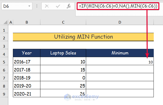
Zero values often create difficulties while visualizing data in a chart. Here are 5 effective methods to hide these values from Excel charts. We will ...