In this article, we will demonstrate how to create a stacked area chart with negative values in Excel for 3 different cases.
Example 1 – Creating a Stacked Area Chart for a Single Column Containing Positive and Negative Values
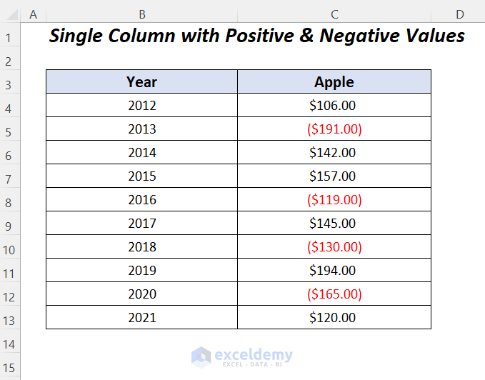
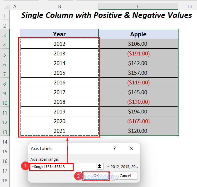
In the dataset below, we have positive and negative profit values (the values in red) mixed together in the Apple column. Using this dataset we’ll plot a stacked area chart showing the negative values.
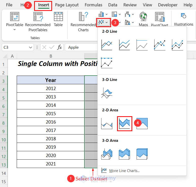
Step 1 – Inserting a Stacked Area Chart
- Select the Apple column, then go to the Insert tab >> Charts group >> Insert Line or Area Chart group >> 2-D Stacked Area.
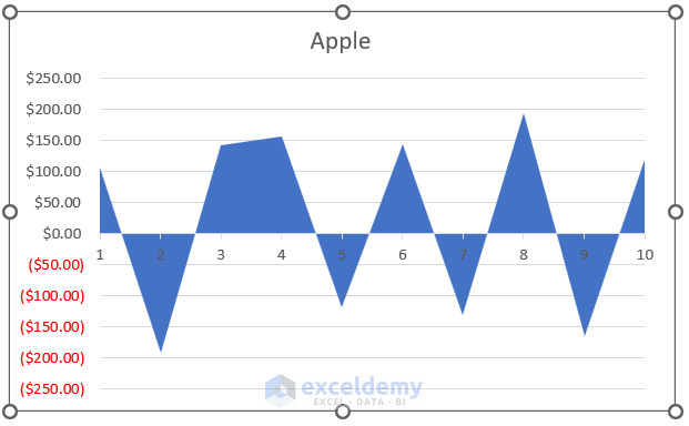
The following chart is drawn, where the negative values are clearly visible in the chart, but on the horizontal axis we have to insert the years.
- Right-click on the chart area and select the option Select Data.
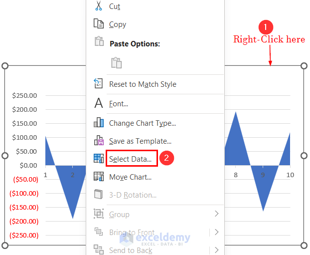
The Select Data Source wizard will open.
- Click on the Edit option under the Horizontal (Category) Axis Labels.
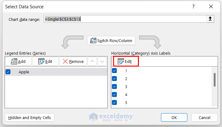
The Axis Labels wizard will open.
- Select the Year column as the Axis label range and click OK.
The Select Data Source dialog box opens again.
- Click OK.
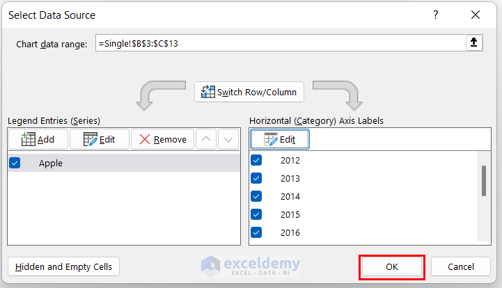
The years are added to the chart.

Step 2 – Formatting the Chart
Now, we will change the color of the positive areas into green and the negative areas into red to identify the differences in their values.
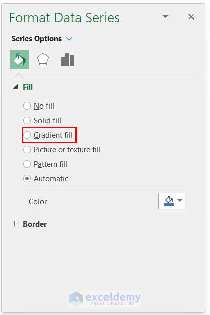
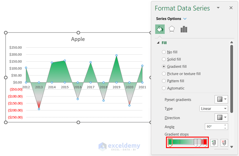
- Right-click on the series and select the Format Data Series.
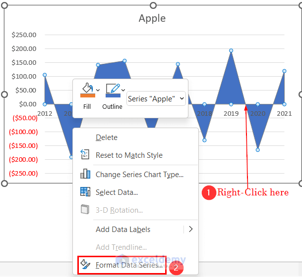
The Format Data Series wizard will pop up on the right side of your worksheet.
- Select the Gradient fill option under Fill.
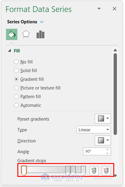
Go down to the Gradient stops option, where you can control the color of your chart.
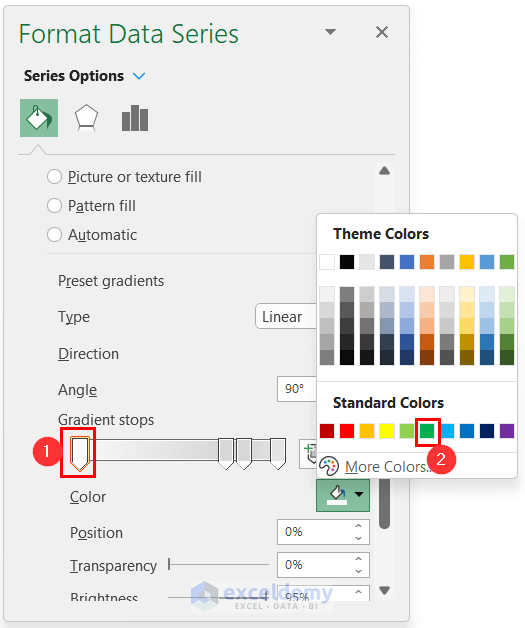
- Select the first stop on the left side and choose green as the fill color (assuming you want green for the positive areas).
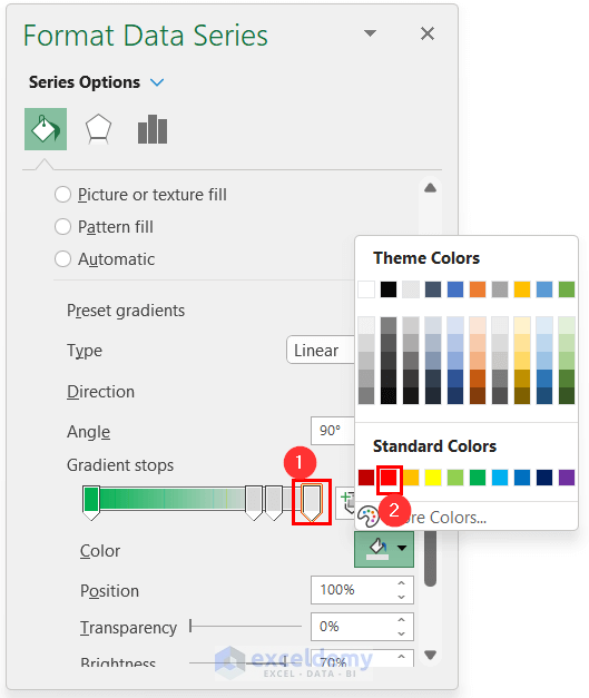
- Then choose red as the fill color for the last three stop points for the negative areas.
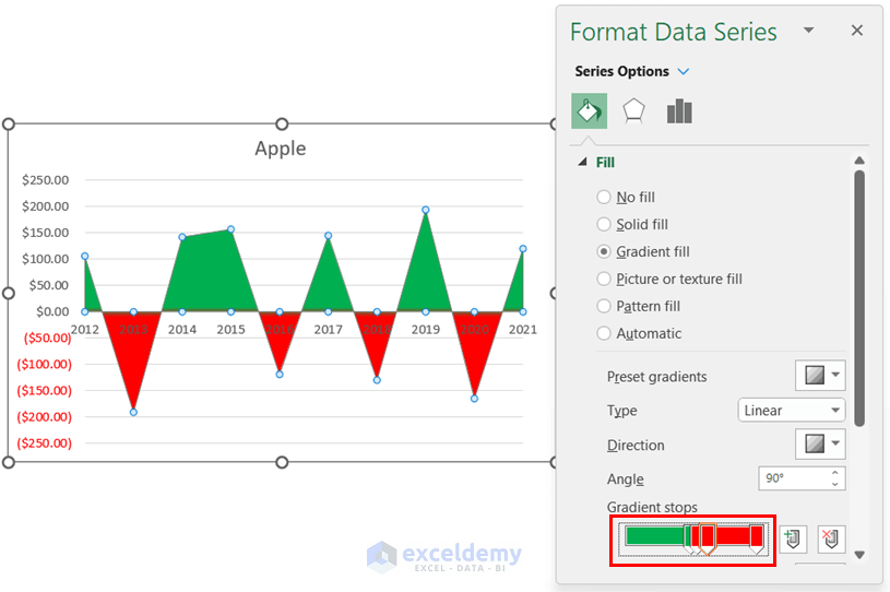
After applying the colors, the following changes will be visible in your chart.
- Move the green point from left to right and the red point from right to left and balance the points accordingly to bring the following colors to your chart.
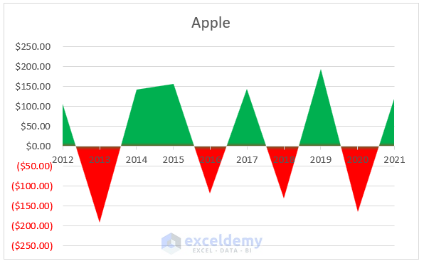
Finally, we have the following chart representing the positive and negative profits of apples for different years.
Read More: How to Create an Area Chart in Excel
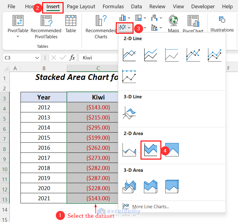
Example 2 – Creating a Stacked Area Chart for Two Columns Containing Positive and Negative Values in Excel
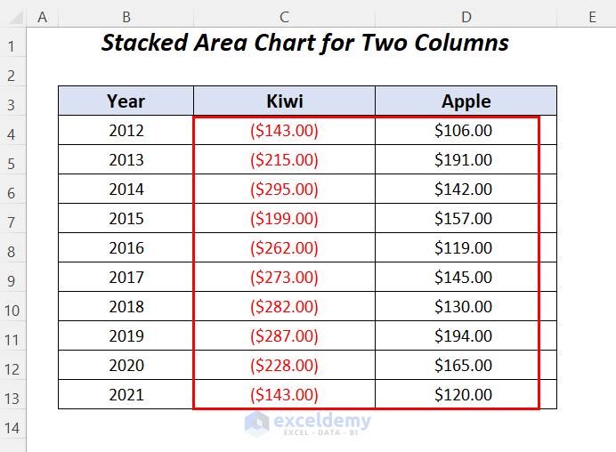
Here, we have negative profit values for Kiwi and positive profits for Apple for different years. To apply this example the negative series should be in the first place, which is why the Kiwi column is placed before the Apple column.
Steps:
- Select the Kiwi and Apple columns, then go to the Insert tab >> Charts group >> Insert Line or Area Chart group >> 2-D Stacked Area.
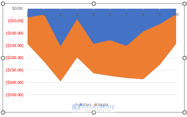
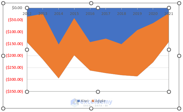
The following chart will appear, where we will input the year values on the horizontal axis.
- Right-Click on the chart area and select the option Select Data.
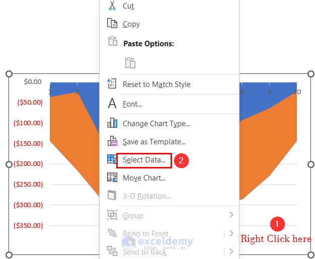
The Select Data Source wizard will open.
- Click on the Edit option under the Horizontal (Category) Axis Labels.
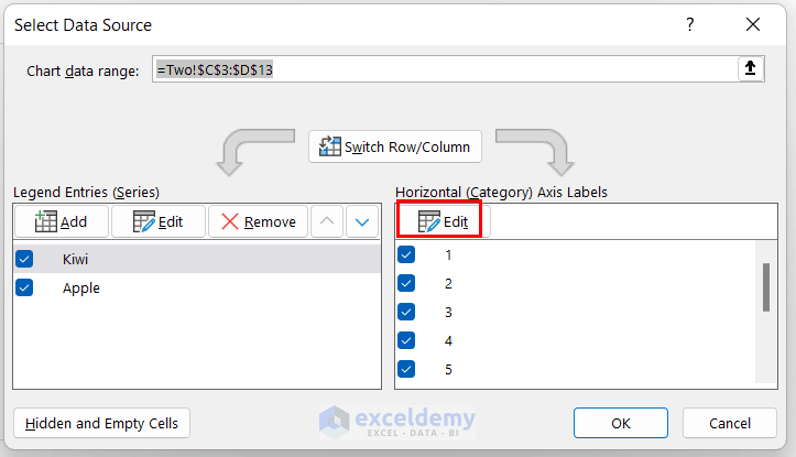
The Axis Labels wizard will open up.
- Select the Year column as the Axis label range then click OK.
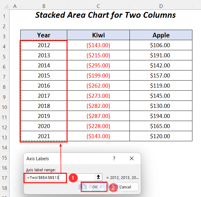
The Select Data Source dialog box will open again.
- Click OK.
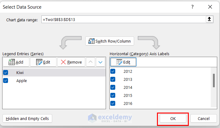
In this way, the years will appear in the chart.
To modify the chart, right-click on the Y-axis.
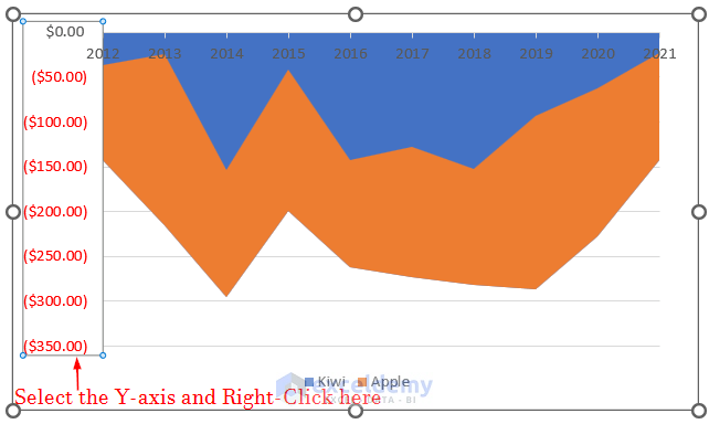
- Select Format Axis.
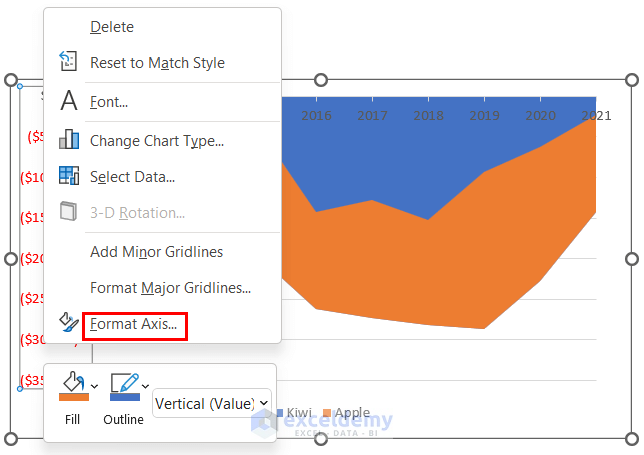
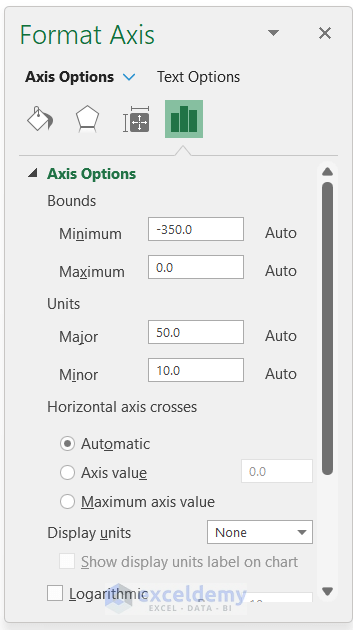
The Format Axis dialog box will open on the right side of your worksheet.
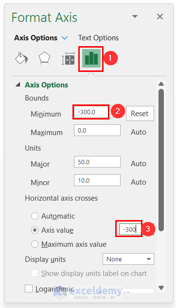
- Go to the Axis Options tab and enter -300.0 (the minimum limit for negative profits of the Kiwi column) as the Minimum Bounds value and Axis value where the Horizontal axis crosses.
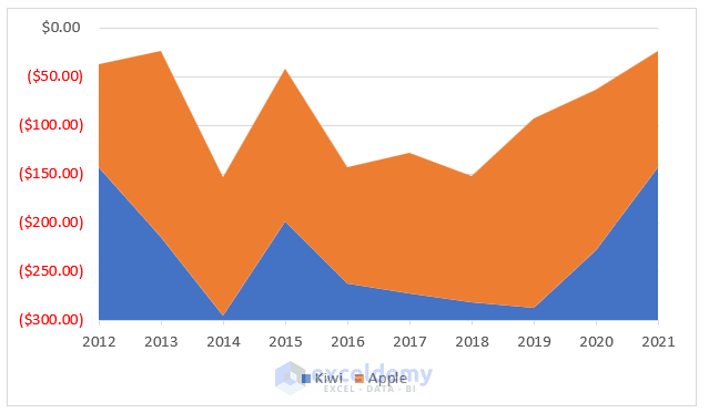
We have the final result of the area chart where the negative values of the Kiwi column are shown on the negative Y-axis and the positive values of the Apple column are shown also with respect to this negative axis, as the baseline has been shifted to -300.
Read More: Excel Area Chart Data Label Position
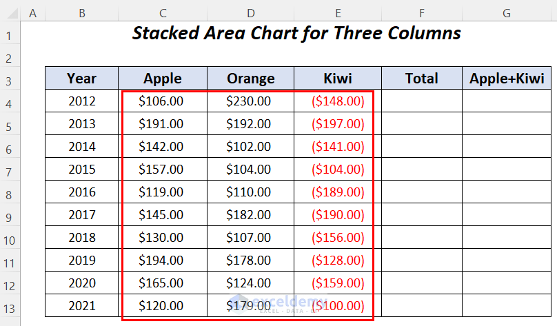
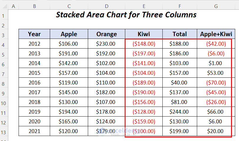
Example 3 – Creating a Stacked Area Chart for Three Columns Containing Positive and Negative Values
In this example, we will deal with two columns with positive profits and one column with negative profits, and plot the values in a stacked chart showing the negative values. For this purpose, we need two extra columns, Total and Apple+Kiwi.
Step 1 – Using Formulas to Calculate Values
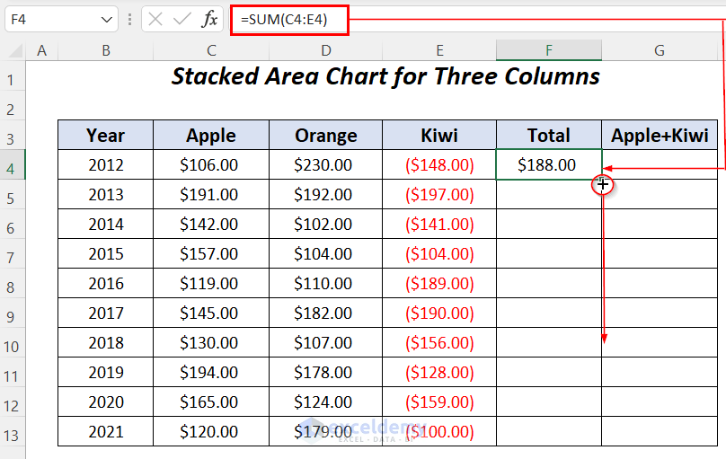
- In cell F4 of the Total column, enter the following formula:
=SUM(C4:E4)Here, the SUM function will add up the profit values of Apple, Orange and Kiwi.
- Drag down the Fill Handle tool to copy this formula to the rest of the cells.
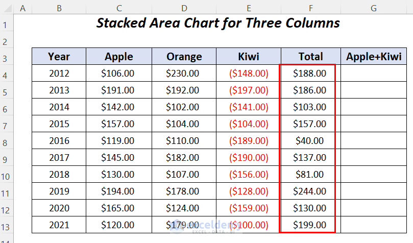
We have the total profits of all the three products in the Total column.
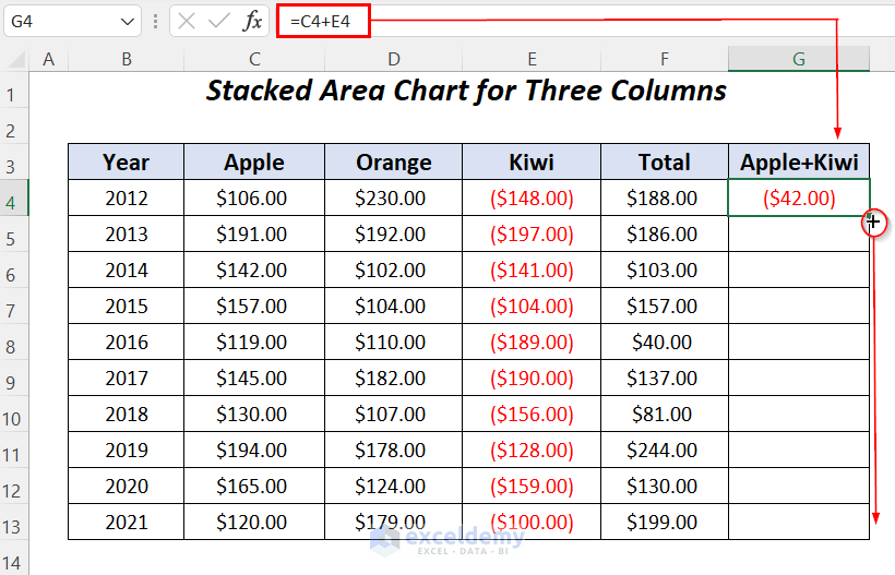
- Enter the following simple formula in cell G4:
=C4+E4Here, the profits of the Apple and Kiwi columns will be added.
- Drag down the Fill Handle tool to copy this formula to the rest of the cells.
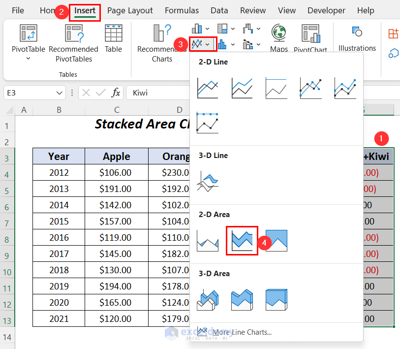
Step 2 – Inserting a Stacked Area Chart
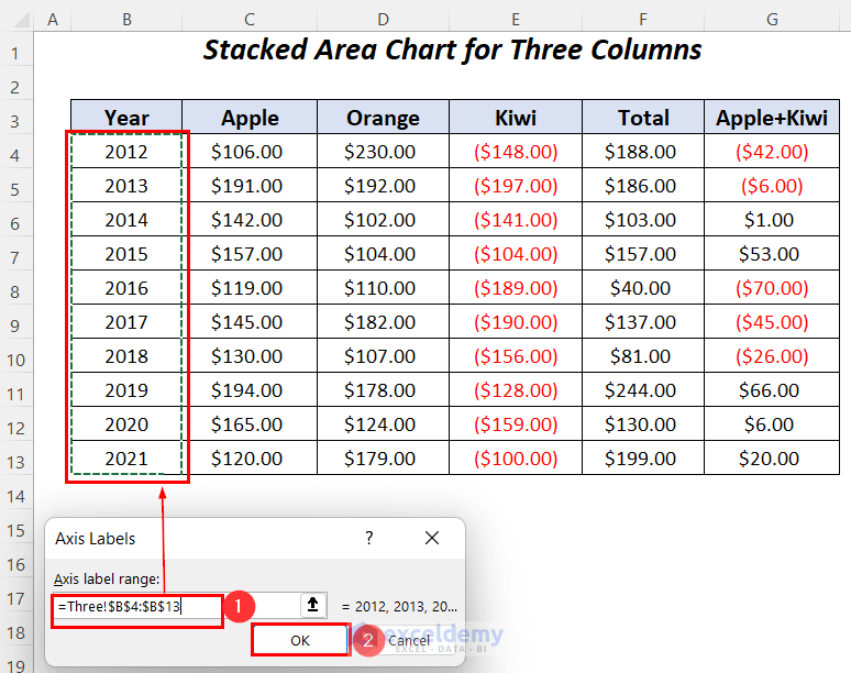
After calculating all of the values, we will use the 3 columns indicated below to plot our stacked area chart.
- Select the Kiwi, Total and Apple+Kiwi columns, then go to the Insert tab >> Charts group >> Insert Line or Area Chart group >> 2-D Stacked Area.
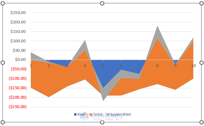
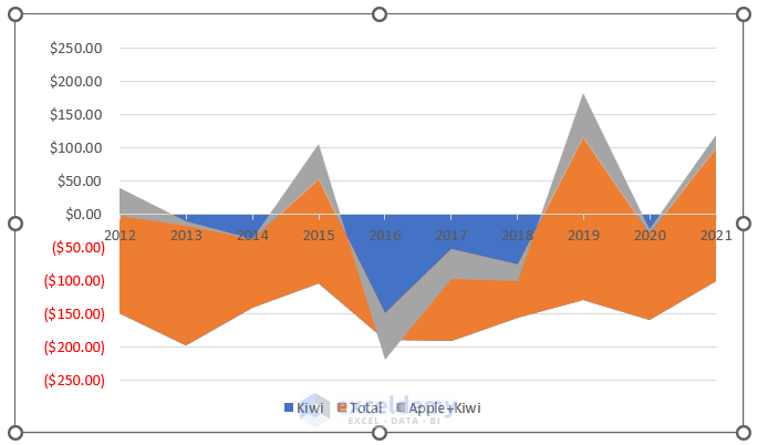
The following chart will appear, where we will input the year values on the horizontal axis.
- Right-click on the chart area and select the option Select Data.
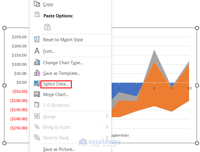
The Select Data Source wizard will open.
- Click on the Edit option under Horizontal (Category) Axis Labels.
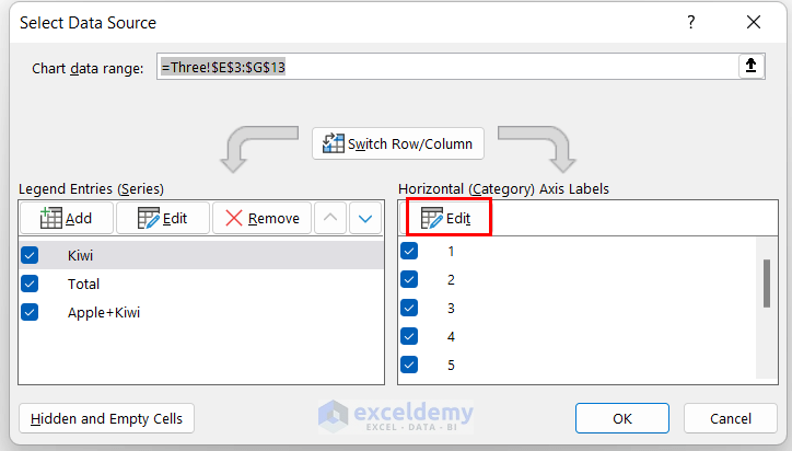
The Axis Labels wizard will open up.
- Select the Year column as the Axis label range and click OK.
The Select Data Source dialog box will open again.
- Click OK.
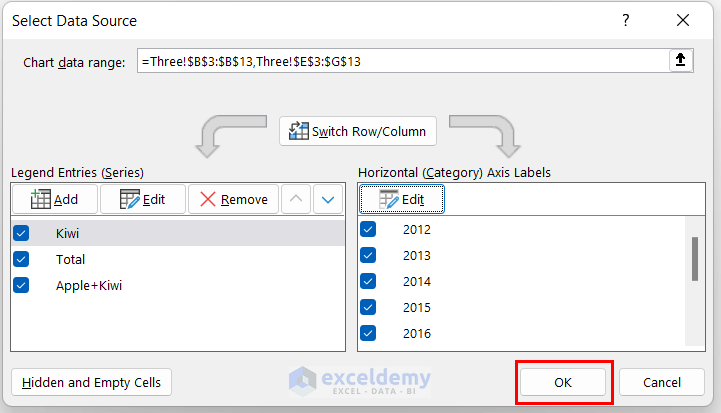
In this way, the years will appear in the chart.
Read More: How to Shade an Area of a Graph in Excel
Download Practice Workbook
Related Article
<< Go Back To Excel Area Chart | Excel Charts | Learn Excel
Get FREE Advanced Excel Exercises with Solutions!
