Fortunately, many of us use Excel in our business organizations. In any business organization, we use Excel to organize data as per need and make databases for the future. Moreover, one interesting thing is that we can scale the X-axis in an area chart easily in Excel for better representation and operation. However, I have used Microsoft Office 365 for the purpose of demonstration, and you can use other versions according to your preferences. In this article, I will show you a step-by-step procedure to scale the X-axis in the Excel area chart. Hence, read through the article to learn more and save time.
What Is Area Chart in Excel?
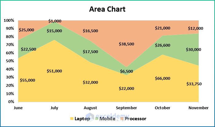
In general, an area chart is used to plot data arranged in rows or columns on a worksheet. Fortunately, you can use it to draw attention to the change over time and show the total value across a trend. Excel allows us to insert both 2-D and 3-D area charts. Moreover, there are three types of area charts available in excel. However, an area chart displays the change in values over time. A Stacked Area Chart shows the change in the contribution of each value over time. Additionally, the 100% Stacked Area Chart shows the change in the contribution of each value over time in percentages.
How to Scale X Axis in Excel Area Chart (With Easy Steps)
Often, we need to scale an area chart through the X-axis for certain business analytics, and the process becomes more interesting with Excel. However, the task is easy and simple. But you will need an arrangement in order to perform the operation properly. Hence, go through the following steps in order to scale X-axis in an area chart using Excel.
📌 Step 1: Select Dataset
For the purpose of demonstration, I have selected the following sample dataset.

📌 Step 2: Draw Area Chart in Excel
- Initially, select a cell in the dataset.
- Then, go to the Insert tab and move on to Charts.
- Next, select a 2-D Area Chart.
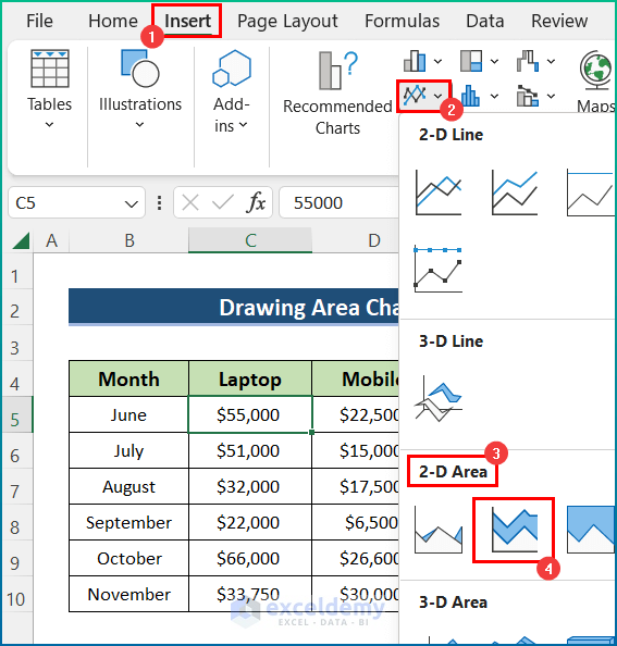
- Afterward, you will get your desired area chart. However, the chart will appear as the below image after some modifications.

Read More: How to Create an Area Chart in Excel
📌 Step 3: Scale X Axis in Area Chart
- Firstly, right-click on any value on the X-axis and select Format Axis.
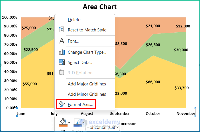
- Secondly, a Format Axis panel will appear on the right side.

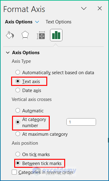
- Thirdly, change the Axis Type to Text Axis as our dataset shows the X values in texts.
- Now, select At category number 1 for Vertical axes crosses. However, you can insert other values if you want the axis crosses in between the chart or at the end of the chart.
- Fourthly, check the option Between tick marks for the Axis position. Usually, it will shorten the width of your chart and show it within the tick marks to better optimize the values in the chart.
- Then, the chart will appear as below.

- Next, you can check the Categories in reverse order in order to get the chart in a reverse direction.

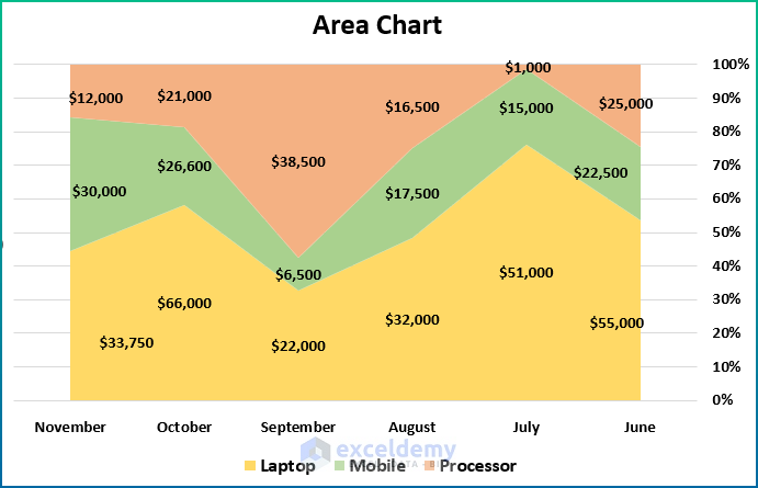
- Now, the reverse order chart will look like the image below.

- After that, select 1 as the Specify Interval unit. Otherwise, it will not show all the months as intervals.
- Now, insert 200 in the Distance from axis and select Next to Axis for the Label Position.

Read More: Excel Area Chart Data Label Position
Final Output
Last but not least, the final changes in the X-axis in an Area Chart in Excel will appear as in the image below. However, you can insert different values for the changes mentioned above according to your personal choice and need.
💬 Things to Remember
- First of all, you need to select the chart to access the Chart Element menu and other chart editing options.
- Then, you can modify the chart according to your personal preference.
- Next, hold the SHIFT key to drag the data labels horizontally or vertically.
- Afterward, you can use Microsoft Power BI to automatically adjust the data label position in the area chart.
- At last, you can not directly scale the X-axis or Horizontal axis. But you can do it for the Vertical axis.
Download Practice Workbook
You can download the workbook used for the demonstration from the download link below.
Conclusion
These are all the steps you can follow to change the X-axis scale in the Excel area chart. Overall, in terms of working with time, we need this for various purposes. I have shown multiple methods with their respective examples, but there can be many other iterations depending on numerous situations. Hopefully, you can now easily create the needed adjustments. I sincerely hope you learned something and enjoyed this guide. Please let us know in the comments section below if you have any queries or recommendations.
Related Articles
- Excel Stacked Area Chart Negative Values
- Proportional Area Chart Excel
- Smooth Area Chart Excel
- How to Shade an Area of a Graph in Excel
- Excel Stacked Area Chart Change Order
- Excel Stacked Area Chart with Line
<< Go Back To Excel Area Chart | Excel Charts | Learn Excel
Get FREE Advanced Excel Exercises with Solutions!
