In this example, we’ll consider a watersports business. They offer the Activity cruise, Nature cruise, and Sunset cruise. Here, we will analyze the business in 4 Seasons.
Step 1 – Input Data
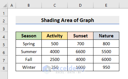
- Input your necessary information in an Excel worksheet. For this case, we input the Seasons.
- We inserted the total number of people on each cruise in the respective seasons.
Step 2 – Create Minimum and Maximum Columns
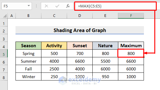
- Create a new column named Maximum. We’ll use it to retrieve the maximum number of people from a particular season.
- Select cell F5.
- Insert the formula:
=MAX(C5:E5)- Press Enter.
- Use the AutoFill tool to complete the column.
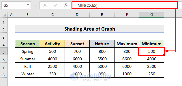
- Add a Minimum column.
- Choose cell G5 and insert the formula:
=MIN(C5:E5)- Press Enter to get the minimum number of people.
- Use AutoFill to fill in the rest.
Read More: How to Create an Area Chart in Excel
Step 3 – Insert a Line Graph
- Select the range B4:G8.
- Go to the Insert tab.
- Click the 2-D Line graph from the Charts section.
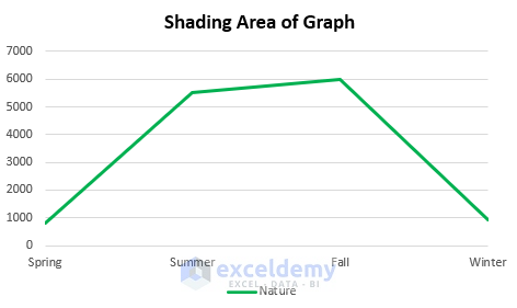
- We want to perform a relative analysis of Nature cruise only. Select the other lines (Sunset and Activity) and press Delete.
- You’ll see the Nature cruise series only.
Step 4 – Add the Maximum Line and Format to Shade an Area
- Click on the chart and right-click to open the context menu.
- Click Select Data.
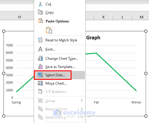
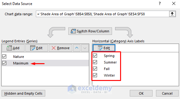
- The Select Data Source dialog box will pop out. In the Legend Entries field, press Add and select the Maximum column.
- Choose the Season column in the Horizontal Axis Labels box.
- Press OK.
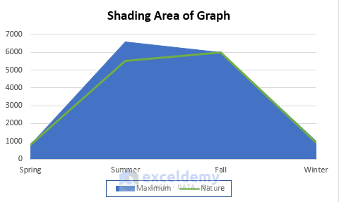
- You’ll get the Maximum line.
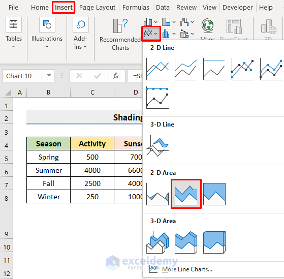
- Select the line and go to the Insert tab.
- Choose the 2-D Stacked Area chart.
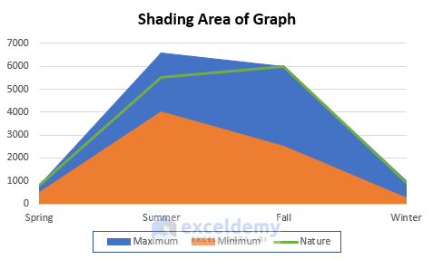
- You’ll see the following figure.
Read More: Excel Stacked Area Chart Change Order
Step 5 – Place the Minimum Line and Shade an Area of a Graph
- Select the chart.
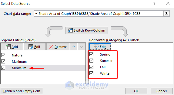
- Go to the Select Data option from the Context Menu.
- In the pop-out dialog box, choose the Minimum column in the Legend Entries.
- Select the Season columns as shown below.
- Press OK.
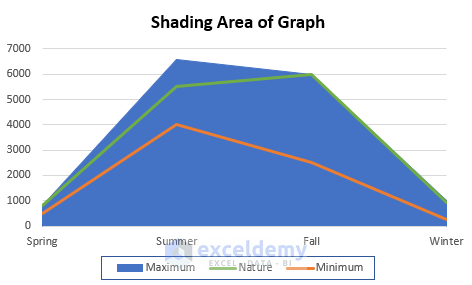
- You’ll get the below graph. The Minimum series is added to the graph.
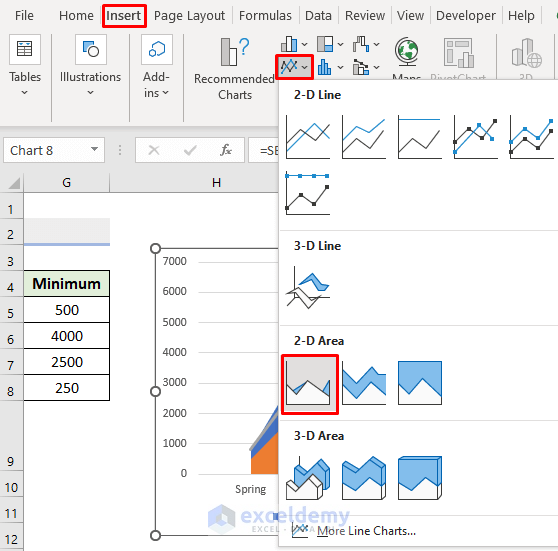
- Select the Minimum line.
- Choose the 2-D Area chart as demonstrated below.
- You’ll see the shaded regions.
Read More: Excel Area Chart Data Label Position
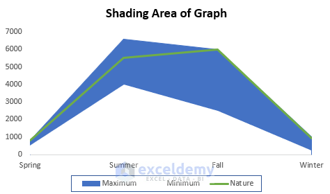
Final Output
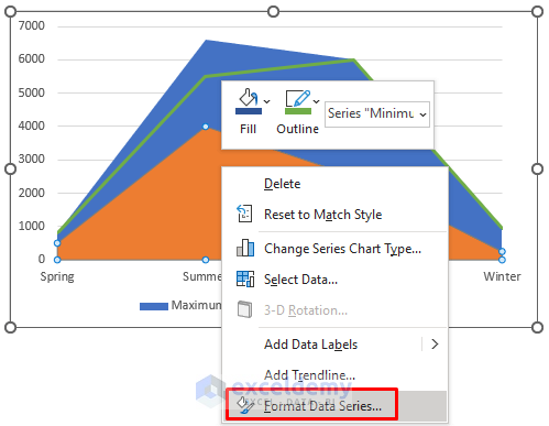
- Select the Minimum series.
- Choose Format Data Series from the Context Menu.
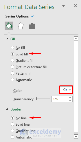
- This will return the Format Data Series pane. Under the Fill tab, check the circle for Solid Fill.
- Choose the Color White.
- Choose No line in Border.
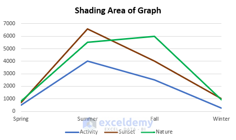
- You’ll get a clearer graph.
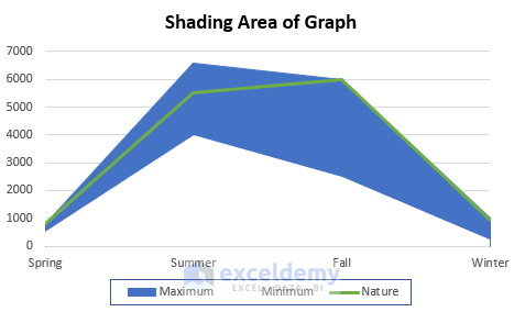
- Select the Gridline and press Delete.
- The lower boundary of the shaded region is the Minimum line. The upper one is the Maximum.
- The Green colored line is our Nature cruise series.
Download the Practice Workbook
Related Articles
<< Go Back To Excel Area Chart | Excel Charts | Learn Excel
Get FREE Advanced Excel Exercises with Solutions!
