Charts are useful tools that can be used for representing data in an Excel worksheet. We can also use Area Charts to display the data charts in a proportional way. This article is going to show how you can insert data in a Proportional Area Chart in Excel.
How to Insert Proportional Area Chart in Excel (With Easy Steps)
First, We have to take a dataset of 4 different items. Then, we will modify the data according to our requirements.
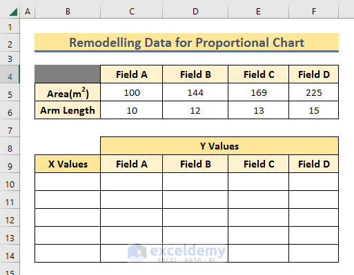
After that, we need to remodel the modified data so that we can insert that in an Area Chart.
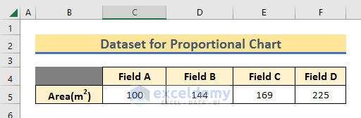
Step 1: Dataset for Proportional Area Chart
We have taken a dataset of 4 different fields and their land areas. The purpose of this article is to present them in a 2-D Chart in square shapes.
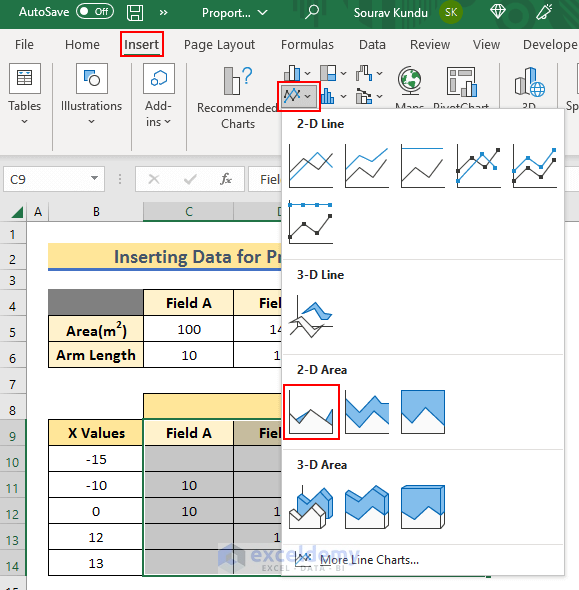
Read More: How to Create an Area Chart in Excel
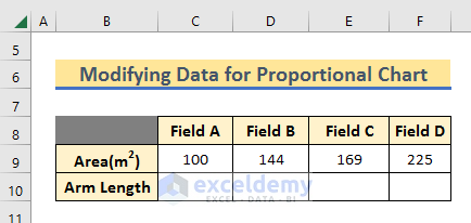
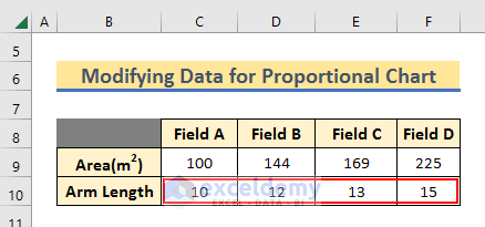
Step 2: Data Modification
As mentioned earlier, we are going to present the field area in square shapes. For that, we have to calculate the equivalent Arm Length of each square. For that, we will use the SQRT function.
- So, Add another Row just below the dataset.
- Then, write the following formula in C10 and Press Enter.
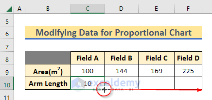
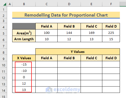
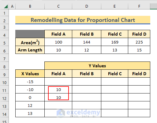
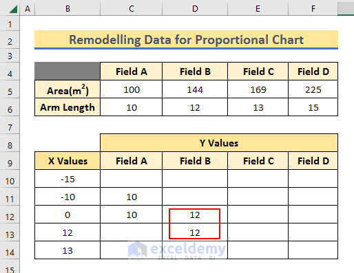
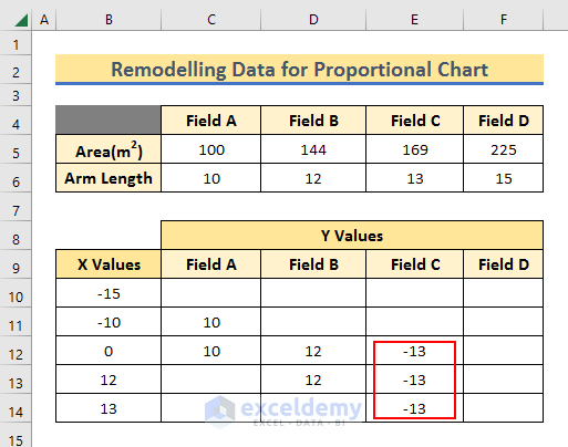
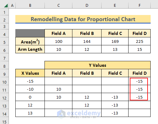
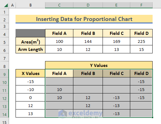
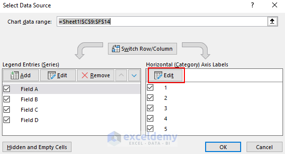
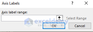
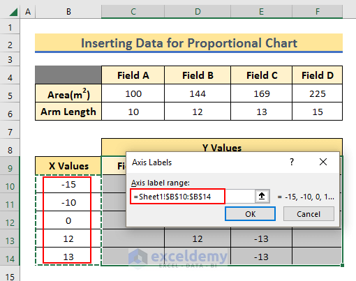
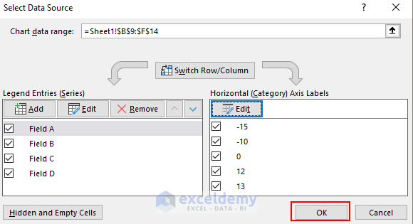
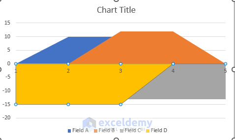
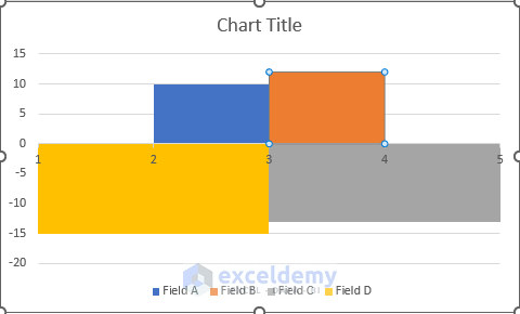
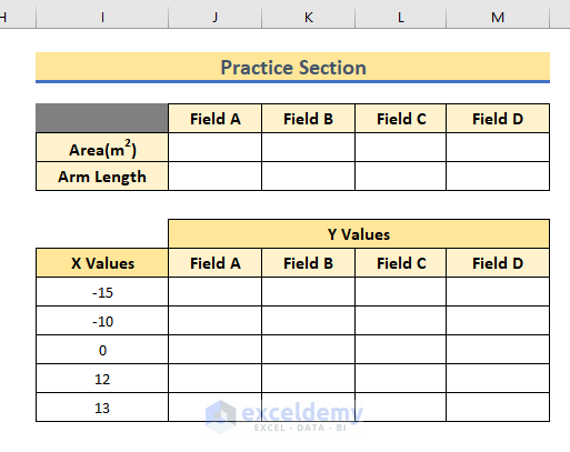
This SQRT() function finds the Square Root of a given number. So, we get the Arm Length for Field A and which is 10. Thus, we have got Arm Length for each Field. We have to insert the Field Area in a 4-coordinated system. Already we have found the Arm Length which will be used as coordinates. Now these coordinates can be both positive and negative. As we have to create a square, the Arm Length has to be taken as both X Values and Y Values. We have to take two X Values negative and the other two positive and also have to include 0. So, we have taken -15, -10, 0, 12 and 13 sequentially. All the squares are connected to point (0,0). Field A is extended from 0 to -10. And we assume that it’s in the 2nd Coordinate. We want Field B to be in the 1st Coordinate. Similarly, we want Field C to be in the 4th Coordinate. And, Field D is to be placed in the 3rd Coordinate. And, we have remodeled the dataset. Read More: Excel Stacked Area Chart Negative Values Now, let’s insert this remodelled data in an Area Chart. A new window Axis label range will appear. Your chart will still look the same. But don’t worry. And, this new window will appear. Read More: Smooth Area Chart Excel You can download the practice workbook where you can practice yourself. Download Practice Workbook You can download and practice this Workbook. We have shown you how to insert a proportional Area Chart using 4 data. If you have to compare more than 4 data this method will not be useful. We hope you find the content of this article useful. If there are further queries or suggestions, make sure you mention them in the comment section. Have a good day. << Go Back To Excel Area Chart | Excel Charts | Learn Excel=SQRT(C5)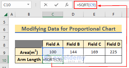
Step 3: Remodelling Data
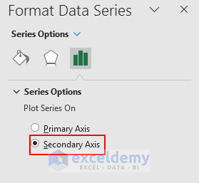
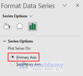
Step 4: Creating Proportional Area Chart

Practice Section
Conclusion
Related Articles

