What is a Box and Whisker Plot?
A box and whisker plot is used to analyze a given dataset’s median, quartiles, and max and min values. It has two components: box and whisker. The rectangular box represents the Quartiles and Median of the dataset. The lower line represents the first quartile whereas the upper line denotes the third quartile. The middle line demonstrates the median of the given dataset. The vertical lines extending from the box are known as whiskers. The lower and upper extreme points represent the Min and Max values of the dataset.
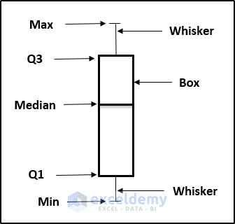
The most important benefit of having a box and whisker plot is that it represents the mean, median, max, min, and quartile in a single plot. One can determine that the data is skewed if the median line doesn’t divide the box into equal spaces.
How to Create Box and Whisker Plot in Excel with Multiple Series: 2 Easy Methods
We have two different methods to create a Box and Whisker Plot with multiple series; a box and whisper plot or a stacked column chart.
Method 1 – Using Box and Whisper Plot
To make a box and whisker plot in Excel with multiple series, our process is to set up a dataset for the plot, insert the box and whisper plot, then modify it to be more presentable.
Steps:
- Prepare a dataset containing multiple entries for a single record.
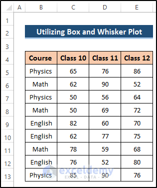
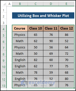
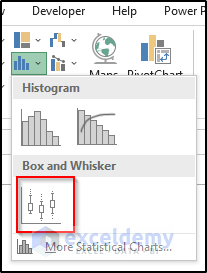
- Select the range of cells B4 to E13.
- Go to the Insert tab on the ribbon.
- Select the Insert Statistic Chart drop-down option from the Charts group.
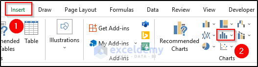
- Select the Box and Whisker chart.
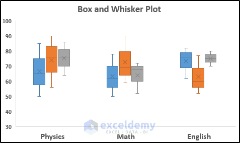
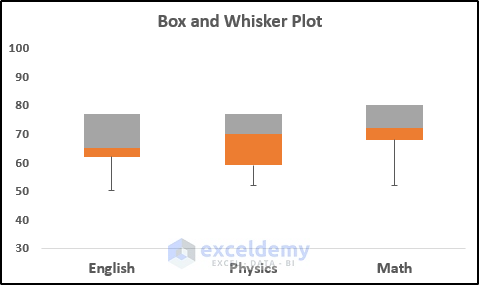
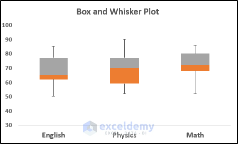
The following chart is generated:
- Double-click on the box and whisker icon.
The Format Data Series window opens.
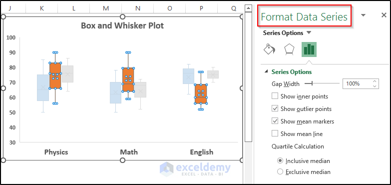
- Set options as desired:
- Gap Width: Controls the gap between the categories.
- Show Inner Points: Displays the points that are situated between the lower whisker line and the upper whisker line.
- Show Outlier Points: Displays the outlier points that lie either below the lower whisker line or above the upper whisker line
- Show Mean Markers: Displays the mean marker of the selected series.
- Show Mean line: Displays the line connecting the means of the boxes in the selected series.
- Inclusive Median: The median is included in the calculation if N (the number of values in the data) is odd.
- Exclusive Median: The median is excluded in the calculation if N (the number of values in the data) is odd.
Read More: How to Add Horizontal Box and Whisker Plot in Excel
Method 2 – Using a Stacked Column Chart
An alternative approach is to use a stacked column chart. We’ll need to calculate the min, max, median, quartile 1, and quartile 3 using the MIN, MAX, MEDIAN, and QUARTILE functions. Then, we’ll use a stacked column chart to plot them.
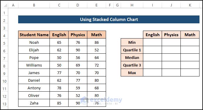
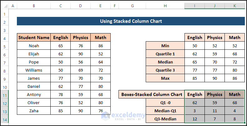
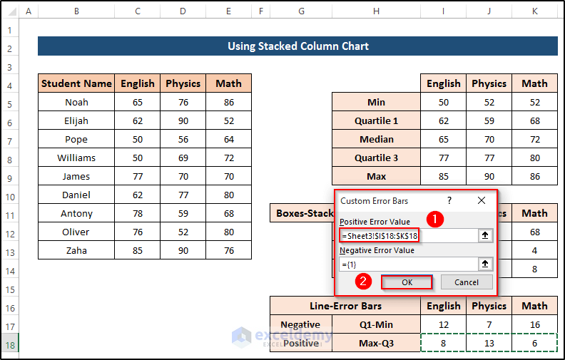
Step 1 – Prepare Dataset
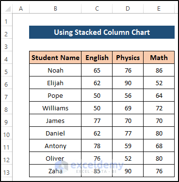
- Prepare the data containing multiple entries for a single record. Using this dataset, we will create further data for the box and whisker plot.
Step 2 – Calculate Box and Whisker Plot Components
- Create some new columns in which to put the required component values.
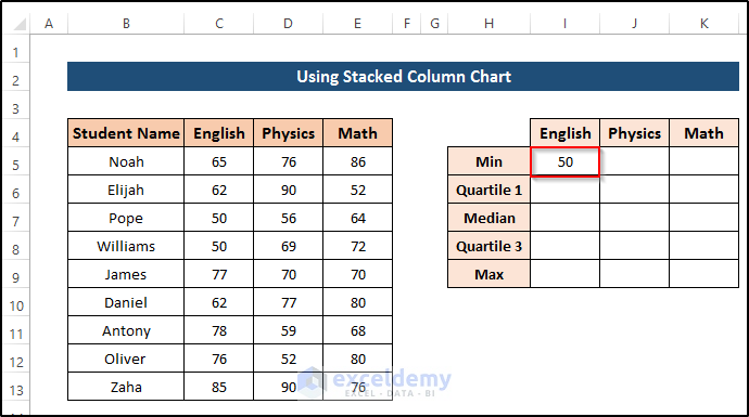
- In cell I5, enter the following formula:
=MIN(C5:C13)
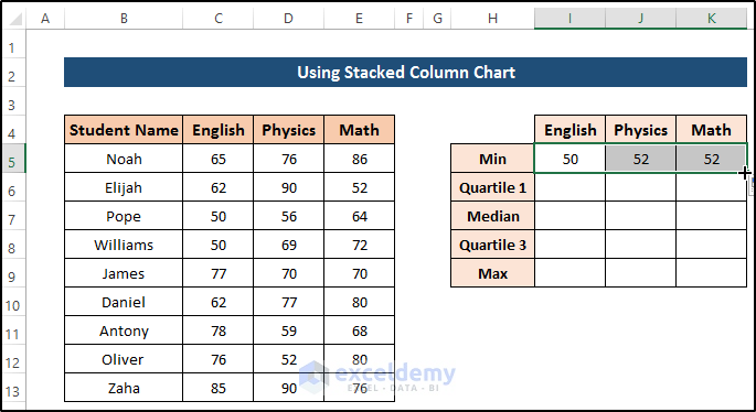
- Press Enter to apply the formula.
- Drag the Fill Handle icon across to cell K5.
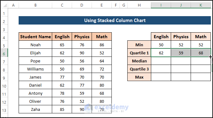
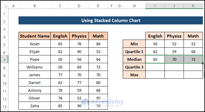
- In cell I6, enter the following formula:
=QUARTILE(C5:C13,1)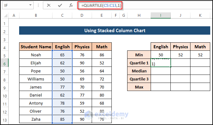
- Press Enter to apply the formula.
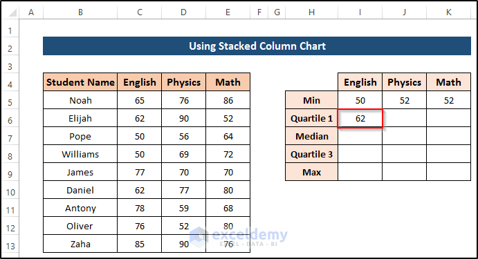
- Drag the Fill Handle icon across to cell K6.
- In cell I7, enter the following formula:
=MEDIAN(C5:C13)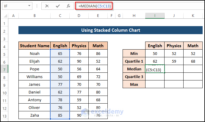
- Press Enter to apply the formula.
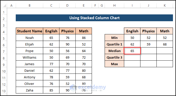
- Drag the Fill Handle icon across to cell K7.
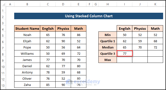
- In cell I8, enter the following formula:
=QUARTILE(C5:C13,3)
- Press Enter to apply the formula.
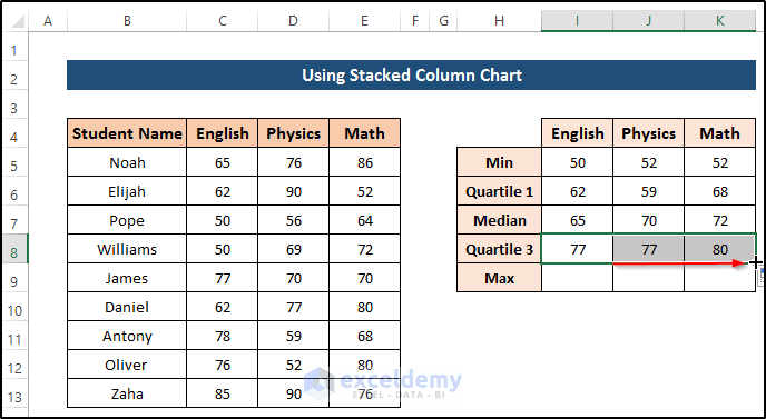
- Drag the Fill Handle icon across to cell K8.
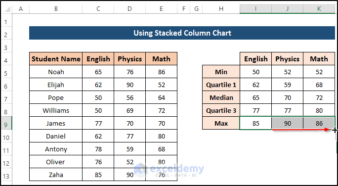
- In cell I9, enter the following formula:
=MAX(C5:C13)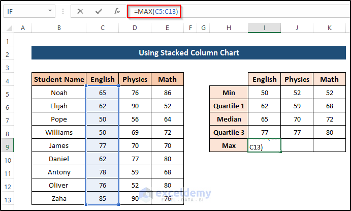
- Press Enter to apply the formula.
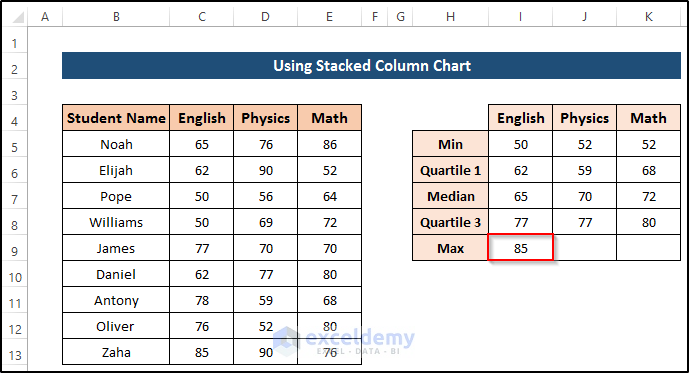
- Drag the Fill Handle icon across to cell K9.
Step 3 – Create a Dataset for a Stacked Column Chart
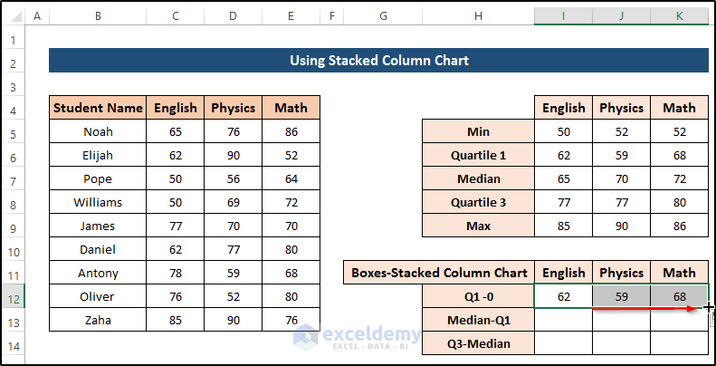
- In cell I12, enter the following formula:
=I6-0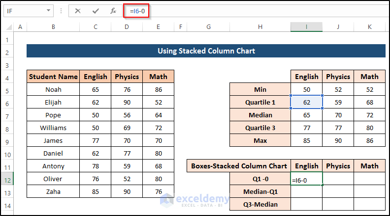
- Press Enter to apply the formula.
- Drag the Fill Handle icon across to cell K12.
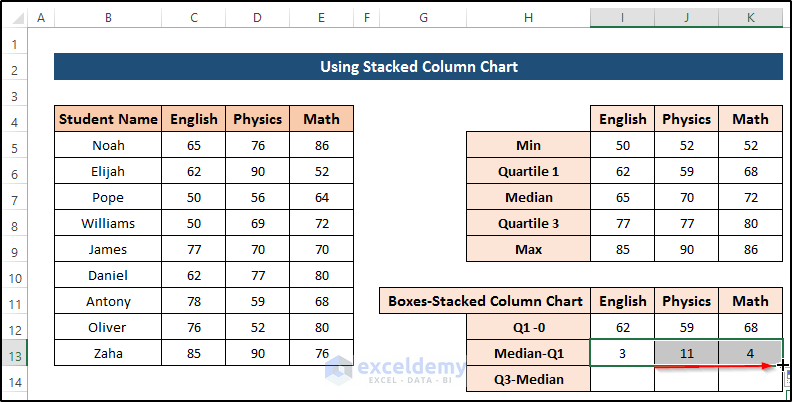
- In cell I13, enter the following formula:
=I7-I6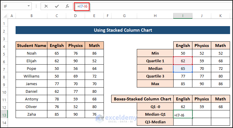
- Press Enter to apply the formula.
- Drag the Fill Handle icon across to cell K13.
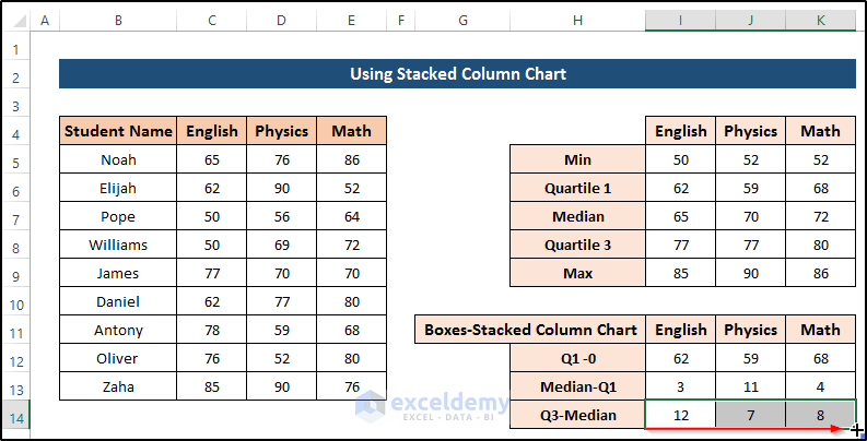
- In cell I14, enter the following formula:
=I8-I7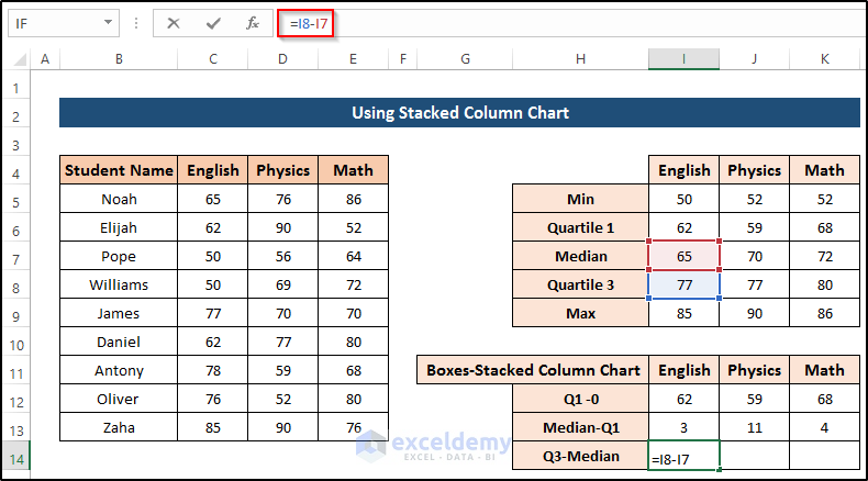
- Press Enter to apply the formula.
- Drag the Fill Handle icon across to cell K14.
Step 4 – Create a Dataset for Whiskers
We’ll utilize error bars to create our whiskers.
- In cell I17, enter the following formula:
=I6-I5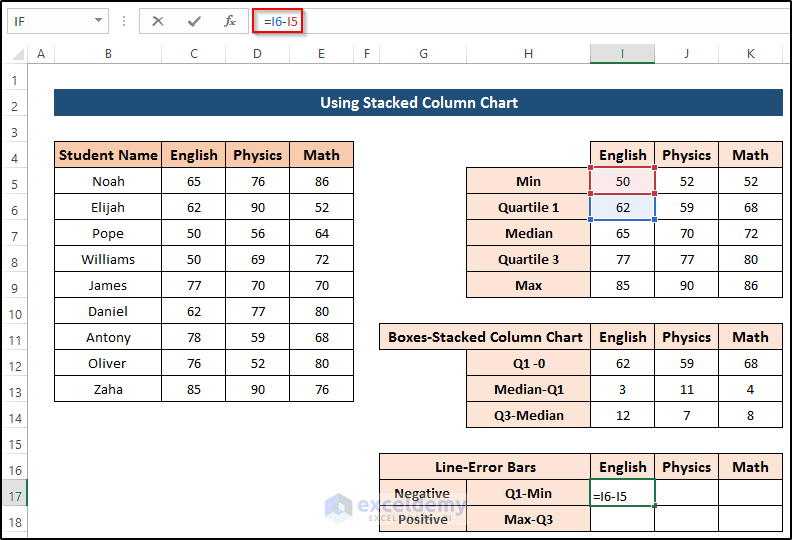
- Press Enter to apply the formula.
- Drag the Fill Handle icon across to cell K17.
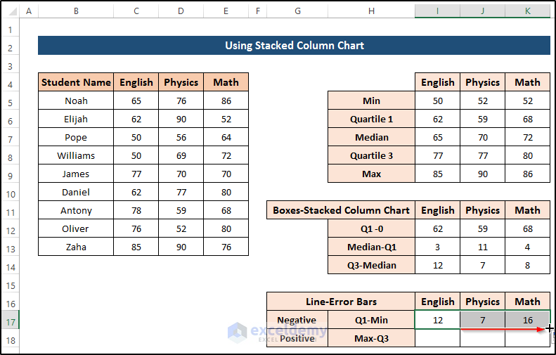
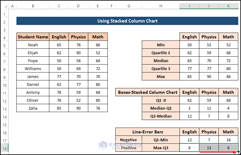
- In cell I18, enter the following formula:
=I9-I8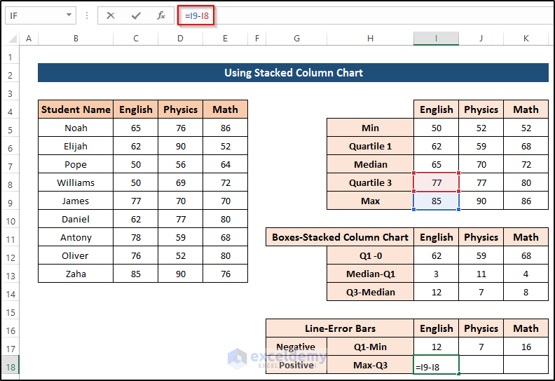
- Press Enter to apply the formula.
- Drag the Fill Handle icon across to cell K18.
Step 5 – Insert Stacked Column Chart
- Select the range of cells I11 to K14.
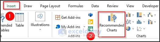
- Go to the Insert tab on the ribbon.
- From the Charts group, select Recommended Charts.
- Select the Stacked Column chart option.
- Click on OK.
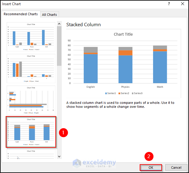
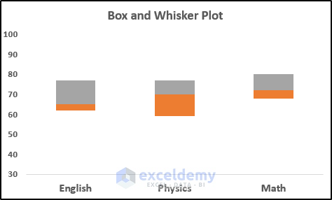
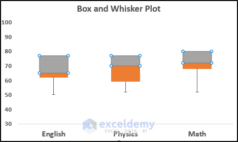
The following chart is generated:
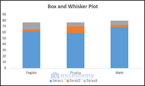
We need to remove the blue box from the chart.
- Double-click on the blue box to open the Format Data Series panel.
- Select the Fill & Line tab at the top.
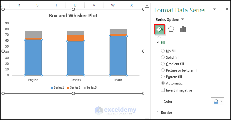
- Select No Fill from the Fill section.
- Select No line from the Border section.
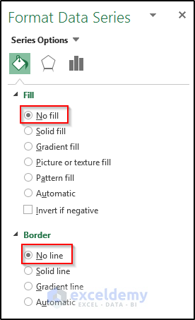
The blue box will be removed from the chart.
Step 6 – Create Box and Whisker Plot
Now we create the whiskers using the error bar and our prepared dataset.
- Select the lower box, which will open up the Chart Design tab.
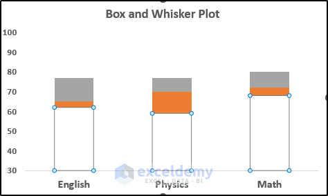
- Go to the Chart Design tab in the ribbon.
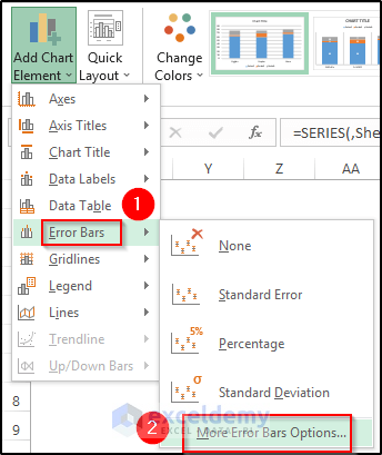
- Select Add Chart Element from the Chart Layouts group.
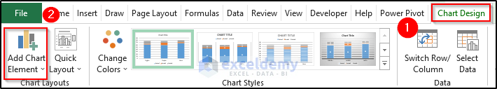
- Select the Error Bars option.
- Select More Error Bars options.
- Set Vertical Error Bars direction as Minus.
- Select Custom from the Error Amount.
- Select Specify Value.
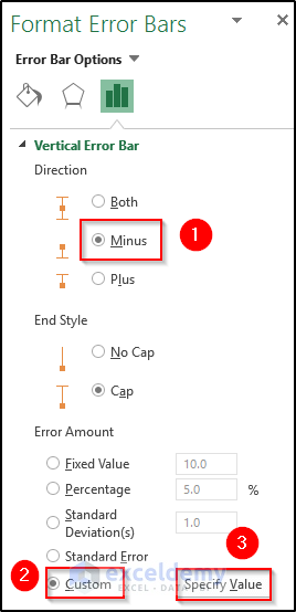
This will open up the Custom Error Bars dialog box.
- Select the negative error value range.
- Click on OK.
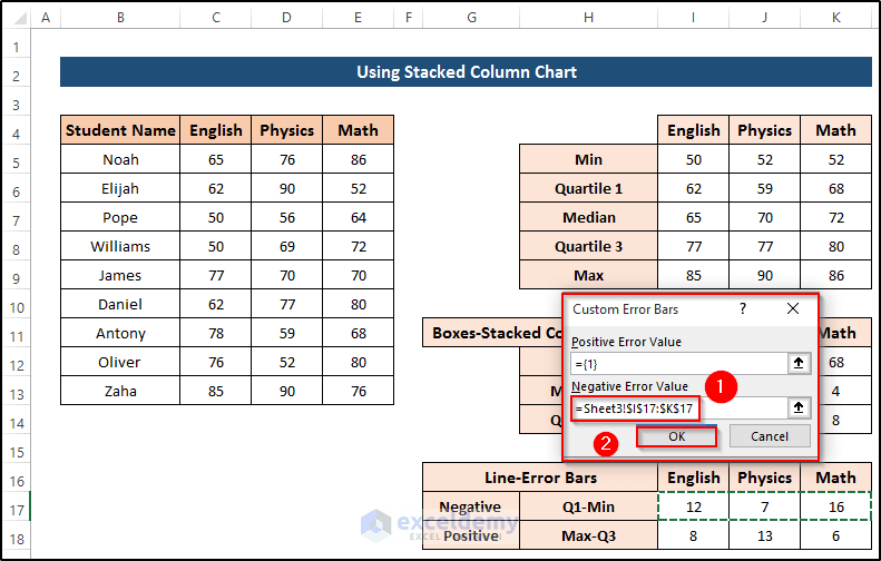
This will create an error bar like a whisker.
- To create a whisker in the positive direction, select the upper box.
- Again go to the Chart Design tab.
- Select the Error Bars option.
- Set Vertical Error Bars direction as Plus.
- Select Custom from the Error Amount section.
- Select Specify Value.
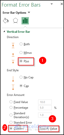
This will open up the Custom Error Bars dialog box.
- Select the positive error value range.
- Click on OK.
As a result, we get our desired chart which is similar to a box and whisker plot with multiple series.
Read More: How to Rotate Box and Whisker Plot in Excel
Download Practice Workbook
Related Article
<< Go Back to Box and Whisker Plot in Excel | Excel Charts | Learn Excel
Get FREE Advanced Excel Exercises with Solutions!
