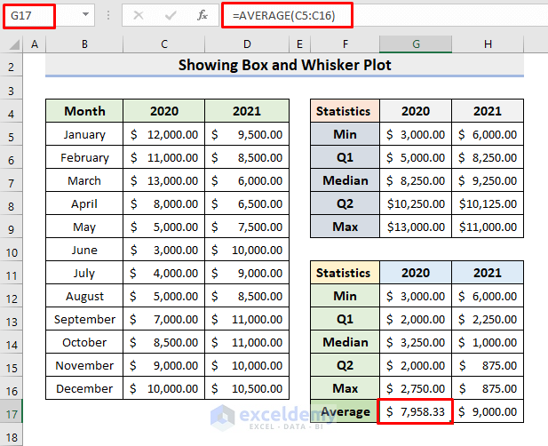
The sample dataset contains Monthly Sales in 2020 and 2021. Instead of showing the 12 sales amounts, 5 values will be used to show the distribution.
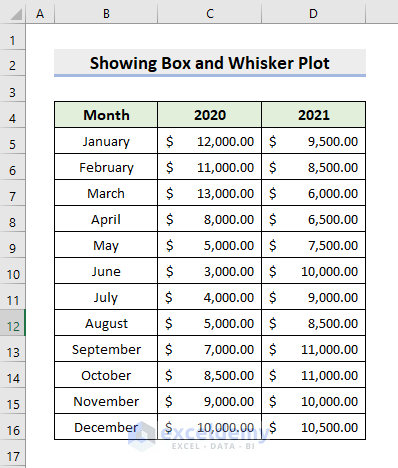
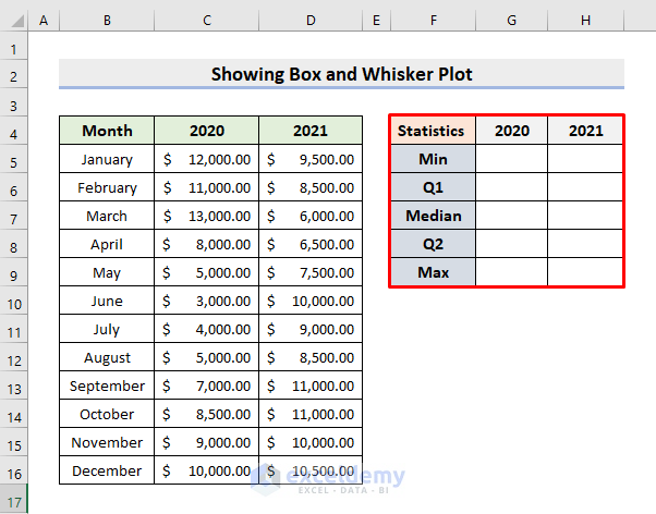
STEP 1 – Create a Table to find 5 Statistics Numbers
- Enter Minimum, First Quartile, Median, Third Quartile, and Maximum.
STEP 2 – Enter Formulas
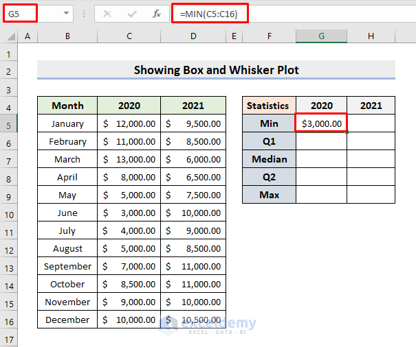
- Select G5.
- Use the following formula with the the MIN function to determine the minimum value:
=MIN(C5:C16)- Press Enter.
This is the output.
- Drag the Fill Handle to the right.
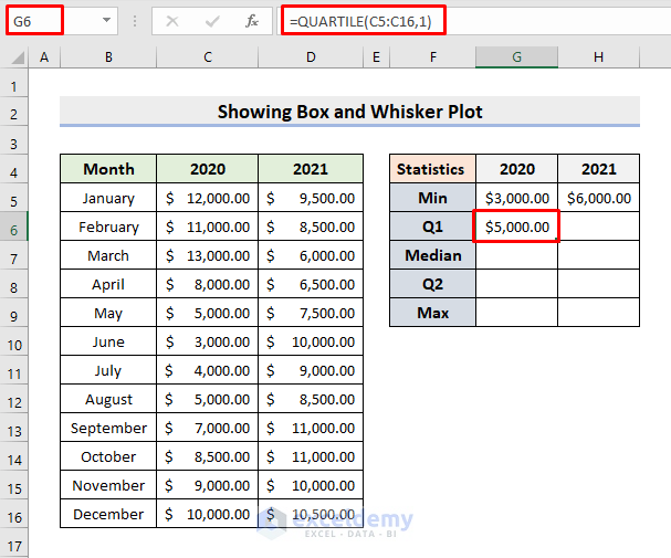
- Select G6.
- Enter the QUARTILE function to get the quartile values:
=QUARTILE(C5:C16,1)- Press Enter.
- Drag the Fill Handle to the right.
- Select G7.
- Enter the MEDIAN function:
=MEDIAN(C5:C16)- Press Enter.
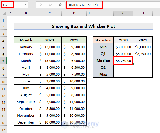
- Drag the Fill Handle to the right.
- Select G8.
- Use the formula:
=QUARTILE(C5:C16,3)- Press Enter.
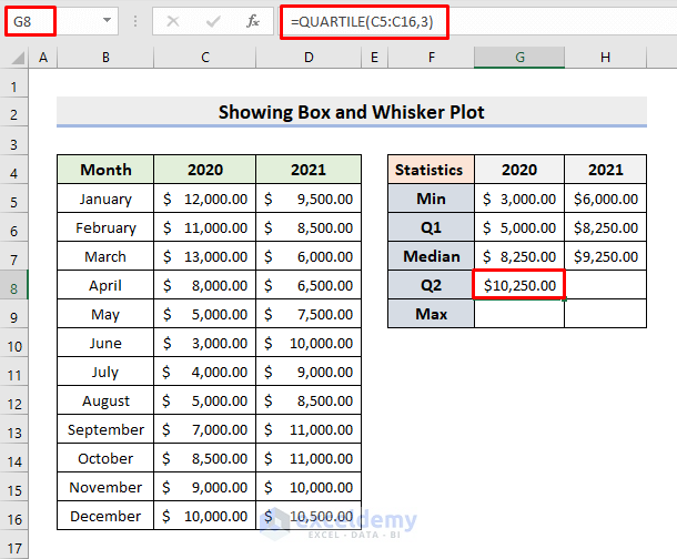
- Drag the Fill Handle to the right.
- Select G9.
- Use the MAX function:
=MAX(C5:C16)- Press Enter.
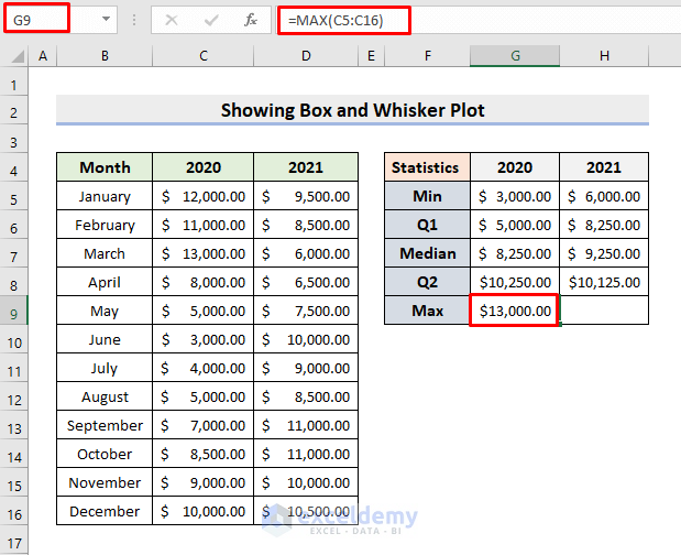
- Drag the Fill Handle to the right.
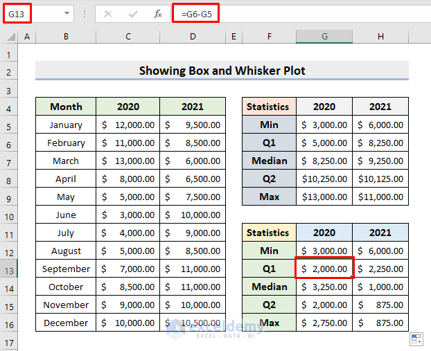
STEP 3 – Create a New Table to Find the Differences
- In G12 and H12, enter the minimum values.

- Select G13.
- Enter the formula:
=G6-G5- Drag the Fill Handle down and to the right.
This is the output.
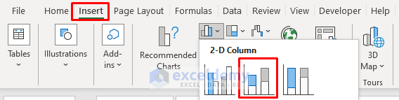
STEP 4 – Insert a Column Chart
- Select G12:H16.
- Go to Insert ➤ 2-D Column.
The chart will be displayed.
- Click the chart.
- Go to Chart Design and select Switch Row/Column.
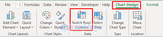
The column chart is displayed:
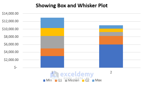
STEP 5 – Modify the Chart to Add a Whisker Plot to the Box
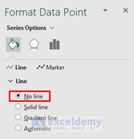
- Right-click the minimum box (deep blue in the column).
- Choose Format Data Series.
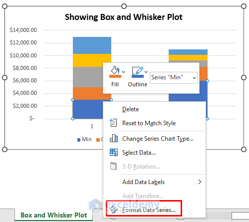
- In Fill & Line, choose No Fill.
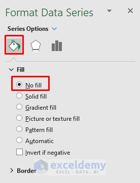
The minimum box is not visible.
- Enter 2020 and 2021 in the X-axis by selecting data instead of 1 and 2.
- Follow the same steps to make the maximum box (the top bar in the column) invisible.
- Right-click the maximum box.
- Go to Chart Design ➤ Add Chart Element ➤ Error Bars ➤ Standard Deviation.
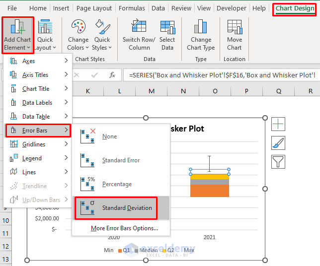
You’ll see the whisker lines.
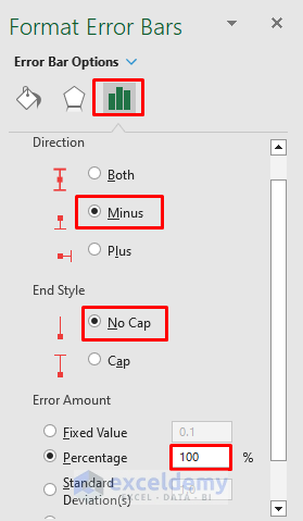
- Click the whisker line and press Ctrl+1.
- In Format Error Bars, choose Direction ➤ Minus.
- End Style ➤ No Cap.
- Error Amount ➤ Percentage ➤ 100%.
- Repeat the steps described above to choose No Fill for the Q1 box (in orange).
- Insert the whisker line for the Q1 bar by repeating the above-described procedure.
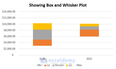
This is the output.
STEP 6 – Embed an Average Marker in the Box and Whisker Plot
- Select G17.
- Enter the formula:
=AVERAGE(C5:C16)- Press Enter.
- Drag the Fill Handle to the right.
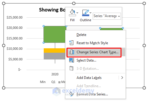
- Copy F17:H17 and paste it into the chart.
- Right-click the added boxes.
- Choose Change Series Chart Type.
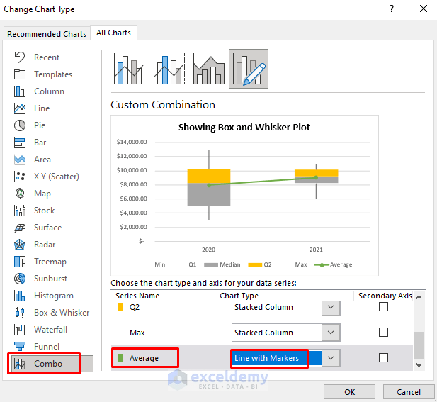
- Go to the Combo tab.
- Select Line with Markers as Chart Type for the Average series.
- Click OK.
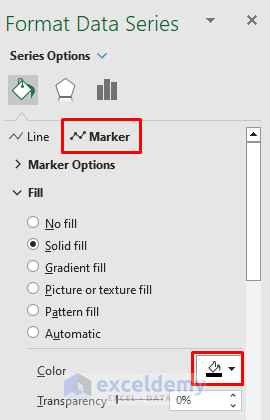
- Double-click the inserted line.
- In Line & Fill, choose No line.
- Choose Black in Marker.
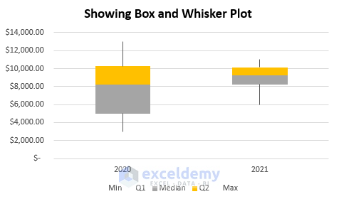
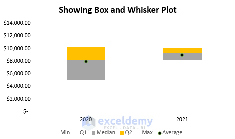
STEP 7 – Final Output
- Delete the gridlines.
The Box and Whisker Plot are complete:
Read More: How to Add Horizontal Box and Whisker Plot in Excel
Download Practice Workbook
Download the following workbook.
Related Articles
- How to Create Box and Whisker Plot in Excel with Multiple Series
- How to Rotate Box and Whisker Plot in Excel
<< Go Back to Box and Whisker Plot in Excel | Excel Charts | Learn Excel
Get FREE Advanced Excel Exercises with Solutions!

Thank you so much for this.. was able to plot a box and whisker graph with these explicit steps.. God bless
Dear Anthonia Aniekule,
You are most welcome.
Regards
ExcelDemy