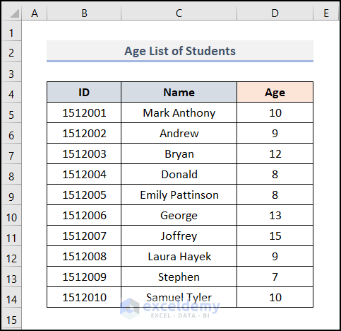
Method 1 – Insert Single Horizontal Box and Whisker Plot in Excel
We’ll use the sample dataset below to learn how to make a whisker plot and a horizontal box in Excel.
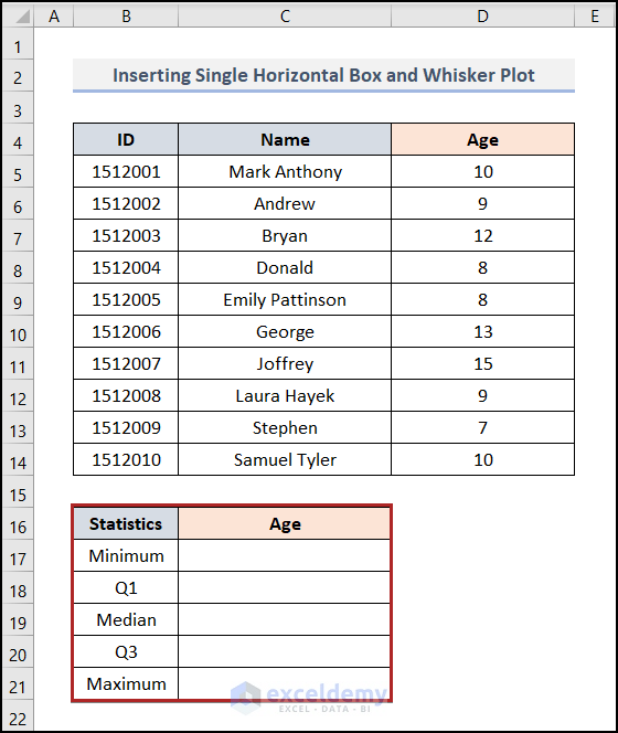
Step 1: Calculate Statistical Terms to Insert Horizontal Box and Whisker Plot in Excel
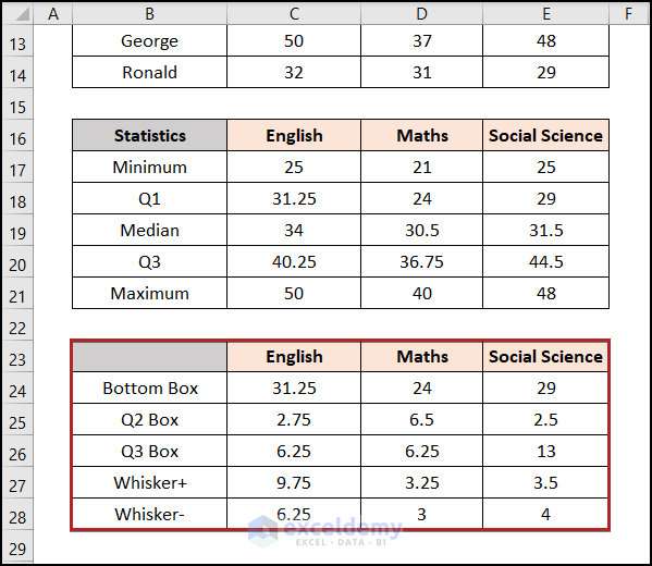
- Create a table in the cells B16:C21 Give the heading and elements as shown in the image below.
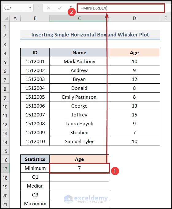
- Select cell C17, enter the following formula and press ENTER.
=MIN(D5:D14)
D5 and D14 represent the age of the students.
The MIN function returns the minimum values among the selected data arrays.
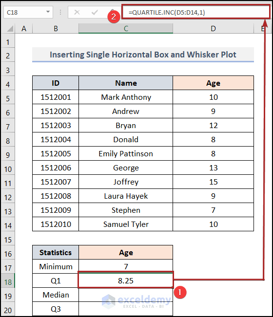
- Select cell C18, enter the following formula and press the ENTER.
=QUARTILE.INC(D5:D14,1)
D5 and D14 represent the age of the students.
The Quartile.INC function finds the quartile (each of four equal groups) for a conveyed set of data. We used 1 as the quart argument. Result gives the first quartile.
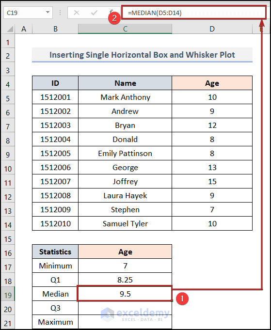
- Select cell C19. Enter the following formula and press ENTER.
=MEDIAN(D5:D14)
The MEDIAN function returns the median of a group of numbers. That is actually the number in the middle of a set of numbers.
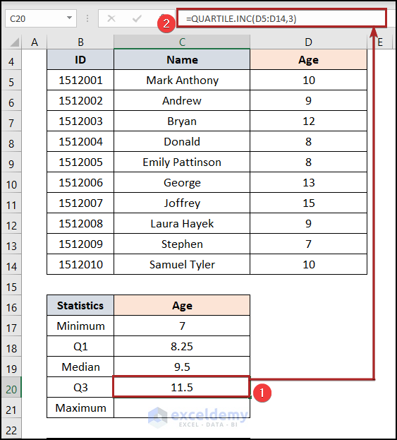
- To calculate the third quartile, select cell C20 and enter the following formula.
=QUARTILE.INC(D5:D14,3)
This calculates the third quartile of the dataset.
- Press ENTER.
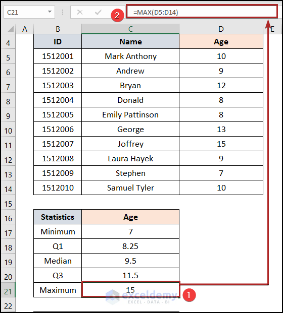
- To determine the Maximum value, select cell C21.
- Enter the following formula.
=MAX(D5:D14)
The MAX function returns the largest value in a given data array.
- Press ENTER.
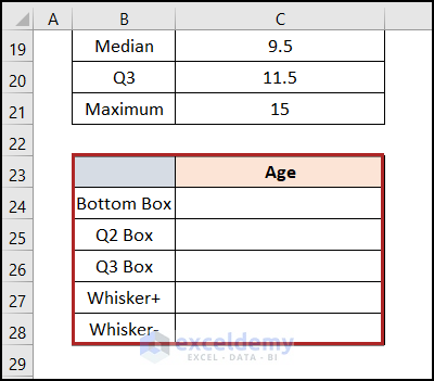
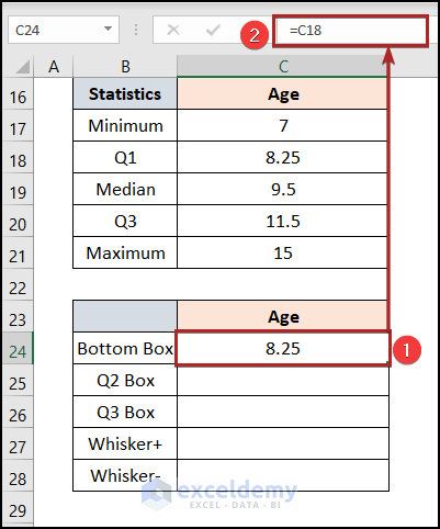
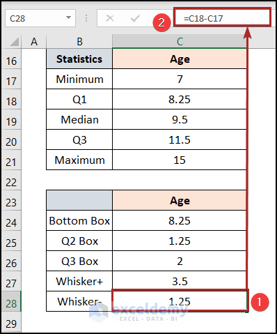
- Create another table in the cells B23:C28 range. Give the heading and elements as shown in the image below.
- In cell C24, enter the following formula and press ENTER.
=C18
That means it’s equal to the first quartile.
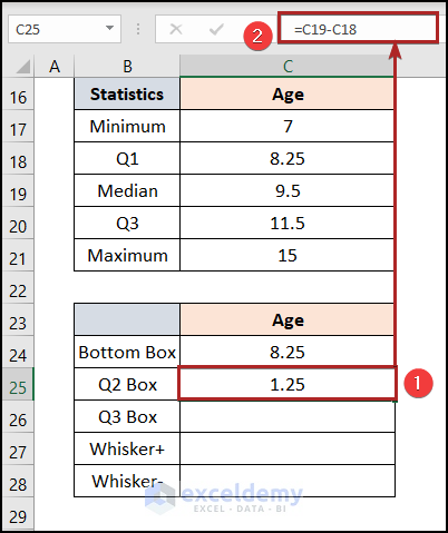
- In cell C25, enter the following formula and press ENTER.
=C19-C18
This means the Q2 Box is equal to the difference between the Median and Q1.
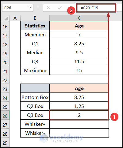
- In cell C26, enter the following formula and press ENTER.
=C20-C19
This means the Q3 Box is equal to the difference between the Q3 and Median.
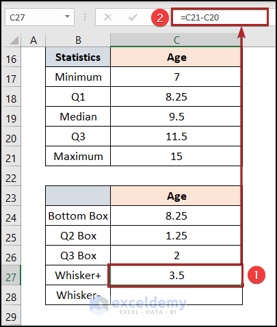
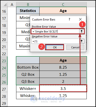
- In cell C27, enter the following formula and press ENTER.
=C21-C20
That means the Whisker+ is equal to the difference between the Maximum and Q3.
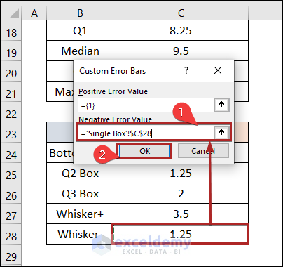
- In cell C28, add the following formula and press ENTER.
=C18-C17
That means the Whisker- is equal to the difference between the Q1 and Minimum.
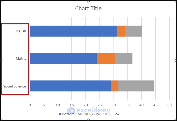
Step 2: Insert Bar Chart
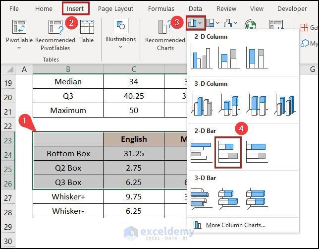
- Insert a bar chart.
- Select cells in the B23:C26 range.
- Go to the Insert tab.
- Click on the Insert Column or Bar Chart drop-down.
- Select the 2-D Stacked Bar from the available options.
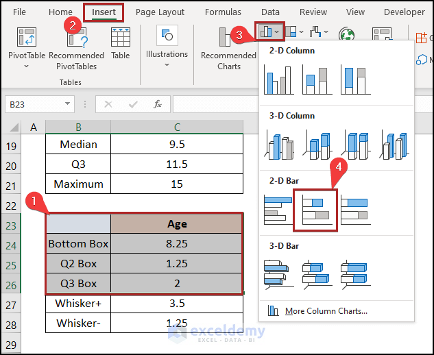
- A bar chart will be inserted into the sheet.
- Right-click anywhere on the plot area.
- Choose the Select Data option on the context menu.
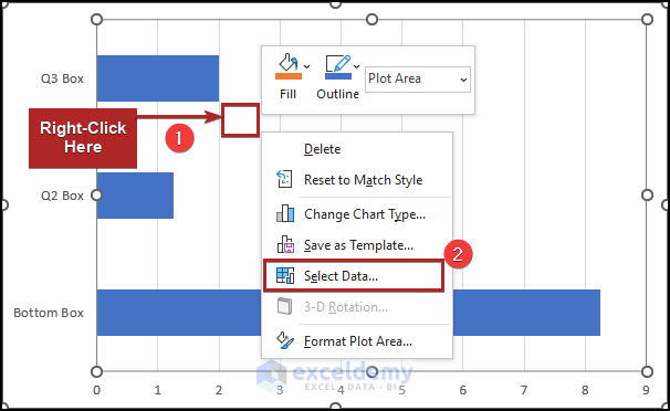
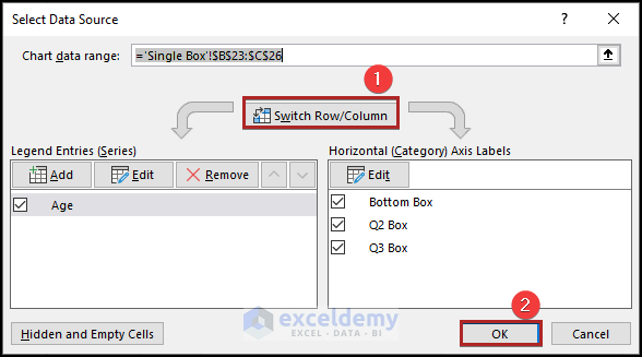
- The Select Data Source window opens.
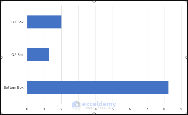
- Click on Switch Row/Column.
- Click OK.
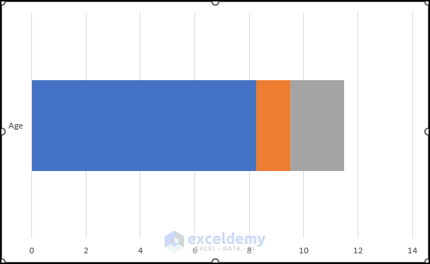
- The chart will look as shown in the image shown below.
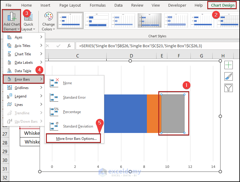
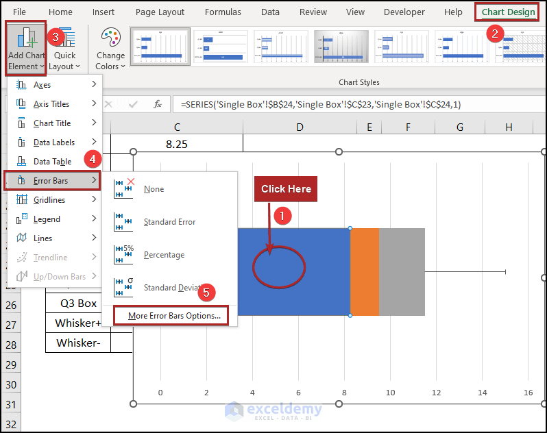
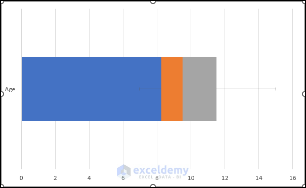
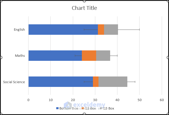
Step 3: Add Error Bars
- Select series Q3 Box.
- Move to the Chart Design tab.
- Click on the Add Chart Element drop-down on the Chart Layouts group.
- Click on the right arrow of Error Bars.
- From the sub-menu, select More Error Bar Options.
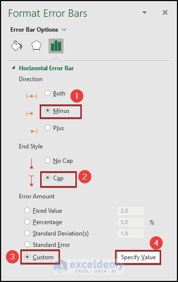
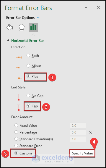
- The Format Error Bars task pane opens.
- Select Plus under Direction.
- Choose the Cap as the End Style.
- Select Custom under the section of Error Amount.
- Click on the Specify Value button.
- It opens the Custom Error Bars input box.
- Input cell C27 in the Positive Error Value box.
- Click OK.
- Select the series Bottom Box.
- Move to Chart Design.
- Click on the Add Chart Element drop-down on the Chart Layouts group.
- Click on the right arrow of Error Bars.
- From the sub-menu, select More Error Bar Options.
- The Format Error Bars task pane opens.
- Select Minus under Direction.
- Choose the Cap as the End Style.
- Select Custom under the section of Error Amount.
- Click on the Specify Value button.
- It opens the Custom Error Bars input box.
- Input cell C28 in the Negative Error Value box.
- Click OK.
- The chart will look as shown in the image below.
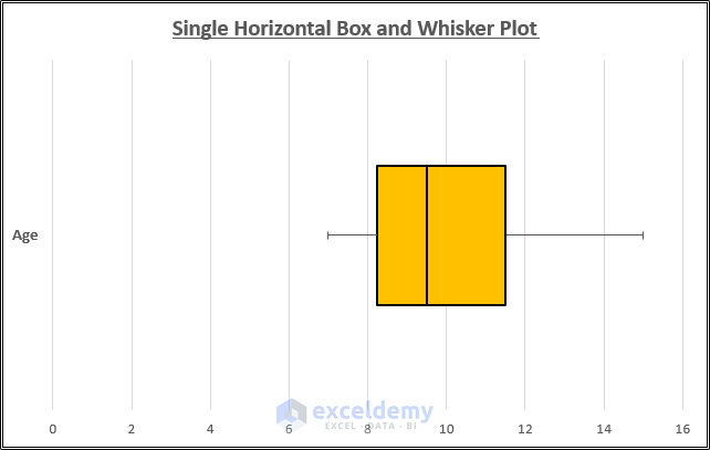
Step 4: Format the Horizontal Box and Whisker Plot
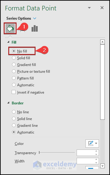
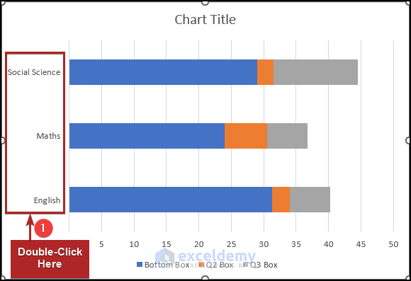
- Double-click on the Bottom Box series.
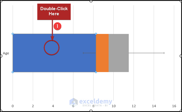
- The Format Data Point task pane opens.
- Click on the Fill & Line icon.
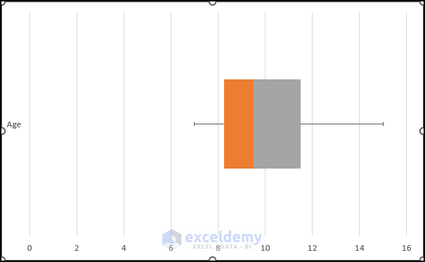
- Select No Fill under the Fill section.
- The horizontal box and whisker plot will look as shown in the image below.
- Double-click on the series Q2 Box.
- The Format Data Point task pane opens.
- Click on the Fill & Line icon.
- Select Solid Fill under the Fill section.
- Click on the Fill Color drop-down and select Gold, Accent 4 from the available colors.
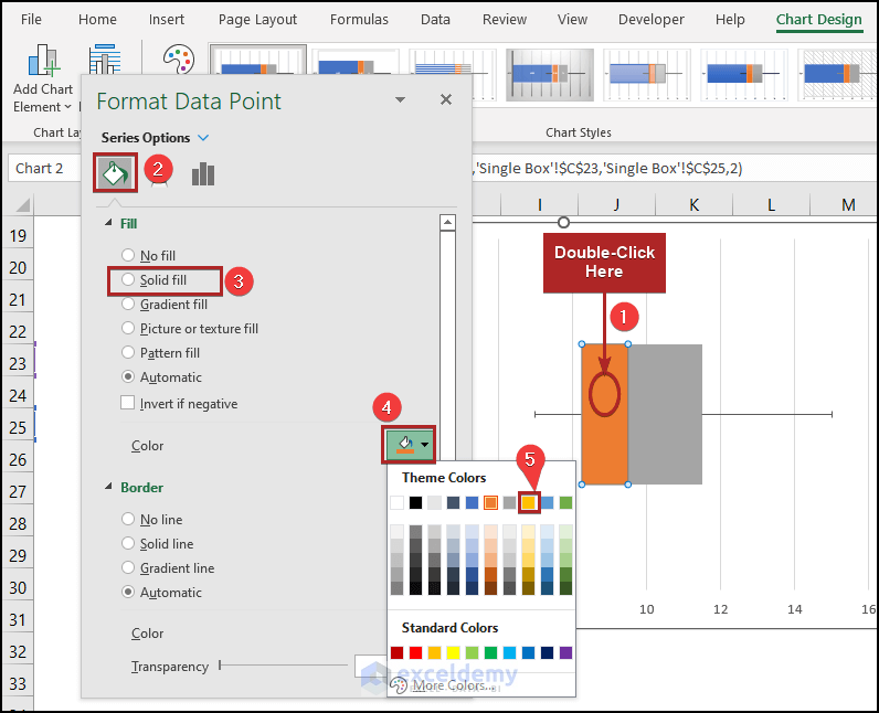
- Follow the same steps for series Q3 Box.

- Open the Format Data Point task pane for the Q3 Box series.
- Click on the Fill & Line icon.
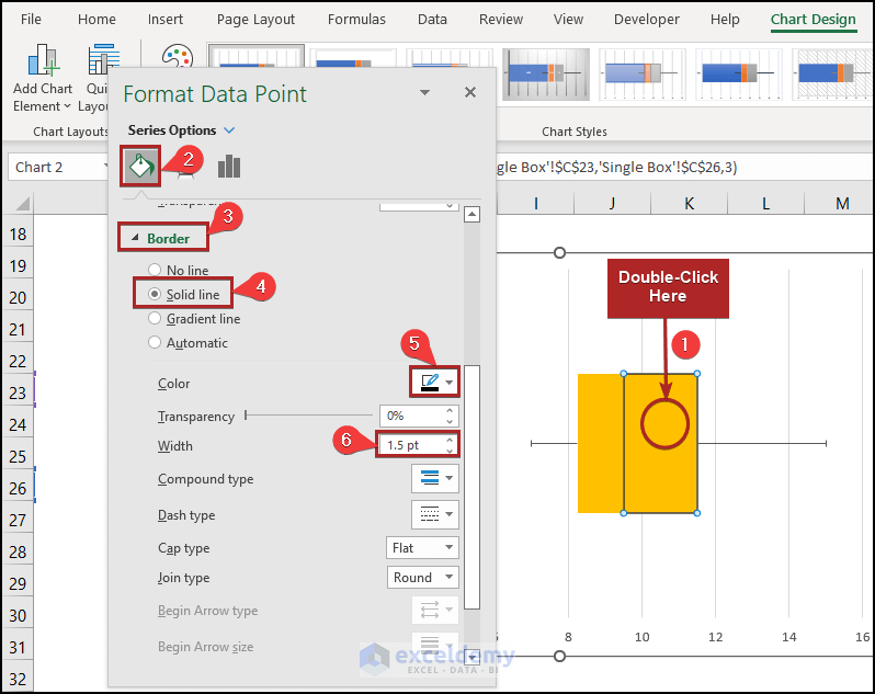
- Select Solid Line under the Border section.
- Click on the Outline Color drop-down and select Black, Text 1 from the available colors.
- Set the Width as 5 pt.
- Follow the same steps for other series.
- The horizontal box and whisker plot are ready to be interpreted.
Read More: How to Create Box and Whisker Plot in Excel with Multiple Series
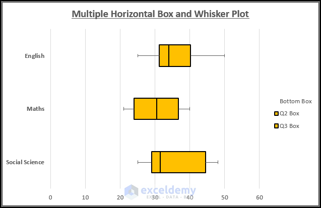
Method 2 – Insert Multiple Horizontal Box and Whisker Plots in Excel
Steps
- Find out the statistical terms by following Step 1 of Method 1.
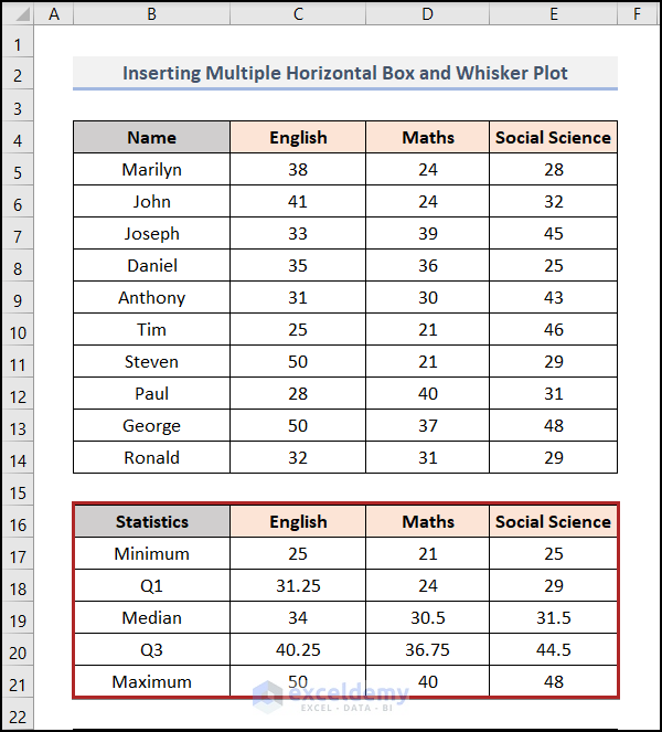
- Calculate the chart elements as we did in Method 1.
- Select cells in the B23:E26 range.
- Go to the Insert tab.
- Click on the Insert Column or Bar Chart drop-down.
- Select the 2-D Stacked Bar from the available options.
- The chart is inserted into our worksheet.
- Double-click on the Vertical Axis Title.
- The Format Axis task pane opens.
- Click on the Axis Option icon.
- Check the box of Categories in reverse order.
- Select the Horizontal axis crosses as At maximum category.
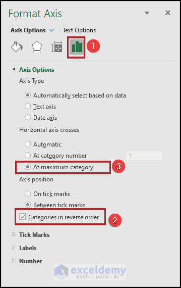
- The axis titles are in the right sequence.
- Add the whisker plot following the steps in method 1.
- Apply the No Fill in the Bottom Box series.

- After all formatting (shown in Step 04) is done, the horizontal box and whisker plot look as in the image below.
How to Insert Vertical Box and Whisker Plot in Excel?
Steps
- Select cells in the C4:E14 range.
- Proceed to the Insert tab.
- Click on the Insert Statistic Chart drop-down.
- Select Box and Whisker from the available options.
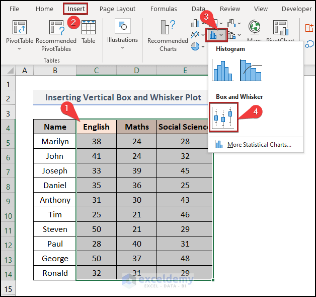
- The vertical box and whisker chart appears on our worksheet.
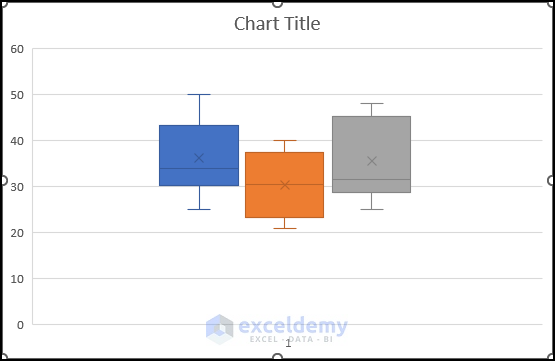
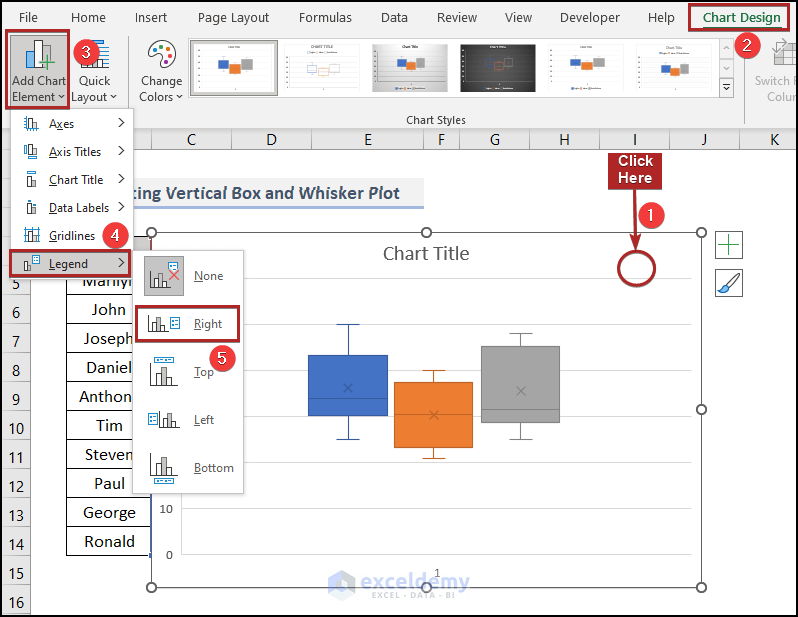
- Select the chart.
- Move to the Chart Design tab.
- Click on the Add Chart Element drop-down on the Chart Layouts group.
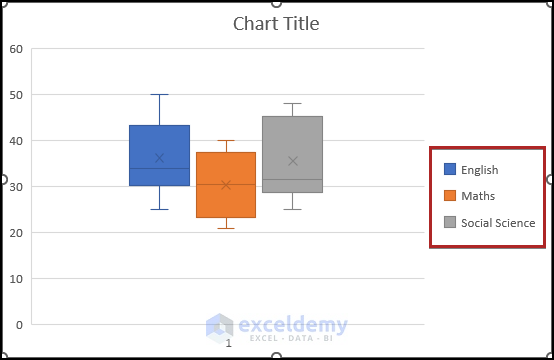
- Click on the right arrow of Legend.
- From the sub-menu, select Right.
- The legends are now available on the chart.
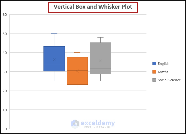
- Enter a suitable Chart Title to the vertical box and whisker plot.
Read More: How to Rotate Box and Whisker Plot in Excel
Download Practice Workbook
Related Article
<< Go Back to Box and Whisker Plot in Excel | Excel Charts | Learn Excel
Get FREE Advanced Excel Exercises with Solutions!
