Excel’s Box and Whisker Plot demonstrate the distribution of Quartiles, Median, and Outliers of the assigned dataset. Users often need to make a Box and Whisker Plot in Excel to display their data.
Let’s say we have a dataset holding obtained numbers of students in multiple subjects. And we want to create a Box and Whisker Plot.
This article demonstrates the step-by-step process to insert a Box and Whisker Plot.
Box and Whisker Plot and It’s Components
Excel provides the Box and Whisker Plot in its Insert tab > Charts section. The Box and Whisker Plot has two main components: Box and Whisker.
Box: A rectangular box displays the distribution of sample data containing Quartiles, and Median.
Whisker: Vertical lines extended from the Box are known as Whisker. Lower and upper extreme points are referred to as Min and Max values, respectively.

Other sub-components of a Box and Whisker Plot are:
Minimum Value: apart from outliers, the lowest data value within the sample.
Maximum Value: apart from outliers, the highest data value within the sample.
Median: the midpoint value within the sample.
First Quartile (Q1): median value of the lower half of the sample.
Third Quartile (Q3): median value of the upper half of the sample.
Read More: How to Create Box and Whisker Plot in Excel with Multiple Series
How to Make a Box and Whisker Plot in Excel: Step-by-Step Procedures
Making a Box and Whisker Plot in Excel requires multiple variants of a single entry. Setting up the dataset, inserting the Box and Whisker Plot, and modifying the Box and Whisker Plot are the steps to create a proper Box and Whisker Plot.
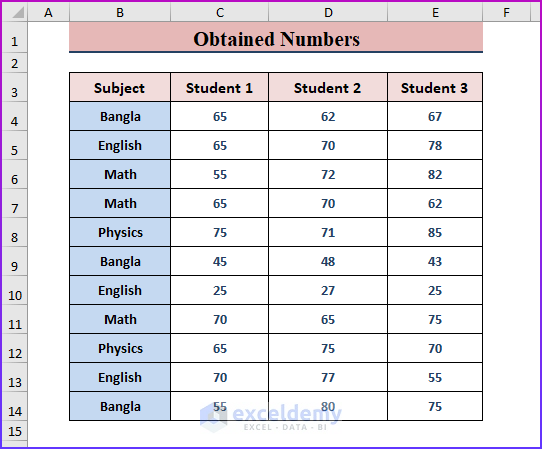
Step 1: Setting up Data to Insert a Box and Whisker Plot
🔼 Prepare a dataset containing multiple entries for a single record. The following screenshot depicts the sample data to insert a Box and Whisker Plot.
Read More: How to Add Horizontal Box and Whisker Plot in Excel
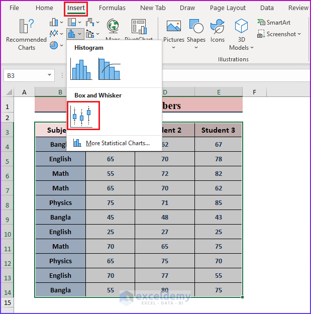
Step 2: Inserting Box and Whisker Plot in Excel
🔼 After setting up the data, highlight the entire data or range, then go to Insert > Insert Statistic Chart > Click Box and Whisker.
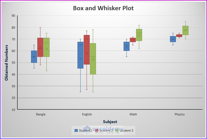
🔼 In a moment, Excel inserts a Box and Whisker Plot as shown in the image below.
Read More: How to Rotate Box and Whisker Plot in Excel
Step 3: Modifying Box and Whisker Plot for Better Representation
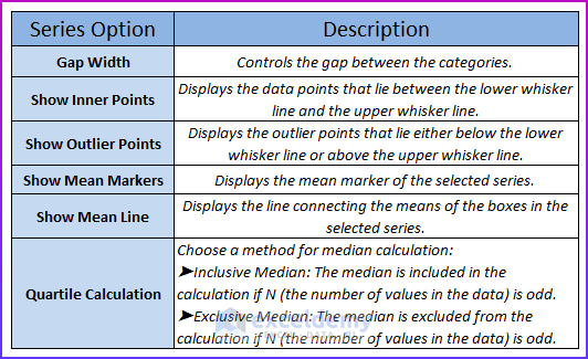
🔼 Double click on any inserted Box and Whisker icon within the plot, and the Format Data Series dialog box appears. Mark desired options to modify your Box and Whisker Plot.
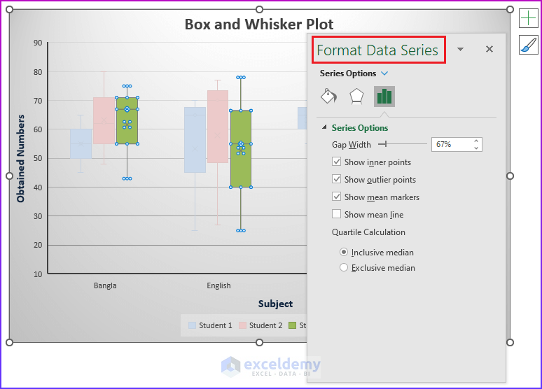
Format Data Series: The format data series dialog box contains the options below; follow the descriptions to modify the plot according to your desire.
Download Excel Workbook
Conclusion
In this article, we describe the step-by-step process to create a Box and Whisker Plot. We hope this article helps you to make stunning Box and Whisker Plots with your data. Comment if you have any inquiries or have anything to add.
Related Articles
- How to Make a Modified Box Plot in Excel
- How to Make a Box Plot in Excel
- [Fixed!] Box and Whisker Plot Not Showing in Excel
<< Go Back to Box and Whisker Plot in Excel | Excel Charts | Learn Excel
Get FREE Advanced Excel Exercises with Solutions!
