A great way of representing statistical data in Excel is by using a box plot. If the data in a data set are interrelated to each other then showing them in a box plot is a wonderful idea. It helps to visualize the distribution of data. A modified box plot is slightly different from a normal box plot. In this article, we will show you how to make a modified box plot in Excel.
Modified Box Plot
The main difference between a modified box plot and a standard box plot lies in terms of showing the outliers. In a standard box plot, the outliers are included in the main data and cannot be differentiated from the plot. However, in a modified box plot, users can differentiate outliers from the main data by seeing the plot, as the plot displays outliers as points far from the whiskers of the plot.
How to Make a Modified Box Plot in Excel: Step-by-Step Procedures
In this article, you will see the step-by-step procedures to make a modified box plot in Excel. Also, after making the box plot, we will analyze the plot in terms of different values found in our data set.
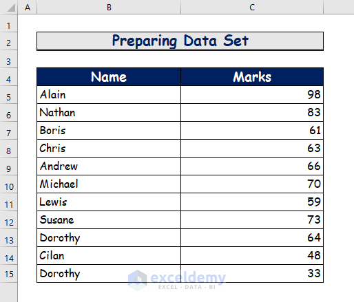
Step 1: Preparing Data Set
To make the modified box plot, we will need a data set first. To do that,
- First of all, prepare the following data set.
- Here, we have some random names and their obtained marks in an exam.
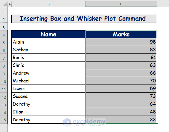
Step 2: Inserting Box and Whisker Plot Command
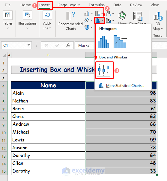
After preparing our data set, we now have to insert some commands. For that,
- Firstly, we will select the data range from cell C4:C15.
- Secondly, go to the Charts group from the Insert tab of the ribbon.
- Then, click on the icon named Insert Statistic Chart.
- Lastly, select Box and Whisker from the dropdown.
Step 3: Showing Modified Box Plot
Now we are in the final step of our procedure. To show the result, do the following.
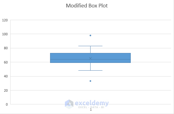
- After inserting the command from the previous step, you will see the following plot.

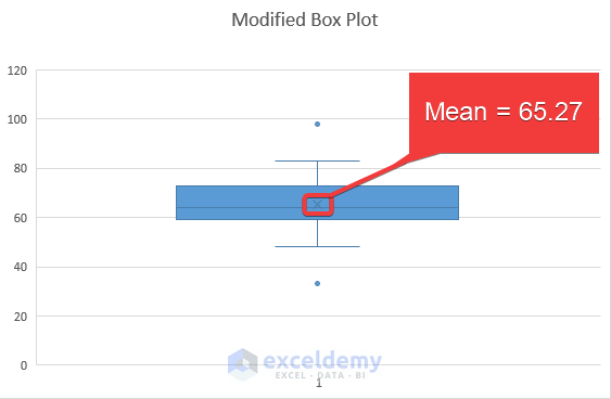
- Finally, name the plot as Modified Box Plot and you will get to see the distribution of all the data throughout the plot.
Read More: How to Rotate Box and Whisker Plot in Excel
How to Analyze Modified Box Plot in Excel: 9 Methods
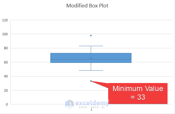
From our previous discussion, you can see how to make a modified box plot in Excel. A box plot is mainly a synopsis of five numbers, which are- the minimum value, the first quartile, the median value, the third quartile, and the maximum value. Also, the modified box plot shows the mean value and the lower and upper limits of a data set. It also displays the outliers separately. Now, in our following discussion, you will see how to find those values and how to show them in the plot.
1. Finding Out Minimum Value
From our data set, we will find the minimum value. To do that, follow the following steps.
Step 1:
- Firstly, use the following formula of the MIN function in cell F4.
=MIN(C5:C15)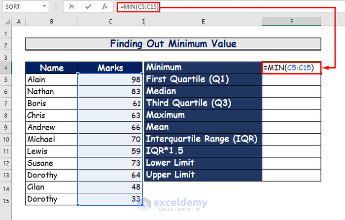
Step 2:
- Secondly, press Enter and get the minimum value which is 33.
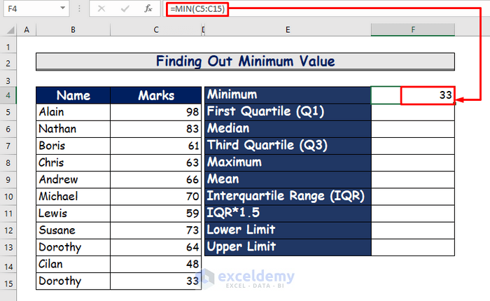
Step 3:
- Finally, show the value in the box plot.
2. Calculating First Quartile
The first quartile in a data set represents the value that is between the minimum and the median value. To calculate the first quartile, see the following steps.
Step 1:
- Firstly, type the following formula of the QUARTILE.EXC function in cell F5.
=QUARTILE.EXC(C5:C15,1)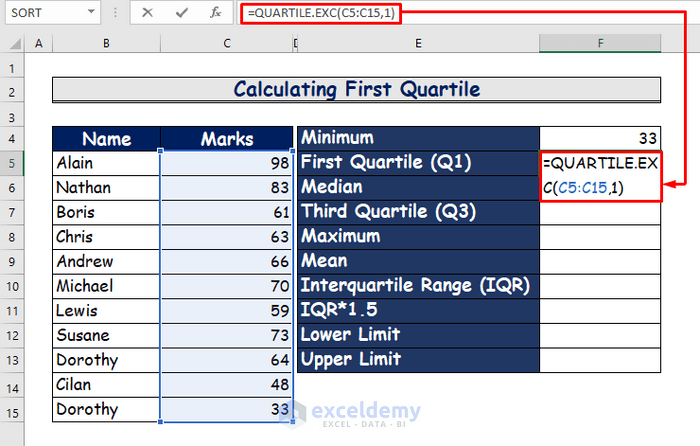
Step 2:
- Secondly, press Enter to see the value which is 59.
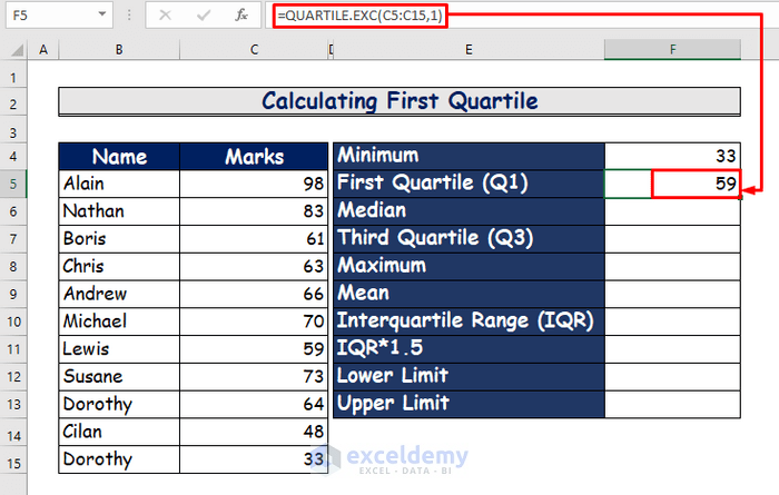
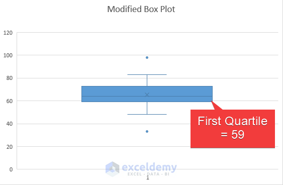
Step 3:
- Finally, show the first quartile in the modified box plot.
3. Determining Median Value
To determine the median value, do the following.
Step 1:
- First of all, use the following formula of the MEDIAN function in cell F6.
=MEDIAN(C5:C15)
Step 2:
- Secondly, hit the Enter button to see the result.
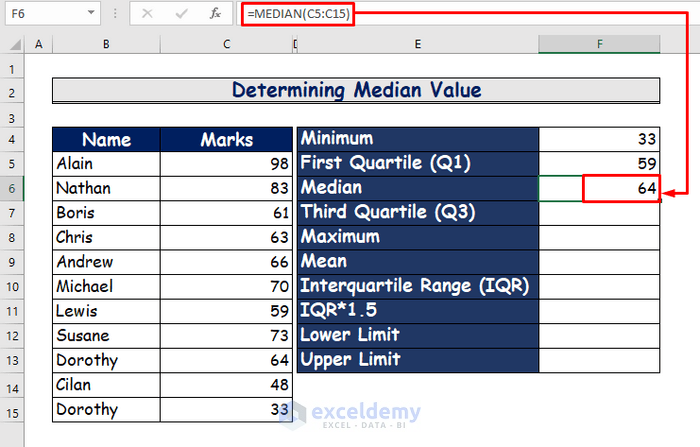
Step 3:
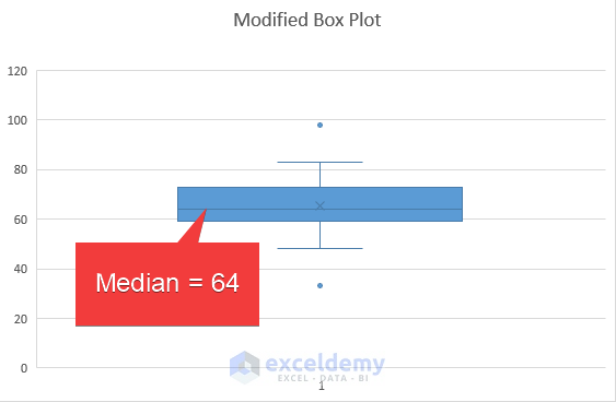
- Finally, mark the value in the plot that is 64.
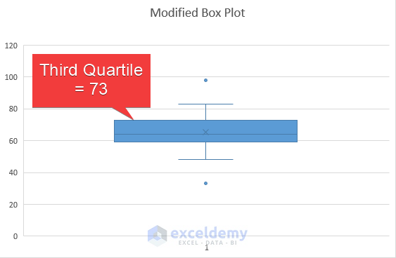
4. Measuring Third Quartile
The third quartile can be described as the value that lies between the median and the maximum value of a data set. We will use the following steps to measure it.
Step 1:
- Firstly, in cell F7, type the following formula of the QUARTILE.EXC function to measure the third quartile.
=QUARTILE.EXC(C5:C15,3)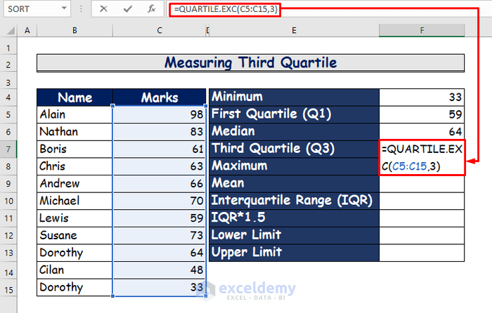
Step 2:
- Secondly, to see the result, press Enter.
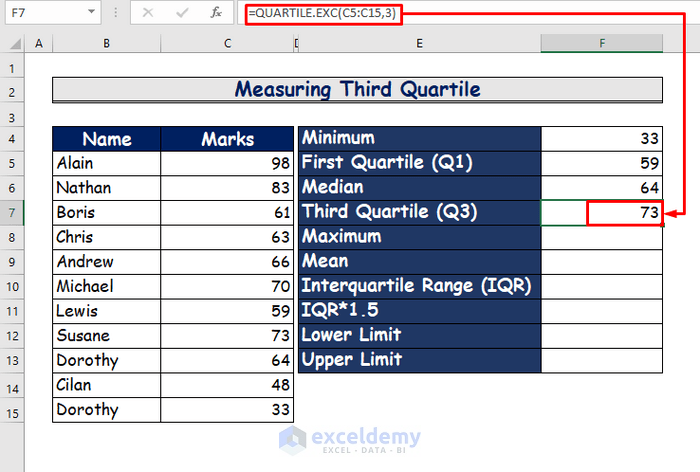
Step 3:
- Finally, present the value in the box plot.
5. Finding Out the Maximum Value
In this discussion, we will find out the maximum value. For that, do as follows.
Step 1:
- First of all, to find out the maximum value, write the following formula of the MAX function.
=MAX(C5:C15) 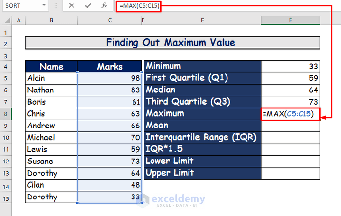
Step 2:
- In the second step, press Enter to see the result.
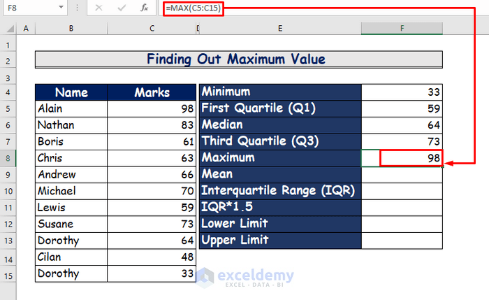
Step 3:
- Finally, show the result in the plot which is 98.

6. Calculating Mean Value
In the following section, we will calculate the mean value of the data set. For that, do as follows.
Step 1:
- In the beginning, apply the following formula of the AVERAGE function in cell F9.
=AVERAGE(C5:C15) 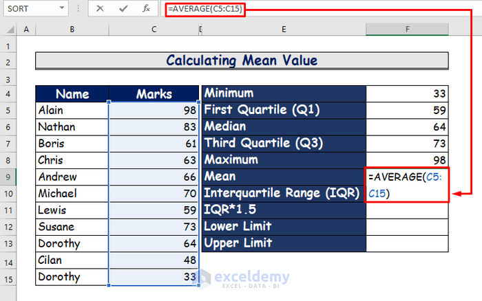
Step 2:
- Secondly, to see the result hit Enter.

Step 3:
- Thirdly, point out the mean value in the plot, which is shown as the letter X in the plot.
7. Determining Interquartile Range
The interquartile range (IQR) is the difference between the third quartile and the first quartile of a data set. To determine this from our data set, do the following.
Step 1:
- Firstly, in cell F10, write the following formula.
=F7-F5 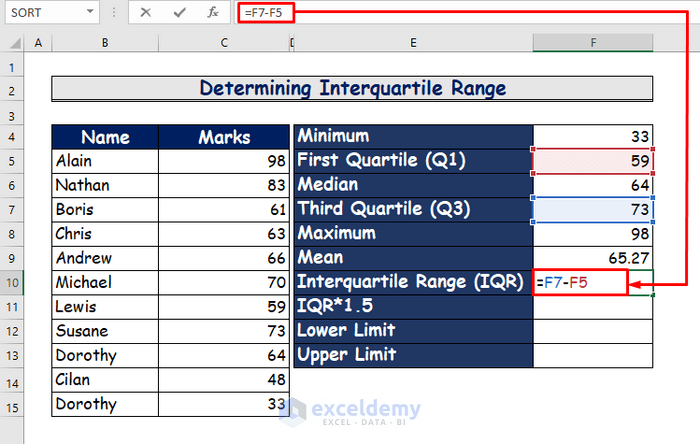
Step 2:
- In the second step, press the Enter button to see the result.
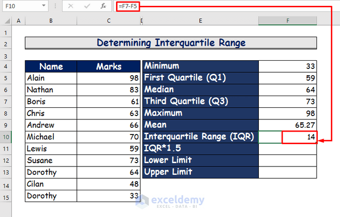
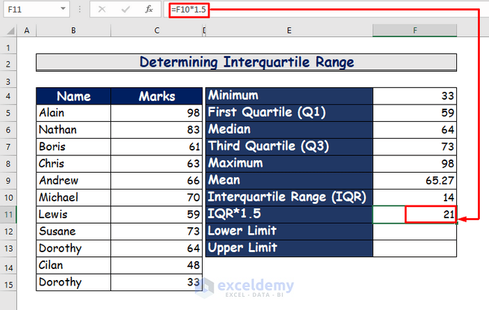
Step 3:
- Thirdly, we will multiply the IQR by 1.5 to find the upper and lower limits of this data set.
- So, use the following formula in cell F10.
=F10*1.5 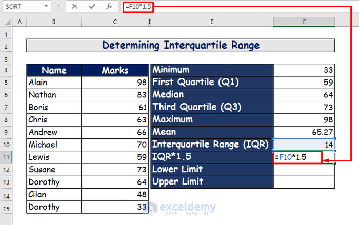
Step 4:
- Finally, to see the result hit Enter.
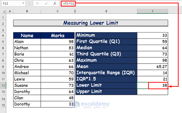
8. Measuring Lower Limit and Upper Limit
Now, we will measure the lower limit and the upper limit of our data set. The procedure is as follows.
Step 1:
- Firstly, type the following formula in cell F12 to measure the lower limit.
=F5-F11 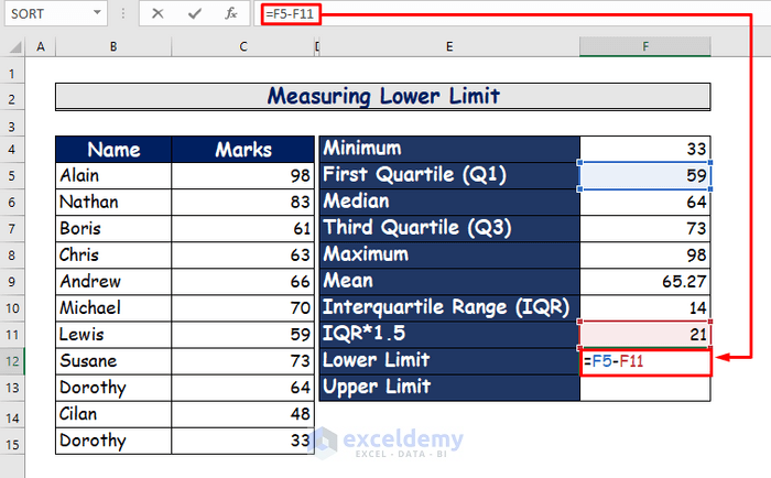
Step 2:
- Secondly, press Enter to see the lower limit which is 38.
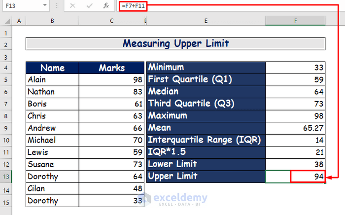
Step 3:
- Thirdly, type the following formula in cell F14 to measure the upper limit.
=F7+F11 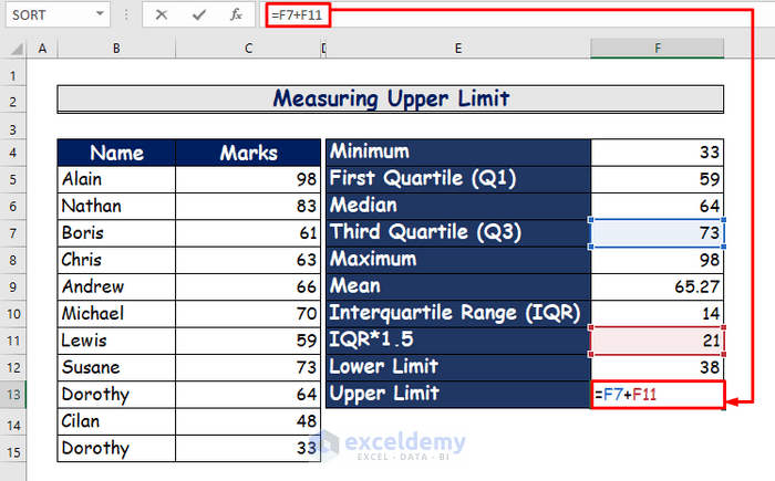
Step 4:
- Fourthly, hit the Enter button to see the result.
Step 5:
- Finally, point out the lower limit and the upper limit in the plot.
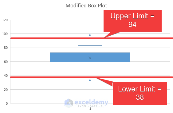
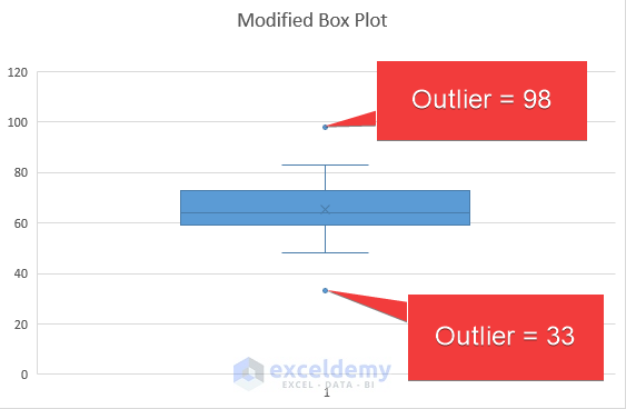
9. Showing Outliers in Modified Box Plot
This is the last point in our analysis. We will show the outliers in this content. The detailed procedures are as follows.
- In the previous step, you will see the lower limit and the upper limit of the data set.
- Any value that is lower than the lower limit or higher than the upper limit is considered an outlier.
- From the above discussion, you can see two values in the data set which are out of range of these limits.
- These values are 98 and 33.
- Finally, mark these values in the plot to present the outliers.
Download Practice Workbook
You can download the free Excel workbook here and practice on your own.
Conclusion
That’s the end of this article. I hope you find this article helpful. After reading the above description, you will be able to make a modified box plot in Excel by following the above-described method. Please share any further queries or recommendations with us in the comments section below.
Related Articles
- How to Create Box and Whisker Plot in Excel with Multiple Series
- How to Add Horizontal Box and Whisker Plot in Excel
- How to Make a Box and Whisker Plot in Excel
- [Fixed!] Box and Whisker Plot Not Showing in Excel
<< Go Back to Box and Whisker Plot in Excel | Excel Charts | Learn Excel
Get FREE Advanced Excel Exercises with Solutions!
