This tutorial will demonstrate how to make a box plot in Excel. The box plot is another way of presenting statistical data for better visualization. It helps to compare different values and understand how they are distributed throughout the dataset. Setting a box plot is helpful for various purposes such as summarizing different variations of a large dataset, comparing multiple distributions, showing outliners, indicating symmetry and skewness to a degree, etc. So, learning how to make a box plot in Excel is essential.
What Is Box Plot?
A box plot is a way of representing different numbers graphically. It can be drawn vertically or horizontally. It mainly works with 5 sets of numbers: Minimum, First Quartile, Median (also known as the second Quartile), Third Quartile, and Maximum. The values in a vertical box are explained below.
- Minimum: It indicates the smallest value in the dataset.
- First Quartile: It is displayed as the 25th percentile of the dataset and It stays between a minimum value and the median of the dataset.
- Median (also known as the second Quartile): It is the 50th percentile of the dataset and stays in the middle.
- Third Quartile: It marks the 75th percentile of the dataset and stays in the middle of the median and maximum values of the dataset.
- Maximum: It is the maximum number of the dataset.
How to Make a Box Plot in Excel: Step-by-Step Procedures
If you follow the steps correctly, you should learn how to make a box plot in Excel on your own. The steps are described below.
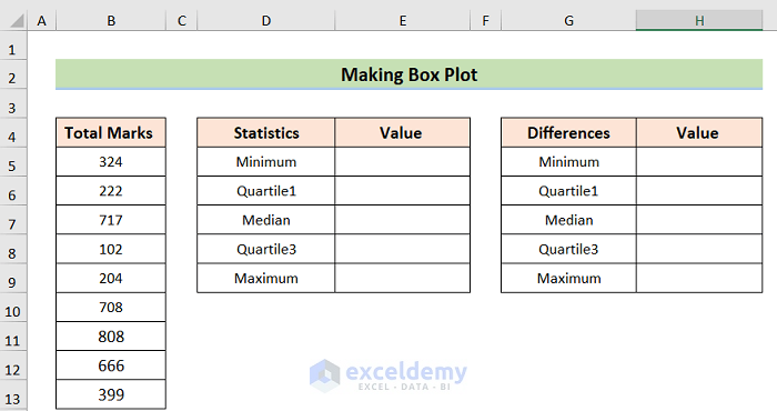
Step 1: Arranging Dataset
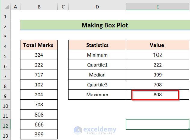
Our goal is to make a box plot. To do so, we have to arrange a dataset first. In this dataset, we have Total Marks in Column B, Statistics in Column D, and Differences in Column G. By the side of the Statistics and Differences columns we have the Value columns (Column E and Column H) where the values will be input.
Read More: How to Make a Box and Whisker Plot in Excel
Step 2: Creating Box Plot
Next, we want to create a box using the 5 sets of numbers. The step is described below.
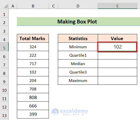
- At first, go to any blank ( in this case, Cell E5) and insert the following formula.
=MIN(B5:B13)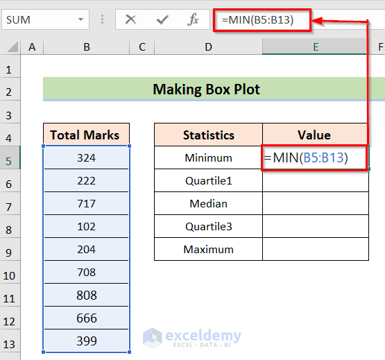
- Second, press the Enter button to get the result.
- Third, go to any blank (in this case, Cell E6) and insert the following formula.
=QUARTILE.INC(B5:B13,1)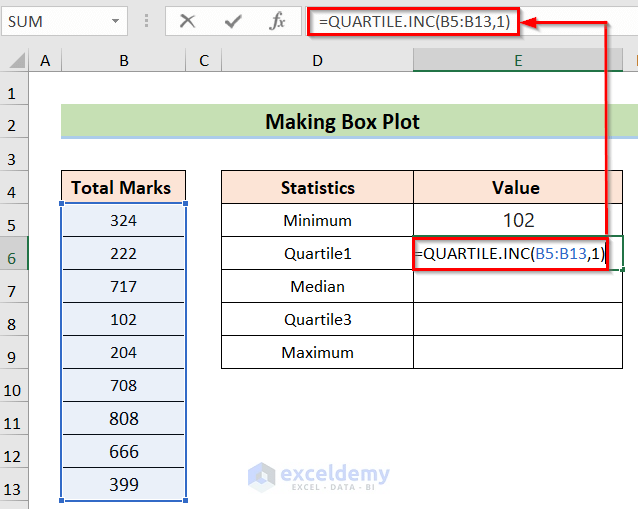
- Fourth, press the Enter button to get the result.

- Fifth, go to any blank (in this case, Cell E7) and insert the following formula.
=QUARTILE.INC(B5:B13,2)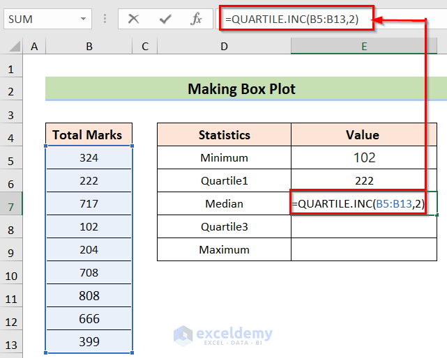
- Sixth, press the Enter button to get the result.

- Seventh, go to any blank (in this case, Cell E8) and insert the following formula.
=QUARTILE.INC(B5:B13,3)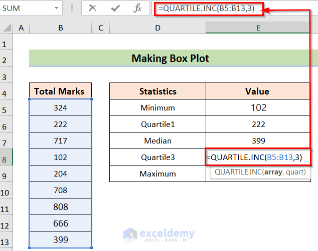
- Eighth, press the Enter button to get the result.
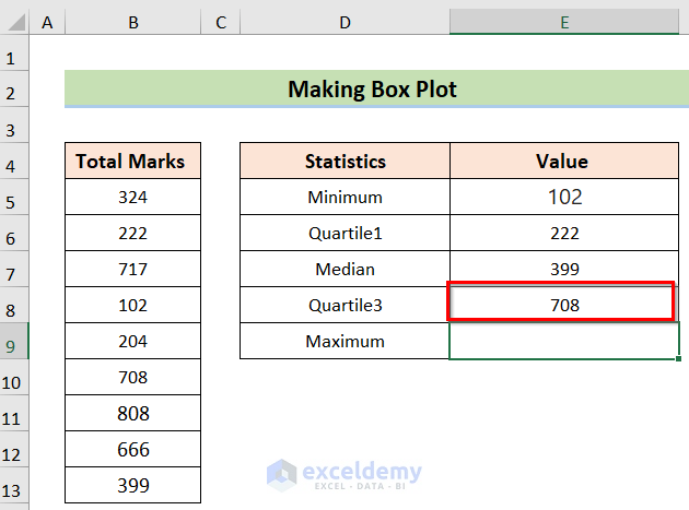
- Ninth, go to any blank (in this case, Cell E9) and insert the following formula.
=MAX(B5:B13)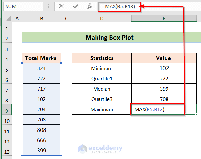
- Last, press the Enter button to get the result.
Step 3: Calculating Differences in Values
In this next step, we aim to calculate the differences in values. To fulfill this goal we will follow the below steps.
- To begin with, we will determine the difference between Q1 and Min So, we put the formula in the H6 cell.
=E6-E5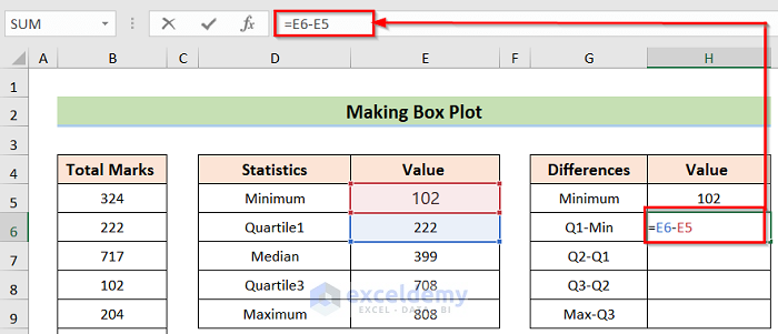
- In addition, use the cells to determine the differences according.
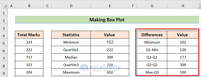
- At the end of this step, you will get the below result.
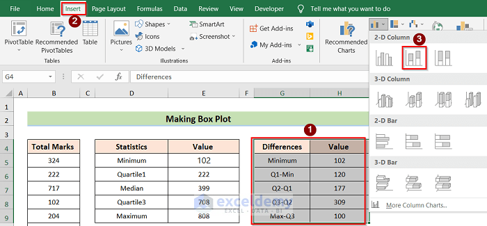
Step 4: Inserting Column Chart
The next step is to insert a column chart in Excel. The step is described below.
- Firstly, select the whole dataset you want to represent, and from the Insert tab select the 2-D Column chart option.
- Secondly, you will get a chart like the below image.

- Thirdly, right-click on the Select Data option.

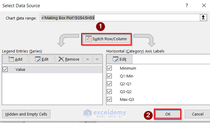
- Fourthly, in the Select Data Source dialog box, select the Switch Row/Column option and press OK.
- Lastly, you will get the result like the below image.

Step 5: Editing and Formatting Column Chart
After that, we want to edit and format the column chart for better visualization. The process of this step is.
- To begin with, right-click on the bottom section of the chart and select the Format Data Series option.

- In addition, in the Format Data Series window, select No Fill in the Fill section and No line in the Border section.

- Finally, you will get the result like the below image.

Step 6: Creating Whiskers for Box Plot
Next, our aim is to make the Whiskers for the boxplot by the following steps.
- Firstly, select the chart and go to Chart Elements>Error Bars>More Options.

- Secondly, in the Format Error Bars option window, select Minus in the Vertical Error Bar, Cap in the End Style section, and 100% in the Error Amount option.

- or you can do the same thing by going to Chart Design>Add Chart Element>Error Bars>More Error Bars Options.

- Next, again in the Format Error Bars option window, select Minus in the Vertical Error Bar, Cap in the End Style section, and 100% in the Error Amount option.

- Lastly, you will get the below result.

Step 7: Presenting Final Result
You can hide the upper and lower portions by using the same previous steps. The final result of this process will be like the below image.

Things to Remember
- The most important part is to determine the differences in the values. So, we have to be careful about that step.
- In case inserting the chart, you can’t choose any chart option you have to choose the Stacked Column chart. Otherwise, the process won’t work.
- In the case of editing and formatting, you have your freedom. In this case, we have shown it our way, you can hide or color more ways in this section accordingly.
Download Practice Workbook
You can download the practice workbook from here.
Conclusion
Henceforth, follow the above-described methods. Thus, you will be able to make a box plot in Excel. Let us know if you have more ways to do the task. Don’t forget to drop comments, suggestions, or queries if you have any in the comment section below.
Related Articles
- How to Create Box and Whisker Plot in Excel with Multiple Series
- How to Add Horizontal Box and Whisker Plot in Excel
- How to Rotate Box and Whisker Plot in Excel
- How to Make a Modified Box Plot in Excel
- [Fixed!] Box and Whisker Plot Not Showing in Excel
<< Go Back to Box and Whisker Plot in Excel | Excel Charts | Learn Excel
Get FREE Advanced Excel Exercises with Solutions!
