What Is a Box and Whisker Plot?
In Excel, a box and whisker plot is a graphical depiction of a dataset’s numerical values. It displays the minimum, maximum, first quartile, second quartile (median), and third quartile as five numbers that represent the data as its whole. The median among them is a measure of the middle, whereas the others are measurements of dispersion. Therefore, a box plot displays the dataset’s center and the degree of dispersion from it.
How to Rotate a Box and Whisker Plot in Excel: 4 Easy Methods
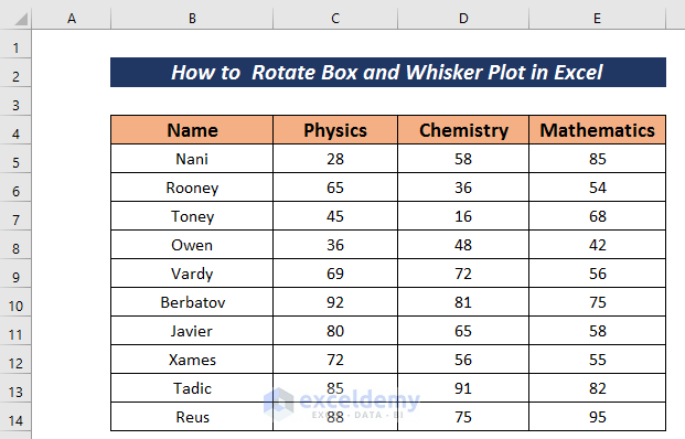
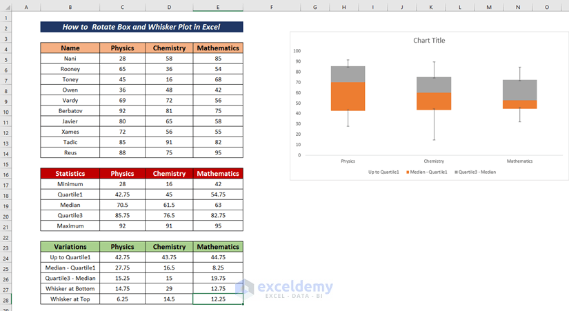
Consider the following dataset that contains the Annual Results of a school, with the Name, Physics, Chemistry, and Mathematics columns.
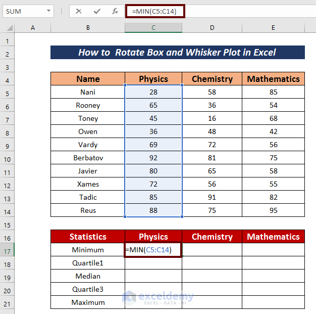
Step 1 – Calculate the Particulars for a Box and Whisker Plot
- Add a new dataset below the original one to put five values for each of the subject columns: minimum, quartile 1, median, quartile 3, and maximum.
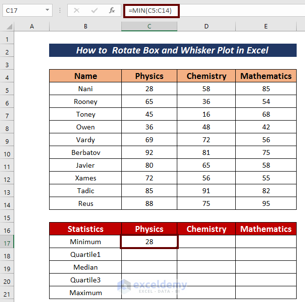
- Calculate the minimum marks obtained in Physics by using the following formula.
=MIN(C5:C14)Here, the MIN function calculates the minimum value among the cells C5:C14.
- Hit Enter.
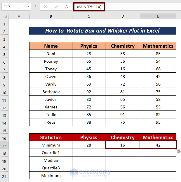
- Use the Fill Handle to AutoFill to the right.
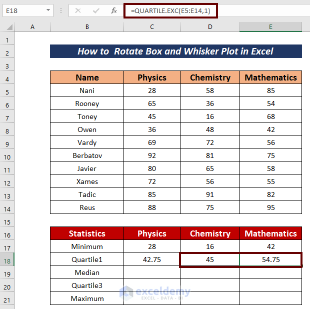
- Input the following formula to get the Quartile1 value.
=QUARTILE.EXC(C5:C14,1)The QUARTILE.EXC function returns the quartile of the above dataset based on the first 25% values.
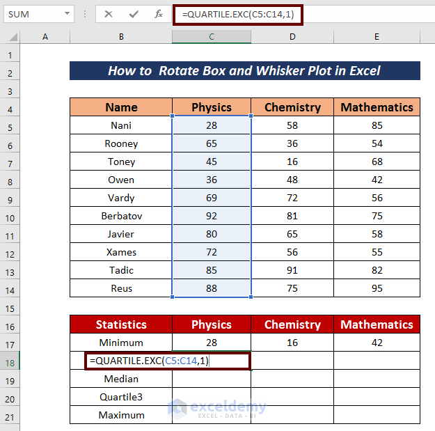
- Hit the Enter button to get the Quartile1 value.
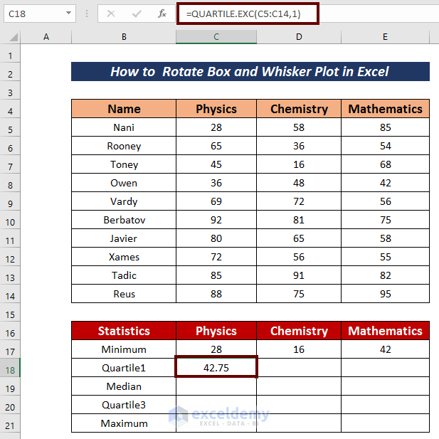
- AutoFill the cells for Quartile1.
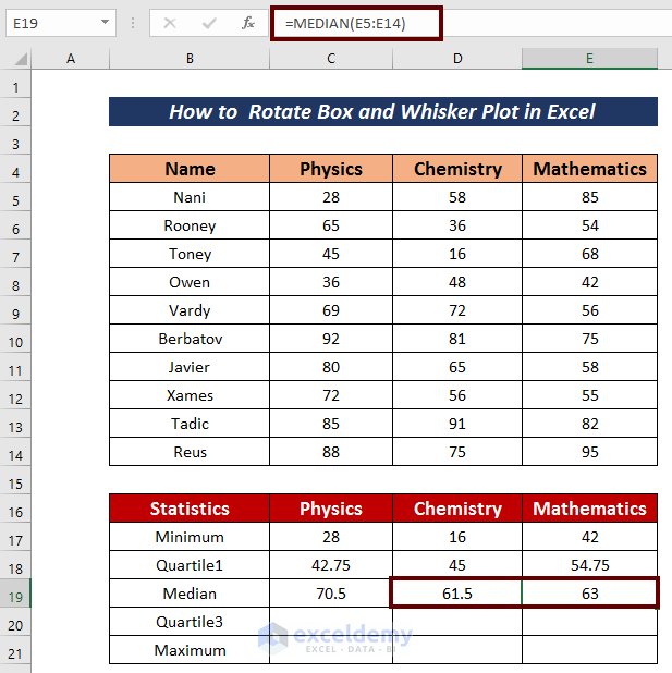
- Apply the following formula to calculate the median value.
=MEDIAN(C5:C14)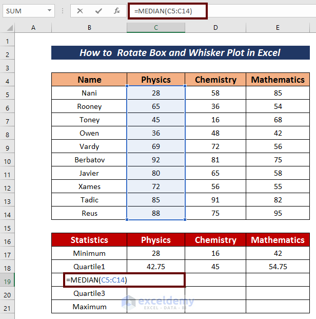
- Press Enter.
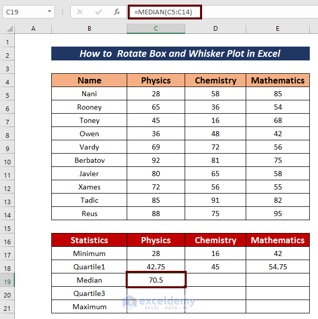
- AutoFill the row.
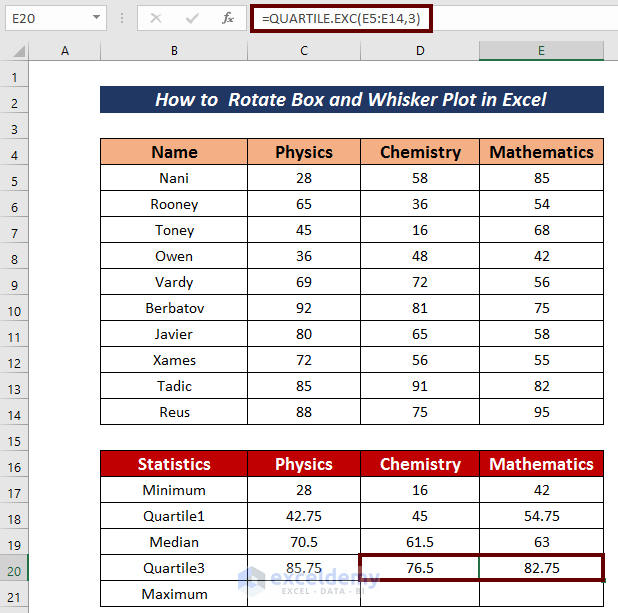
- Use the following formula to get the Quartile3 value.
=QUARTILE.EXC(C5:C14,3)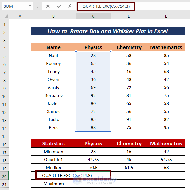
- Hit Enter.
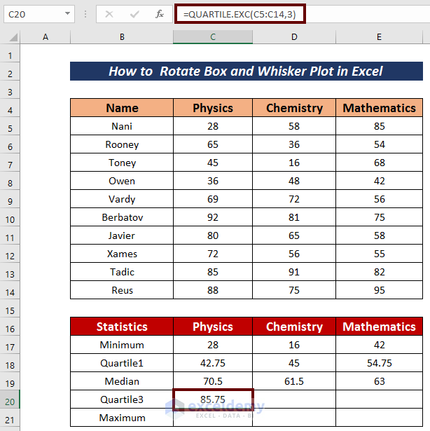
- Use the Fill Handle to AutoFill.
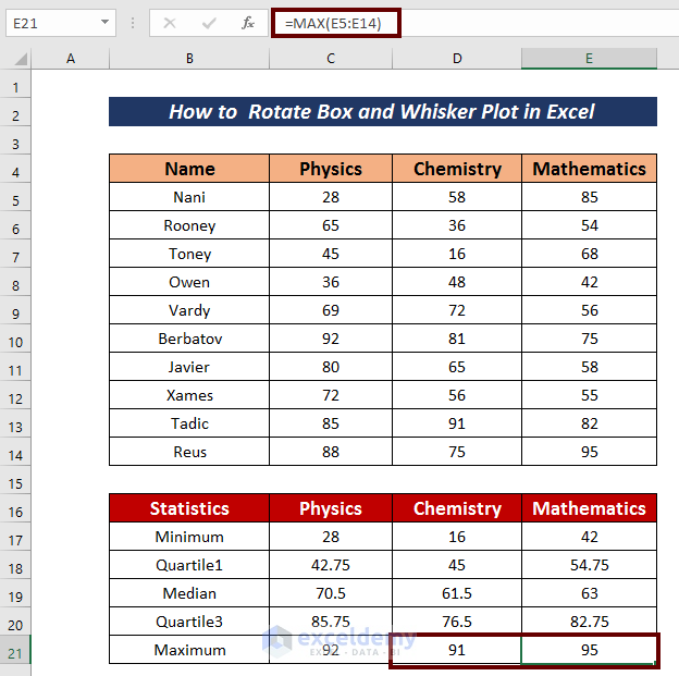
- Input the following formula to get the maximum value.
=MAX(C5:C14)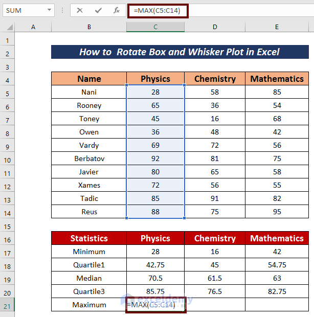
- Hit the Enter button.
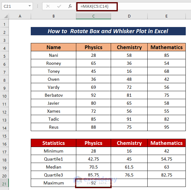
- AutoFill the connected cells.
Step 2 – Find the Differences Between the Particulars
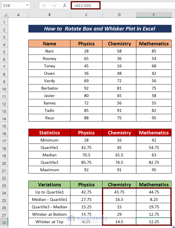
- Insert another small dataset for five more values for each column.
- Input the following formula to get the value Up to Quartile1.
=C18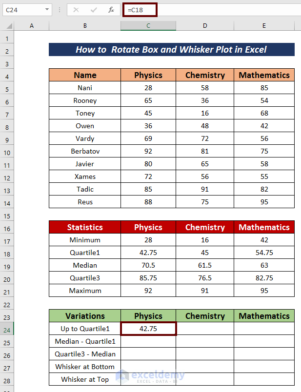
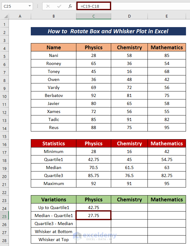
- Apply the formula below to get the Median – Quartile1 value.
=C19-C18C18 = Quartile1
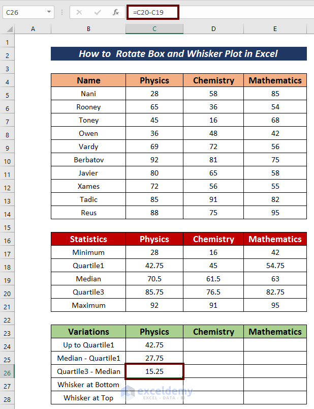
- Input the formula below to get the Quartile3 – Median value.
=C20-C19C20 = Quartile3
C19 = Median
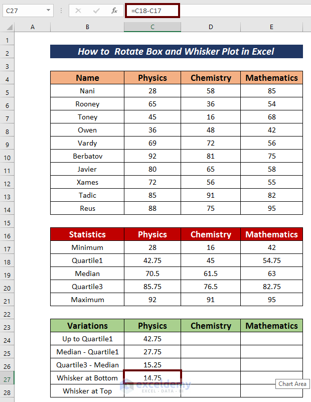
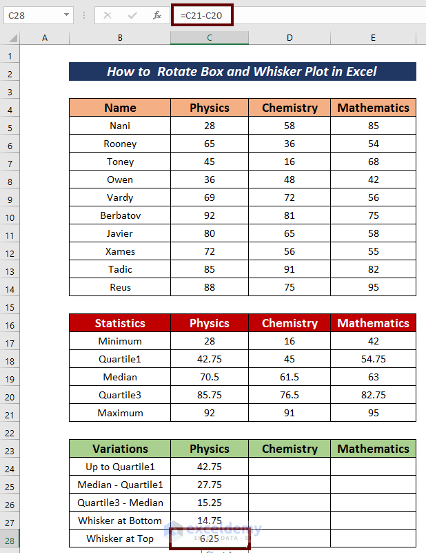
- Find the Whisker at Bottom using the following formula:
=C18-C17C17 = Minimum
- Find the Whisker at Top by using the following formula:
=C21-C20C21 = Maximum
C20 = Quartile3
- Select all five values.
- Use the Fill Handle to AutoFill to the right.
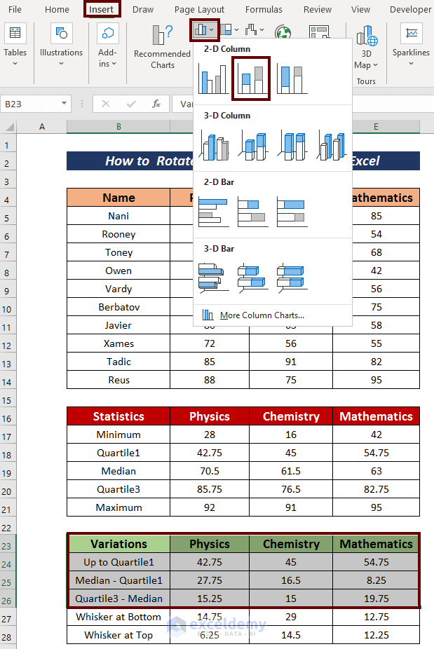
Step 3 – Create a Box and Whisker Plot
- Select the cells in Up to Quartile1, Median – Quartile1, Quartile3 – Median and their headers.
- Go to the Insert tab.
- Click on Insert Column or Bar Chart from the ribbon.
- Choose Stacked Column.
- Select the lower quartile for all the bars.
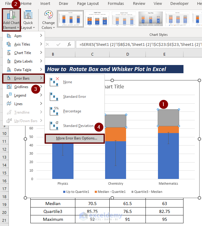
- Click on Add Chart Element from the ribbon.
- Go to Error Bars and pick More Error Bars Options.
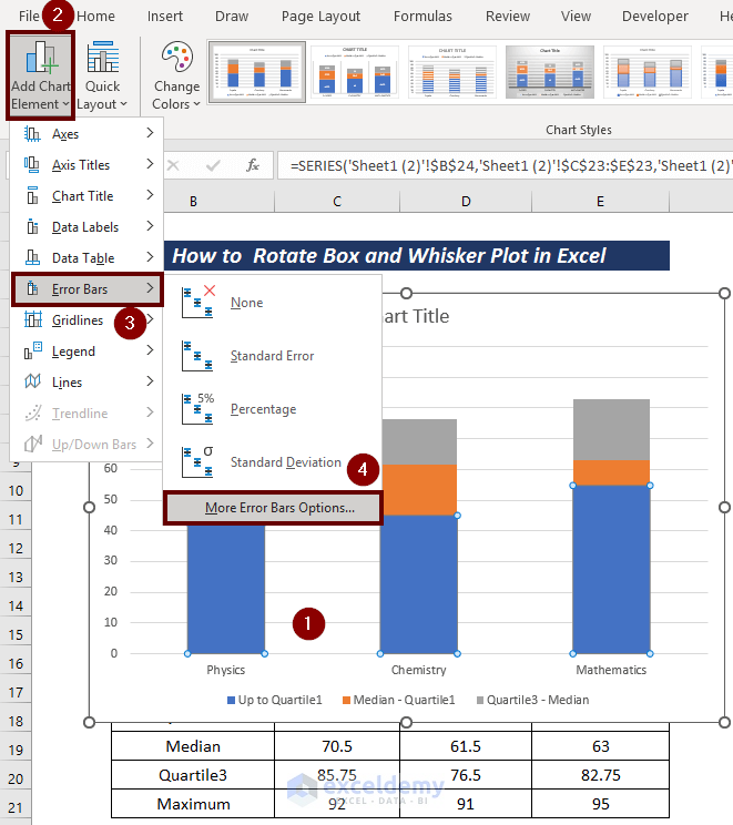
On the right side, a Format Error Bars wizard will appear.
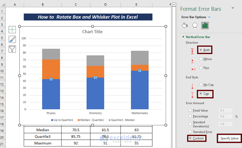
- Choose Both as Direction.
- From the End Style section, pick Cap.
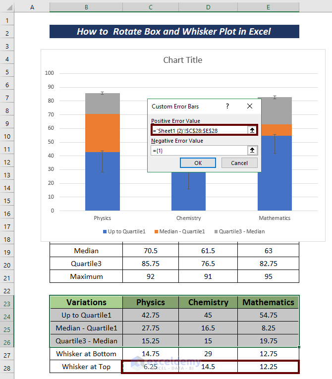
- To enter the Error Amount according to the dataset, select Custom and then click on Specify Value.
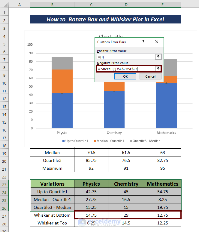
A Custom Error Bars wizard will come forward.
- As we are dealing with Quartile1, select all the cells in Whisker at Bottom in the Negative Error Value option.
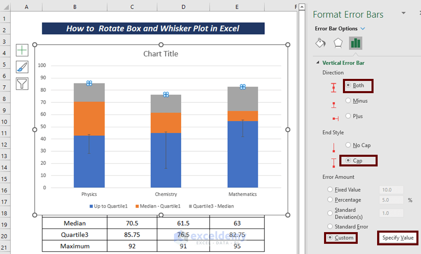
- Select the top quartile for all the bars.
- Click on Add Chart Element from the ribbon.
- Go to Error Bars and pick More Error Bars Options.
A Format Error Bars wizard will appear on the right side.
- Choose Both as Direction.
- From the End Style section, pick Cap.
- Select Custom and then click on Specify Value to enter the Error Amount according to the dataset.
A Custom Error Bars wizard will appear.
- As we are dealing with Quartile3, select all the cells in Whisker at Top in the Positive Error Value
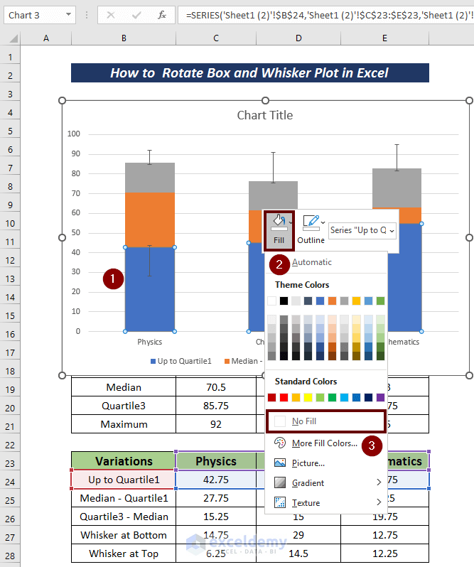
- Select all the lower quartile boxes.
- Apply No Fill from the Fill option.
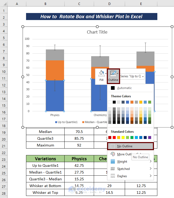
- Apply No Outline from the Outline option.
- Select all the horizontal lines and press the Delete button to have them removed.
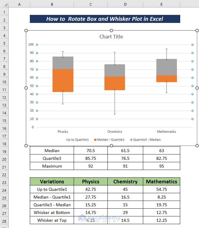
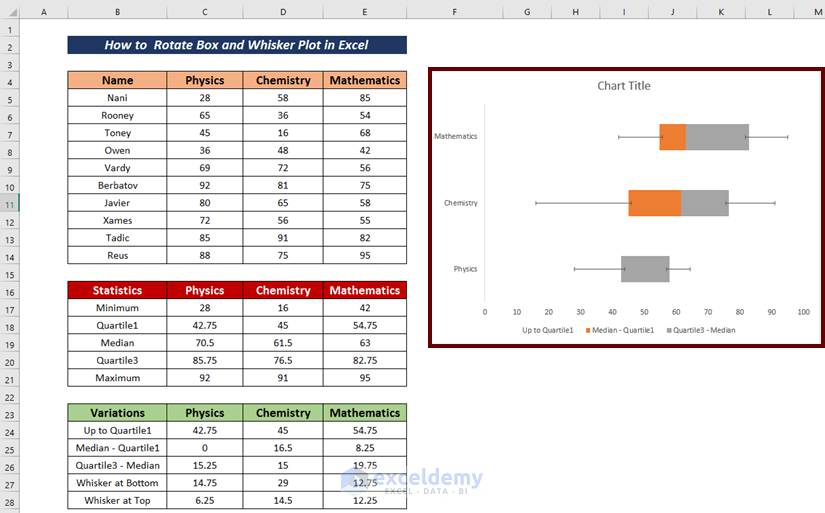
We have our desired box and whisker plot.
Step 4 – Rotate the Box and Whisker Plot
- Select the created box and whisker plot.
- Go to the Insert tab.
- Click on Insert Column or Bar Chart from the ribbon.
- From the available options in the 2-D Bar section, choose Stacked Bar.
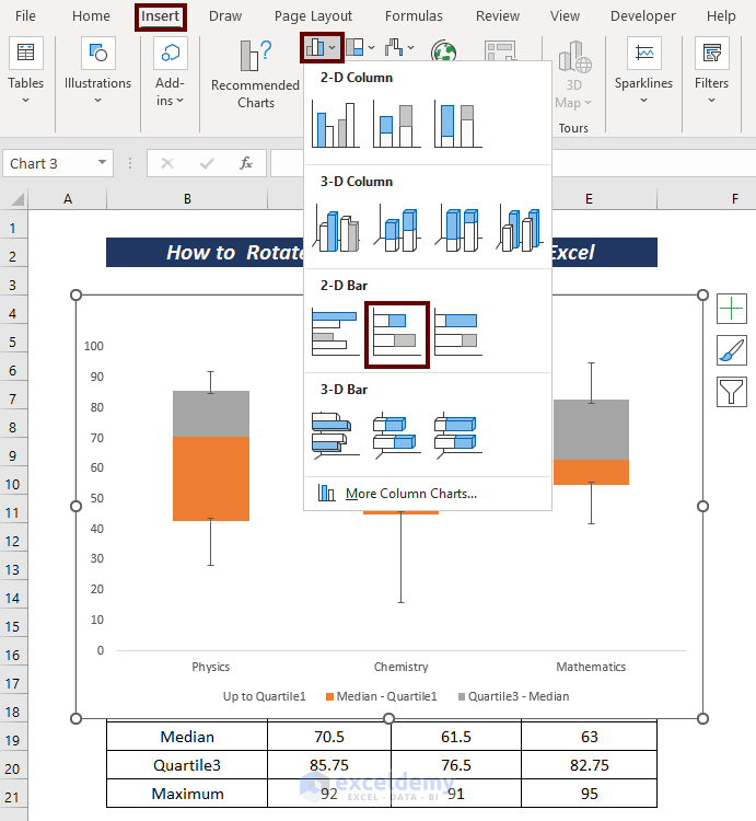
This rotates the chart.
Download the Practice Workbook
Related Articles
- How to Make a Box and Whisker Plot in Excel
- How to Add Horizontal Box and Whisker Plot in Excel
- [Fixed!] Box and Whisker Plot Not Showing in Excel
<< Go Back to Box and Whisker Plot in Excel | Excel Charts | Learn Excel
Get FREE Advanced Excel Exercises with Solutions!
