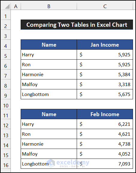
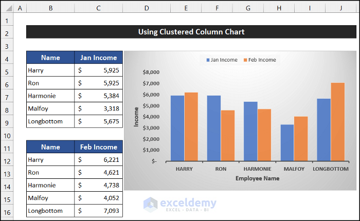
The following two sample data tables, where the income for the two months of January and February of five employees of a company are listed will be used to illustrate the examples. The sample dataset is in the range of cells B5:C9 and B12:C16.
Example 1 – Using Clustered Column Chart
Steps:
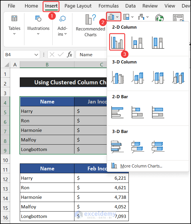
- Select the range of cells B4:C9.
- In the Insert tab, select the drop-down arrow of the Insert Column or Bar Chart from the Charts group and choose the Clustered Column from the 2-D Column section.
- The chart will be inserted.

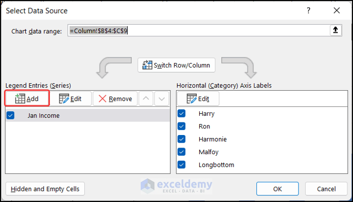
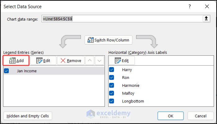
- To add the second table, go to the Chart Design tab, select the Select Data option from the Data group.

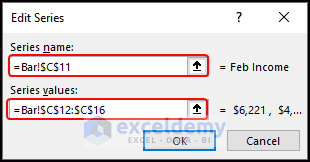
- In the Select Data Source window, select the Add option.
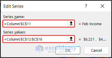
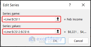
- In the Series name field, select cell C11 as the series name. In the Series values field, select the range of cells C12:C16.
- Click OK.
- Click OK to close the Select Data Source dialog box.
- You will get the value of both tables in the same chart, making it easy to compare the data of one table with the other table.
- You can customize the chart to your liking and keep the necessary elements from the Chart Elements We have kept Axes, Axis Titles and Legends for convenience.
The Clustered Column Chart is created and we can compare the data of the two tables with ease.
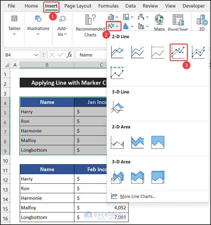
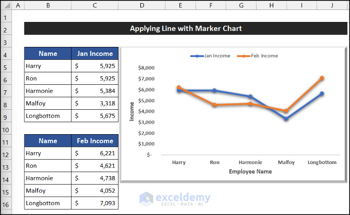
Example 2 – Applying Line with Marker Chart
Steps:
- Select the range of cells B4:C9.
- Go to the Insert tab, select the drop-down arrow of the Insert Line or Area Chart from the Charts group and choose the Line with Marker from the 2-D Line section.
- The line chart will be inserted.

- For adding the second table, go to the Chart Design tab, select the Select Data option from the Data group.
- In the Select Data Source window, select the Add option.
- In the Series name field, select cell C11 as the series name; for the Series values field, select the range of cells C12:C16.
- Click OK.
- Click OK to close the Select Data Source dialog box.
- You will see that the values of both the data tables are shown in the same chart, which will ease our task in comparing their data changing pattern.
- You can customize the chart to your liking and keep the necessary elements from the Chart Elements We have kept Axes, Axis Titles and Legends for convenience.
The Line with Marcker Chart is created and we can compare the data of the two tables with ease.
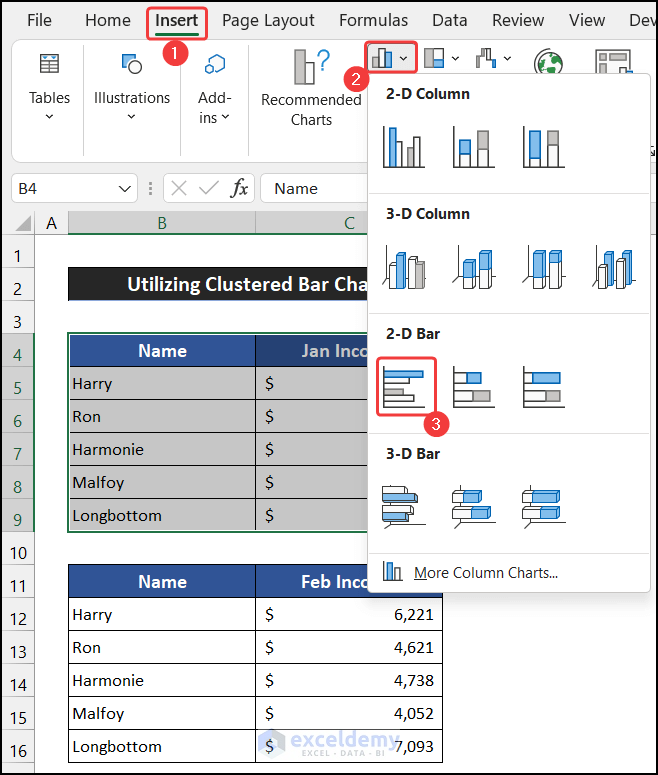
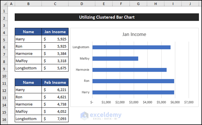
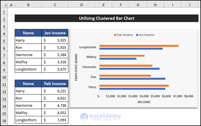
Example 3 – Utilizing Clustered Bar Chart to Compare Two Tables
Steps:
- Select the range of cells B4:C9.
- Go to the Insert tab, select the drop-down arrow of the Insert Column or Bar Chart from the Charts group and choose the Clustered Bar from the 2-D Bar section.
- The chart will be inserted into the worksheet.
- For the second data table, go to the Chart Design tab, select the Select Data option from the Data group.
- In the Select Data Source window, select the Add option.
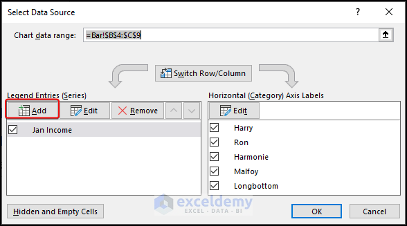
- In the Series name field, select cell C11 as the series name and from the Series values field, select the range of cells C12:C16.
- Click OK.
- Click OK to close the Select Data Source dialog box.
- You will notice that the values of both the data tables are shown in the same chart.
- You can customize the chart according to your preference and keep the necessary elements from the Chart Elements We have kept Axes, Axis Titles and Legends for convenience.
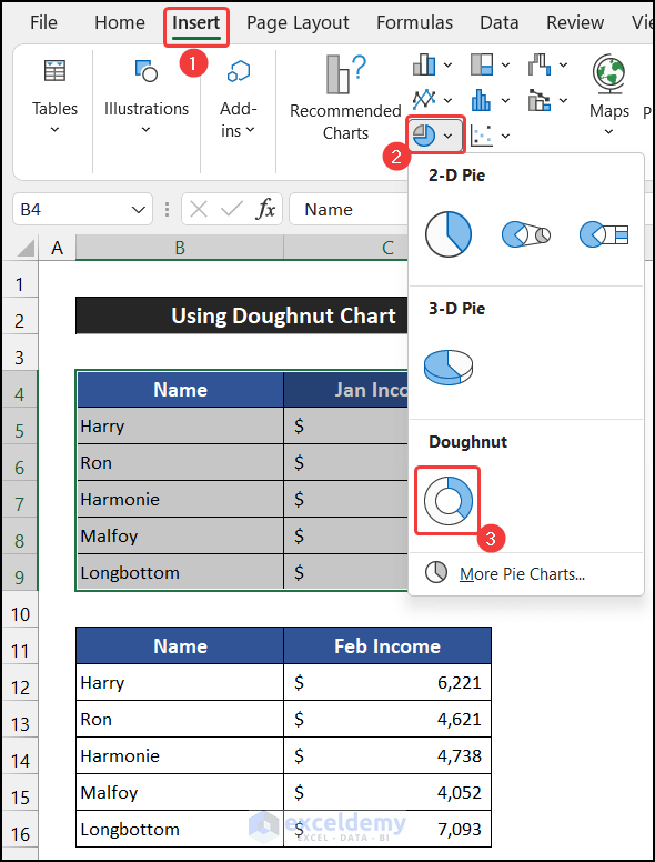
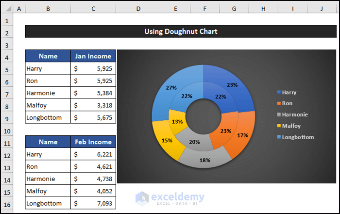
4. Using Doughnut Chart
Steps:
- Select the range of cells B4:C9.
- Go to the Insert tab, select the drop-down arrow of the Insert Pie or Doughnut Chart from the Charts group and choose the Doughnut from the Doughnut section.
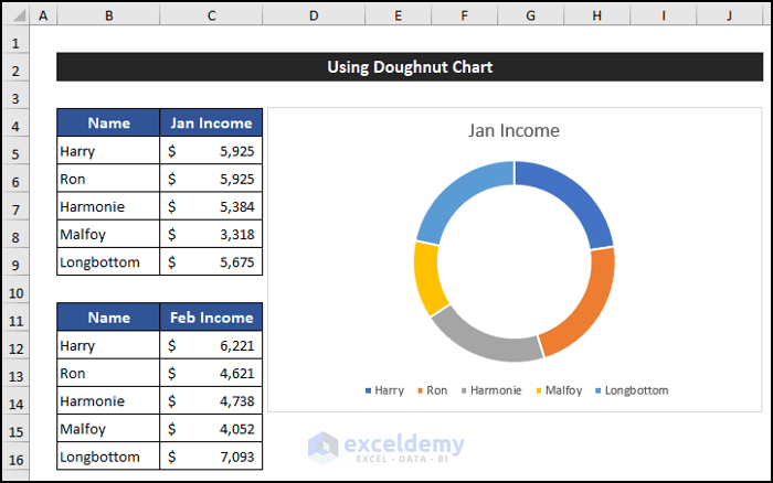
- The Doughnut Chart will be inserted as shown below.
- To add the second table’s data, in the Chart Design tab, select the Select Data option from the Data group.
- Select the Add option.
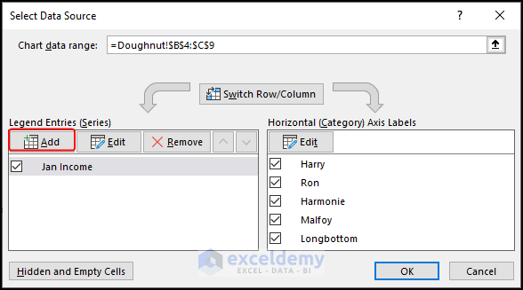
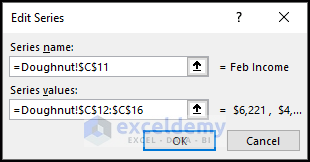
- In the Series name field, select cell C11 as the series name and for the Series values field, select the range of cells C12:C16.
- Click OK.
- Click OK to close the Select Data Source dialog box.
- You will see the values of both the data tables are shown in the same chart. This will help us to compare their data changing pattern.
- You can customize the chart according to your preference and keep the necessary elements from the Chart Elements We have kept Axes, Axis Titles and Legends for convenience.
The Doughnut Chart is inserted and we can compare the data of the two tables with ease.
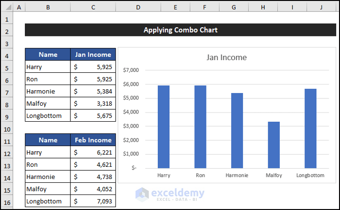
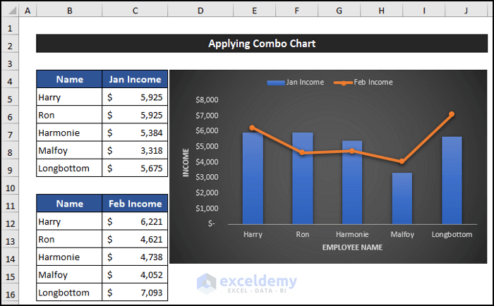
Example 5 – Applying Combo Chart
Steps:
- Select the range of cells B4:C9.
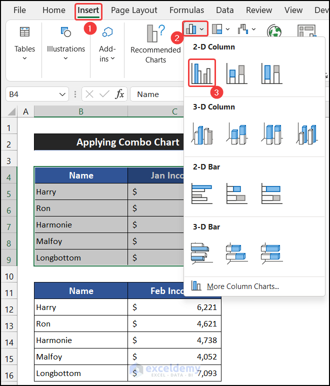
- Go to the Insert tab, select the drop-down arrow of the Insert Column or Bar Chart from the Charts group and choose the Clustered Column from the 2-D Column section.
- The chart will be inserted into the worksheet.
- To add the second table’s data, in the Chart Design tab, select the Select Data option from the Data group.
- Select the Add option.
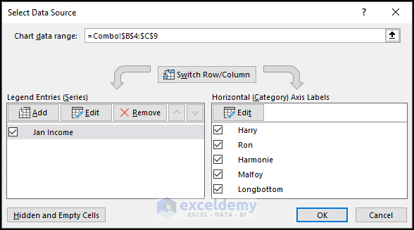
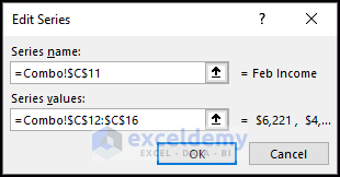
- In the Series name field, select cell C11 as the series name and for the Series values field, select the range of cells C12:C16.
- Click OK.
- Click OK to close the Select Data Source dialog box.
- Both data will show in a similar type of chart. But we want to show them using two different types of charts.
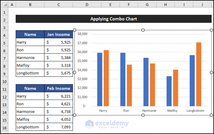
- Go to the Chart Design tab, and select the Change Chart Type from the Types group.
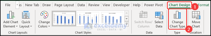
- The Change Chart Type dialog box will pop-up.
- Click on the drop-down arrow of the Chart Type and choose the Line and Marker chart.
- Click OK.
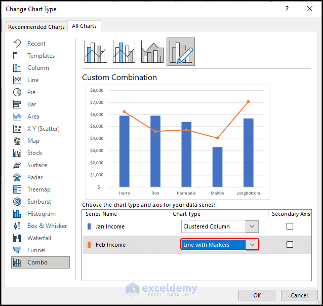
- You will see that the values of both the data tables are shown in the same chart in two different types of data.
- You can customize the chart according to your preference and keep the necessary elements from the Chart Elements We have kept Axes, Axis Titles and Legends for convenience.
Download Practice Workbook
<< Go Back to Tables | Compare | Learn Excel
Get FREE Advanced Excel Exercises with Solutions!
