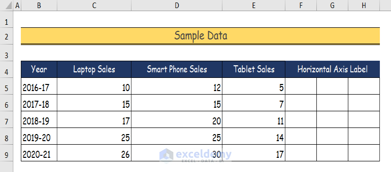
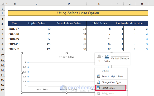
This is the sample dataset.
Method 1- Using the Select Data Option to Create a Dot Plot in Excel
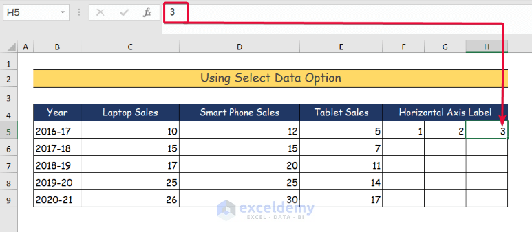
Step 1:
- Enter the horizontal axis number: 1,2,3 in F5, G5, and H5.
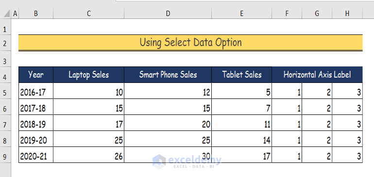
Step 2:
- Enter the same numbers as shown below.
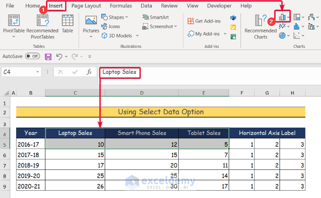
Step 3:
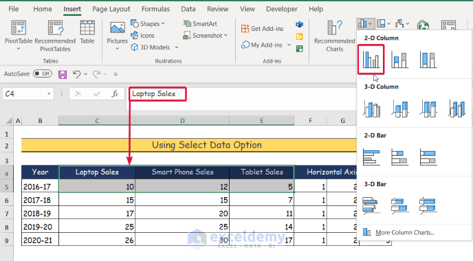
- Select the first row with the header of the data you want to plot. Here, C4:E5.
- Go to the Insert tab.
- Click Bar Chart in Chart.
Step 4:
- Select Clustered Column.
- The bar chart is created.
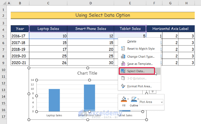
Step 5:
- Right-click the chart.
- Choose Select Data.
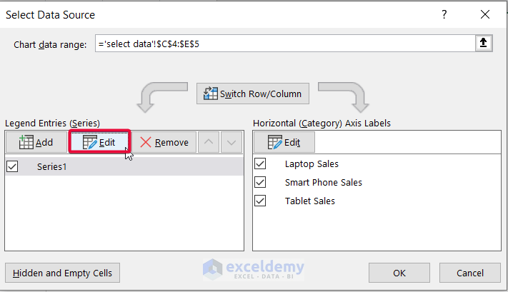
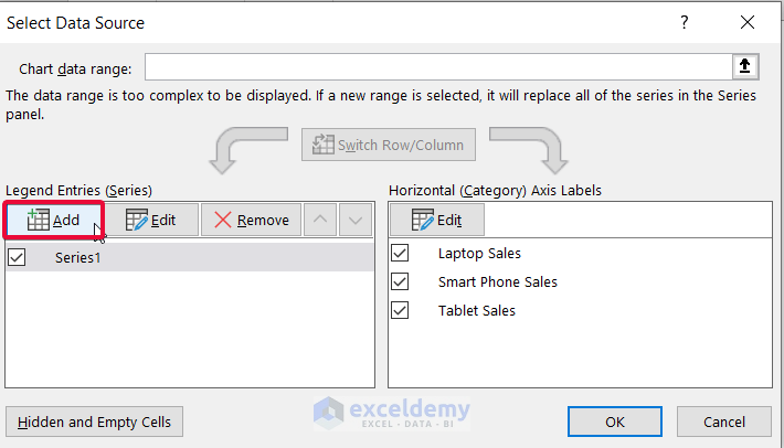
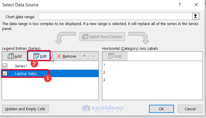
Step 6:
- In Select Data Source, select Edit.
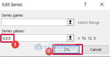
Step 7:
- In the Edit Series dialog box , in Series Value, enter three zeros separated by commas(0,0,0).
- A blank chart is created.
Step 8:
- Right-click the blank chart.
- Choose Select Data.
Step 9:
- In the dialog box, select Add.
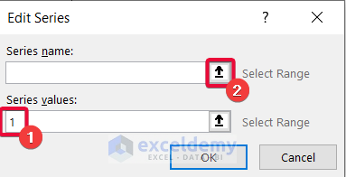
Step 10:
- In Edit Series, enter 1 in Series values.
- Click the upward arrow sign as shown below.
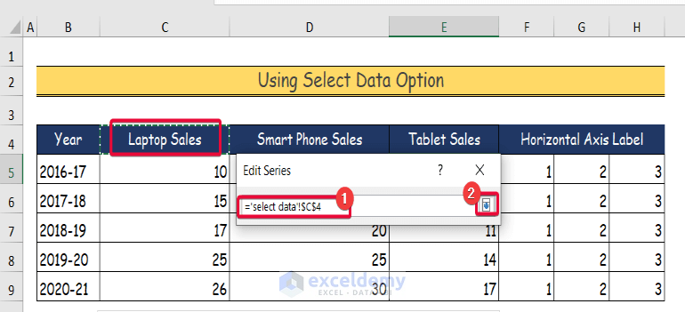
Step 11:
- Select the header row of the first column in the dataset. Here, “Laptop Sales“- C4.
- Select the downward arrow to confirm the selection.
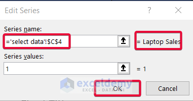
Step 12:
- The Series name is now “Laptop Sales”.
- Click OK.
- The Laptop Sales bar chart is created.
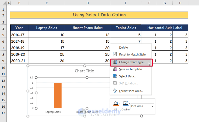
Step 13:
- Right-click the chart.
- Select Change Chart Type.
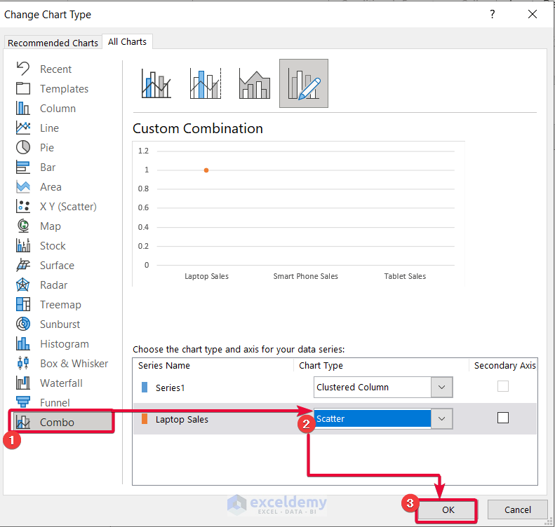
Step 14:
- In the dialog box, select Combo in All Charts.
- Change the chart type of “Laptop Sales” to Scatter.
- Click OK.
- The first dot of the dot plot is created.
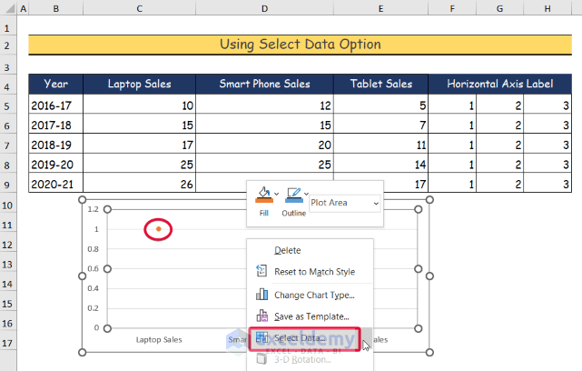
Step 15:
- Right-click the dotted chart.
- Select Select Data.
Step 16:
- Select “Laptop Sales” in the dialog box.
- Choose Add.
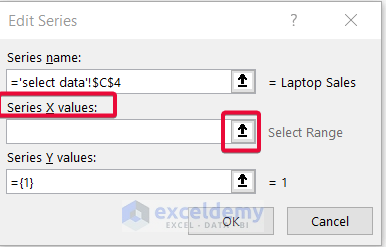
Step 17:
- In Edit Series, choose the upward arrow as shown below.
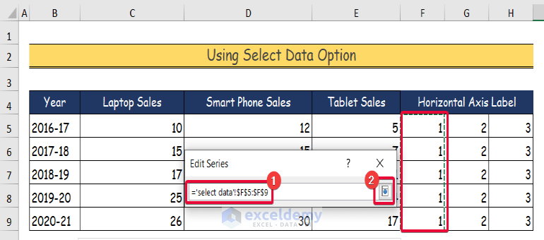
Step 18:
- In the dataset, select the entire column containing 1’s as the horizontal label of the chart. Here, F5:F9.
- Select the downward arrow to confirm the selection.
Step 19:
- The selection is added to the Series X Values.
- Select the upward arrow as shown below.
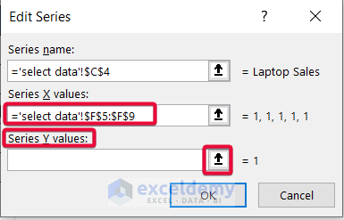
Step 20:
- In the dataset, select the data under “Laptop Sales”. Here, C5:C9.
- Click the downward arrow to confirm the selection.
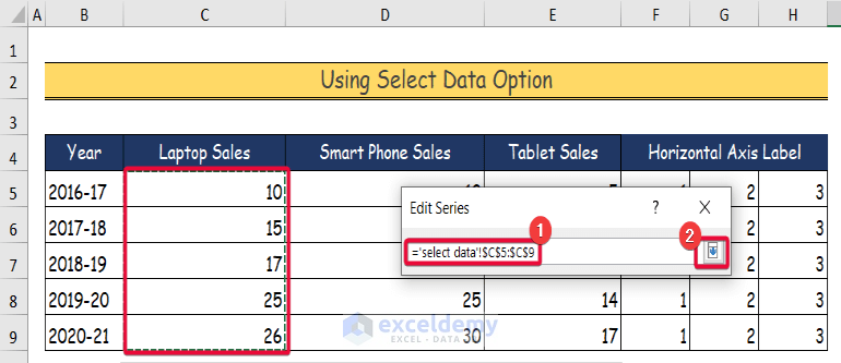
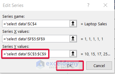
Step 21:
- The selection will be added to the Select Y Values box.
- Click OK.
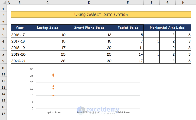
Step 22:
- The dot chart is displayed.
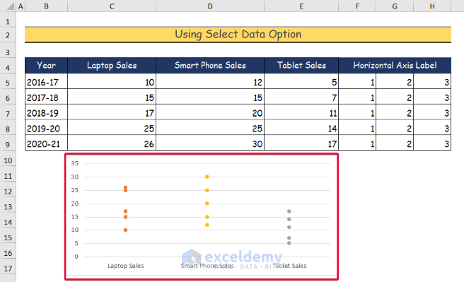
Step 23:
- To get the dot representation for the rest of the data, repeat the procedures from Step 16 to Step 21.
- Select all of the columns that contain 2s and 3s in Series X Values.
- The Series Y Values will be the data under the header rows “Smart Phone Sales” and “ Tablet Sales”.
Method 2 – Applying the COUNTIF Function to Create a Dot Plot in Excel
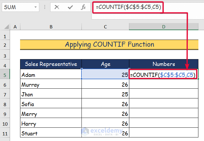
Step 1:
- Select D5 cell and enter the following formula.
=COUNTIF($C$5:$C5,C5)- The first argument of the COUNTIF function is the range C5:C5 with absolute cell references.
- The second argument is the value of the number that the function will count. Here, C5 – 25.
- Press Enter.
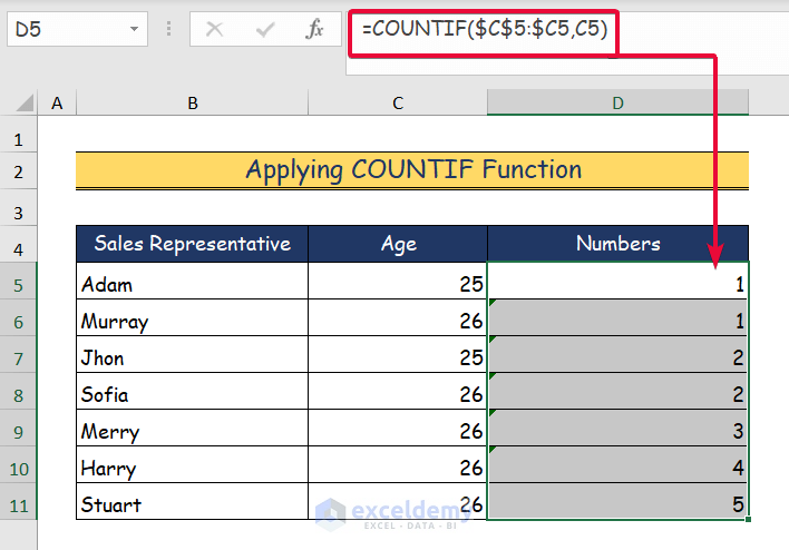
Step 2:
- The value count is displayed: 1.
- Drag down the Fill Handle to see the result in the rest of the cells.
- The formula counts how many times the values 25 and 26 appear with an increment of 1.
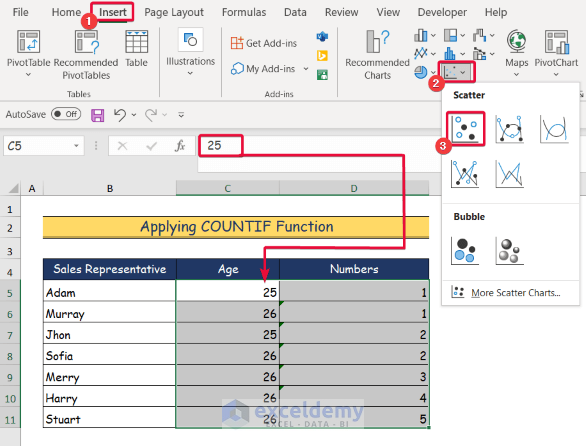
Step 3:
- Select the data you want to plot. Here, C5:D11.
- Go to the Insert tab.
- In Chart, click Scatter chart.
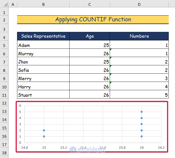
Step 4:
- The dot plot is created.
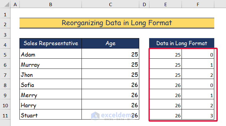
Method 3 – Reorganizing Data in Long Format to Create a Dot Plot
Step 1:
- Reorganize data in long format as shown below.
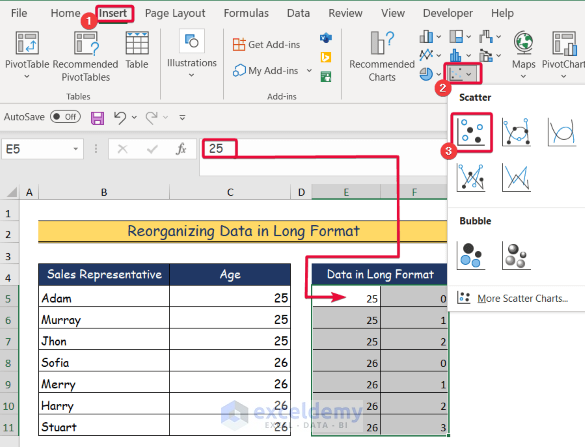
Step 2:
- Select the long formatted data. Here, E5:F11.
- Go to the Insert tab.
- In Chart, click Scatter.
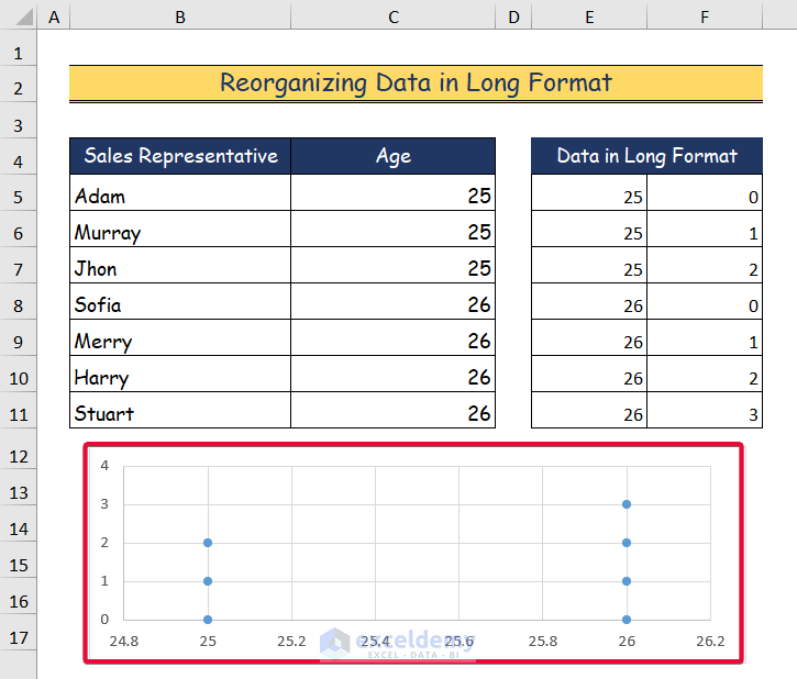
Step 3:
- A dot plot is displayed.
Download the Practice Workbook
<< Go Back To Excel Charts | Learn Excel
Get FREE Advanced Excel Exercises with Solutions!
