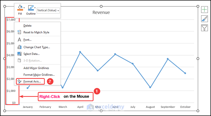
Let’s consider the Revenue Earnings by Month dataset shown in the B4:D14 cells. We have the Month Numbers, the Month Names, and the Revenue earnings ...
Let’s consider a dataset of Yearly Sales of XYZ Traders. The data table has three columns, B, C, and D, indicating the data of No. of Year, Cost, and ...
The dataset showcases the yearly orders of an online shop. In the chart, Excel keeps the first column horizontally and the second column vertically ...
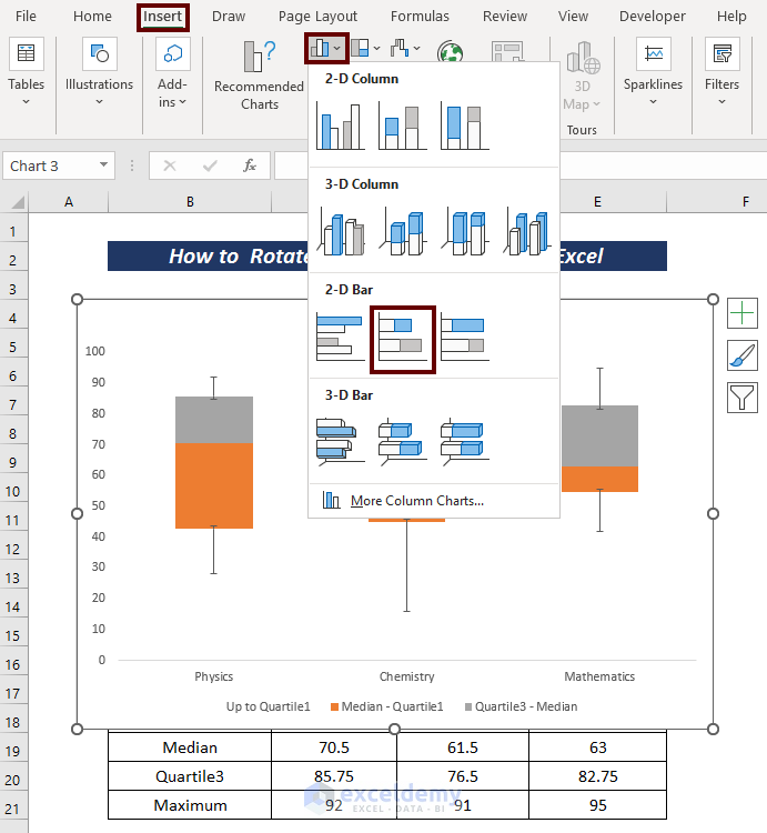
What Is a Box and Whisker Plot?
In Excel, a box and whisker plot is a graphical depiction of a dataset's numerical values. It displays the minimum, ...