What Is an Organizational Chart?
An organizational chart is a diagram where the hierarchy of an organization is depicted.
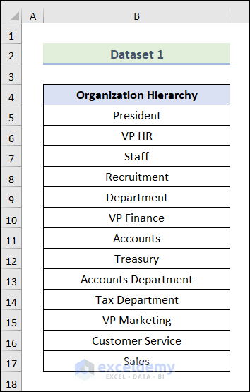
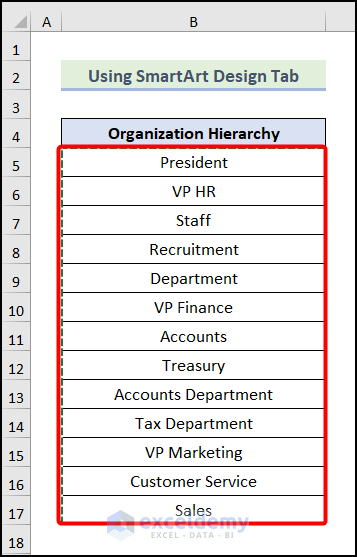
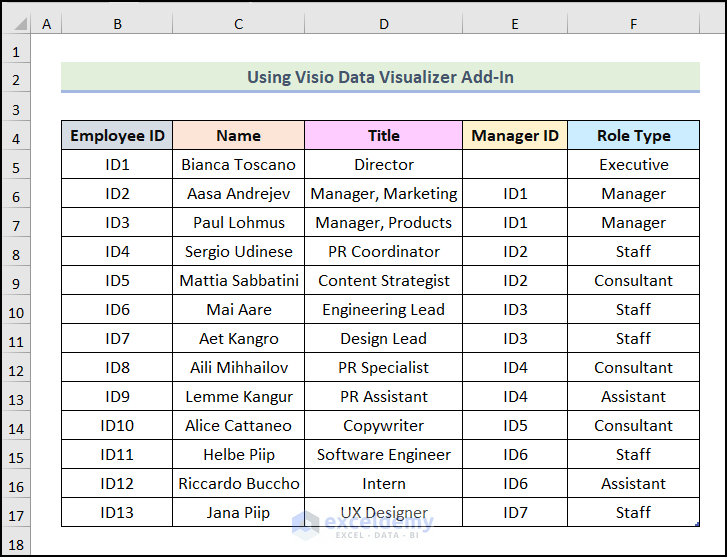
The following dataset showcases an Organizational Hierarchy of a company in the form of a list. To create an organizational chart:
Note: Make sure that the positions written in the list maintain the hierarchy order.
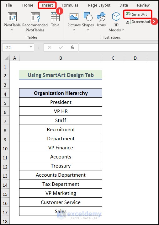
Method 1 – Using the Excel SmartArt Design Tab to Create an Organizational Chart from a List
- Go to the Insert tab.
- Click SmartArt in Illustration.
The Choose a SmartArt Graphic dialog box will open.
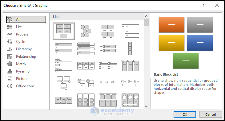
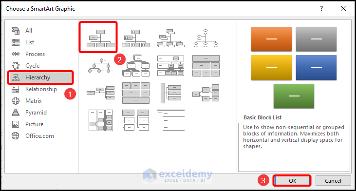
- Select Hierarchy.
- Choose Organization Chart.
The following image will be displayed.
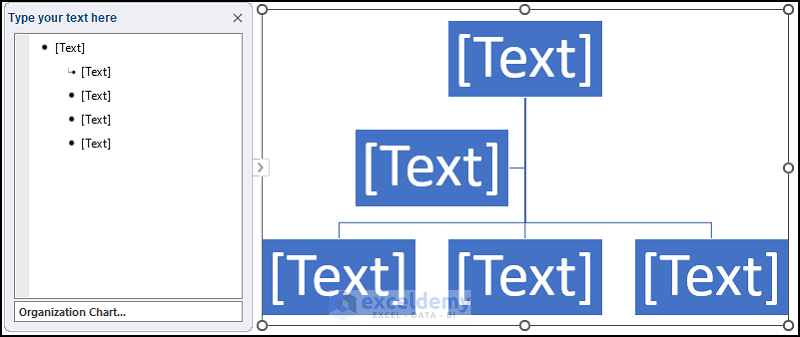
Step 2: Editing the Organizational Chart
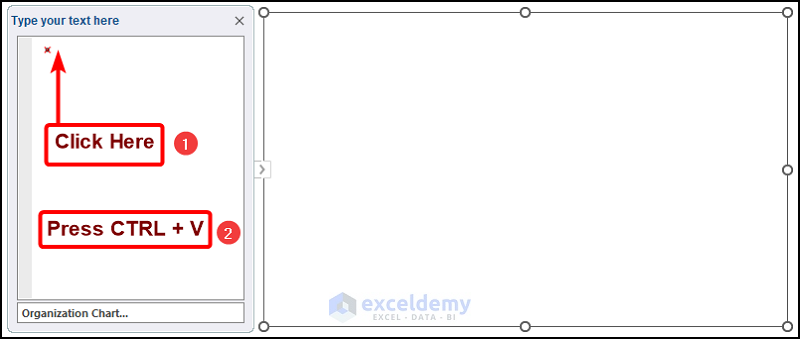
- Click as shown below.
- Press CTRL + A.
- Press DELETE.
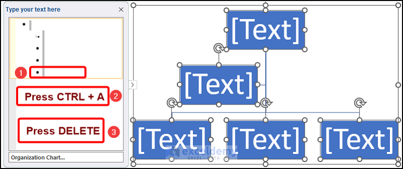
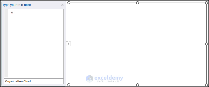
All text and shapes will be removed.
- Select the dataset and press CTRL + C.
- Click as shown below.
- Press CTRL + V to paste the copied items.
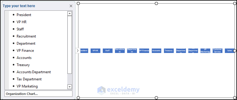
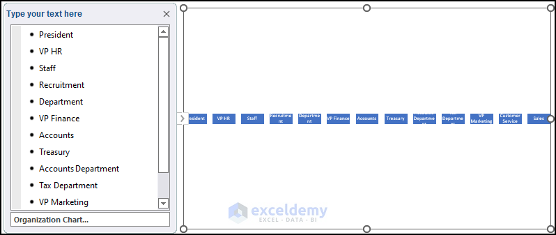
The list will be added:
Step 3: Organizing the Organizational Chart
- Click anywhere in the Organization Chart.
- Click SmartArt Design.
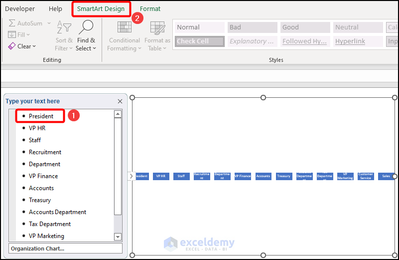
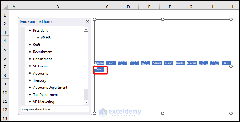
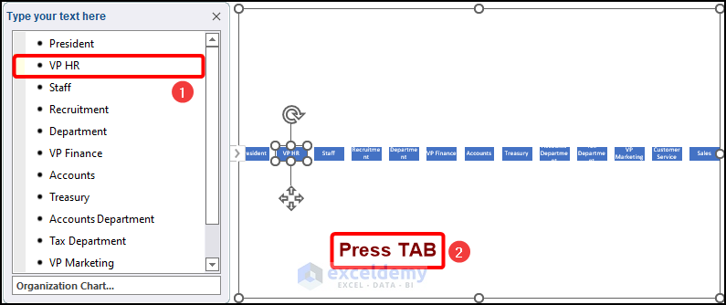
- Click VP HR as shown below.
- Click Demote as VP HR is one position below the President.
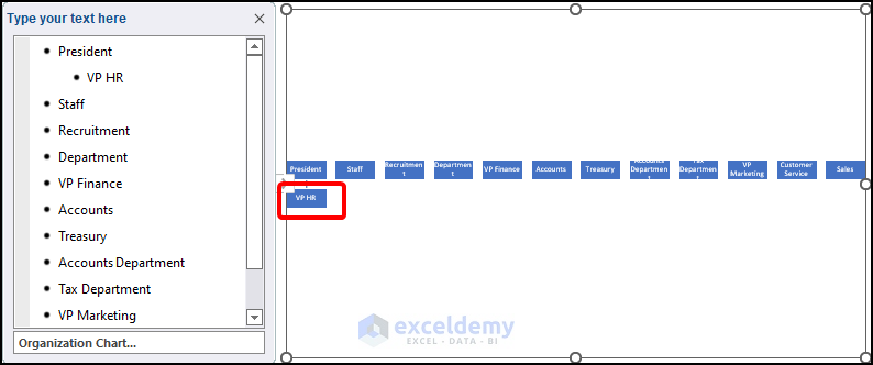
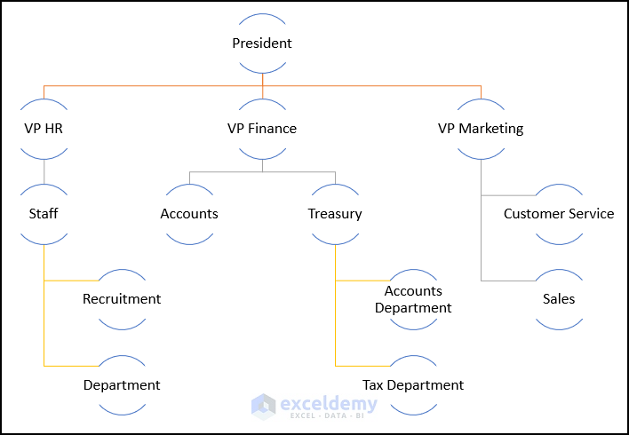
This is the output.
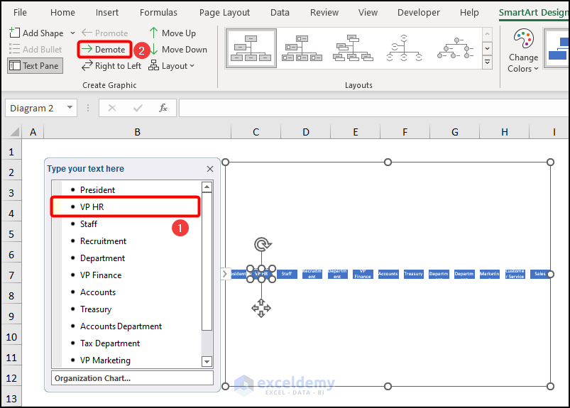
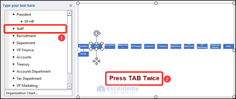
- Choose Staff.
- Click Demote 2 times (it is 2 positions below the President).
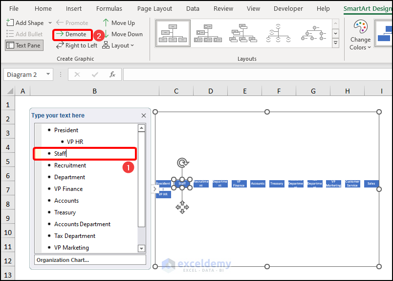
This is the output.
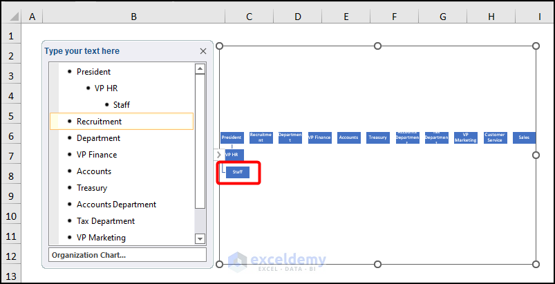
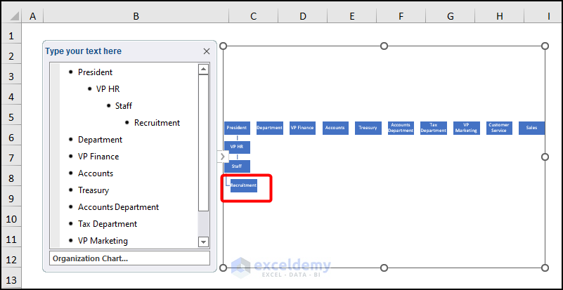
- Select Recruitment.
- Click Demote 3 times (3 positions below the position of the President).
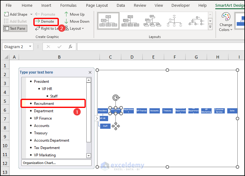
This is the output.
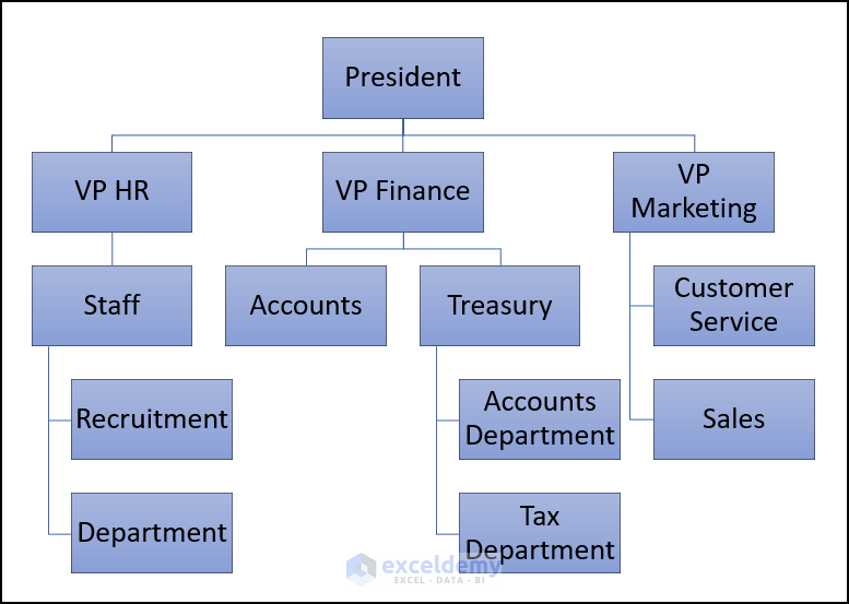
Follow the same steps for the rest of the positions to get the following output.

Method 2 – Using the TAB Button to Create an Organizational Chart from a list in Excel
Steps:
- Select VP HR.
- Press the TAB button 1 time.
The VP HR position is added to one position below the President.
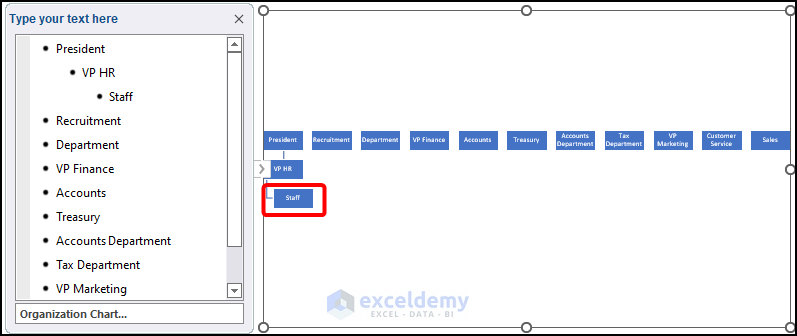
- Click Staff.
- Press TAB 2 times.
This is the output.
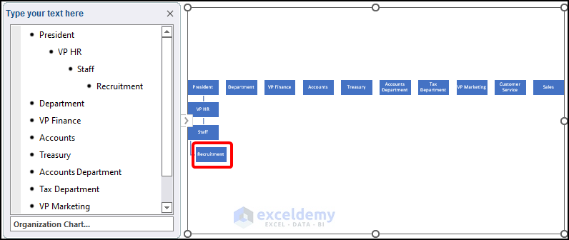
- Choose Recruitment.
- Press TAB 3 times.

This is the output.
Follow the same steps for the other positions to get an organizational chart.
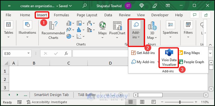
Method 3 – Using Excel Visio Data Visualizer Add-In to Create an Organizational Chart
Steps:
- Go to the Insert tab.
- Choose Add-ins.
- Select Visio Data Visualizer.
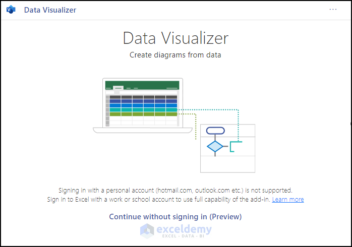
The Data Visualizer dialog box will be displayed.
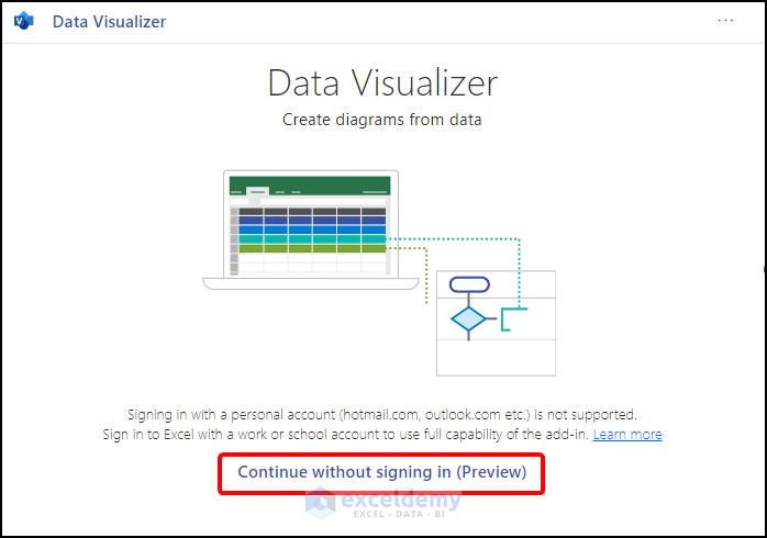
- Click Continue without signing in (Preview).
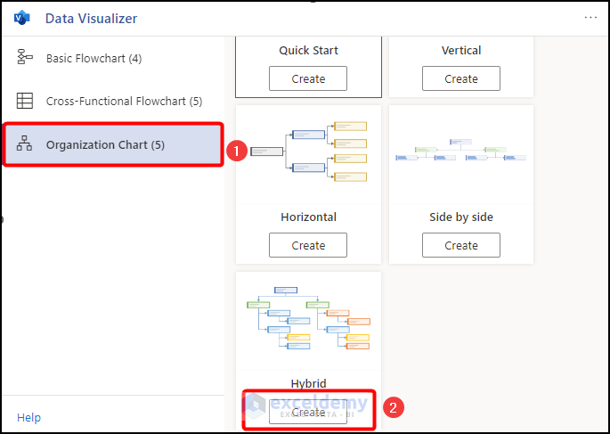
You will see the following image:
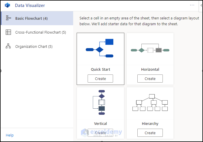
- Select Organization Chart.
- Click Create in Hybrid.
This is the output.
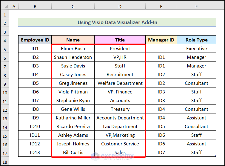
This is a default chart. Edit the data.
- Edit the columns named Name and Title as shown below.
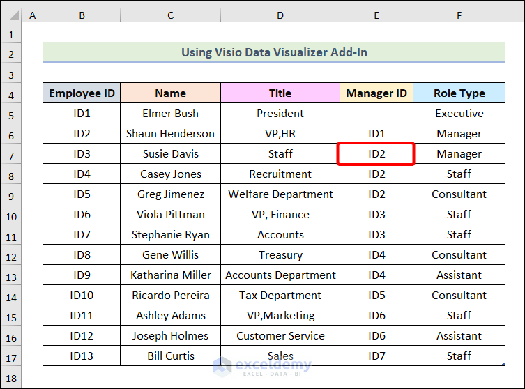
The Manager ID indicates the chain of command. For example, VP, HR reports to the President. So Manager ID of VP, HR is ID1 which is the Employee ID of the President.
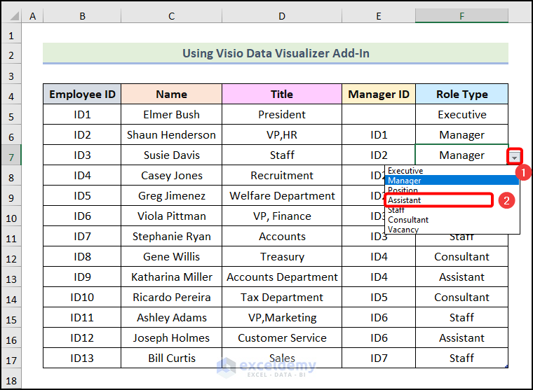
- Edit the Manager ID of the Staff position and enter ID2, as the Staff reports to the VP, HR.
- In the Role Type column, choose Assistant.
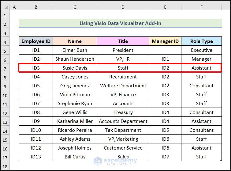
This is the output.
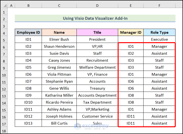
Following the same steps, edit Manager ID and Role Type for the other positions.
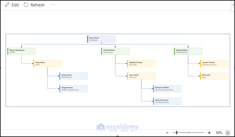
- Go to the diagram beside the table and click Refresh.
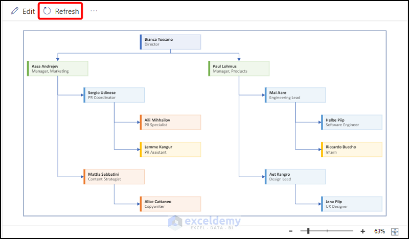
A dynamic organization chart is created.
How to Format an Organizational Chart in Excel
1. Changing the Chart Style
Steps:
- Click SmartArt Design.
- Choose a style in SmartArt Styles. Here, the 3rd option.
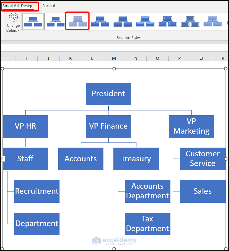
This is the output.

2. Editing the Color of Nodes in an Organization Chart
Steps:
- Click SmartArt Design.
- Select Change Colors.
- Choose an option. Here, the 1st option in Colorful.
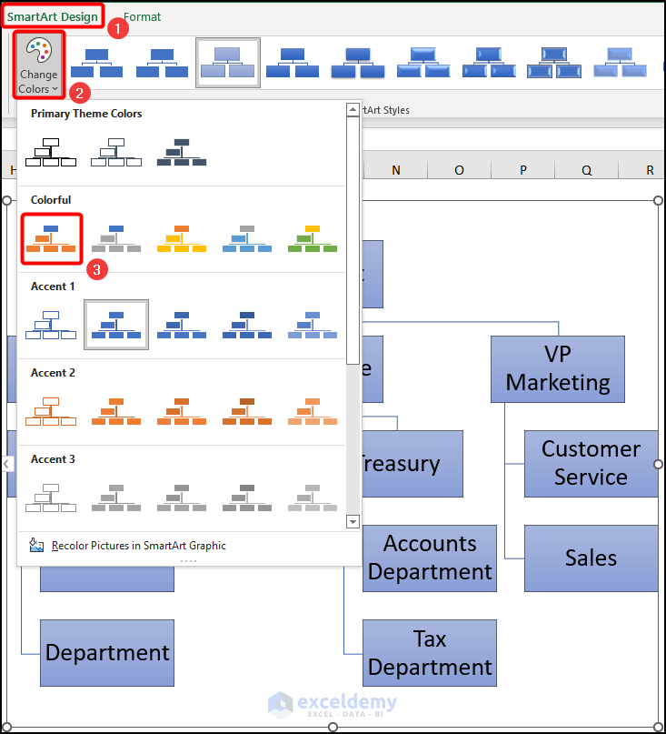
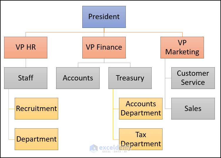
This is the output.
3. Formatting the Chart Layout
Steps:
- Go to SmartArt Design.
- Choose a layout in Layouts.
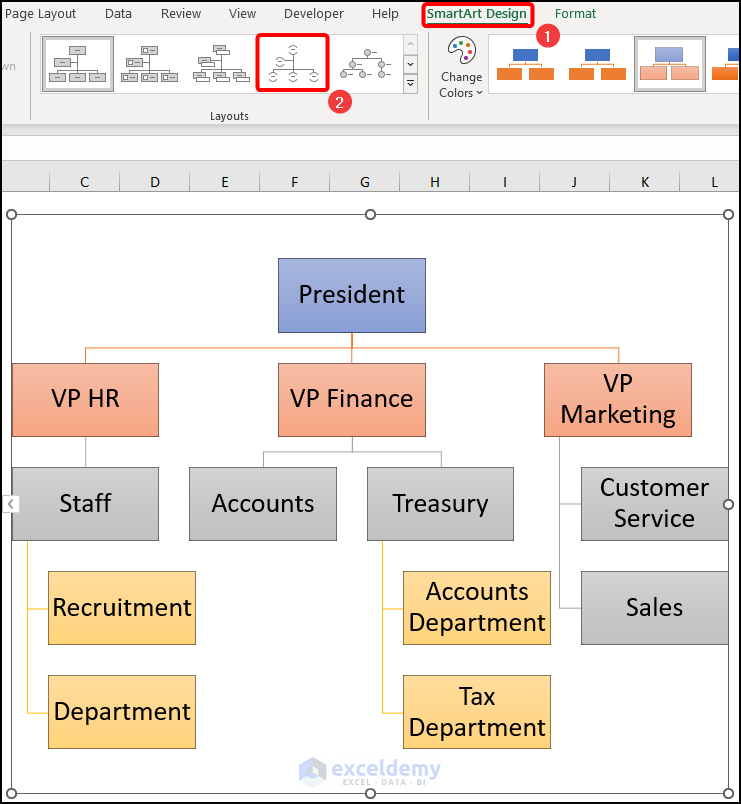
This is the output.
Related Articles
<< Go Back to SmartArt in Excel | Learn Excel
Get FREE Advanced Excel Exercises with Solutions!
