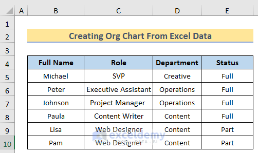
Step 1: Creating an Employee Directory
We will use this dataset to explain a company’s hierarchy. The division is done based on the Role of the employee in the company. The SVP has the highest role in this company, and under their supervision, the Executive Assistant and Project Manager play their roles. All the other members, like Content Writers or Web Designers, work under the supervision of the Executive Assistant and Project Manager.
Step 2: Choosing the Right SmartArt Graphic
- Select all the data, and click on the SmartArt options.
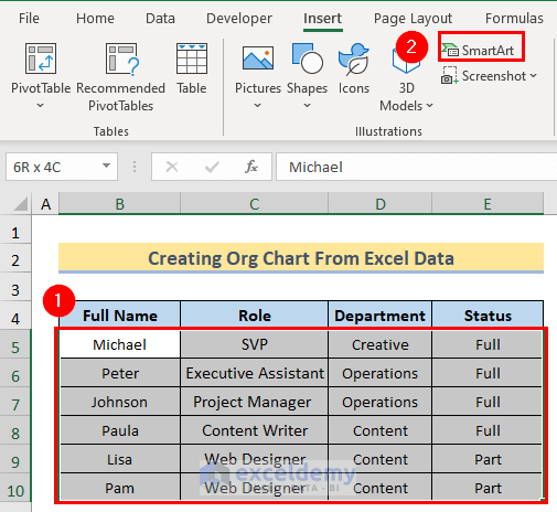
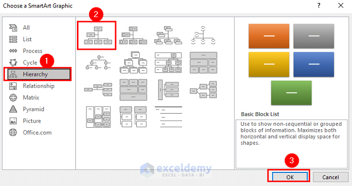
- Choose a SmartArt Graphic window, go to Hierarchy > select desired chart type > OK.
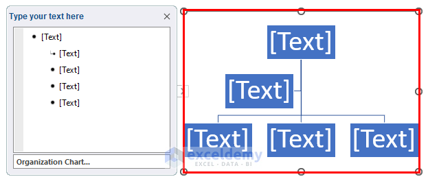
You will get the initial SmartArt Graphic. This graphic chart does not contain data, so in the next step, we will learn how to insert the proper data text in these boxes.
Step 3: Adding Employee Data to the Organizational Chart
We want to add the chart to our data table to represent the chart accordingly.
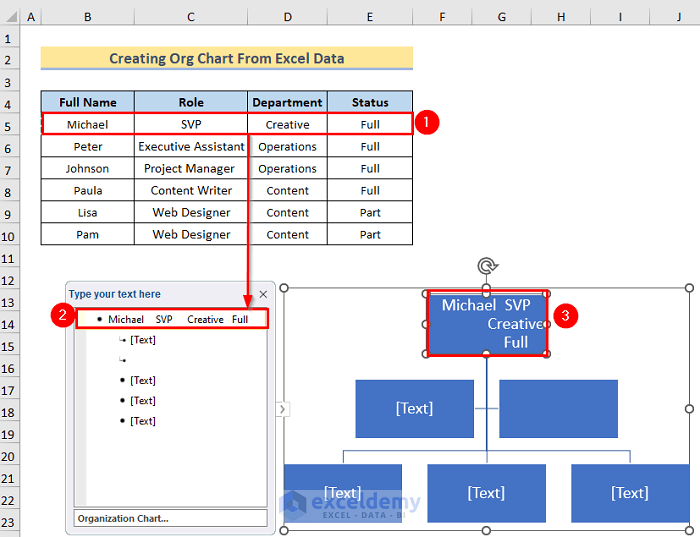
- Copy all the data rows by pressing the Ctrl+C and paste them into the graphic chart using Ctrl+V.
- For each text box, you must manually copy the data from the table and paste it similarly.
- Press Enter to easily add one or two text box options. The whole step looks like the image below.
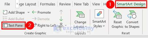
Step 4: Arranging and Customizing the Organizational Chart
- Select the graphic chart.
- Go to the SmartArt Design option and select the Text Pane option to format or customize the data accordingly.
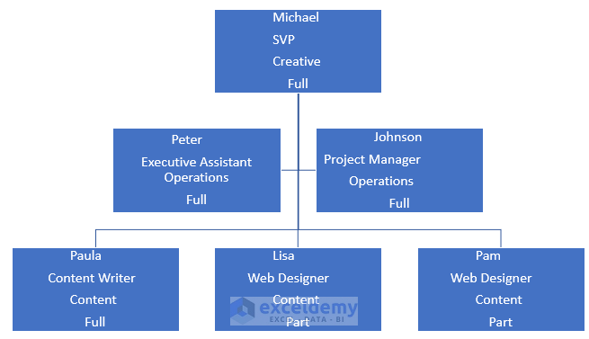
If you have manually inserted all the data rows in the text boxes and customized them correctly, you will get the result below.
Step 5: Saving As an Organizational Chart Template
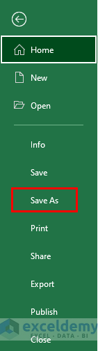
- Go to the File option.
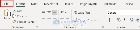
- Select the Save As option.
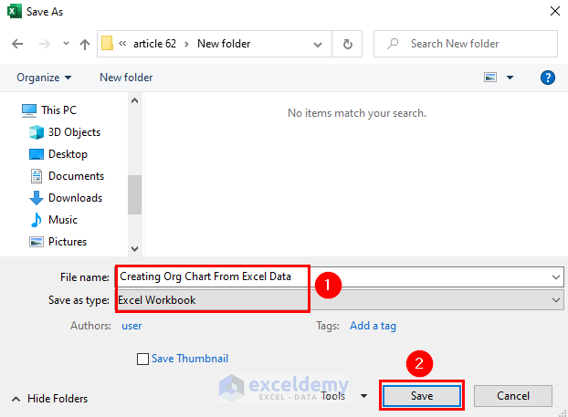
- In the Save As window, select the desired name and file type in the file name and Save as Type. Then press the Save option to save the file as a template.
Things to Remember
- To create the organizational chart, you must use the SmartArt option in the Insert tab.
- After creating the graphic chart, you have taken the inputs manually from the data table and pasted them into the desired box of the graphic chart.
- You must use the Text Pane option in the SmartArt Design tab to customize the text boxes.
- Remember that each of the text boxes must be filled out manually. After creating the graphic chart, you must Save the file as a template; otherwise, the file will be lost.
Download the Practice Workbook
You can download the practice workbook here.
Related Articles
<< Go Back to SmartArt in Excel | Learn Excel

