Sometimes for data visualization, you may need to create an organizational Chart in Excel of your company or any organization. So, in this article, I will explain how to create an organizational chart in Excel.
How to Create an Organizational Chart in Excel: 2 Suitable Ways
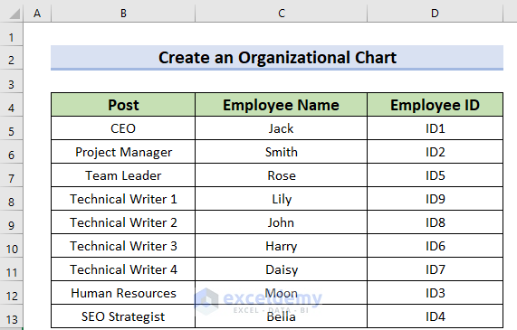
Here, I will explain 2 methods with detailed steps of how to create an Organizational Chart in Excel. For your better understanding, I am going to use the following dataset. Which contains three columns. Those are Post, Employee Name, and Employee ID. The dataset is given below.
1. Use of SmartArt Feature to Create an Organizational Chart in Excel
You can use the SmartArt feature to create an Organizational Chart in Excel. This is a manual process. Here, you have to insert or even remove the data manually inside the Shape. The steps are given below.
Step 1: Inserting Hierarchy Chart
A Hierarchy chart is a way to show the flow from top to bottom. Here, you will see how to insert the hierarchy chart.
- Firstly, you have to open the workbook.
- Secondly, from the Insert tab >> you need to select the SmartArt feature.

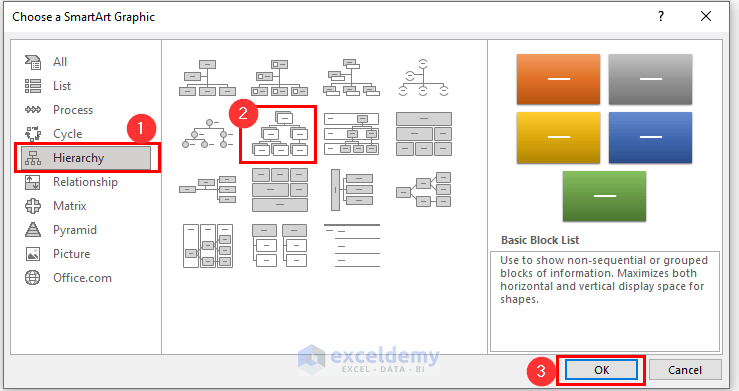
At this time, a dialog box named Choose a SmartArt Graphic will appear.
- Now, from that dialog box >> you need to go to the Hierarchy option.
- Then, you have to choose your preferred shape. Here, I’ve chosen Hierarchy.
- Subsequently, you must press OK to get the shape.
Finally, you will get the following Hierarchy of graphic art.

Step 2: Writing Down in Hierarchy
In this section, you will see how to include target text in the Hierarchy.
- Firstly, you have to click on the box where you want to include the text.

- Here, you can see that I have written CEO then you must press the ENTER button to write the name of CEO “Jack” just below the same box.
- Now, for changing the font select the Text >> then you should Right Click on the text.
- Then, from the Context Menu Bar >> you may change the Font Size to your preferred way.
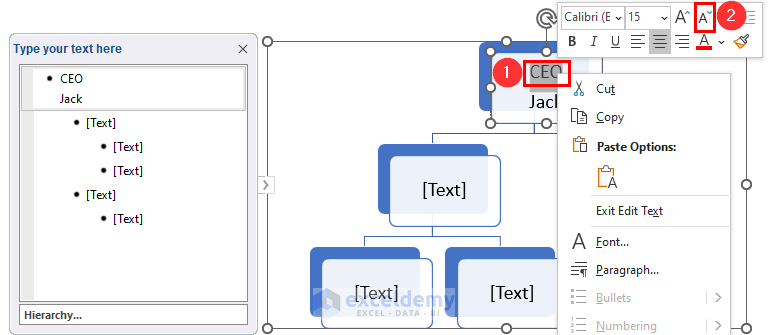
As you can see, I have kept the Font Size of CEO to 12 and Jack to 10.

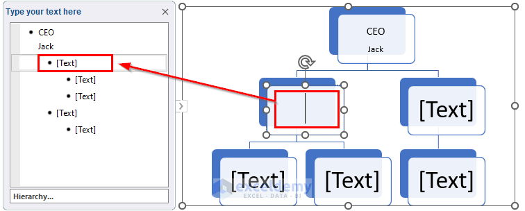
- Similarly, you have to write down the text in the other boxes. Here, you can also type the text to the dialog box named Type your text here.
- To delete any box, you should select that box and then press DELETE.

In this step, lastly, I have made the following Hierarchy.

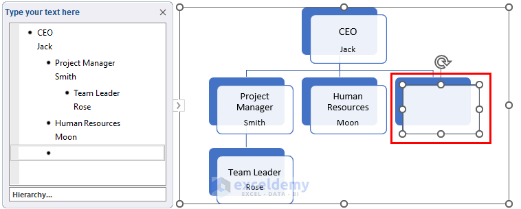
Step 3: Include New Boxes in Hierarchy
Here, I will add new boxes to the Hierarchy.
- Firstly, you need to right click on the box. Which will act as a reference for the upcoming box.
- Secondly, from the Context Menu Bar >> select the Add Shape option >> then you need to choose the preferable one. Here, I wanted to add a new shape after the Human Resources post. Thus, I have chosen Add Shape After.

After that, you will see the following modified Hierarchy.
Again, I want to add other boxes. Here, I will use the Custom Ribbon as an alternate way.
- Firstly, you have to select the box which will be the reference.
- Secondly, from the Smart Design ribbon >> you should click on the Add Shape feature.
- Thirdly, choose your preferred option.

- Repeat the same process to add more shapes.
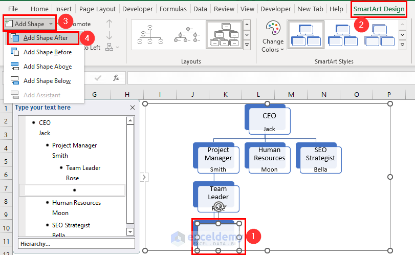
Finally, you will get the following result.

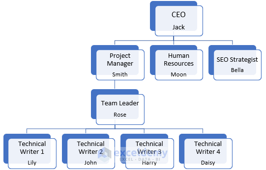
Here, I have added only the Hierarchy which is the Organizational Chart.
2. Employing Add-ins Feature to Create a Dynamic Organizational Chart
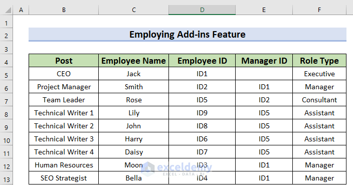
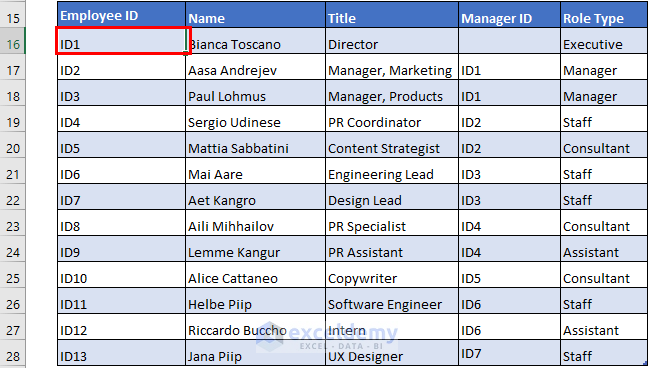
You can employ the Add-ins feature to create an Organizational Chart in Excel. This is a dynamic process. Here, you can update your data. In addition, I will use the following dataset for this method. Which has 5 columns.
For making the dataset, you have to be very careful as all those 5 columns are a must for a Hybrid Hierarchy. Furthermore, the Manager ID must remain in the Employee ID. Moreover, Manager ID denotes the position of the Organization. As CEO is the owner so there is no Manager ID for him/her. ID1 denotes the next position of CEO. ID2 denotes who will be under 1st ID1. Similarly, ID3 will be under 2nd ID1. ID4 will be under 3rd ID1. Then, ID5 will be under 1st ID2, and so on.
Step 1: Inserting Chart
Let’s insert the Organizational Chart.
- Firstly, you have to select a cell where you want to add the chart. Here, I have selected the B15 cell. Also, you can use a new sheet. In that case, you have to go to that sheet.
- Secondly, from the Developer tab >> you have to go to the Add-ins feature.

At this time, a dialog box named Office Add-ins will appear.
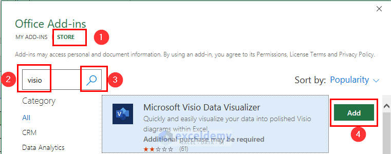
- Now, from that dialog box >> go to the STORE option.
- Then, you may type visio in the search box.
- After that, click on the Search icon.
- Finally, click on Add to the Microsoft Visio Data Visualizer.
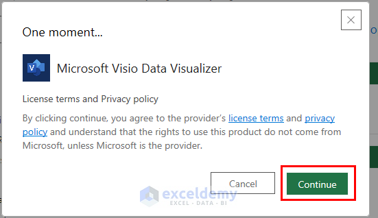
At this time, a dialog box named One moment… will appear.
- Now, you should press Continue to that box.
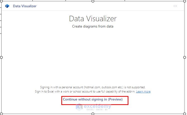
Subsequently, the Data Visualizer window will appear.
- Now, you should click on Continue without signing in (Preview). If you have an office 365 account then you don’t need to use this step.
- After that, from the Organization Chart feature >> choose your preferred way. Here, I have chosen Hybrid.
- Then, you need to click on the Create option.

Finally, you will see the following Organizational Chart with a template data table.
Step 2: Including Organization Information
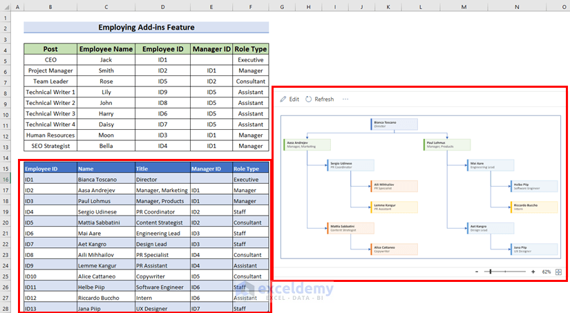
In this section, I will add my organizational information to the data Table of the Template.
- Firstly, you should select the data range. Here, I have selected the D5:D13 range of the Employee ID column.
- Secondly, use Excel keyboard shortcuts CTRL+C to copy these values.

- Now, press CTRL+V to paste that to the Employee ID column.
- Similarly, include the data of Name, Title, Manager Id, and Role Type.
As my data is less than the Template’s data, I have to remove the other values.
- At this time, move the Mouse Cursor to the blue corner of the table.
- Then, Click on that and drag the Cursor up to the data you want to keep.
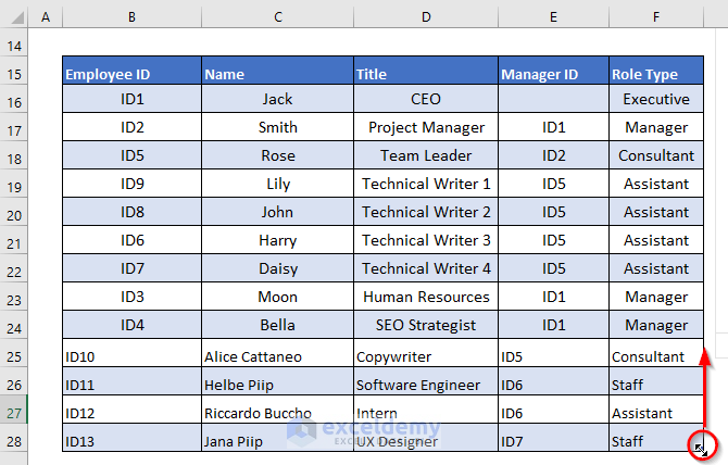
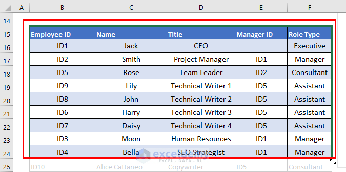
Here, I have removed the data A25:F28. In the same way, you can add more information by dragging the Mouse Cursor down.
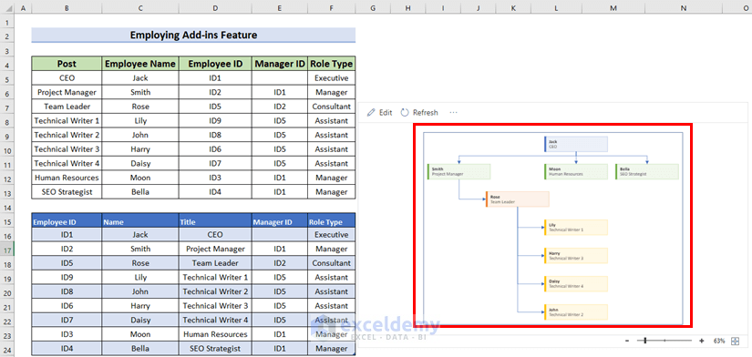
- Lastly, press on the Refresh feature in the chart.

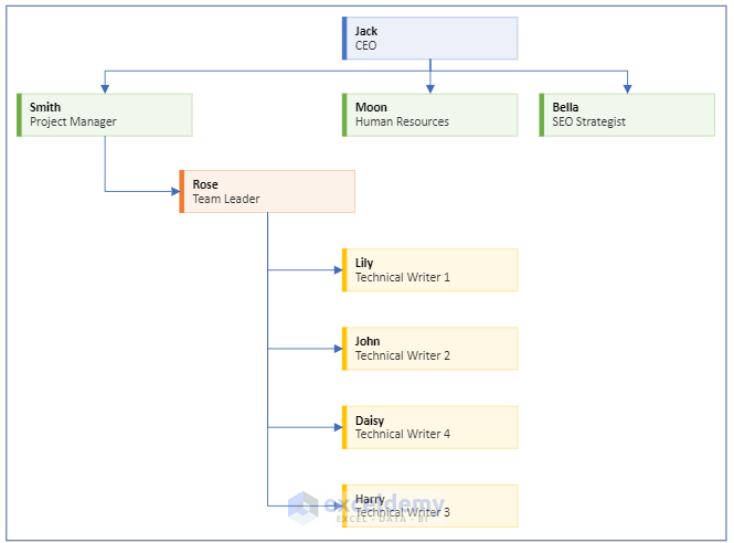
Finally, you will see the following Organizational Chart with the given information.
Here, I have added only the Hierarchy which is the Organizational Chart.
💬 Things to Remember
- In the case of method 2, you must make your dataset according to the data table of the Template.
- Furthermore, method 1 is a manual process.
- On the other hand, method 2 creates the Dynamic Organizational Chart.
You can download the practice workbook from here:
Conclusion
I hope you found this article helpful. Here, I have explained 2 methods to create an Organizational Chart in Excel. Please, drop comments, suggestions, or queries if you have any in the comment section below.
Organizational Chart in Excel: Knowledge Hub
<< Go Back to SmartArt in Excel | Learn Excel
Get FREE Advanced Excel Exercises with Solutions!
