Method 1 – Make Both Sided Confidence Interval Graph Using Margin Value
Steps:
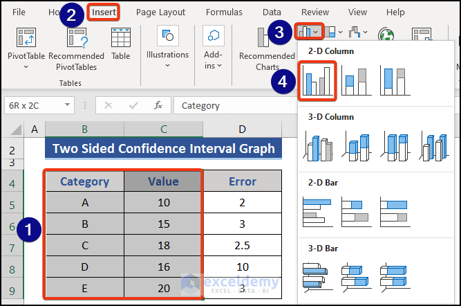
- Choose the Category and Value columns.
- Go to the Insert tab.
- Choose Insert Column or Bar Chart from the Charts group.
- Select Clustered Column from the list of charts.
- Look at the graph.
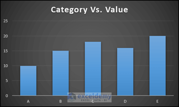
This is the Category Vs Value graph.
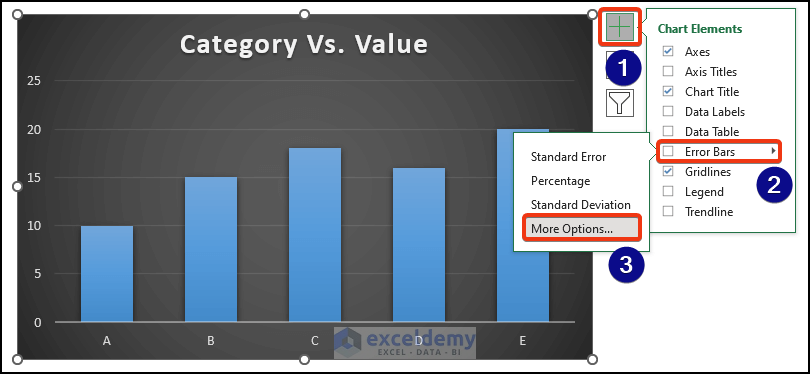
- Click on the graph.
- See an extension section on the right side of the graph.
- Click on the Plus button.
- We choose the Error Bars option from the Chart Elements section.
- Select the More Options from Error Bars.
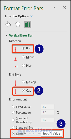
- We can see the Format Error Bars appear on the right side of the sheet.
- Mark Both as Direction and Cap from the End Style section.
- Go to the Custom option of the Error Amount section.
- Click the Specify Value tab.
- See the Custom Error Bars window appears.
- Put the Range D5:D9 on both of the boxes.
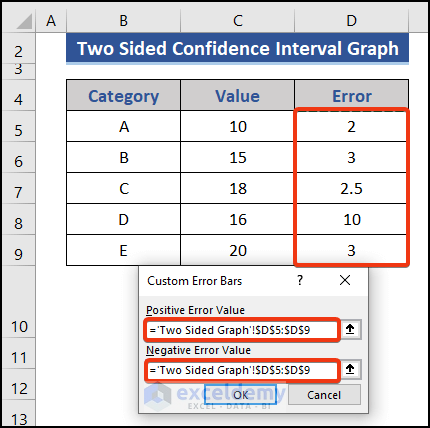
- Press the OK
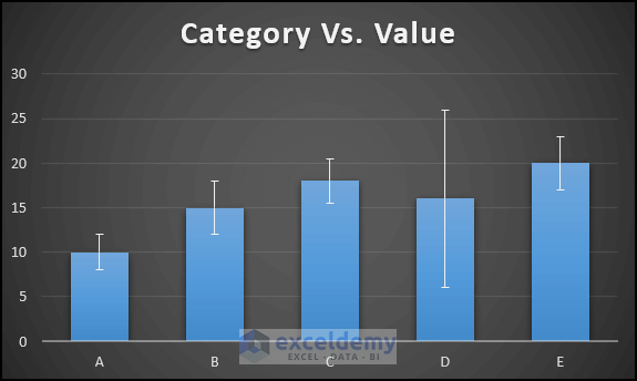
We can see a line on each of the columns. Those indicating the confidence interval amount.
Method 2 – Use Both Upper and Lower Limits to Create a Confidence Graph
Steps:
- Add two columns to the dataset.
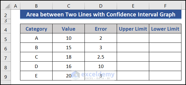
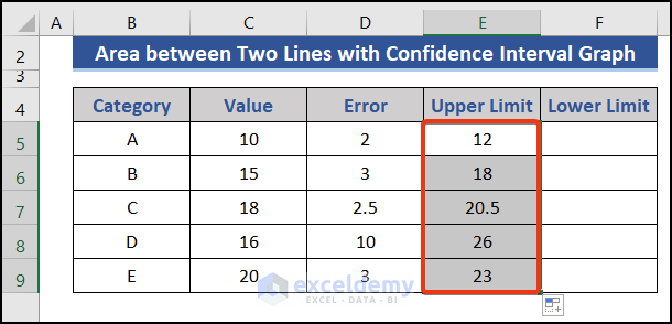
- Go to Cell E5 and sum the value and error columns.
- Put the following formula on that cell.
=C5+D5
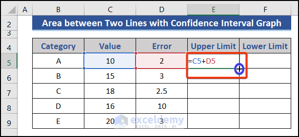
- Pull the Fill Handle icon downwards.
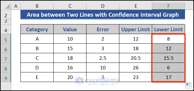
- Calculate the lower limit at Cell F5. Put the following formula.
=C5-D5
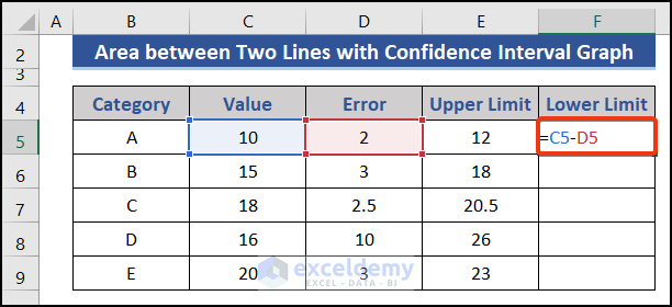
- Drag the Fill Handle icon.
- Choose the Category, Upper Limit, and Lower Limit columns.
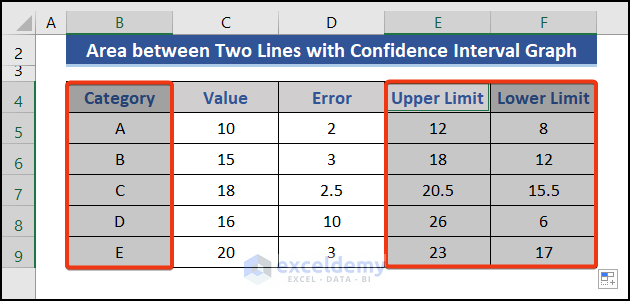
- Go to the Insert tab.
- Choose Insert Line or Area Chart from the Charts group.
- Select the Line graph from the list.
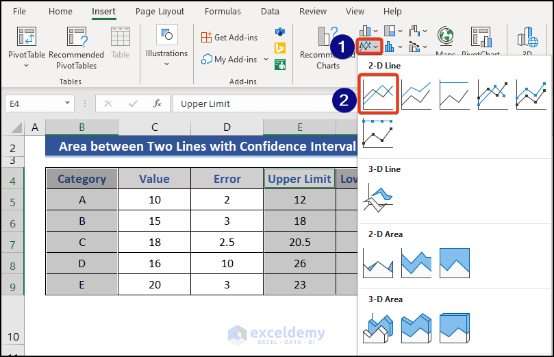
- Look at the graph.
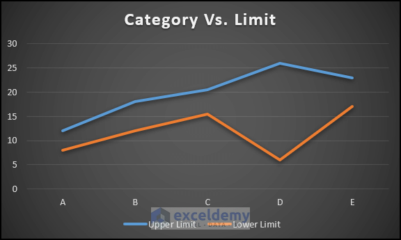
The area between the two lines is the area of concentration. Our desire will be between that range.
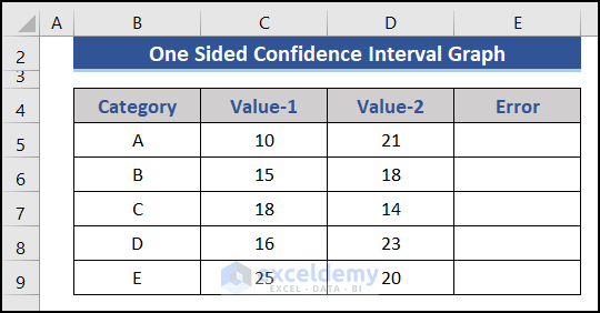
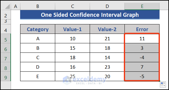
Method 3 – Make a One-Sided Confidence Interval Graph for Error
Steps:
- Add a new column on the right side to calculate the difference indicating the error.
- Go to Cell E5 and put the following formula.
=D5-C5
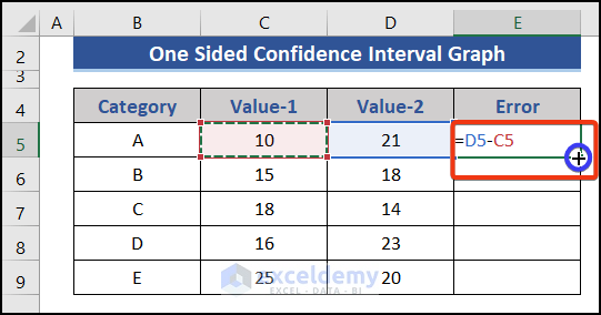
- Drag the Fill Handle icon downwards.
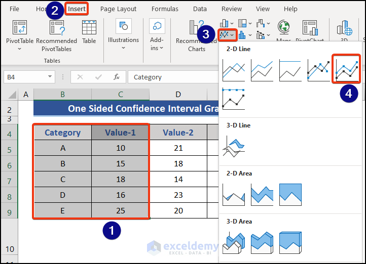
- Select the Category and Value-1 Press the Insert tab.
- Choose Insert Line or Area Chart from the Charts group.
- Select the Stacked Line with Markers chart from the list.
- Look at the graph.
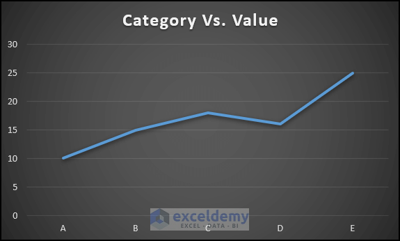
This is the graph of Category Vs. Value.
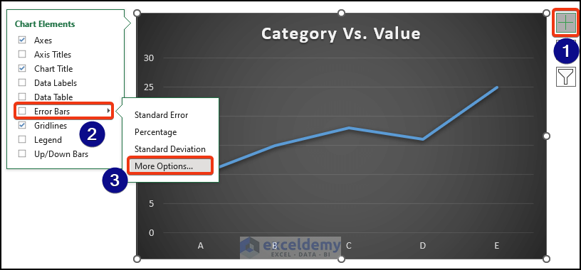
- Click on the graph.
- Press the Plus button from the right side of the graph.
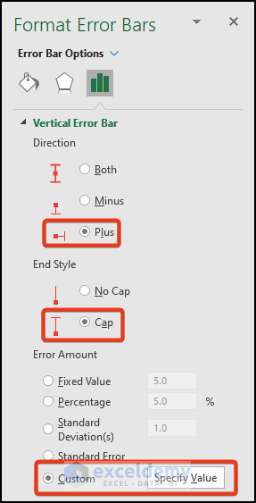
- Proceed to Chart Elements >> Error Bars >> More Options.
- The Format Error Bars window appears.
- Choose Plus as Direction, Cap as End Style, and click on the Custom option from the Error Amount section.
- Click the Specify Value option.
- The Custom Error Value window appears.
- Input the range from the Error column on both boxes.
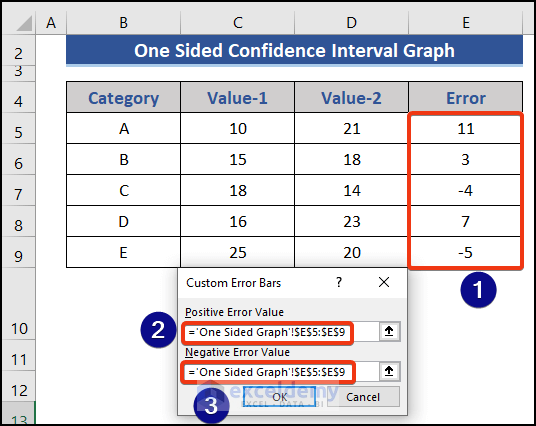
- Press OK.
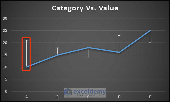
We can see bars on both sides of the line. Esteemed values may be lower or upper than the standard value.
Download Practice Workbook
Download this practice workbook to exercise while you are reading this article.
Related Articles
- Linear Regression Confidence Interval in Excel
- How to Calculate Confidence Interval in Excel
- How to Find Confidence Interval in Excel for Two Samples
<< Go Back to Confidence Interval Excel | Excel for Statistics | Learn Excel
Get FREE Advanced Excel Exercises with Solutions!
