Steps
- Select the entire dataset (B4:C13). Then go to Insert >> Insert Scatter (X, Y) or Bubble Chart >> Scatter as shown below.

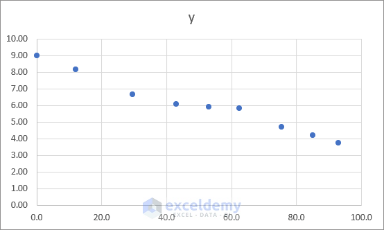
- The following chart will be created.
- Click the chart Element icon in the upper-right corner and enable linear Trendline. Go to More Options or double-click Trendline.
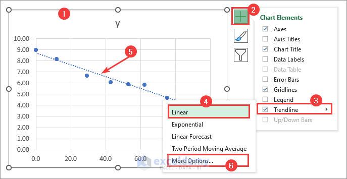
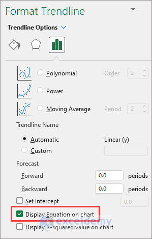
- Check the Display Equation on chart checkbox.
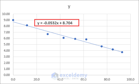
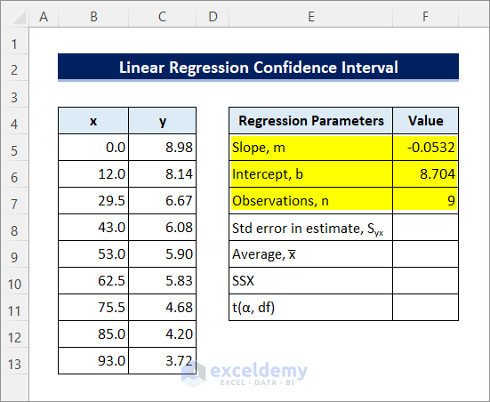
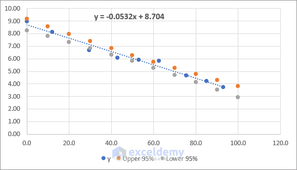
- Y = -0.0532x + 8.704 will appear on the chart. Comparing it to the linear regression equation yields m = -0.0532 and b = 8.704. Use the SLOPE and INTERCEPT functions to calculate these results.
- Enter the values of Slope (m), Intercept (b), and Observations (n) in cells F5:F7 Use the COUNT function to get the sample count or observations to be 9.
- Enter the following formula in cell F8 to calculate the Standard Error. The STEYX function returns the standard error of the predicted y-value for each x in a regression.
=STEYX(C5:C13,B5:B13)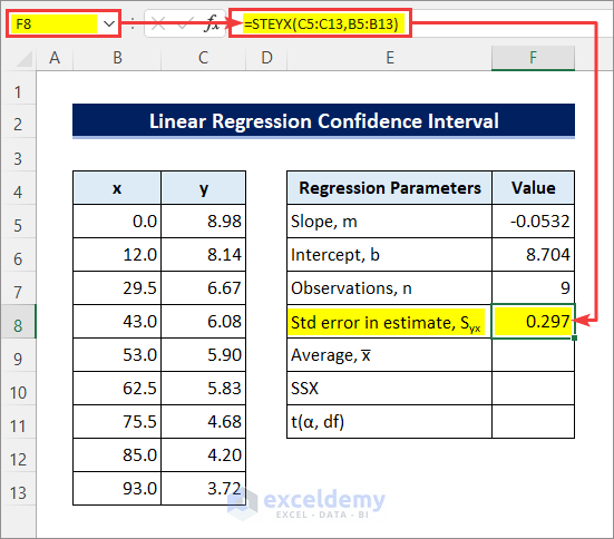
- Apply the following formula in cell F9 to get the sample mean or average. Here we will use the AVERAGE function to do that.
=AVERAGE(B5:B13)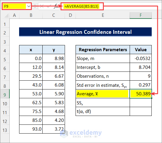
- Enter the following formula in cell F10 to get the sum of squares of the variances. The DEVSQ function returns the sum of squares of deviations of data points from their sample.
=DEVSQ(B5:B13)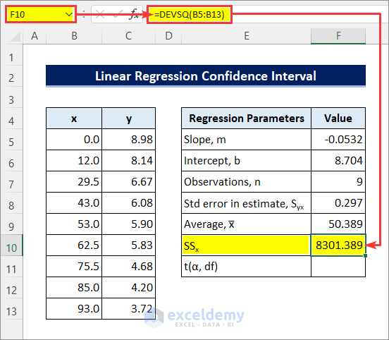
- Apply the following formula in cell F11 to calculate the t-value. Use the T.INV.2T function for that.
=T.INV.2T(0.05,F7-2)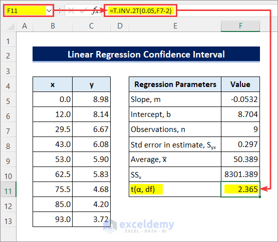
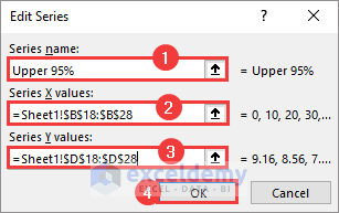
- Calculate the confidence interval for each data point. The range of x is 0 to 93. Calculate the confidence intervals for the x values 0, 10, 20,…….,100 as shown in cells B18:B28. Enter the formula in cell C18 and drag the Fill Handle icon below to do that. The SQRT function returns the square root of values.
=$F$11*$F$8*SQRT(1/$F$7+(B18-$F$9)^2/$F$10)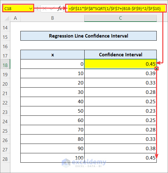
- Apply the following formula in cell D18 to get the y values at the Upper 95% Confidence Interval.
=($F$5*B18+$F$6)+C18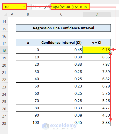
- Enter the following formula in cell E18 to get the y values at the Lower 95% Confidence Interval.
=($F$5*B18+$F$6)-C18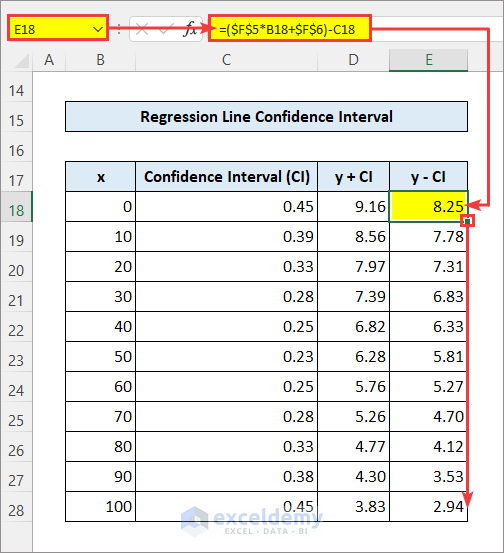
Interpreting Confidence Intervals in Linear Regression
- Right-click on the Chart Area to go to Select Data.
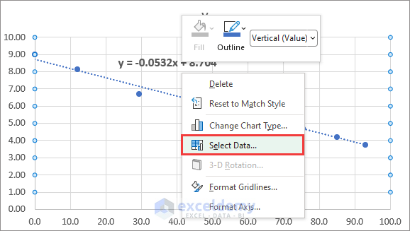
- Click Add.
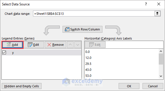
- Enter a Series name for the Upper 95 Confidence Intervals. Use the x column for Series X Values and the y + CI column for Series Y Values. Click OK.
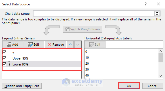
- Insert the lower 95% confidence intervals in the chart. Make sure all the Data Series are checked, and click OK.
- The regression chart will look as follows.
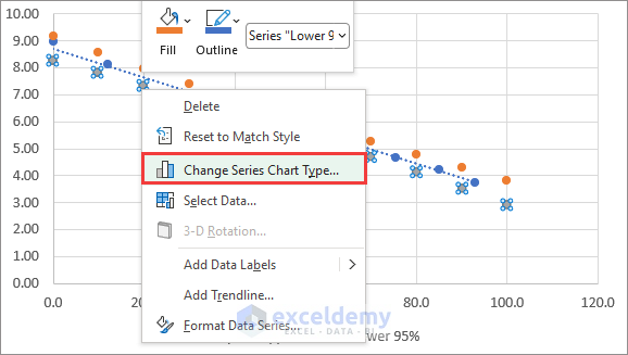
- Right-click on any of the confidence interval data series and click on Change Series Chart Type.
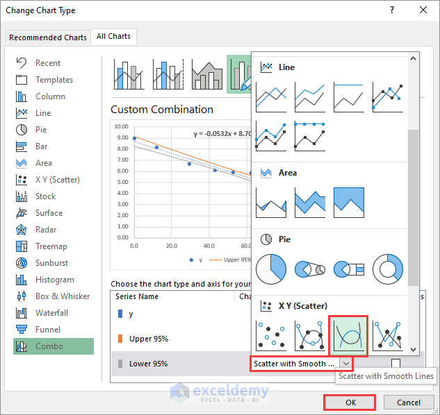
- Then change the chart type to Scatter with Smooth Lines for both confidence interval data series and click OK.
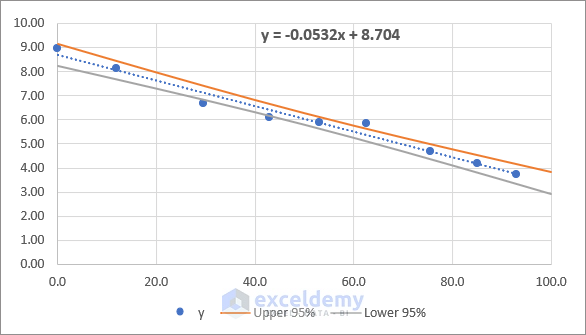
- The regression chart will look as follows. The chart explains that the assumption of the 95% probability of the regression data points falling between the confidence intervals is valid.
Things to Remember
- Don’t forget to apply absolute references in the formulas when necessary to avoid erroneous results.
- A confidence interval is not a guarantee but rather a probability.
Download Practice Workbook
You can download the practice workbook from the download button below.
Related Articles
- How to Make a Confidence Interval Graph in Excel
- How to Calculate 99 Confidence Interval in Excel
- How to Find Confidence Interval in Excel for Two Samples
- How to Find Upper and Lower Limits of Confidence Interval in Excel
- How to Calculate Confidence Interval in Excel
<< Go Back to Confidence Interval Excel | Excel for Statistics | Learn Excel
Get FREE Advanced Excel Exercises with Solutions!
