Solution 1: Selecting Correct Data Label Reference to Display All Labels
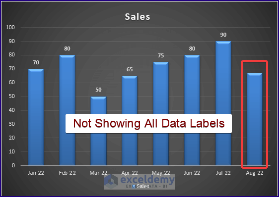
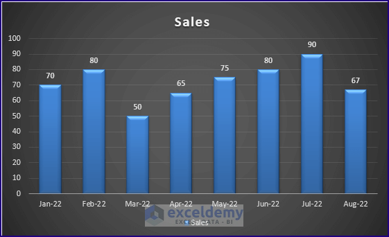
Users normally insert Excel charts (Insert > Charts) and tick the data labels option to display all the data labels. However, some users may use the Value from Cells option to insert the data labels. In that case, they select a partial or incorrect range to insert the data labels. And in the end, they end up looking like the picture below.
Steps:
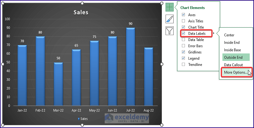
- Click on the chart. The side Menu appears.
- Click the Plus icon > Data Labels > More Positions.
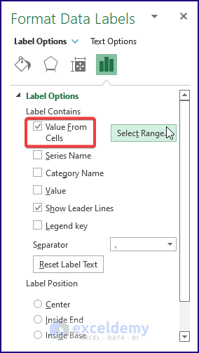
- The Format Data Labels side window pops up. You can see the Value from Cells option is ticked.
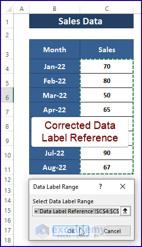
- Click on the Select Range.
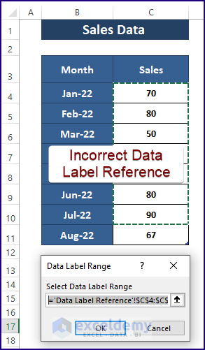
Data Label Range dialog box displays the assigned range. And from it, you can say that the range is partial or incorrect.
- Assign the correct data label range, and click OK.
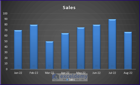
Excel inserts all the data labels as it should, as shown in the image below.
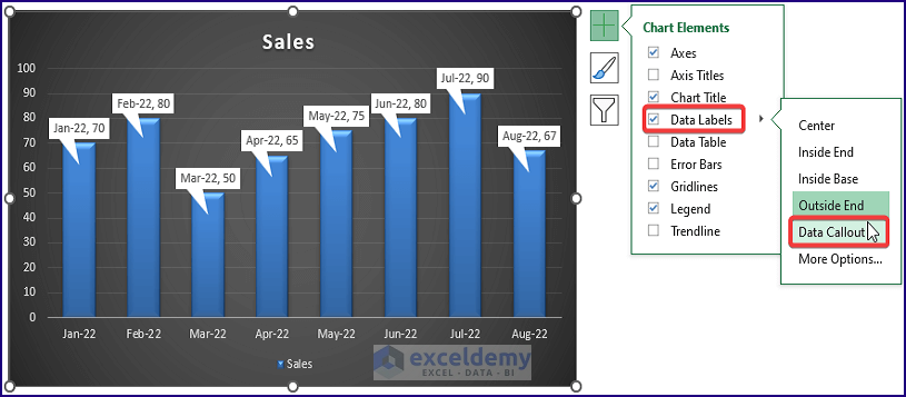
Alternative to the steps, users can simply display all the data labels by applying Data Callout.
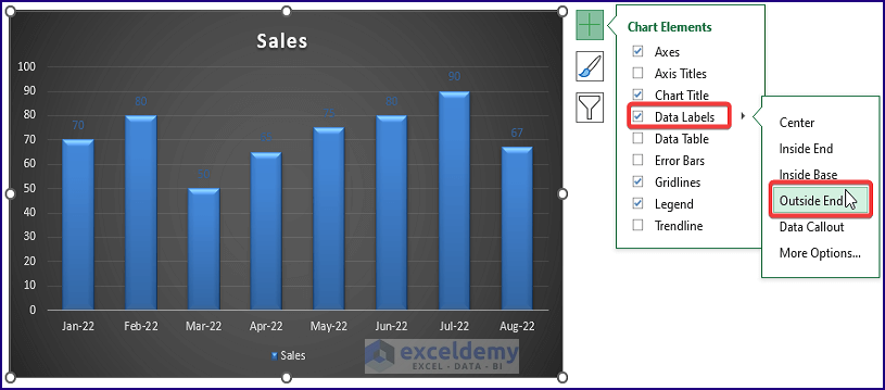
Solution 2: Changing Data Label Color and Position to Show All Data Labels
Often, users use the same data label font and chart color unconsciously. Also, they position the data label inside the Charts’ Elements. Therefore, it’s difficult to see the data labels, or they are not clearly visible.
Steps:
- Click on the Plus icon > Data Labels > Choose Outside End.
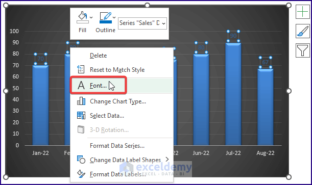
- Select all the data labels and then right-click on them.
- Choose Font from the Context Menu options.
Read more: How to Add Additional Data Labels to Excel Chart
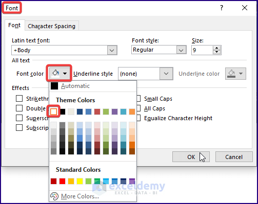
- Excel opens the Font window.
- Select a color as the Font color (here, White is chosen).
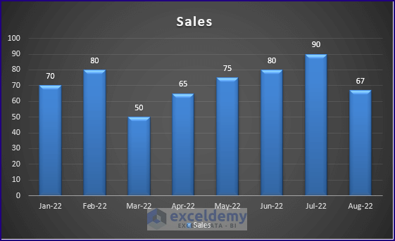
Selecting a different font color results in displaying all the data labels.
Read More: How to Add Data Labels in Excel
Download the Excel Workbook
Related Articles
- How to Remove Zero Data Labels in Excel Graph
- How to Rotate Data Labels in Excel
- How to Change Font Size of Data Labels in Excel
- How to Move Data Labels In Excel Chart
- How to Hide Zero Data Labels in Excel Chart
- How to Edit Data Labels in Excel
- How to Format Data Labels in Excel
<< Go Back To Data Labels in Excel | Excel Chart Elements | Excel Charts | Learn Excel
Get FREE Advanced Excel Exercises with Solutions!
