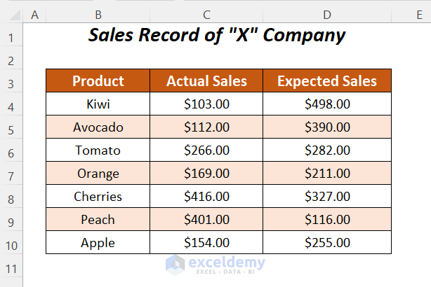
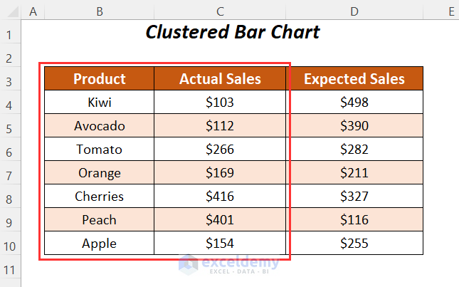
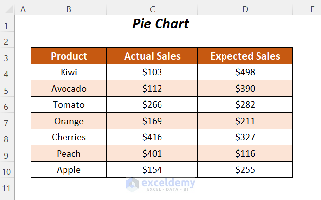
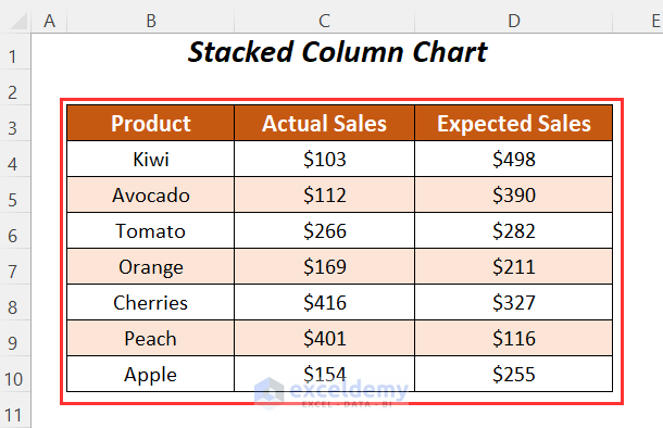
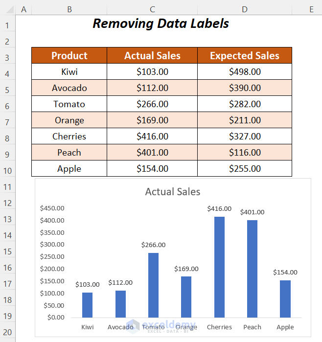
We will be using the following dataset where we have some sales and expected sales values for some products.
Example 1 – Using the Outside End Data Labels Option in Excel
This option is only available for Clustered Column charts, Clustered Bar charts and Pie charts.
Case 1.1 – Clustered Column Chart
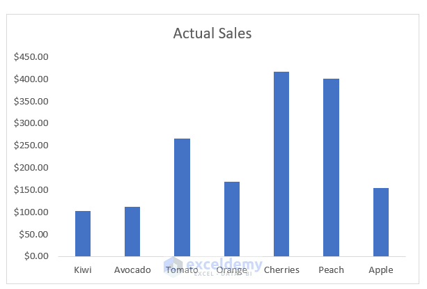
We will create a Clustered Column chart for the Actual Sales values of the products and then define the position of the data labels.
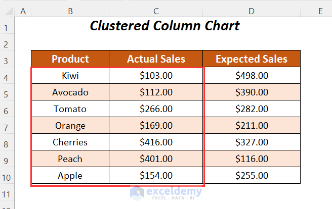
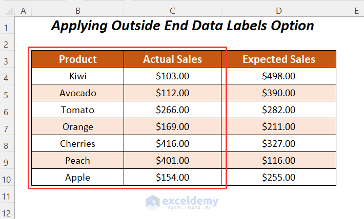
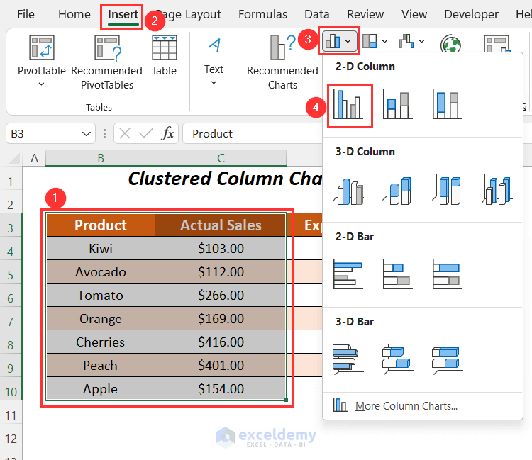
- Select the range.
- Go to the Insert tab and choose the Insert Column or Bar Chart dropdown.
- Select the Clustered Column chart option.
- You will get the following chart.
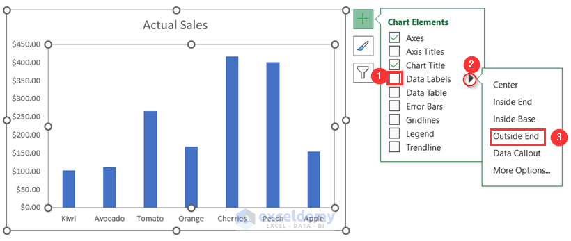
- Click on the Chart Elements option.
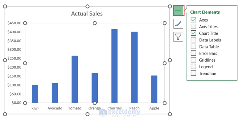
- Check the Data Labels option and click on the right-side arrow.
- Select Outside End.
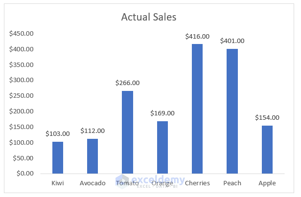
- You can see different positions of data labels and choose to change the positions.
- You will get the data labels at the outside end of the columns.
Read More: How to Add Data Labels in Excel
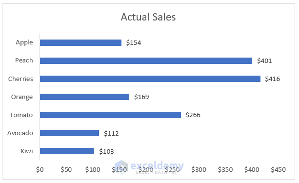
Case 1.2 – Clustered Bar Chart
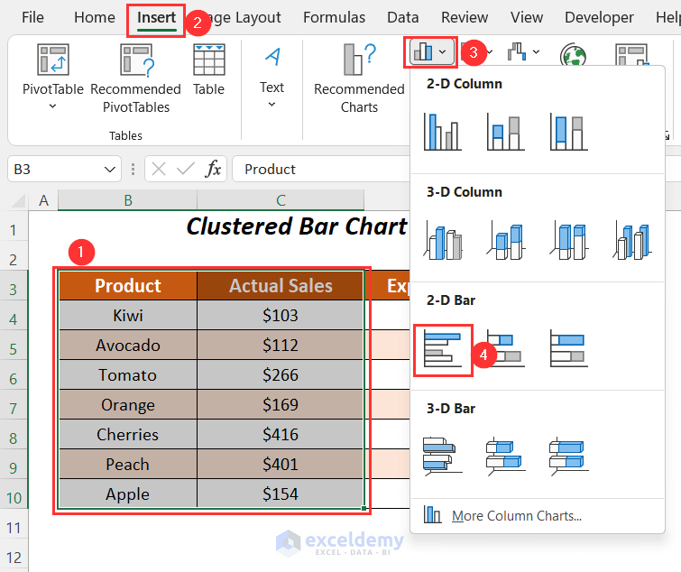
We will form a Clustered Bar chart for the actual sales of the following products and then fix the positions of the data labels outside the bars.
- Select the range, and then go to the Insert tab.
- Select the Insert Column or Bar Chart dropdown and choose the Clustered Bar chart option.
- Click on Chart Elements.
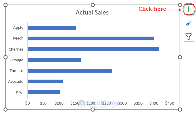
- Check the Data Labels button, and click on the right-side
- Choose the Outside End option among various options.
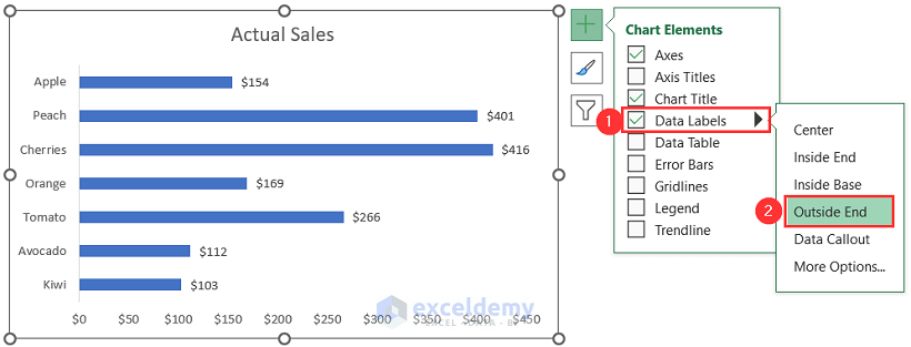
- You will be able to move the data labels outside of the Bar chart.
Read More: How to Edit Data Labels in Excel
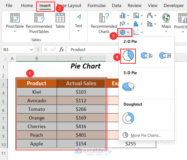
Case 1.3 – Pie Chart
We will place the data labels of a Pie chart on the outside end.
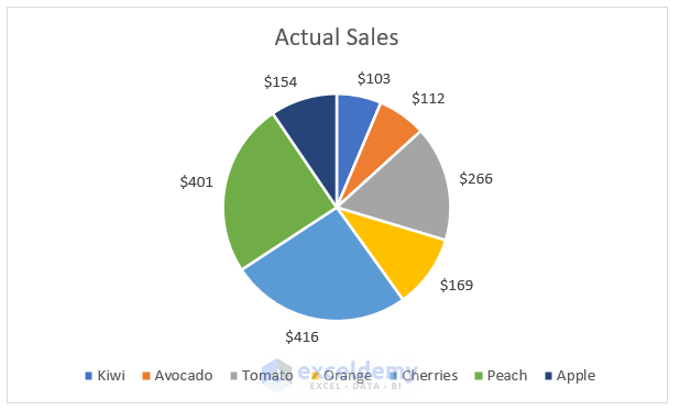
- Select the range, go to the Insert tab, select the Insert Pie or Doughnut Chart dropdown, and choose the 2-D Pie chart option.
- You will get the following chart.
- Click on Chart Elements.
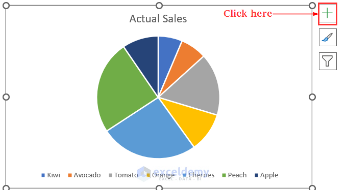
- Check the Data Labels button and click to the right arrow.
- Choose the Outside End option among various options.
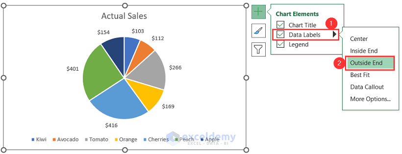
- You will be able to place the data labels on the outside end of the pie chart.
Read More: How to Move Data Labels In Excel Chart
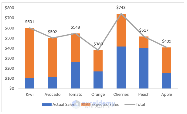
Example 2 – Customizing Data Labels for a Stacked Column Chart to Appear Outside in Excel
We’ll use the same dataset for the Stacked Bar chart.
- Select the range, go to the Insert tab, choose Insert Column or Bar Chart, and select the Stacked Column chart option.
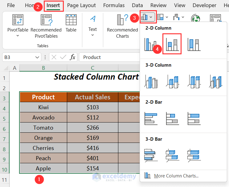
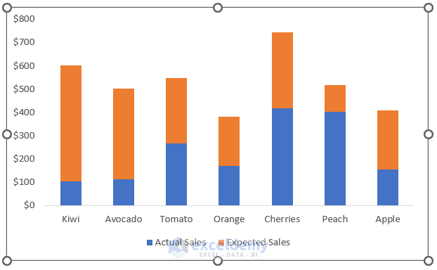
- You will get the following stacked column chart.
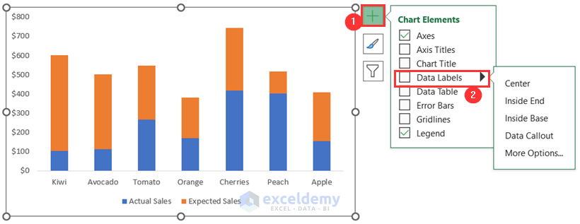
- Click on the Chart Elements option.
- Check the Data Labels option and clic on the right arrow.
- You won’t get the option called Outside End.
- Add an extra column named Total.
- Use the following formula in the column.
=C4+D4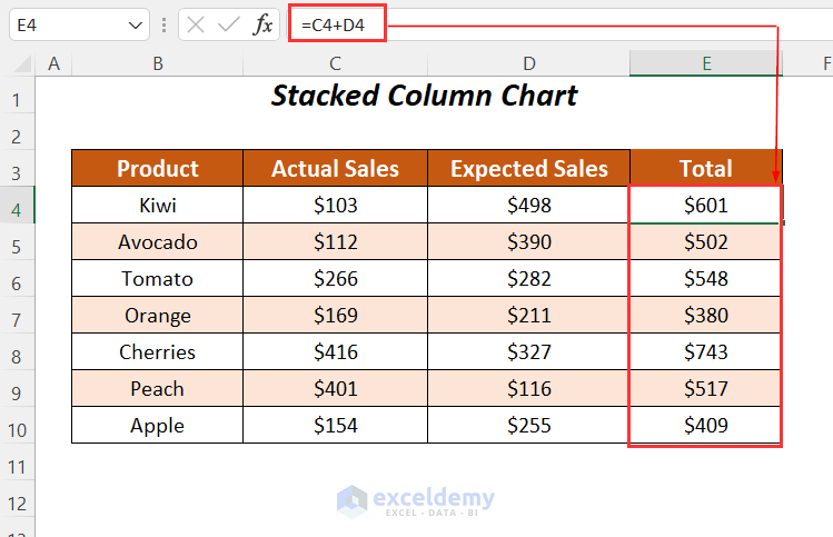
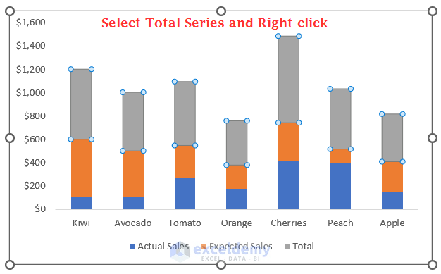
- These three columns will be stacked as three series in the following chart.
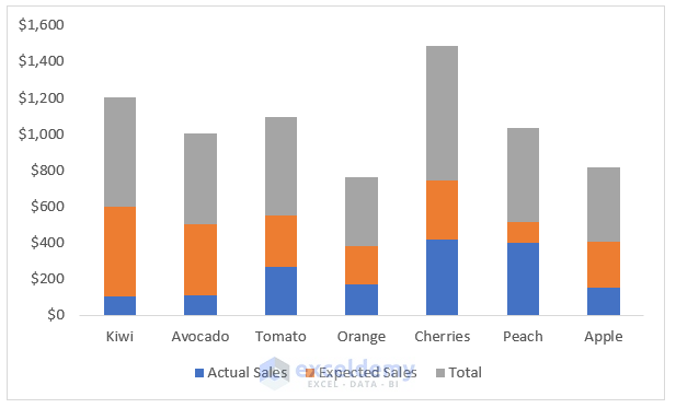
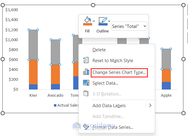
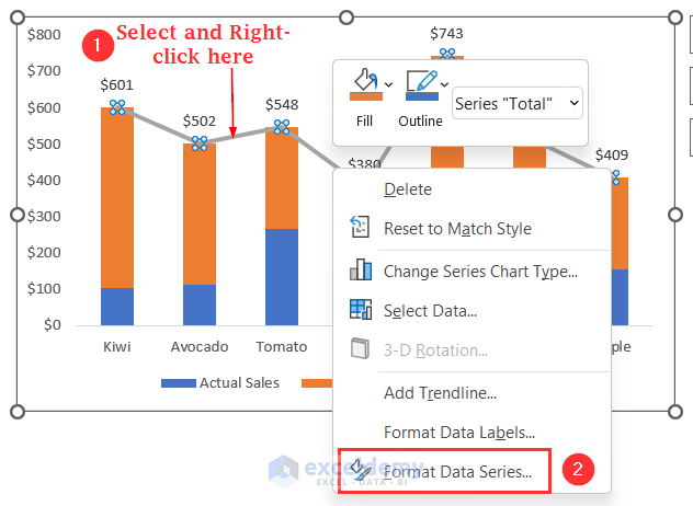
- Select the Total series and right-click.
- Choose the Change Series Chart Type.
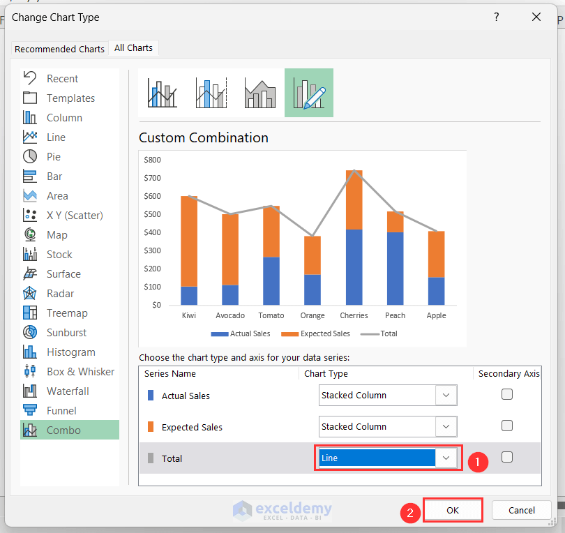
- You will get the Change Chart Type dialog box.
- Change the Chart Type of the Total series to a Line chart.
- Press OK.
- You will notice a difference in the Total series.
- Select this series and go to the Chart Elements, then to Data Labels and Above.
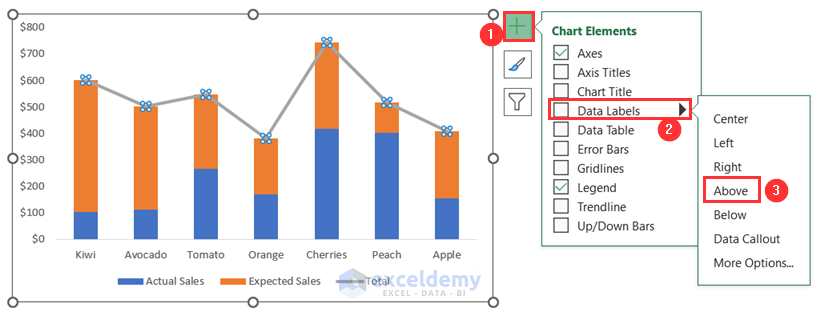
- The data labels will appear outside the columns.
- Select the line chart and right-click on it.
- Choose Format Data Series.
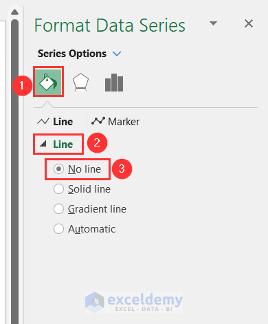
- The Format Data Series window will appear on the right pane.
- Go to the Fill & Line tab and expand the Line tab, then choose No Line.
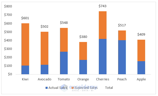
- We will have the labels outside of the stacked columns.
Read More: How to Format Data Labels in Excel
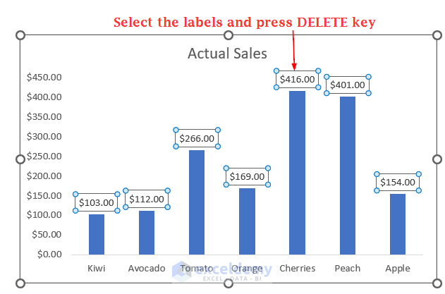
How to Remove Outside End Data Labels in Excel
You can also remove the data labels from your chart if the labels consume extra space in your chart.
- Select the labels and press the Delete key.
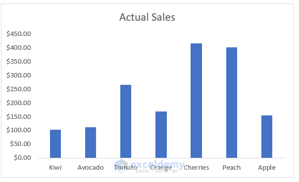
- You will get the following chart without data labels.
Read More: How to Remove Zero Data Labels in Excel Graph
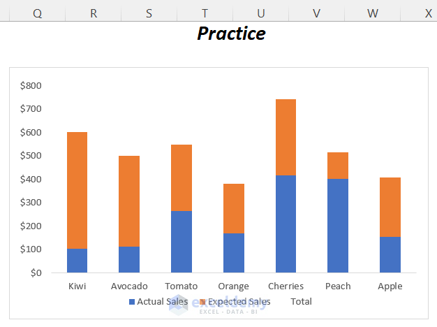
Practice Section
We have created a Practice section on the right side of each sheet.
Download the Practice Workbook
Related Articles
- How to Show Data Labels in Excel 3D Maps
- How to Use Conditional Formatting in Data Labels in Excel
- [Fixed!] Excel Chart Data Labels Overlap
- How to Use Millions in Data Labels of Excel Chart
- How to Show Data Labels in Thousands in Excel Chart
- How to Add Additional Data Labels to Excel Chart
<< Go Back To Data Labels in Excel | Excel Chart Elements | Excel Charts | Learn Excel
Get FREE Advanced Excel Exercises with Solutions!

Hello. I have made a graph in Excel but would like the data labels above the bars to be nearer the edge of the bar. Is there a way to do this without moving each data label down manually?
Hello Neil Homes,
In Excel, you can place data labels above the bars by setting their position to “Outside End.” Here’s how:
1. Click on your chart to select it.
2. Click the plus (+) icon next to the chart or go to Chart Elements >> select Data Labelswww.
3. Choose Outside End from the options.
This will automatically place the data labels just above the bars, near the edge, without needing to move each label manually.
If you still want the labels closer or need finer adjustment, unfortunately, Excel does not offer a setting for custom spacing, you would have to adjust them individually. But for most cases, “Outside End” works well!
Regards
ExcelDemy