How to Edit Data Labels in Excel
- Select the data labels and go to format data labels.
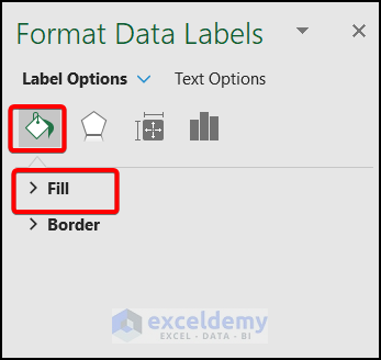
- Choose Fill in Fill & Line.
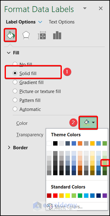
- Select Solid fill and choose a Color.
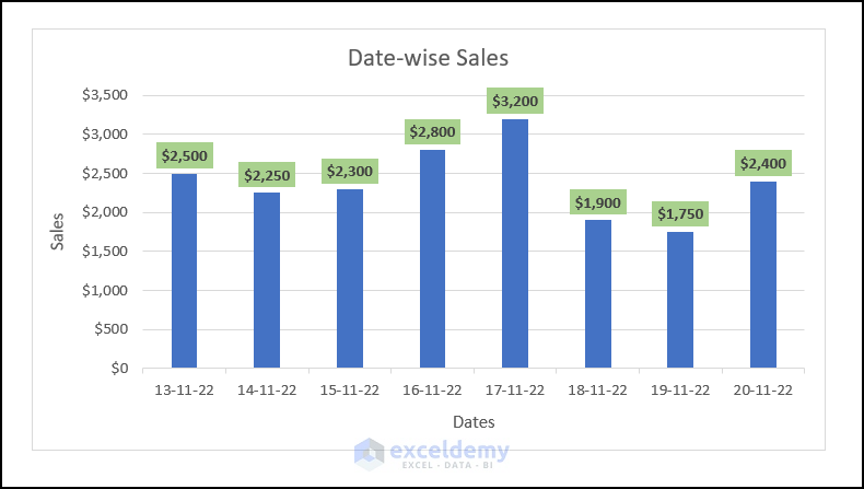
Data labels are edited.
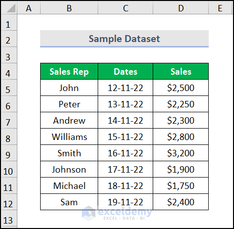
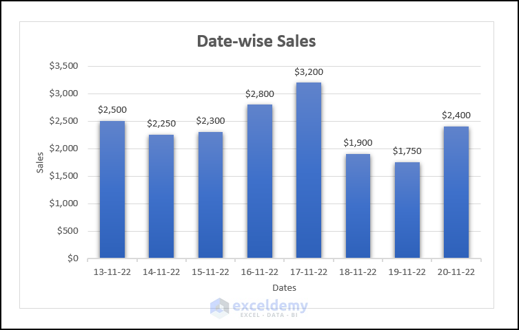
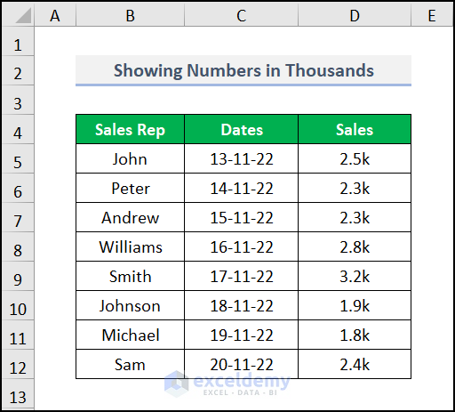
This is the sample dataset.
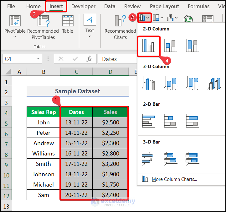
Step 1 – Create a Chart
- Select the range to create the chart.
- Go to the Insert tab >> Insert Column or Bar chart >> select Clustered Column.
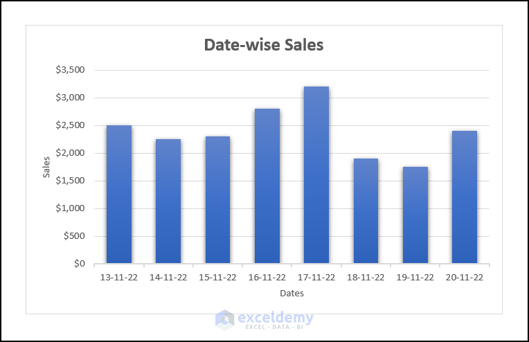
This is the output.
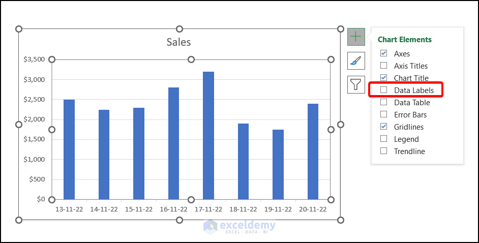
Step 2 – Add Data Labels
- To show the data labels, click the chart
- Select Chart Elements and check Data Labels.
This is the output.
Read More: How to Add Data Labels in Excel
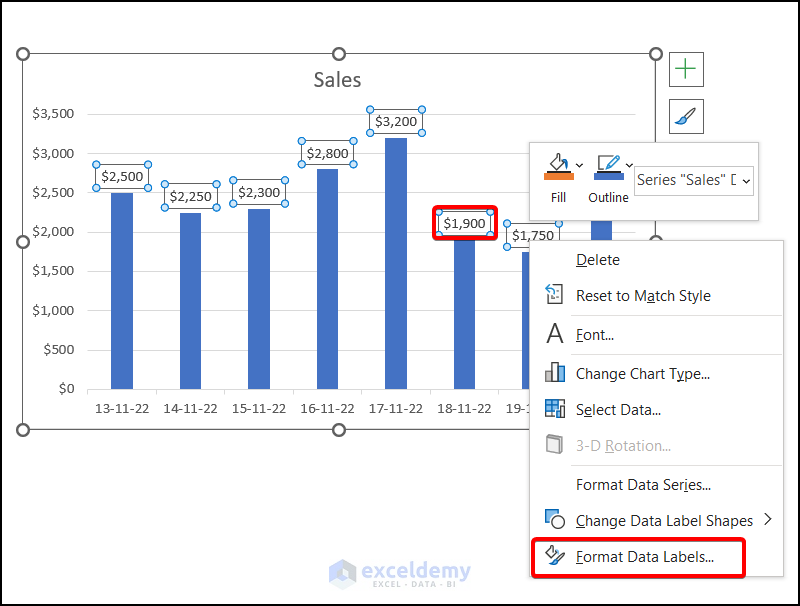
Step 3 – Format Data Labels
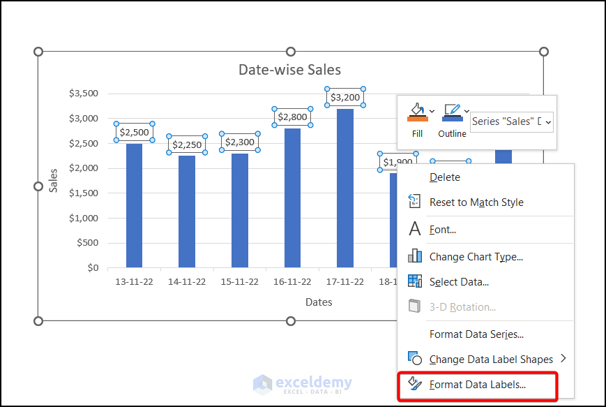
- Right-click any data label and select Format Data Labels.
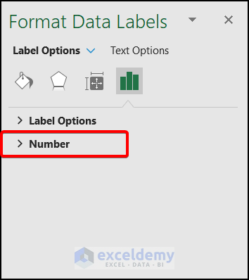
Step 4 – Use the Custom Code in the Label Options
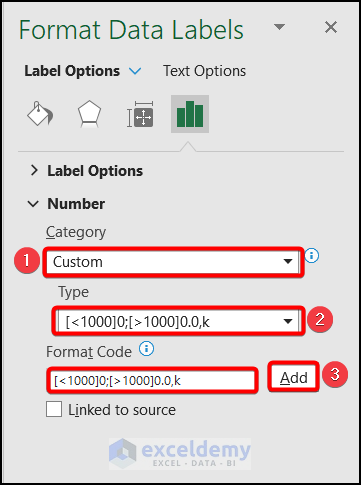
- In the Format Data Labels window, in Label Options, select Number.
- In Category, select Custom.
- Add the following as Format Code. It will automatically be placed in Type.
[<1000]0;[>1000]0.0,k
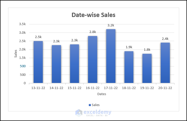
This is the output.
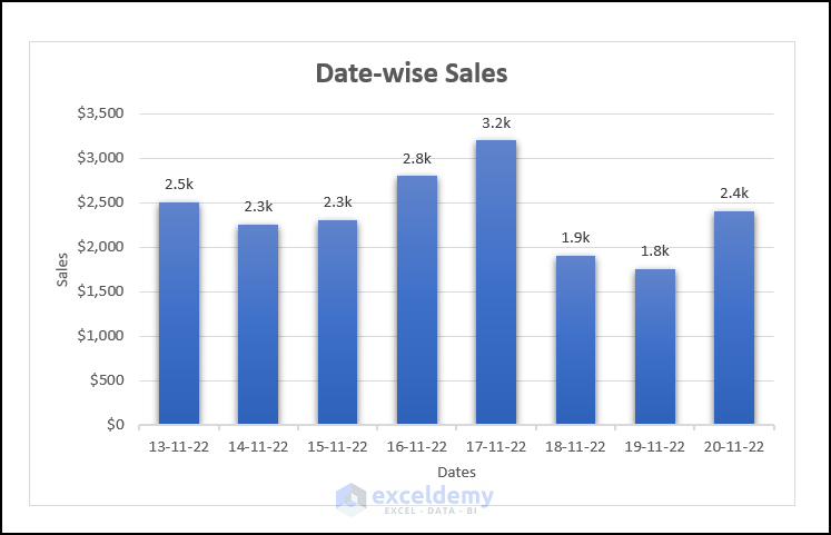
How to Show Numbers in Thousands in an Excel Chart
Steps:
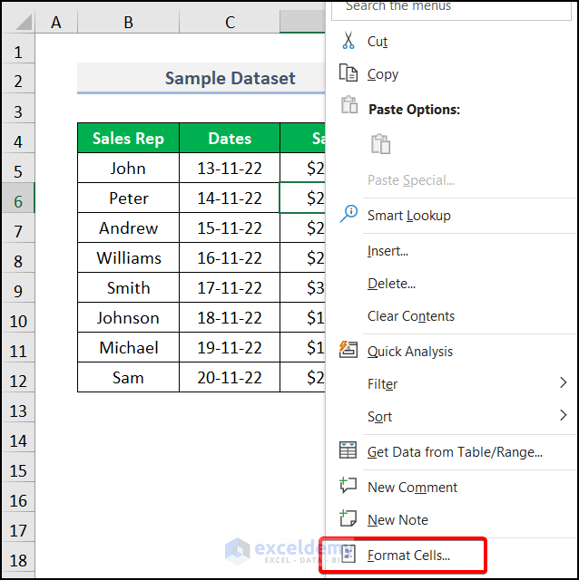
- Right-click any cell and select Format Cells.
Note: You can also press CTRL + 1.
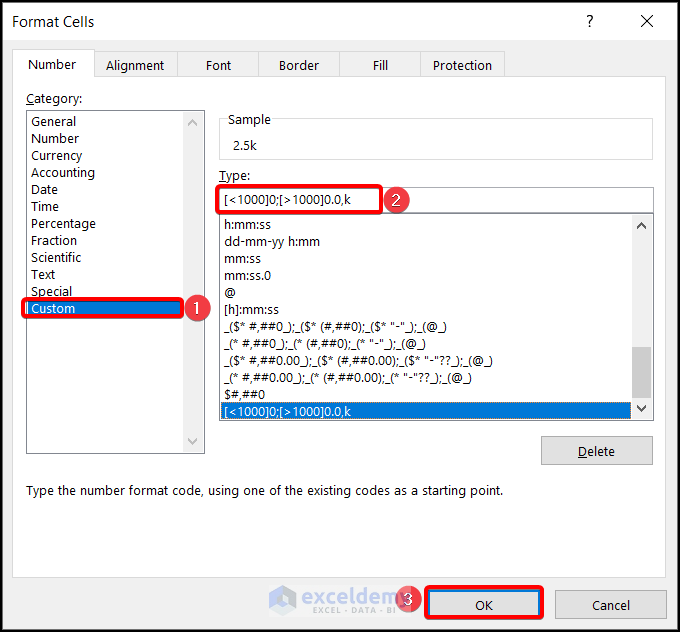
- In the Format Cells dialog box, choose Custom in Category.
- In Type, enter:
[<1000]0;[>1000]0.0,k
- Click OK.
Values are displayed in thousands.
- Select the data and plot a chart.
Read More: How to Use Millions in Data Labels of Excel Chart
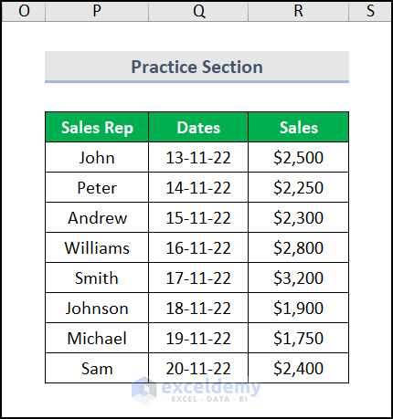
Practice Section
Practice here.
Download Practice Workbook
Download the practice workbook.
Related Articles
- How to Show Data Labels in Excel 3D Maps
- How to Use Conditional Formatting in Data Labels in Excel
- How to Add Additional Data Labels to Excel Chart
- [Fixed!] Excel Chart Data Labels Overlap
- How to Add Outside End Data Labels in Excel
<< Go Back To Data Labels in Excel | Excel Chart Elements | Excel Charts | Learn Excel
Get FREE Advanced Excel Exercises with Solutions!

Hi Fahim, i have found your techniques very helpful regarding this article. I have similiar kind of data,,but i want to show then in millions. Can you be able to help me on this topic?
Hello, Aston!
Hope you are doing well. To show your data labels in millions kindly follow this article Millions in Data Labels
Regards
ExcelDemy