In this article, we will demonstrate how to use conditional formatting in data labels to present data in charts more eloquently. Download the workbook at the bottom of the article to follow along using the same dataset.
Example 1 – Displaying Positive and Negative Data Labels Separately
In the first example, we will display the positive and negative data in different colors by using conditional formatting. We’ll use the IF function to separate the positive and negative values and then plot them in a graph.
Steps:
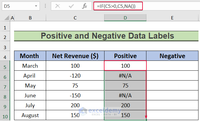
- In cell D5 enter the following formula:
=IF(C5>0,C5,NA())- Press Enter.
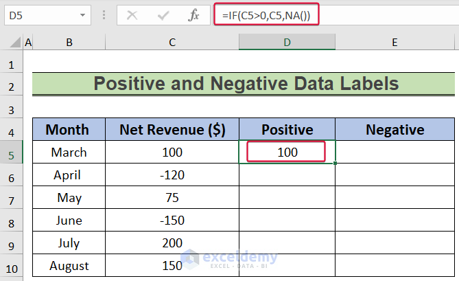
The IF function will evaluate if the value in cell C5 is greater than zero. If it is true then the formula will return the value in cell C5, else #N/A.
A positive value is returned in that cell.
- Drag the cursor down to Autofill the rest of the cells.
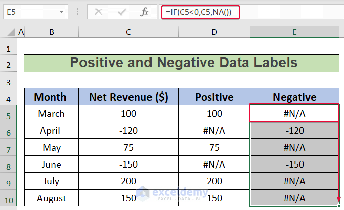
- In cell E5, enter the following formula:
=IF(C5<0,C5,NA())- Press Enter.
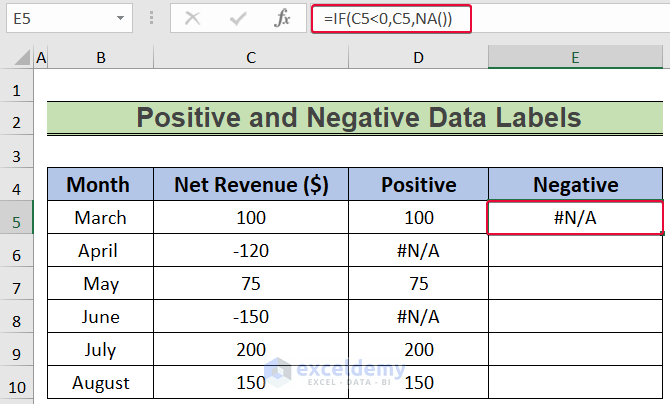
The IF function will check if the value in the C5 cell is lower than zero. If it is less than zero then the formula will return the value in cell C5, else #N/A. Either we will get a negative value or no value in that cell.
- Drag the cursor down to the last data cell to Autofill.
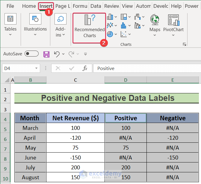
- Select the B4:B10, D4:D10, and E4:E10 cell ranges.
- Go to the Insert tab.
- Choose the Recommended Charts option.
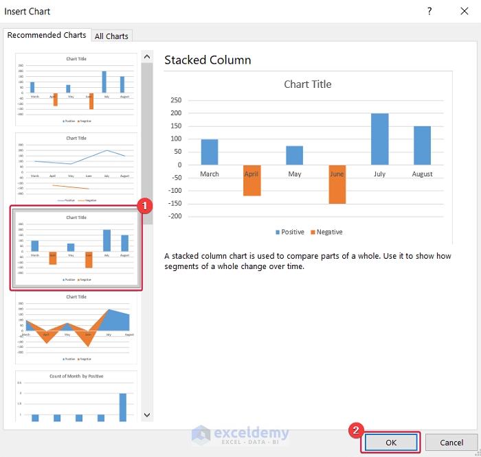
- In the Insert Chart dialog box that opens, select the Stacked Column chart.
- Click OK.
Consequently, we have a chart.
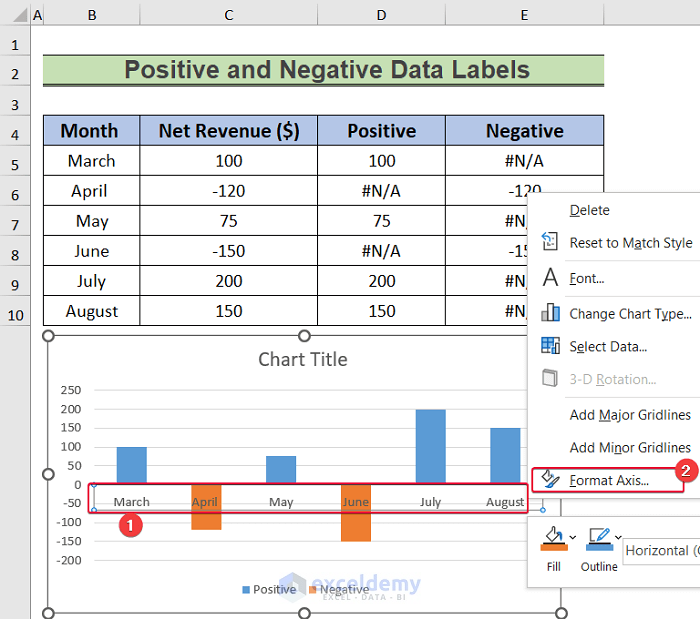
- Select the horizontal axis labels of the chart and right-click.
- From the available options, select Format Axis.
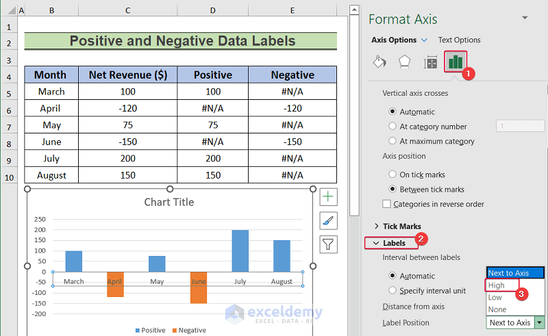
- Go to the Labels Option icon in the sidebar.
- Choose Labels.
- Choose High as the Label Position.
As a result, the axis labels are on the upper side of the chart.
- Click on the positive bars on the chart.
- Click on the plus sign in the top right corner of the chart.
- From the Chart Elements, click Data Labels.
- From the available options, select Inside End.
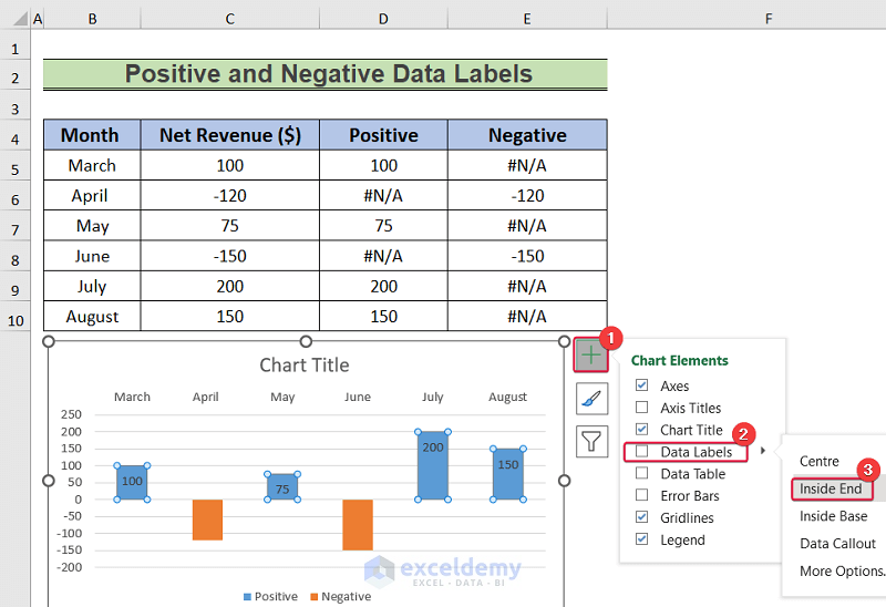
- Repeat the same process for the negative values.
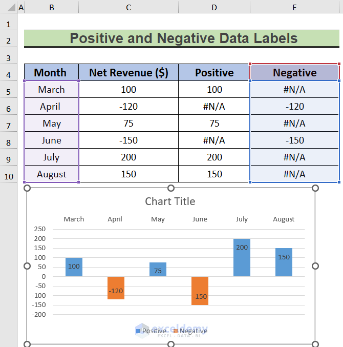
We have data labels on the chart.
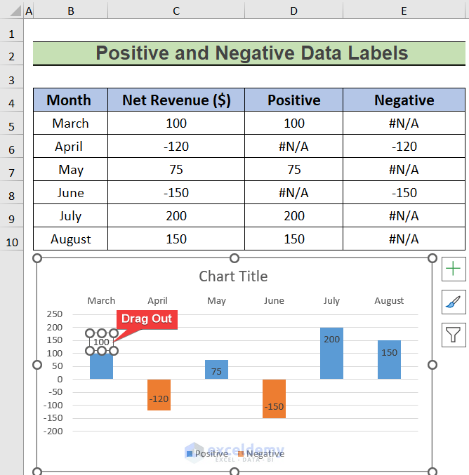
- Click on the data labels one by one and drag them out of the bar.
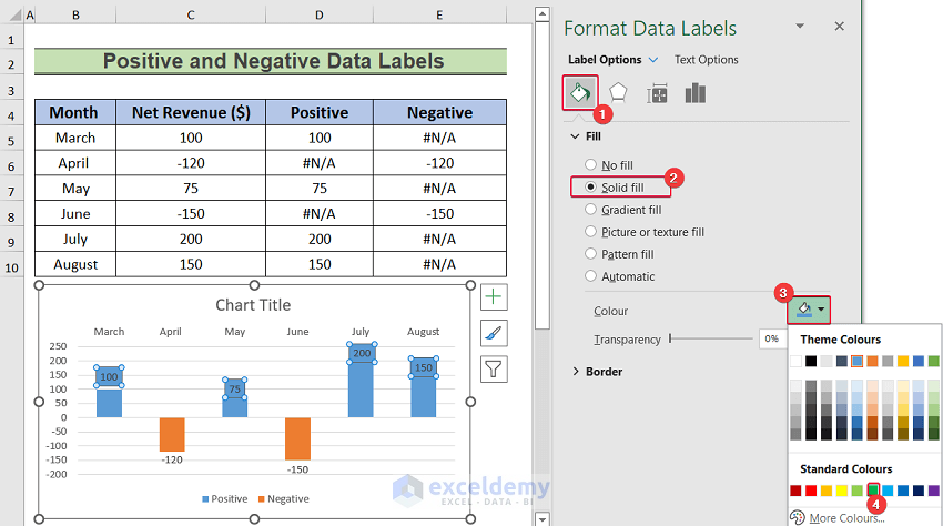
- Select the data labels over the positive bars.
A sidebar will appear.
- In the sidebar, select the paint sign.
- From the Fill options, select Solid Fill.
- Select the color of the fill from the Color option, for example green.
- Do the same for the negative values. Here, we choose red as the fill color for the negative data labels.
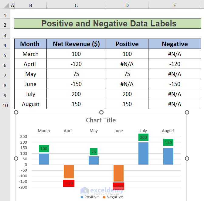
- Make the color of the bars the same for both negative and positive values to make them look like one series.
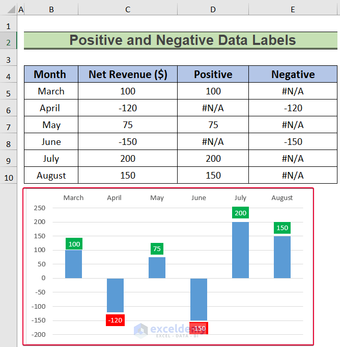
In our chart, the negative and positive values display distinctively.
Read More: How to Edit Data Labels in Excel
Example 2 – Showing Maximum and Minimum Data Labels
In this instance, we will make the maximum and minimum values in a chart stand out by applying conditional formatting, and using the IF, AND, MAX, and MIN functions
Steps:
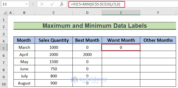
- In cell D5, enter the following formula:
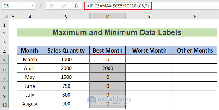
=IF(C5=MAX($C$5:$C$10),C5,0)- Press Enter.
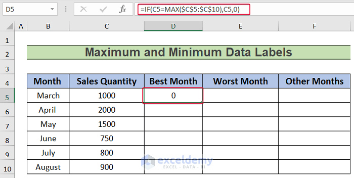
The formula will evaluate if the value is the maximum value in the range C5:C10. If true, the formula will return the value, else zero.
- Drag the cursor down to the last data cell to Autofill the formula.
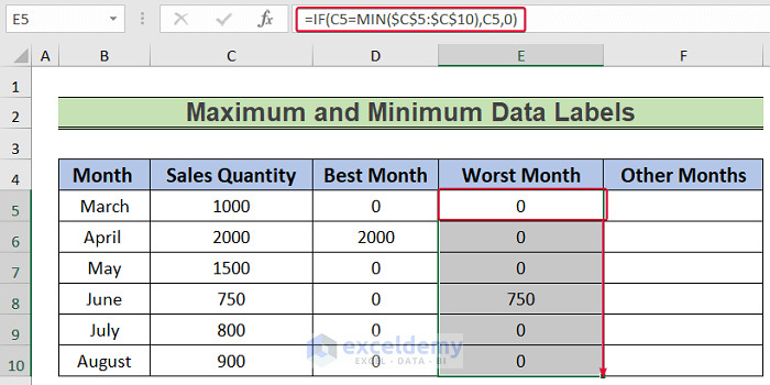
- Select cell E5 and enter the following formula:
=IF(C5=MIN($C$5:$C$10),C5,0)- Press Enter.
Like the maximum formula, this one will look for the minimum value in the C5:C10 range.
- Drag the cursor down to the last cell.
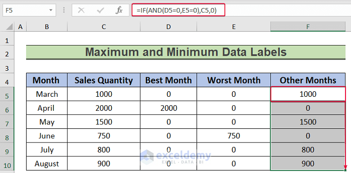
- Select cell F5 and enter the formula below:
=IF(AND(D5=0,E5=0),C5,0)- Press Enter.
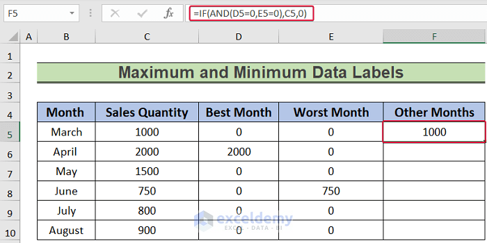
This formula will return zero in cell F5 if the values in cells D5 and E5 are zero, else it will return the value of cell C5.
- Drag the cursor down to the last cell to get the Autofill values.
- Select the D5:F10 range.
- Go to the Home tab.
- Click on the outward arrow in the Number group.
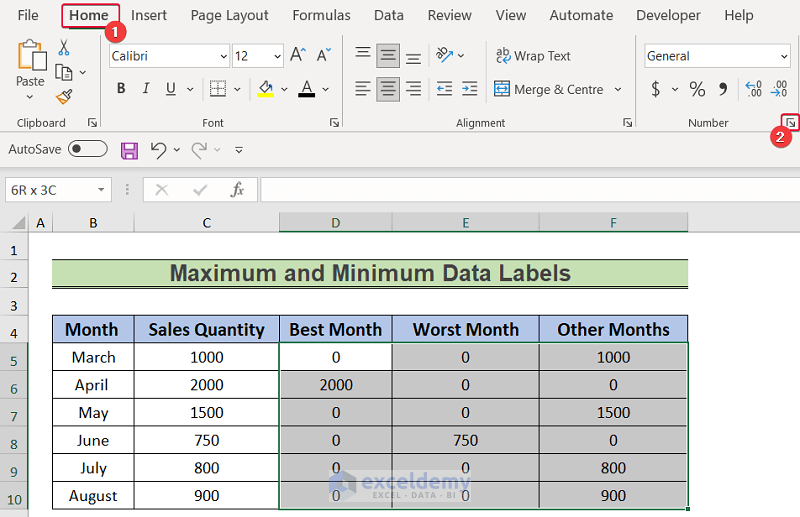
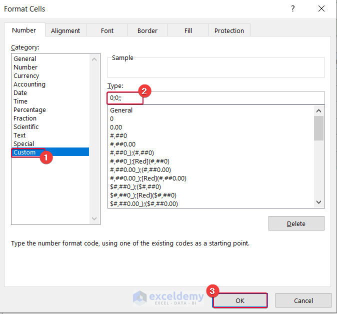
- In the prompt, select Custom.
- Under the Type option, enter:
0;0;;- Click OK.
As a result, all the zeros in that range will be replaced by blanks.
- Select the B4:B10 and D4:F10 ranges.
- From the Insert tab select the Recommended Charts option.
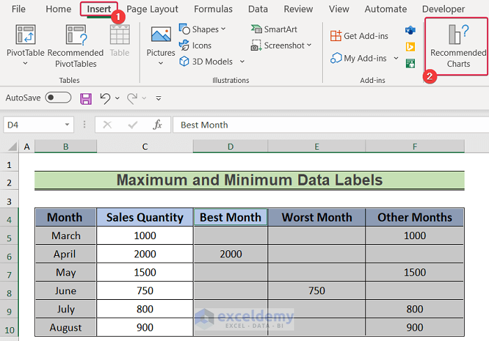
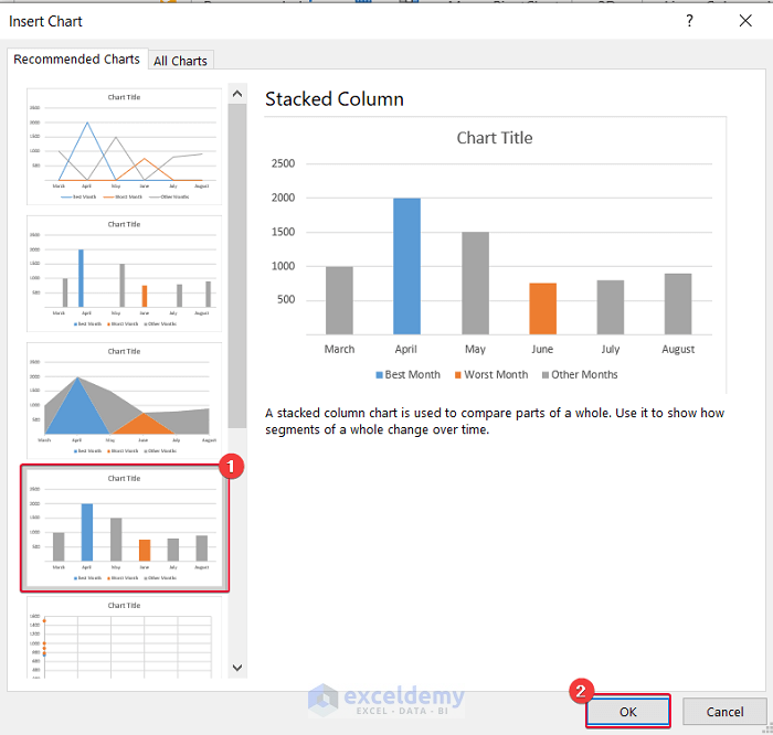
- In the prompt, select the Stacked Column chart.
- Click OK.
Consequently, the data will be plotted in a Stacked Column Chart with maximum and minimum values appearing in different colors.
- Click on the chart.
- Select the plus sign to the right of the chart.
- From the available options select Data Labels.
As a result, we get data labels over the bars.
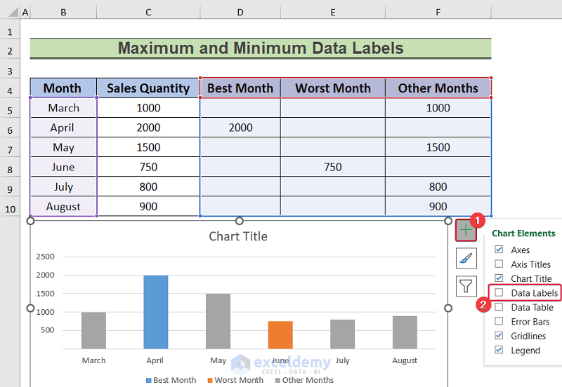
- Format the chart as desired to make it look more attractive.
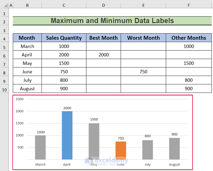
We have successfully conditionally formatted our data to show maximum and minimum values in different series.
Read More: How to Use Millions in Data Labels of Excel Chart
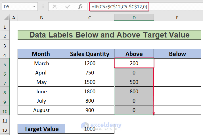
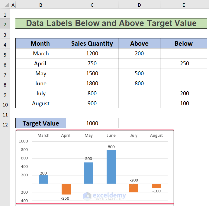
Example 3 – Displaying Data Labels Below and Above Target Value
Now we will apply conditions to our data to find out how much above or below a certain target value they are, then plot them in a graph and show data labels. We will use a sales quantity of 1000 as the target value and find out by how much the other values are below or above that value.
Steps:
- Select cell D5 and enter the following formula:
=IF(C5>$C$12,C5-$C$12,0)- Press Enter.
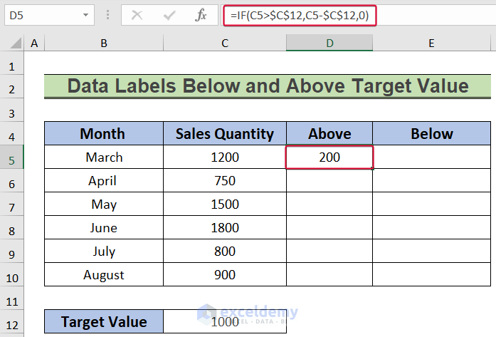
The formula finds out if the value in cell C5 is greater than or less than 1000. If it is, the difference between the value in cell C5 and 1000 is returned, else zero.
- Drag the cursor down to the last cell to fill automatically.
- Select cell E5 and enter the formula below:
=IF(C5<$C$12,C5-$C$12,0- Press Enter.
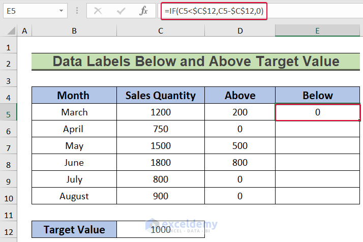
This formula will evaluate if C5 is greater or lower than 1000. If lower, the formula will return the difference between the two, else zero.
- Drag the cursor down to the last data cell to Autofill the values.
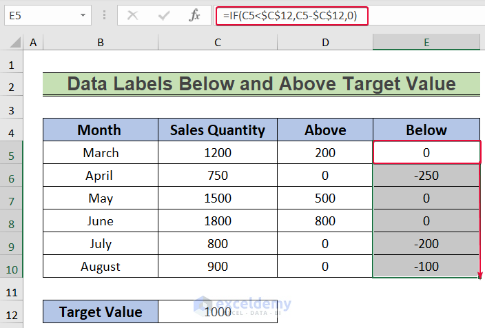
- Select the cells in the C5:C10 range.
- Go to the Home tab.
- Go to the Numbers group and select the outward arrow.
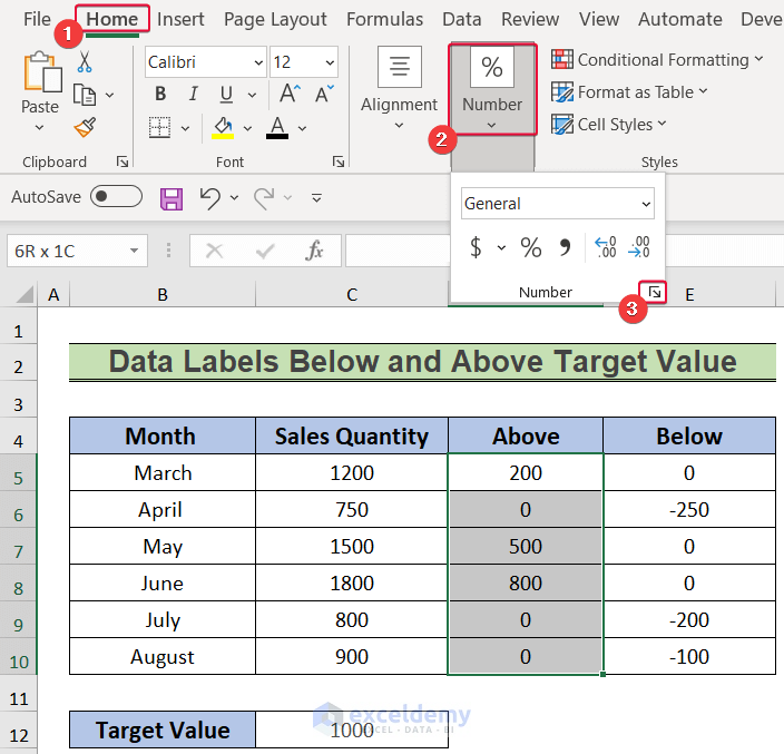
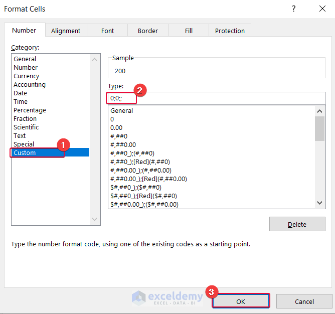
- In the prompt, select Custom.
- Enter the following input under the Type option:
0;0;;- Click OK.
As a result, all the zero values in the D5:D10 range will be replaced by blanks.
- Select cells E5:E10.
- Go to the Home tab.
- From the Number group, click on the outward arrow.
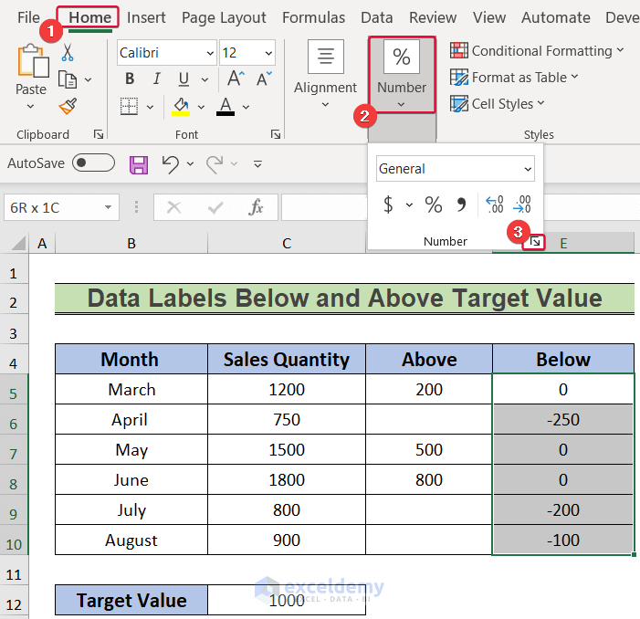
- In the Format Cells prompt, choose the Custom option.
- Under the Type option, enter the following:
0;-0;;- Finally, click OK.
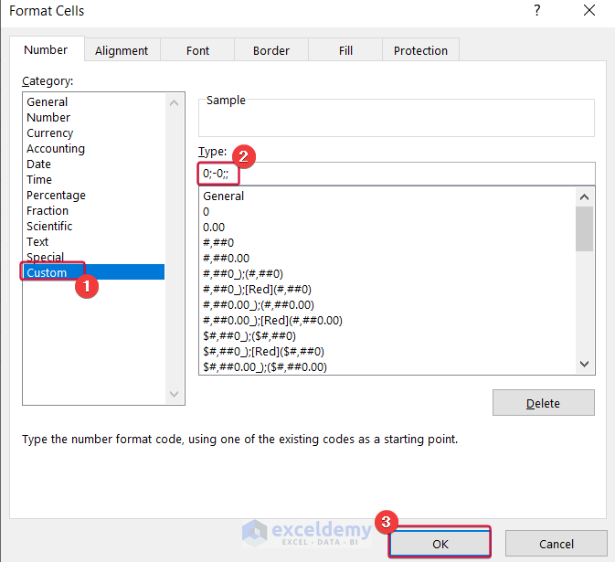
As a result, all the zero values in the E5:E10 cell will be replaced by blanks.
- Select the B4:B10 and D4:E10 ranges.
- Go to the Insert tab.
- Select the Recommended Charts option.
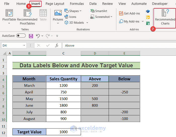
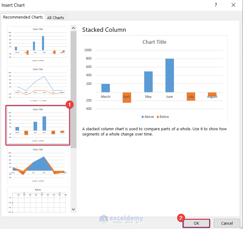
- From the Insert Chart prompt, select the Stacked Column chart.
- Click OK.
We have a chart showing how much the data values are below or above the target value.
- Click on the horizontal axis labels of the chart and right-click.
- From the options, select the Format Axis command.
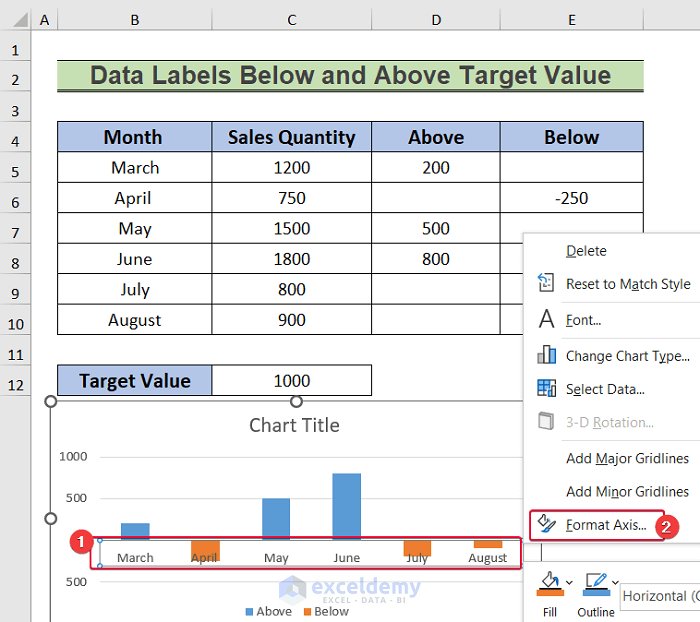
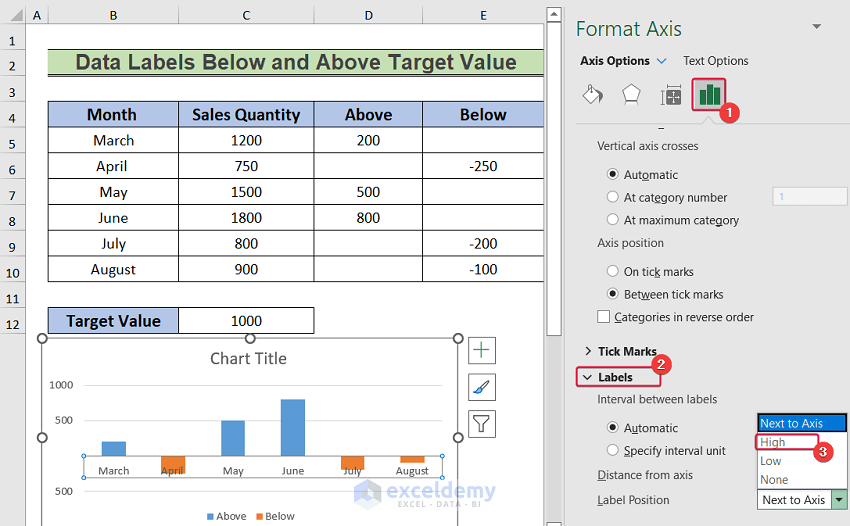
- Select the Labels Option sign in the sidebar.
- Select Labels.
- Select High as the Label Position.
The axis labels will be on the upper side of the chart.
- Select the chart.
- Click on the plus sign to the top right of the chart.
- From the options, select Data Labels.
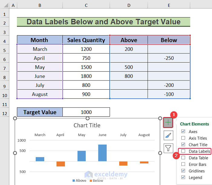
We have data labels showing how much the data are above or below 1000.
Read More: How to Add Additional Data Labels to Excel Chart
Download Practice Workbook
Related Articles
- How to Add Outside End Data Labels in Excel
- How to Show Data Labels in Thousands in Excel Chart
- How to Show Data Labels in Excel 3D Maps
- [Fixed!] Excel Chart Data Labels Overlap
<< Go Back To Data Labels in Excel | Excel Chart Elements | Excel Charts | Learn Excel
Get FREE Advanced Excel Exercises with Solutions!
