The most popular tool for navigating large datasets is Excel. Excel allows us to do countless tasks with numerous dimensions. Excel may be used to visualize our dataset in graphical representations. This enables us to enhance any presentation or report’s content. In the meanwhile, we can use Excel to add two labels to a chart. I’ll demonstrate how to add additional data labels to an Excel chart in this article.
How to Add Additional Data Labels in Excel Chart: Step-by-Step Procedures
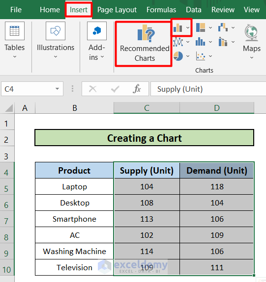
I will use the following dataset called the Supply vs Demand Chart of ABC Traders. The dataset has three columns, B, C, and D called Product, Supply(Unit), and Demand(Unit). The dataset ranges from B4 to D10 cells. I will use the following dataset to add additional data labels in excel chart with four easy steps.

Step 1: Create a Chart
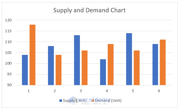
This is the first step of this article. I have a dataset already. Now, I am going to create a chart to represent my dataset.
- First, select the dataset from C4 to D10 cells.

- Go to the Insert tab in your toolbar.
- Then, go to the Recommended Chart
- After that, select any chart type.
- As a result, you will get the chart just like the picture given below.
Read More: What Are Data Labels in Excel
Step 2: Add First Data Label on Chart
This is the second step of this article. I made a chart in the previous step. Now, I am going to add a first data label on the chart. Follow the step-by-step procedure.
- Select any column representing supply units.
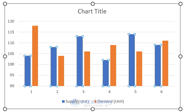
- Then, right-click your mouse.
- After that, select the option Add Data Label.
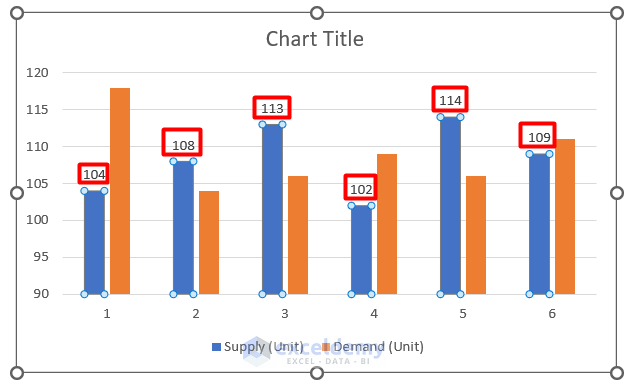
- As a result, you will get the first data label just like the picture below.
Read More: How to Add Outside End Data Labels in Excel
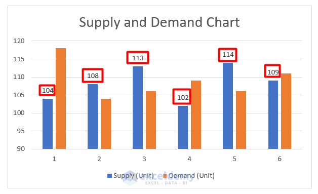
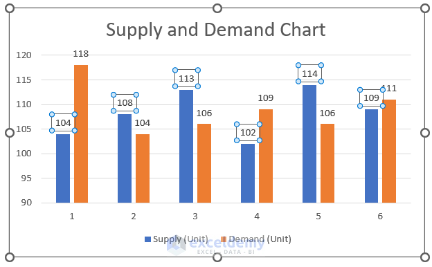
Step 3: Add Additional Data Label on Chart
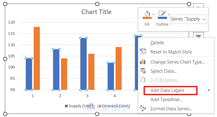
This is the third step. This is the step where I will add the additional data label on the chart. Follow the following steps.
- First, select any data label representing demand charts.

- Then, right-click on your mouse to bring the menu forward.
- After that, select add data labels.
- Hence, you will find the data labels just like the picture given below.
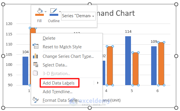
Step 4: Format Data Labels
This is the last but not the least step to add additional data labels. I am going to format the data label here. Follow the following steps. You can also follow the images attached with every step.
- Select the data labels option.
- Then, right-click on your mouse to bring up the menu.
- After that, click on the format data labels.
- Meanwhile, a sidebar will appear.

- Then, click on any of the checkboxes.
- As a consequence, you will find the following result.
Read More: How to Edit Data Labels in Excel
How to Change Data Labels in Excel
Here, in this part of this article, I will show you how to change data labels in Excel. Here, I will use the former chart. Follow the step-by-step procedures to change data labels in Excel.
Steps:
- First, right-click on the data labels of the chart.
- Then select the Format data labels option.

- Consequently, a side menu will appear.
- You will find the Label Position option in the side menu.

- Then, select the label position Inside End.

- As a result, you will find the final outcome just like the picture below.

Read More: How to Use Millions in Data Labels of Excel Chart
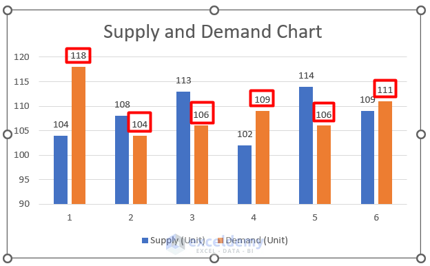
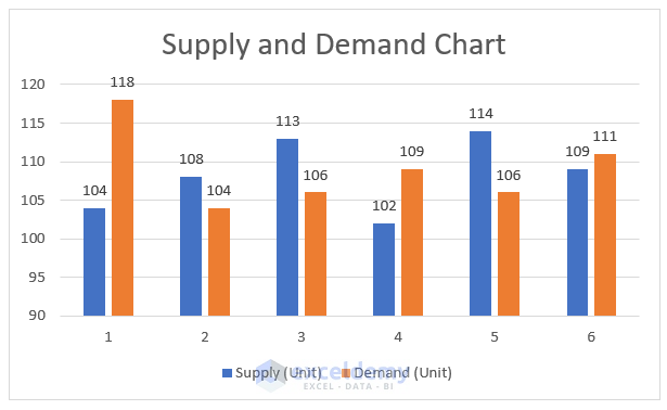
How to Format All Data Labels at Once in Excel
Here, I will show the procedure to format all data labels at once in Excel. I will use the same chart in this portion of this article. Follow the following procedure.
Steps:
- First, right-click on any of the bars to open the menu.
- Then, select the format data labels option.

- You will find the following options in the side menu. Select any of the options to format all data labels.

- For example, select the legend key checkbox.

- Consequently, you will get the following result.

Things to Remember
- You apply this procedure to any other chart type in excel.
Download Practice Workbook
Please download the workbook to practice yourself.
Conclusion
In this article, I have explained how to add additional data labels to an Excel chart. I hope you have learned something new from this article. Now, extend your skill by following the steps of these methods. I hope you have enjoyed the whole tutorial. If you have any queries, feel free to ask me in the comment section. Don’t forget to give us your feedback.
Related Articles
- How to Show Data Labels in Thousands in Excel Chart
- How to Show Data Labels in Excel 3D Maps
- How to Use Conditional Formatting in Data Labels in Excel
- [Fixed!] Excel Chart Data Labels Overlap
<< Go Back To Data Labels in Excel | Excel Chart Elements | Excel Charts | Learn Excel
Get FREE Advanced Excel Exercises with Solutions!
