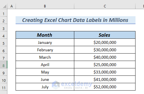
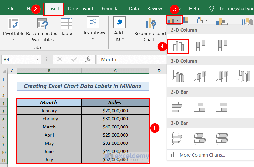
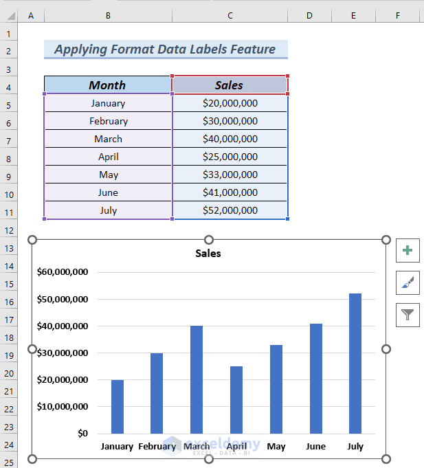
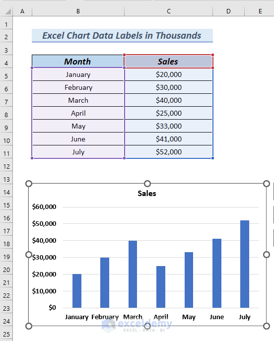
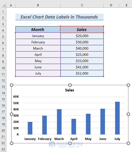
Let’s insert a column chart using the following dataset.
- Select the entire dataset, namely cells B4:C11.
- Click the Insert tab.
- From the Insert Column or Bar Chart group, select a 2D column chart.
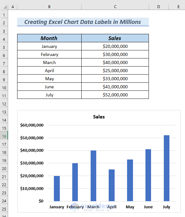
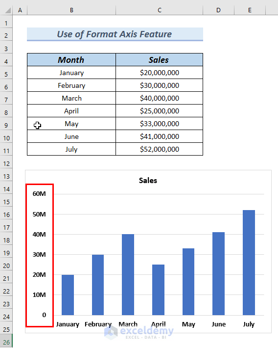
A column chart is generated, where the Y axis values are in General number format.
Let’s go through 3 easy and effective methods to create chart data labels in Millions instead.
We used Microsoft Excel 365 here, but the methods are applicable to any available Excel version.
Read More: How to Add Data Labels in Excel
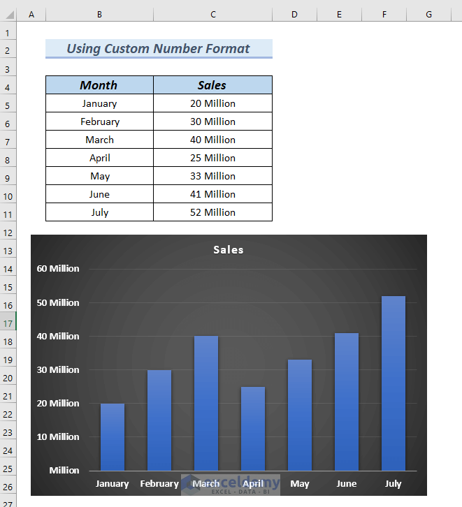
Method 1 – Using Custom Number Format
If we format the data in the data table in millions, then the chart data will also be formatted in millions.
This method is helpful when we want to format both the data table and the chart.
Steps:
- Insert a column chart by following the Steps described above.
A column chart is generated.
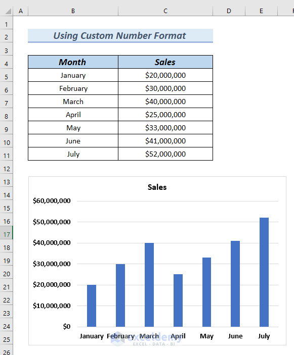
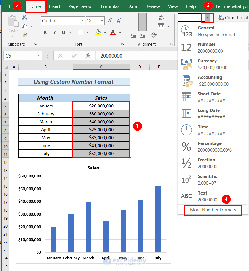
- Select cells C5:C11 to format the Sales column of the data table.
- Click on the Home tab.
- Click on Number Format.
- Click on More Number Formats.
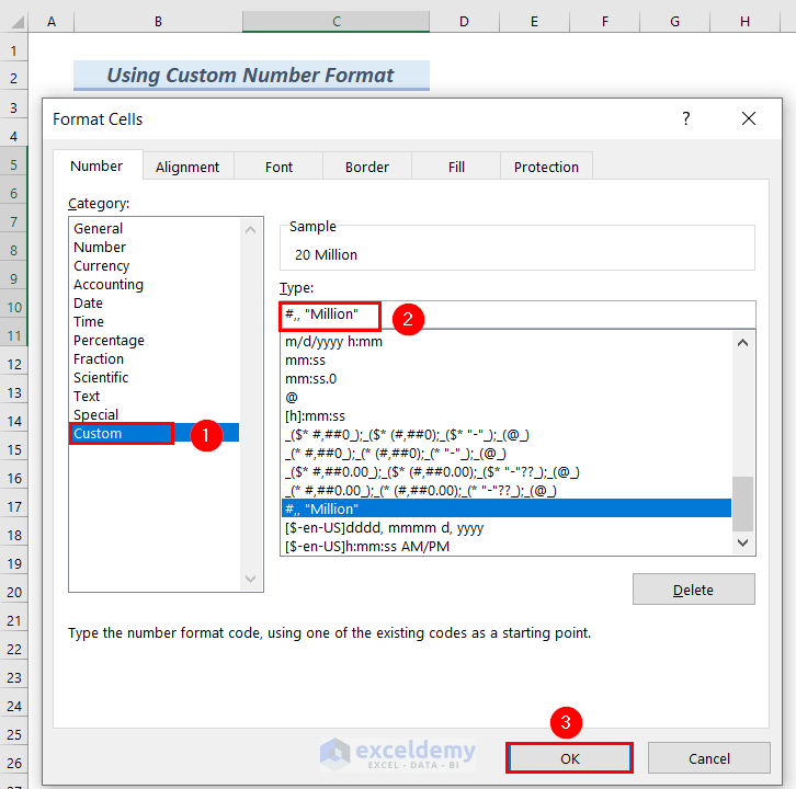
A Format Cells dialog box appears.
- Select Custom from the Category list.
- Enter #,, “Million” in the Type box.
- Click OK.
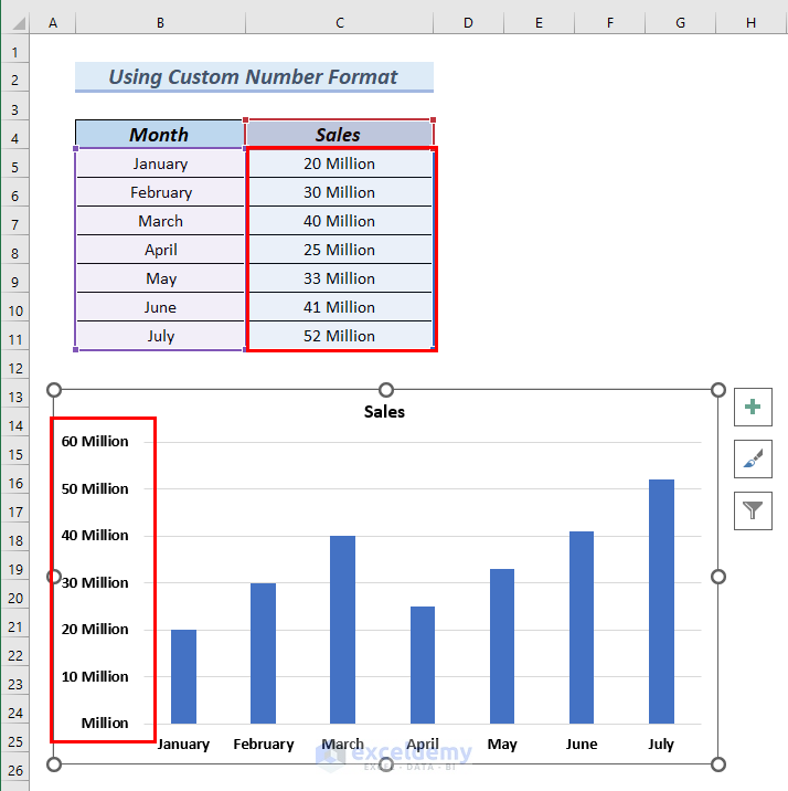
The Sales column is now formatted in Millions, and the Y axis of the chart also displays values in Millions.
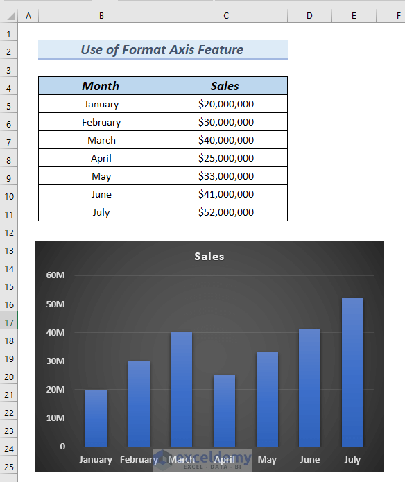
Let’s format the chart to make it more presentable and easy on the eye.
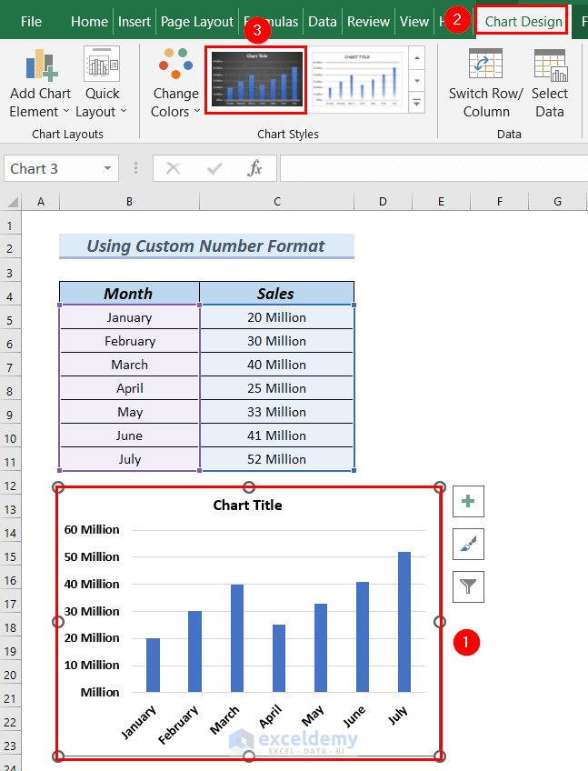
The selected chart format is applied.
Read More: How to Edit Data Labels in Excel
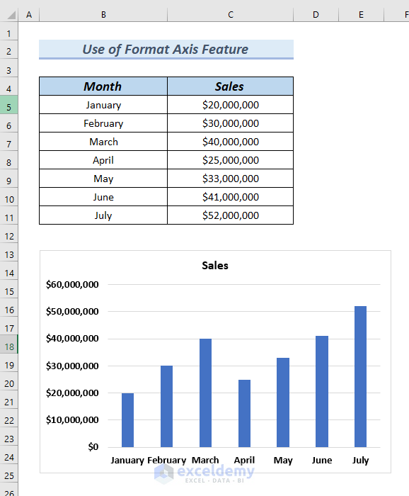
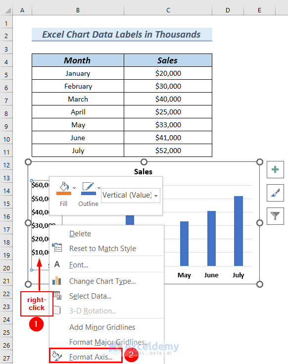
Method 2 – Using the Format Axis Feature of Excel Chart
Steps:
- Insert a column chart by following the Steps described above.
A column chart is generated.
- Right-click on the Y-axis of the chart.
- Select Format Axis from the Context Menu.
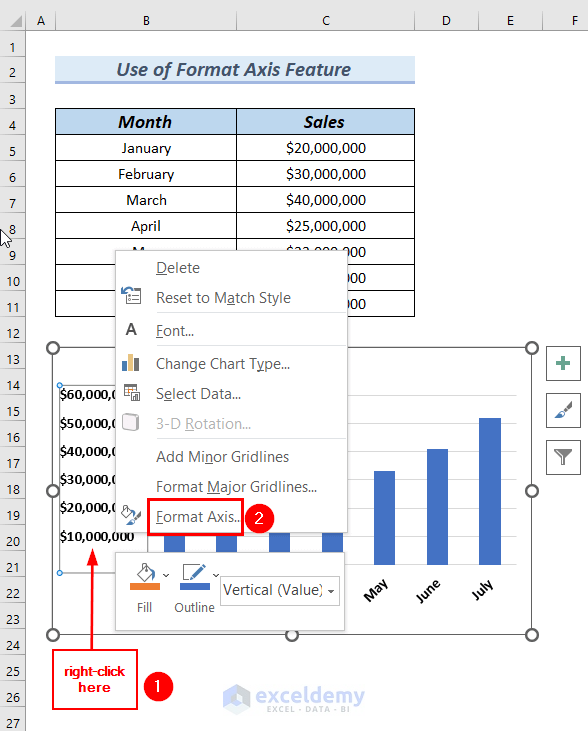
A Format Axis dialog box appears at the right end of the Excel sheet.
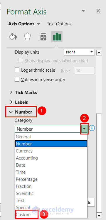
- Click on Number.
- Click on the drop-down icon of the Category box.
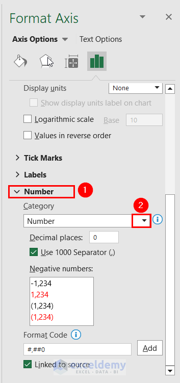
- Select Custom.
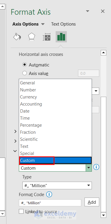
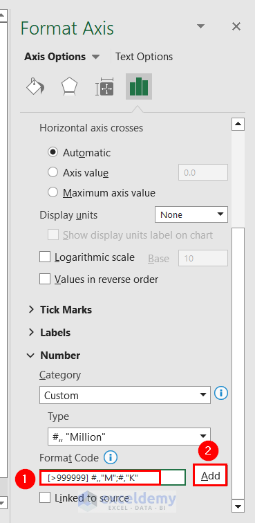
- Enter the format [>999999] #,,”M” in the Format Code box.
- Click Add.
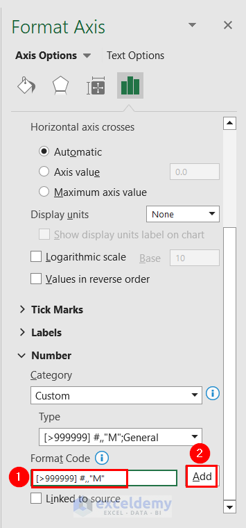
Data labels are now displayed in millions in the chart.
- Format the chart by following the Steps described in Method 1.
The formatted chart is generated.
Read More: How to Format Data Labels in Excel
Method 3 – Applying Format Data Labels
In this method, we will add data labels to our chart, then use the Format Data Labels feature to create Excel chart data labels in millions.
Steps:
- Insert a column chart by following the Steps described above.
A column chart is generated.
- Click on the Chart Elements button.
- Click on Data Labels.
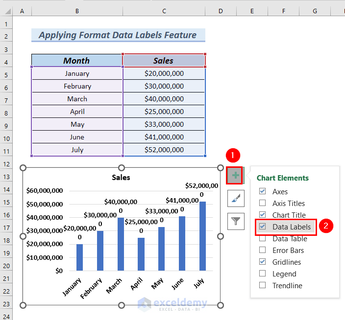
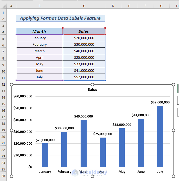
Data Labels are added to the chart.
- Right-click on Data Labels and select Format Data Labels from the Context Menu.
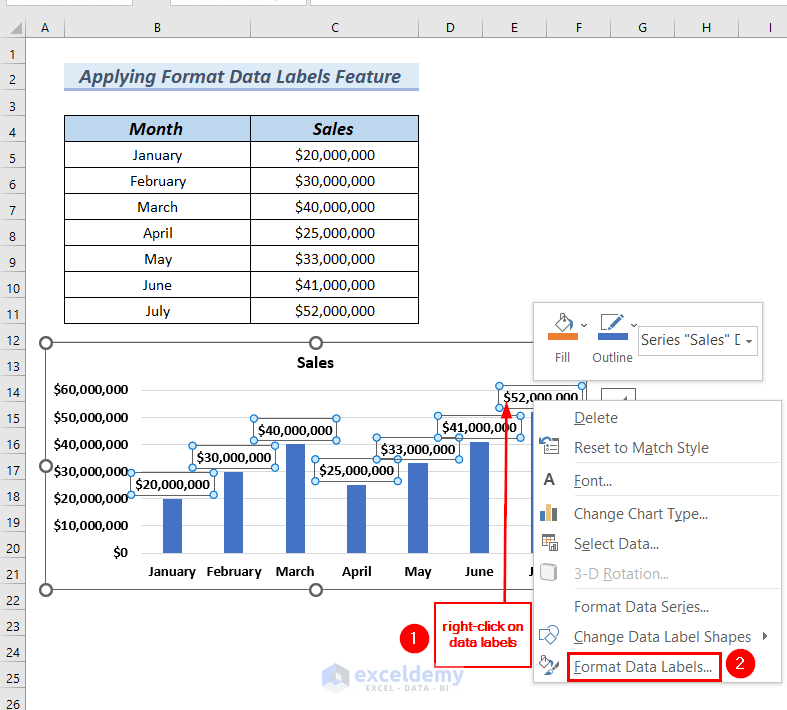
A Format Data Labels dialog box appears at the right end of the Excel sheet.
- Click Number.
- Click on the drop-down icon of the Category box.
- Select Custom.
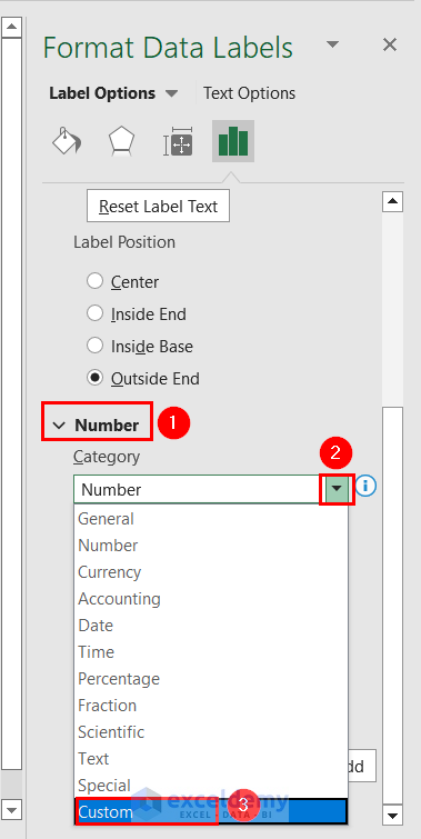
- Enter #,, “Million” in the Format Code box.
- Click Add.
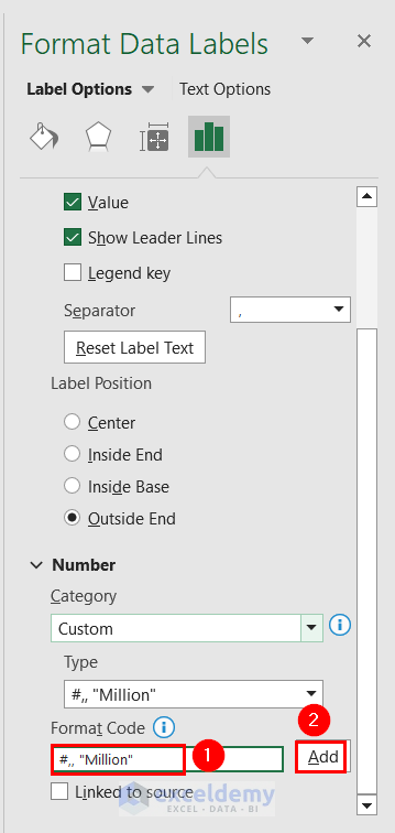
The chart’s data labels are now formatted in millions.
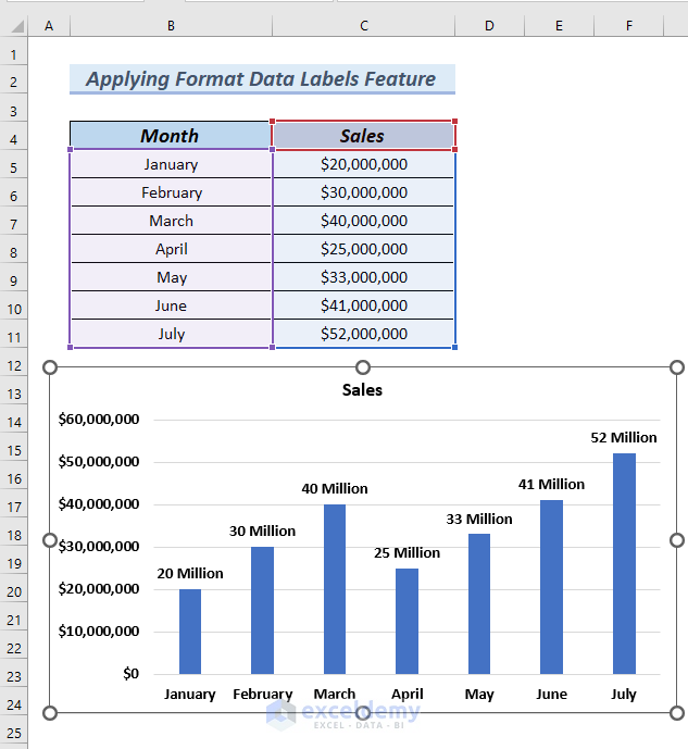
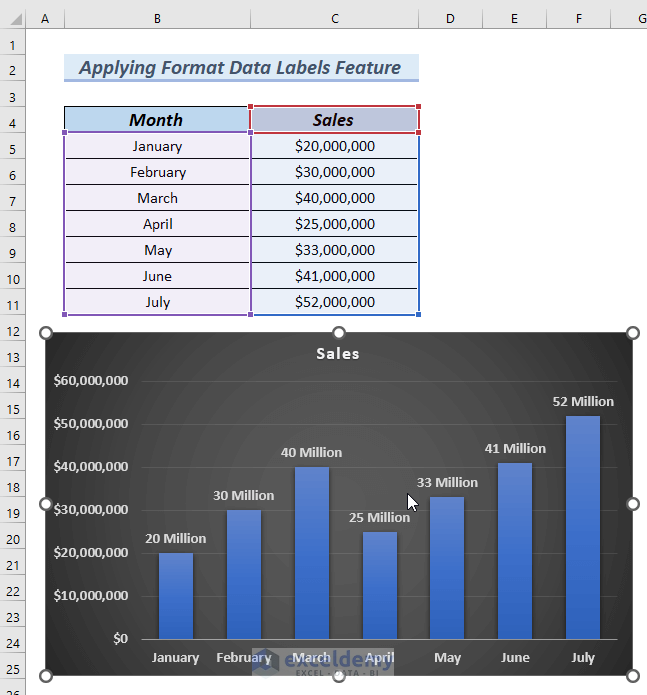
- Format the chart by following the Steps described in Method 1.
Our chart now looks like this:
Read More: How to Change Font Size of Data Labels in Excel
How to Use Thousands in Data Labels of Excel Charts
Steps:
- Insert a column chart by following the Steps described above.
A column chart is generated.
- Right-click on the Y-axis of the chart.
- Select Format Axis from the Context Menu.
A Format Axis dialog box appears at the right end of the Excel sheet.
- Click on Number.
- Click on the drop-down icon of the Category box.
- Select Custom.
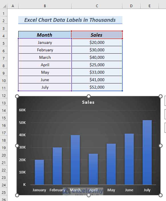
- Enter [>999999] #,,”M”;#,”K” in the Format Code box.
- Click Add.
The chart data labels display in Thousands.
- Format the chart by following the steps described in Method 1.
The chart’s data labels now looks like this:
Read More: How to Show Data Labels in Thousands in Excel Chart
Download Practice Workbook
Related Articles
- How to Show Data Labels in Excel 3D Maps
- How to Use Conditional Formatting in Data Labels in Excel
- [Fixed!] Excel Chart Data Labels Overlap
- How to Add Additional Data Labels to Excel Chart
- How to Add Outside End Data Labels in Excel
<< Go Back To Data Labels in Excel | Excel Chart Elements | Excel Charts | Learn Excel
Get FREE Advanced Excel Exercises with Solutions!
