Sometimes, we need to draw the Y equation on an Excel graph. Fortunately, it is quite simple and easy to do this in Excel. In this article, we will show you six easy ways to get the Y equation on an Excel graph. Read the article carefully and save your time.
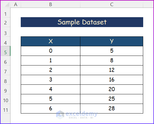
From the Excel graph, you can get Y equations for various types of equations. Generally, it includes linear equations, Exponential equations, Logarithmic equations, polynomials, Power equations, and Moving averages. Today we will demonstrate to you all of them step by step. We have selected a random dataset as the following image.
1. Creating Linear Y Equation
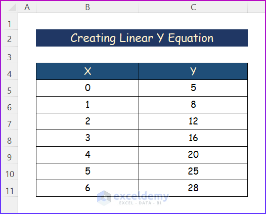
Generally, Linear Y Equation is the most common type of equation in Excel. We use them on a regular basis. Moreover, it is best for linear data. For the purpose of demonstration, we have used the following random dataset.
Hence, follow the steps.
Steps:
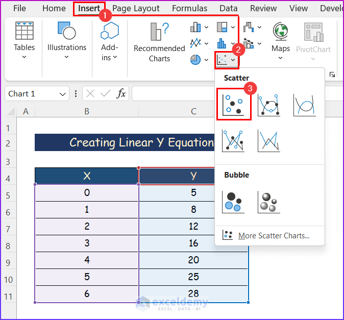
- Firstly, select any cell within the data.
- Secondly, click the Insert tab.
- Next, from the Charts group of commands, click on the Scatter command.
- After that, a drop-down menu will appear; select the first one, which is simply the Scatter chart.
- A chart will appear. However, select the chart and click on the + symbol.
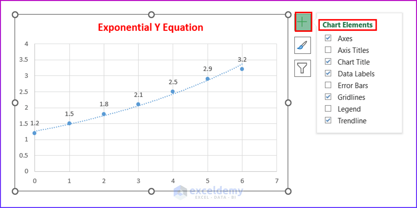
- After that, click on the Chart Elements as shown below.
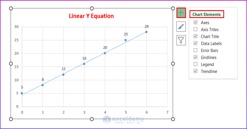
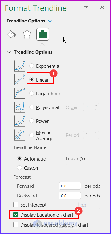
- From the Format Trendline, select Linear and Display Equation on Chart.
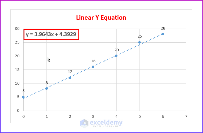
- Finally, you will get the Linear Y Equation as below.
2. Plotting Y Equation on Excel Graph for Exponential
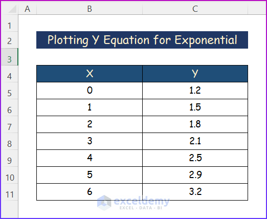
Another type of equation that we can plot in an Excel graph is the Exponential Y Equation. It is not only quite simple but also easy to plot. Hence, follow the dataset mentioned below, which I have used to plot the Exponential Y Equation.
Steps:
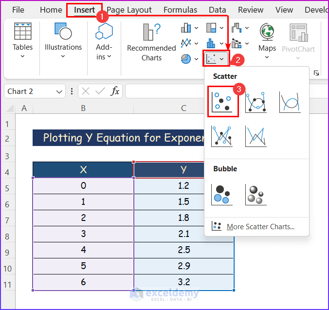
- First, select any cell within the data.
- Similarly, click the Insert tab and select the Scatter command from the Charts group of commands.
- After that, select the first one, simply the Scatter chart from the drop-down menu.
- Then, a chart will appear. However, select the chart and click on the + symbol.
- After that, click on the Chart Elements as mentioned below.
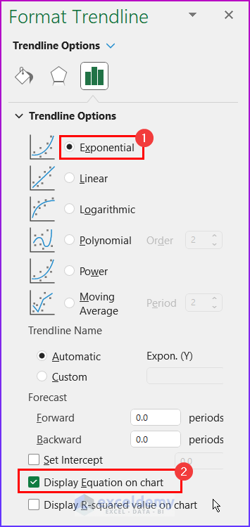
- Lastly, select Exponential and Display Equation on Chart from the Format Trendline option.
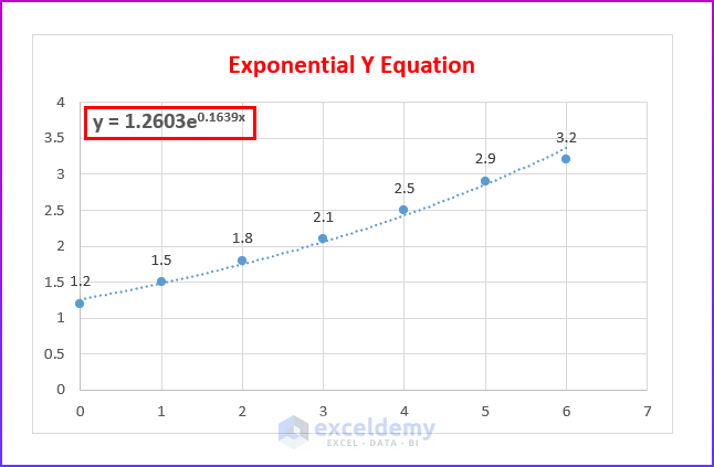
- Finally, the Exponential Y Equation will appear as below.
Read More: How to Show Equation in Excel Graph
3. Making Logarithmic Type Y Equation
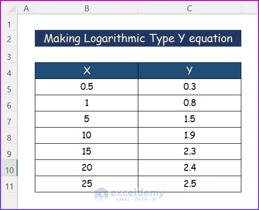
In general, Logarithmic type Y equations are quite common to plot data that grows or declines quickly before leveling out. Moreover, both positive and negative values may be present while creating Logarithmic Y Equations. For example, I have used the following random dataset in order to make the Logarithmic Type Y Equation.
Steps:
- Firstly, select any cell within the data.
- Secondly, click on the Insert tab.
- Thirdly, from the Charts group of commands, select the Scatter command.
- After that, select the Scatter chart from the Scatter command.

- After all, a chart will appear. Again, select the chart and click on the + symbol.
- After that, mark the Chart Elements as shown below.
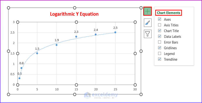
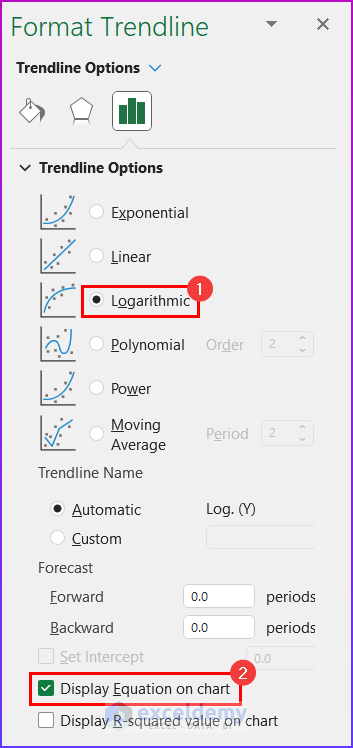
- In addition to this, select Logarithmic and Display Equation on Chart.
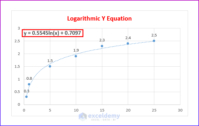
- Finally, you will get the Logarithmic Y Equation in the following image.
4. Plotting Y Equation for Polynomials on Excel Graph
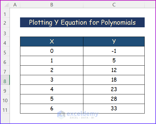
A Polynomial is often categorized based on the degree of the biggest exponent. Usually, Polynomial Y Equations perform better for big datasets that contain multiple rises and falls. Moreover, it has multiple orders. However, we have selected the below dataset in order to get the Polynomial Y Equation.
Steps:
- First of all, select a cell from the given data.
- Next, click the Insert tab.
- Similarly, from the Charts group of commands, select the Scatter command.
- After that, a drop-down menu will appear; select the Scatter chart.
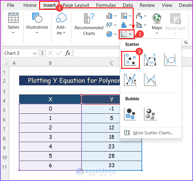
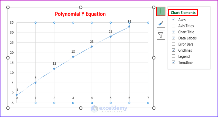
- Hence, a chart will appear. However, click on the + symbol after selecting the chart.
- After that, click on the Chart Elements in the image below.
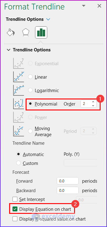
- Select Polynomial of Order 2 and Display Equation on Chart from the Format Trendline Option accordingly.
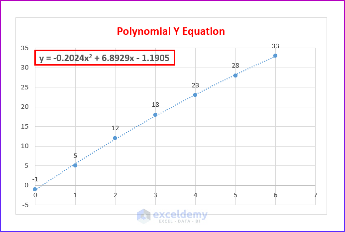
- Lastly, you will find the Polynomial Y Equation in the below picture.
Read More: How to Make a Polynomial Trendline in Excel
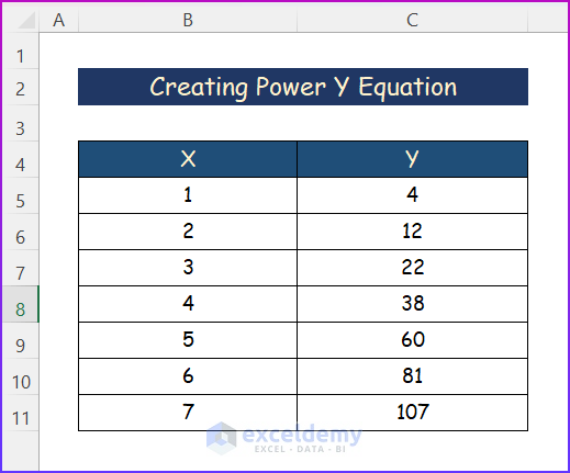
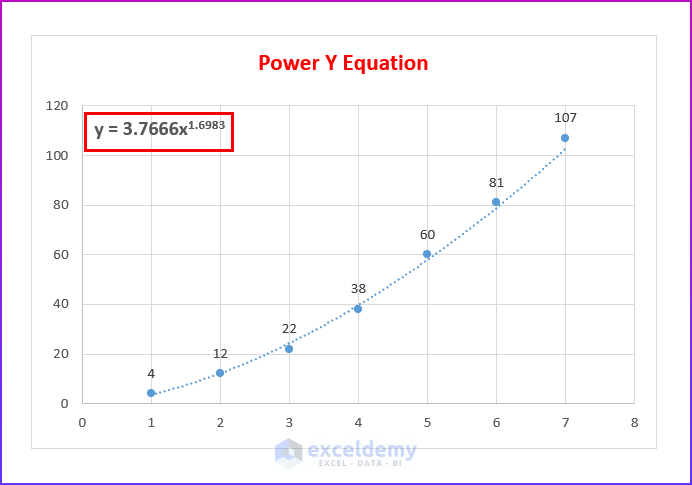
5. Creating Power Y Equation on Excel Graph
The exponential curve and the power curve line are extremely similar. However, the Power Curve is more symmetric. But Power Y Equation will not work if the data contains zero or any negative values. For the purpose of demonstration, I have picked the sample dataset mentioned below. Lastly, you have to go through the following steps.
Steps:
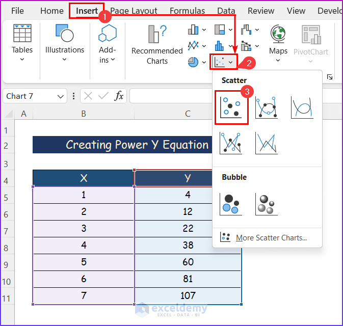
- Firstly, select any cell from the data.
- Secondly, click the Insert Moreover, click on the Scatter command from the Charts group of commands.
- Thirdly, select simply the Scatter chart.
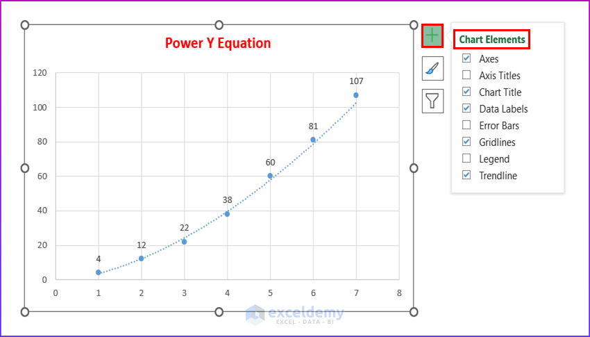
- Above all, a chart will appear.
- Now, select the chart and click on the + symbol.
- After that, click on the Chart Elements which are mentioned in the below image.
- From the Format Trendline Option, select Power and Display Equation on Chart.
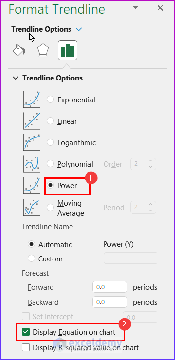
- Finally, you will get the Power Y Equation as in the image below.
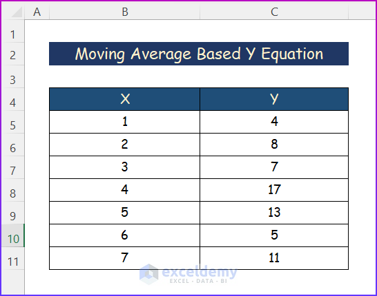
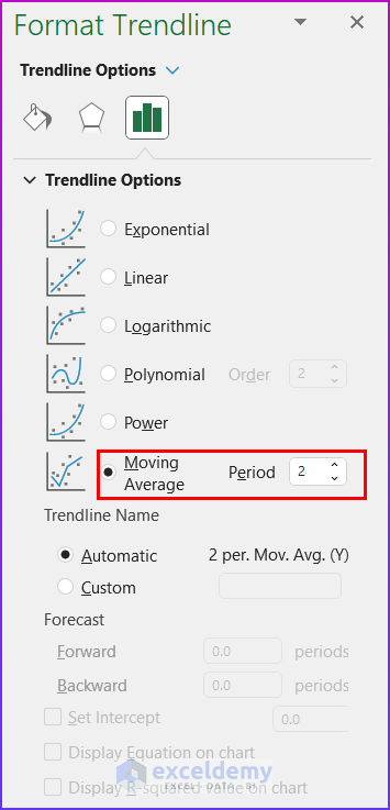
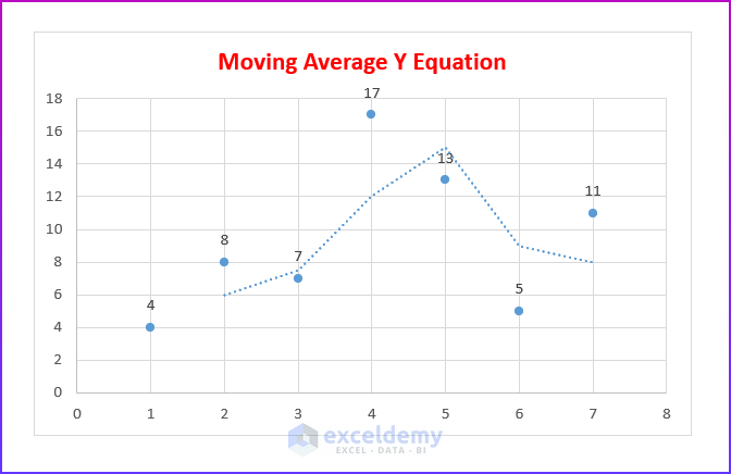
6. Moving Average Based on Y Equation
In some situations, you may have data that contains several fluctuations. In this case, the Moving Average trendline helps a lot. Though it doesn’t provide any Y equation. But it smooths the extreme ups and downs in the data set and certainly shows a smooth curve. For example, I have created the sample dataset mentioned below to plot the curve.
Steps:
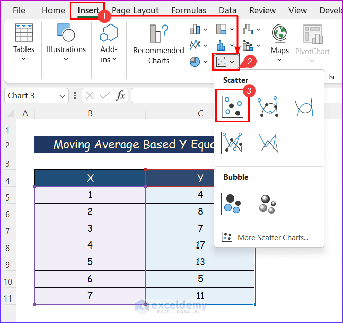
- At first, click on any cell within the data.
- Now, press the Insert tab.
- Next, from the Charts group of commands, select the Scatter command.
- After that, a drop-down menu will appear. Similarly, select the first one, simply the Scatter chart.
- Gradually, a chart will appear. However, click on the + symbol after selecting the chart..
- After that, select some of the Chart Elements as shown below.
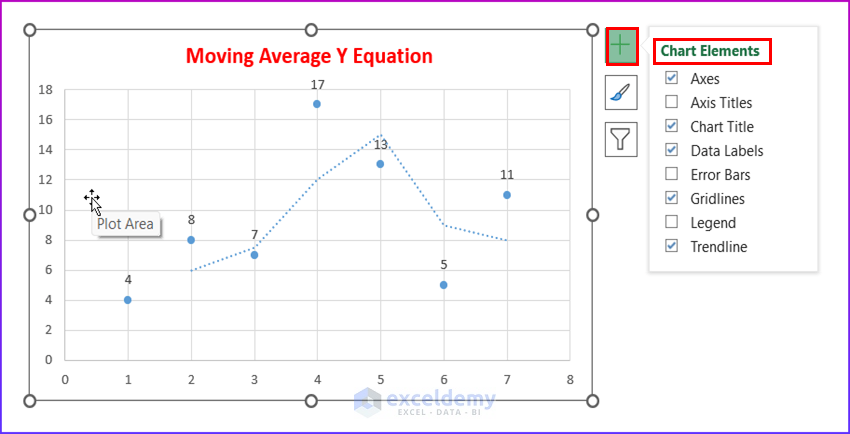
- Lastly, select Moving Average of Period 2 and Display Equation on Chart from the Format Trendline option.
- Finally, you will get the Moving Average Y equation as mentioned in the below image.
Read More: How to Create Equation from Data Points in Excel
Download Practice Workbook
You can download the workbook used for the demonstration from the download link below.
Conclusion
These are all the steps you can follow in Excel to get the Y equation on the Excel graph. Hopefully, you can now easily make the needed adjustments. I sincerely hope you learned something and enjoyed this guide. Please let us know in the comments section below if you have any queries or recommendations.
Related Articles
- How to Find the Equation of a Line in Excel
- How to Find the Equation of a Trendline in Excel
- How to Use Trendline Equation in Excel
- How to Find Slope of Trendline in Excel
- How to Find Slope of Polynomial Trendline in Excel
- How to Find Intersection of Two Trend Lines in Excel
<< Go Back To Trendline Equation Excel | Trendline in Excel | Excel Charts | Learn Excel
Get FREE Advanced Excel Exercises with Solutions!
