Latest Blog Posts

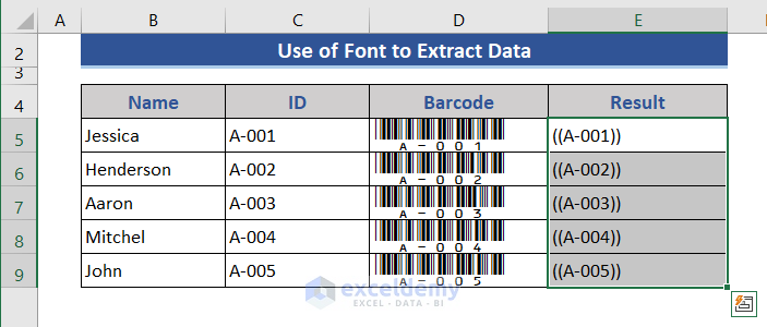
How to Create Barcode Without Font in Excel (2 Smart Methods)

Method 1 - Using Add-in to Create Barcode Without Font Steps: Download an Add-in and install it on your computer. Click on the Add-ins ...

How to Format Data Labels in Excel (Easy Steps)

Dataset Overview To display formatted data labels in Excel, follow these steps using the below dataset that includes country names and their ...

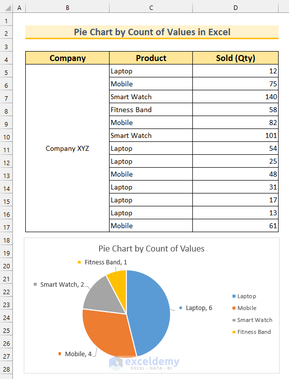
How to Create a Pie Chart by Count of Values in Excel (2 Methods)

Dataset Overview To illustrate the methods, we’ve chosen a dataset with three columns: Company, Product, and Sold (Qty). Method 1 - ...

How to Do Exponential Smoothing in Excel: 2 Methods

Method 1 - Using Data Analysis Tool to Do Exponential Smoothing in Excel Step 1 - Enabling Data Analysis ToolPak Add-In In Excel, Data Analysis ...

Progress Circle Chart in Excel as Never Seen Before

A progress circle chart is a great tool to visualize the completion status of a task. Generally, we can create a progress circle chart by simply ...

Excel Area Chart Data Label & Position

This article deals with the excel area chart data label position. An area chart is used to plot data arranged in rows or columns on a worksheet. You ...

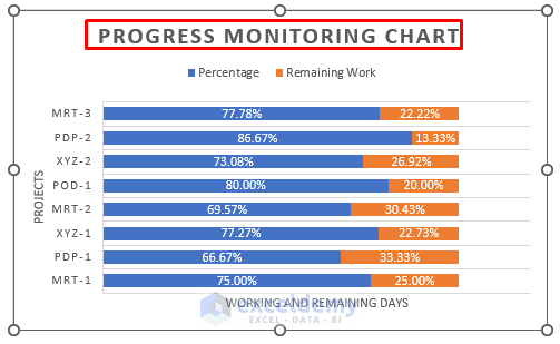
How to Make a Progress Monitoring Chart in Excel – 2 Steps

The sample dataset contains information on different projects. Step 1 - Create a Dataset Calculate the percentage of work on the ...

Create an Excel Bar Chart with a Line Overlay – 3 Steps

The following table contains the Month, Sales, and Profit. Create an Excel bar chart with a line overlay: Step 1- Inserting the Bar Chart ...

How to Use Barcode Scanner in Excel (2 Suitable Ways)

Method 1 - Use a Barcode Scanner and Show the Scanned Code in an Excel Cell Steps: You need to manage a barcode scanner. Turn off the computer ...

How to Make a Personal Monthly Budget in Excel (2 Smart Ways)

We always try to make the best out of our limits. In order to make the best use of our monthly income, it is best to make a personal monthly budget. ...


How to Change Legend Colors in Excel: 4 Easy Methods

Method 1 - Using Context Menu Steps: Right-click on the column that is represented by the legend you are trying to change the color. The ...

How to Create a Bar Graph in Excel with 2 Variables – 3 Methods

  Types of Bar Graphs in Excel There are two types of bar graphs: Horizontal (2-D/ 3-D bars) and Vertical (2-D/ 3-D Columns). Bar ...

How to Show Percentage in Legend in Excel Pie Chart (with Easy Steps)

Step 1 - Prepare the Dataset We'll make a dataset containing monthly total sales in different months. Input the name of the first 6 months in ...

How to Create a Column Chart in Excel (2 Suitable Ways)

Column Charts can be used to show how data changes over time or to show comparisons between things. In Column Charts, the categories are usually ...

How to Add Vertical Line to Excel Bar Chart (3 Quick Ways)

Excel charts are a familiar figure to all of us. Among them, the Bar chart is a pretty common one. In our regular life, we use it to show the data ...

Close the CTA

Advanced Excel Exercises with Solutions PDF


ExcelDemy
Logo