What Is Pivot Chart? Pivot charts are a powerful way to visualize summarized data from a pivot table. They help illustrate comparisons, patterns, ...
Step 1 - Arrange the Dataset for a Scatter Plot with 3 Variables We have a dataset of sales with Month(X) in Column B, Product Price(Y) in ...
Excel is a powerful tool to handle large data sets and charts. In Excel, we often use the Correlation Scatter Plot to visualize our data, find any ...
Method 1 - Use the Taxable Income to Compute the Income Tax in Excel STEPS: Enter the Gross Income: the whole amount received from all sources, ...
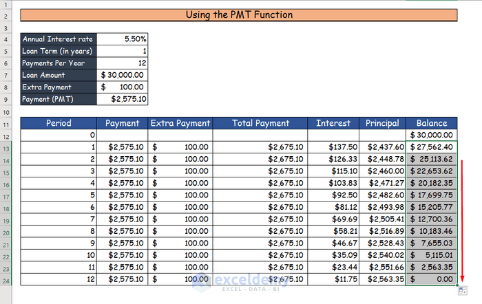
The sample dataset will be used to create an Excel loan calculator with extra payments. Method 1- Applying the IFERROR Function to Create ...
Watch Video – Create Real Time Tracker in Excel In the following article, we will demonstrate how to create a real-time ...
The sample dataset covers prices for crude oil and retail gas in the U.S.A. over a 12-month period. Step 1 - Arrange Data Properly The ...
How to Add a Stacked Area Chart in Excel We have a dataset of 6 months’ sales data of an electronic store. Using these data, you can create ...
To demonstrate our methods, we'll use the following sample dataset that contains Income and Expenses in different Categories. Example 1 - ...
Looking for ways to show the percentage in 100 stacked column chart in Excel? Then this is the right article for you. You can show the percentage ...
Method 1 - Inserting Dummy Values to Create a Legend Without a Chart in Excel Add a helper column adjacent to the dataset. Copy the immediate cell ...
The following table contains the Due Date and Task columns. We will use it to create a progress tracker. Method 1 - Using "To-Do List with ...
Dataset Overview Suppose you have a dataset containing the sales quantity of two products over six months, and you want to create a bar chart based ...
What Is a Stacked Bar Chart? A stacked bar chart is a graph to represent and compare the segments of a whole. It can show the parts of a ...
Watch Video – Create an Area Chart in Excel Example 1 - Make a Simple 2-D Area Chart in Excel Steps: Select range B6:E12. Cell ...
Advanced Excel Exercises with Solutions PDF