This article demonstrates the features of a Column Chart vs Bar Chart in Excel. Without any doubt, Excel charts are an excellent tool. It’s suitable for presenting any data graphically rather than by displaying a complicated table with numerous fields. Here, we will discuss a Column Chart vs Bar Chart in Excel and when to use which one effectively.
What Is a Column Chart and Bar Chart in Excel?
A Chart is a graphic representation of data, where the data is shown as bars, lines, circular shapes, etc. When tabular data is insufficient to show meaningful correlations or patterns between data points, we use a chart to present the data and further explore a subject. Column Charts and Bar Charts are the two charts most frequently used to track changes over time between various groups.
- A Bar Chart employs horizontal bars to depict data which are used to compare values across categories. The bars’ lengths are positively associated with the values they stand for.
- Column Chart uses vertical bars to represent data. Column charts can be used to demonstrate change over time and to compare numbers across categories.
How to Make a Column Chart in Excel
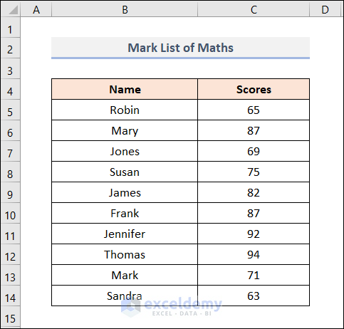
Suppose, we have a Mark List of Maths of some students including their Names and Scores.
We’ll plot a Column Chart from this dataset. Follow the steps below.
Steps:
- First, select the whole dataset including the headers which means in the B4:C14 range.
- Then, go to the Insert tab.
- Now, select Insert Column or Bar Chart > 2-D Clustered Column.

- At this point, our Column Chart looks like the one below.
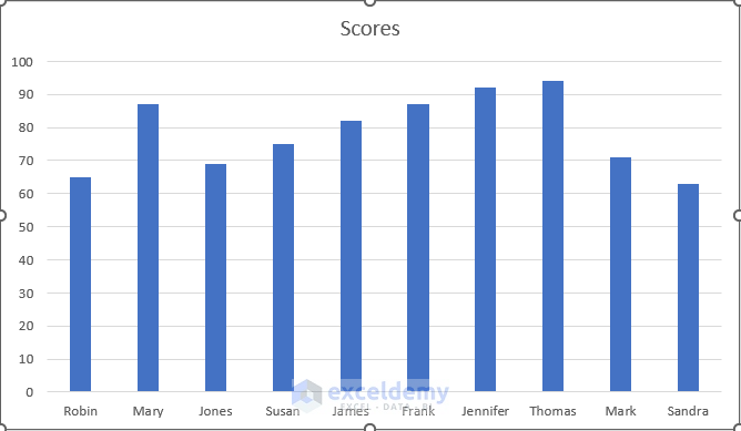
In the image above, all the columns are in the same colors. We can make it more suitable by giving different colors to each column.
- Firstly, right-click on any column.
- Then, select Format Data Series from the menu.
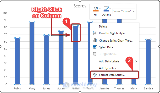
- Eventually, this will open up the Format Data Series task pane.
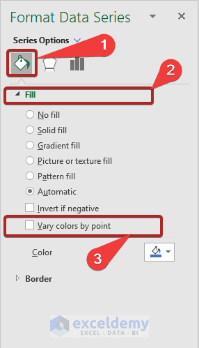
- Then, click on the Fill & Line icon.
- After that, expand the Fill menu.
- Now, check the box of Vary colors by point.
At this moment, our Column Chart looks like the one below.
This looks more captivating than before.
How to Make a Bar Chart in Excel
From the same dataset that we used in our previous section, we’ll make a Bar Chart. Follow us carefully.
Steps:
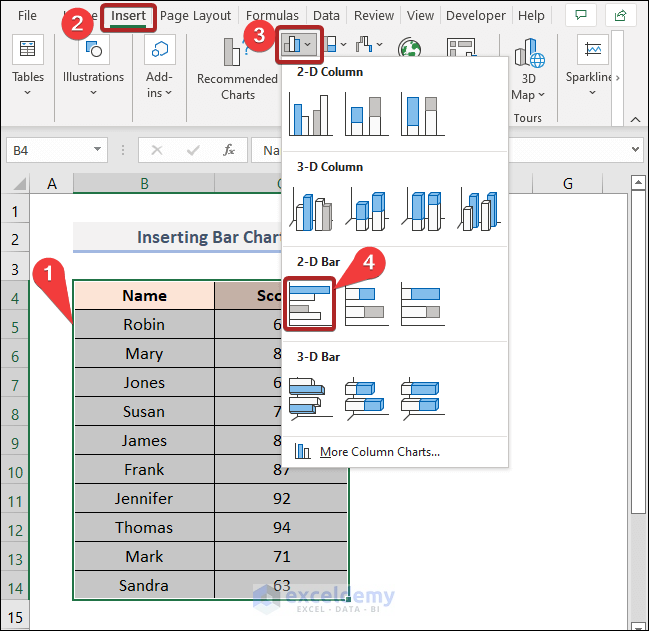
- Firstly, select cells in the B4:C14 range covering the whole dataset.
- Then, go to the Insert tab.
- Now, select Insert Column or Bar Chart > 2-D Clustered Bar.
Therefore, a Bar Chart opens through our previous action.
We changed the default blue color of the bar to differentiate it from our previous Column Chart.
Basic Difference Between Column and Bar Chart in Excel
Both the Bar and Column charts use rectangular bars to display data, with the length of the bar being proportional to the data value. Both charts compare two or more values. However, their orientation is what makes them different. The sole distinction is that the Column Chart is displayed vertically (with values on the y-axis and categories on the x-axis), whilst the Bar Chart is presented horizontally (with values on the x-axis and categories on the y-axis).
Column Chart:

Bar Chart:

There are some instances of data representation where these charts outperform one another in terms of functionality. This happens due to the differences in how they are represented. We are giving examples below where sometimes a Column Chart communicates the message better and sometimes a Bar Chart works better.
Example 1: Column Chart Is Suitable to Compare Between Sets of Variables
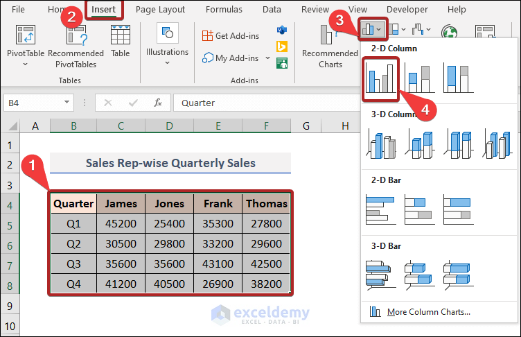
Let’s say, we have a dataset of Sales Rep-wise Quarterly Sales.
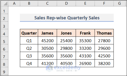
Here, columns B, C, D, E, and F represent the Quarters, and the sales amount of James, Jones, Frank, and Thomas respectively. Now, we’ll create a Column Chart from this dataset.
Steps:
- Firstly, select cells in the range B4:F8.
- Then, go to the Insert tab.
- Now, select Insert Column or Bar Chart > 2-D Clustered Column.
Therefore, it opens a Column Chart like the one below.
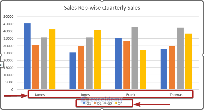
In the chart above, we can see that the Quarterly sales of James are together. But, we want to compare the sales among all sales reps in each quarter.
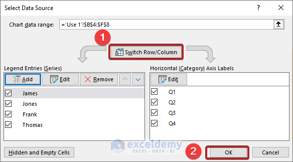
- First, right-click anywhere on the graph.
- Then, select Select Data from the menu.

- However, a Select Data Source wizard will open up.
- Then, select Switch Row/Column.
- Now, click on OK.
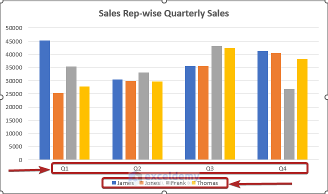
Now, our Column Chart compares the sales of all sales reps in each quarter.
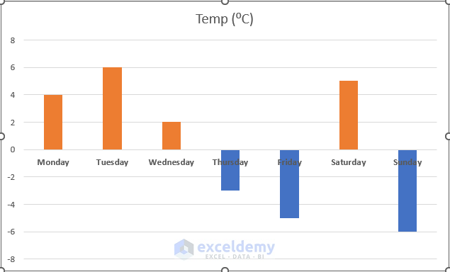
Example 2: Column Charts Are Convenient to Represent Data Sets with Negative Values
Here, we have a dataset for the Observation of Daily Temperatures including the Days and their Temperatures in degrees Celsius consecutively.
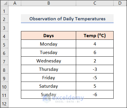
In this dataset above, temperatures of some days have gone to negative values.
- At first, insert a Column chart following the steps in Example 1.
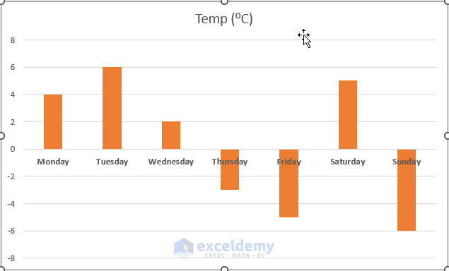
To make the minus value understandable easily, we’ll add a different color to these columns.
- Now, right-click on any column in the chart.
- Then, select Format Data Series.
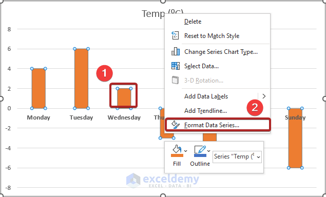
- At this moment, the Format Data Series task pane opens.
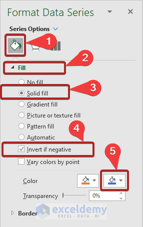
- Then, click on the Fill & Line icon.
- After that, expand the Fill menu.
- Now, check the box of Inverse if negative.
- Later, choose a Fill Color according to your preference.
- However, our chart is more distinguishable than before.
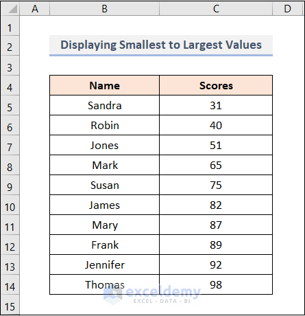
Example 3: Column Chart Is Suitable to Display Smallest to Largest Values to Focus on the Largest Values
Here, a Column Chart performs best. The columns are displayed with the smallest on the left and the largest on the right. Additionally, it is simple to focus on the largest value.
For example, we have a mark list of some students sorted from smallest to largest.
The Column Chart for this dataset would look like the one below.
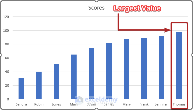
From the image above, the largest value is noticeable without extra effort.
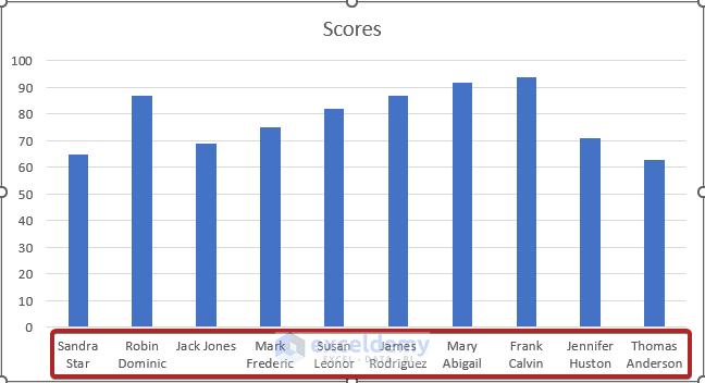
Example 4: Bar Charts Are Preferable to Show Long Data Labels in Category Axis
There isn’t much room in the category axis of a Column Chart. Therefore, the category axis may appear cluttered if your data labels are lengthy. However, employing the Bar Chart will significantly enhance the legibility of your chart.
Also, we have a mark list of some individuals like before.

In the image above, we can notice that the text strings of the Names of the individuals are quite long. A Bar Chart is the best option for this kind of situation.
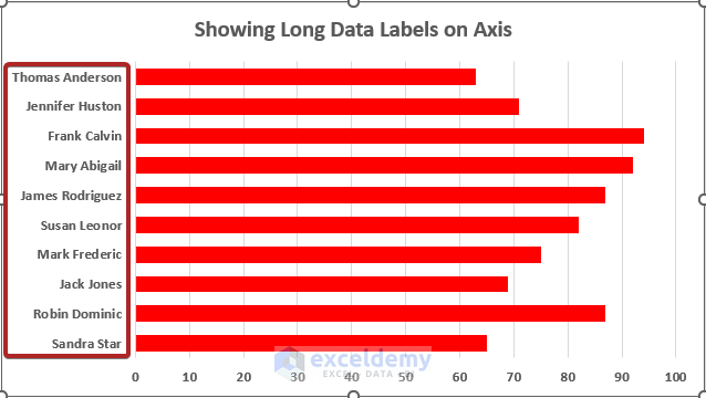
Those long data labels on the axis are easily fitted in the chart above.
If we used a Column Chart instead of this, this would look like the one below.
Obviously, this doesn’t look cool or comprehensive.
Read More: How to Make a Stacked Bar Chart in Excel
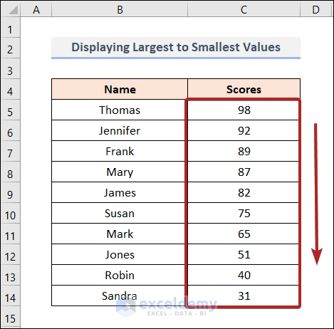
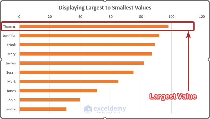
Example 5: Bar Chart Is Handy Enough to Display Largest to Smallest Values to Focus on the Largest Values
In this case, a Bar Chart is ideal. The values are displayed with the largest at the top and the smallest at the bottom. For example, we have a mark list of some students sorted from largest to smallest.
The Bar Chart for this dataset would look like the one below.
Read More: Excel Stacked Bar Chart with Subcategories
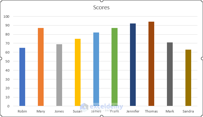
Example 6: Bar Chart Is Suitable When the Dataset Is Larger
When the dataset has so many rows of categories, that means the data set is big enough. In that case, using a Bar Chart is more convenient than a Column Chart.
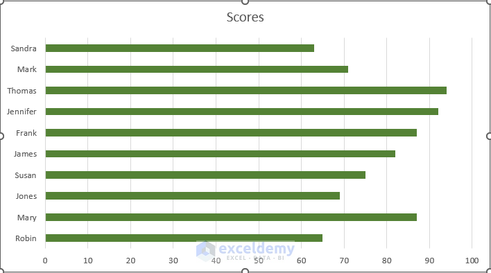
In this place, we have Scores of some random individuals.
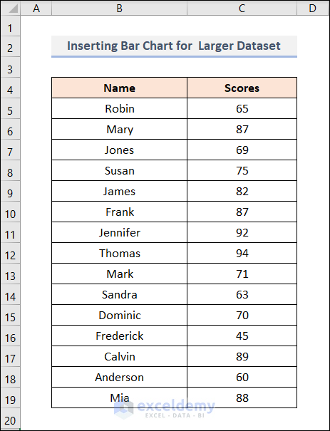
We can easily understand that this dataset is larger than those we used before. In such a situation, a Bar Chart is the perfect fit.
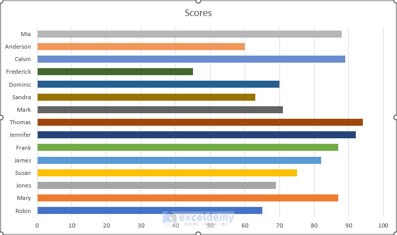
It’s soothing for the eye also.
How it would look like if we used a Column Chart in this position?
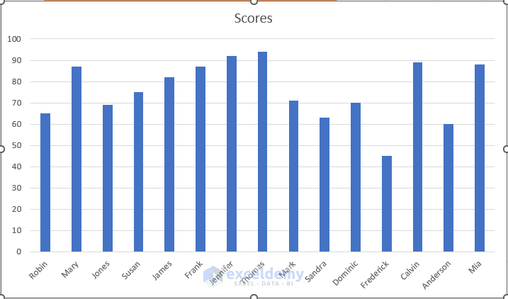
We can notice that there isn’t enough space available for labels on the axis. If the dataset becomes heavier, it will get messier.
Download Practice Workbook
You may download the following Excel workbook for better understanding and practice yourself.
Conclusion
Thank you for reading this article, we hope this was helpful. Please let us know in the comment section if you have any queries or suggestions.
Related Articles
- How to Create Stacked Bar Chart with Negative Values in Excel
- How to Create Stacked Bar Chart for Multiple Series in Excel
- How to Create Stacked Bar Chart with Line in Excel
- How to Plot Stacked Bar Chart from Excel Pivot Table
- How to Create Stacked Bar Chart with Dates in Excel
- How to Create Bar Chart with Multiple Categories in Excel
- How to Ignore Blank Cells in Excel Bar Chart
<< Go Back to Excel Bar Chart | Excel Charts | Learn Excel
Get FREE Advanced Excel Exercises with Solutions!

Thank you
Your contents are very much helpful
You’re most welcome, Ovi! We’re always trying hard to deliver the best possible solutions to our readers.