A progress circle chart is a great tool to visualize the completion status of a task. Generally, we can create a progress circle chart by simply inserting a doughnut chart. But, this chart can be unattractive and vague sometimes as default. Regarding this, with some customizations, we can create an excellent-looking progress circle chart in Excel. In this article, I will show you detailed steps to create a progress circle chart in Excel as never seen before!
How to Create a Progress Circle Chart in Excel as Never Seen Before: Steps
Say, we have the completion status of a task. Now, you can create an excellent progress circle chart with arc edges from this data. Follow the steps below to do this.
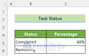
📌 Step 1: Create a General Progress Circle Chart
- First and foremost, you need to calculate the remaining percentage with respect to the completed percentage. To do this, select the C6 cell and write the following formula. Next, press the Enter button.
=1-$C$5
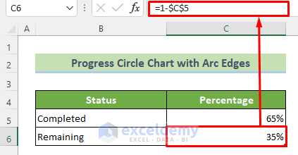
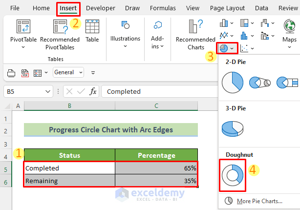
- Afterward, select the cells B5:C6. Subsequently, go to the Insert tab >> Insert Pie or Doughnut Chart tool >> Doughnut option.
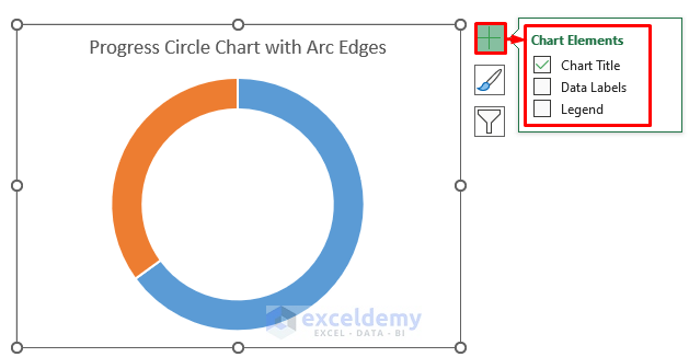
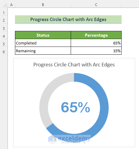
As a result, you will have a doughnut chart acting as a progress circle chart according to your data. This would look like the figure below by default. Here, the blue segment represents the completed percentage and the orange one represents the remaining percentage.

Read More: How to Make Progress Chart in Excel
📌 Step 2: Format Chart Appearance
Now, you need to customize the chart for a better look.
- To do this, at first, click on the Chart Elements icon. Subsequently, tick only the Chart Title option. Afterward, Rename the Chart Title as your desired title by double-clicking on the chart title text box.
- Now, you can see that there is a gap between the two arc segments. To remove this, double click on the blue-colored segment >> go to the Format tab >> Shape Outline tool >> No Outline option. Repeat this procedure for the orange segment too.

- Consequently, you can see that there is no gap between the two segments now.
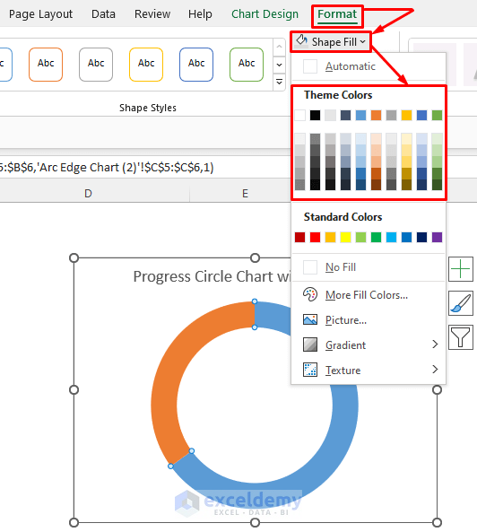
- Now, suppose, for a better look of the chart you want to change the fill color of the orange segment. For doing this, double-click on the orange segment first.
- Subsequently, go to the Format tab >> Shape Fill tool >> Choose your desired color from the Theme Colors option. Similarly, you can change the other segment’s color too.
- Afterward, to show the completed percentage inside the chart, go to the Insert tab >> Text group >> Text Box tool.
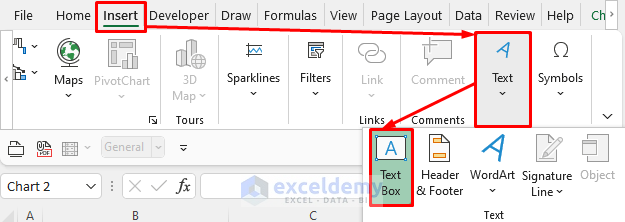
- As a result, a text box will appear inside the chart wherever you click your mouse. Now, after clicking on the text box, go to the formula bar. Subsequently, put an equal sign (=) and refer to the C5 cell of the worksheet.
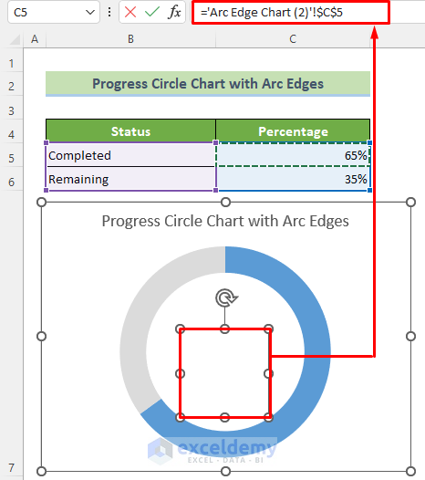
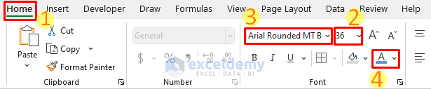
- Consequently, the completed percentage will be shown inside the chart now. But, to make it more visible, go to the Home tab >> make the Font Size 36 >> change the Font as Arial Rounded MT Bold >> Change the Font Color as your completed percentage segment’s color. Besides, you can change the position of the text box as you want by simply dragging it.
Thus, you will get a more attractive and understanding progress circle chart which may look like this.
Read More: Make a Progress Pie Chart in Excel
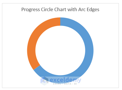
📌 Step 3: Create Arc Borders to Make the Circle Chart Unique
Now, to make the chart fantastic like never seen before, you can change its borders.
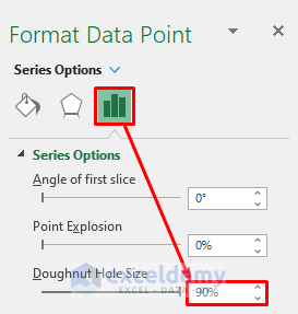
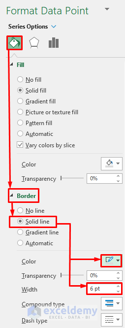
- In order to do this, initially, you need to change the doughnut hole size. For this, click on any segment of the chart.
- As a result, the Format Data Point ribbon will appear on the right side. Afterward, go to the Series Options group and fix the Doughnut Hole Size option as 90%.
- Afterward, select the blue colored segment >> go to the appeared Format Data Point ribbon at the right side >> Fill & Line group >> Border semi group >> Solid line option >> Outline color icon >> choose Blue, Accent 1 >> Width option >> 10 pt.
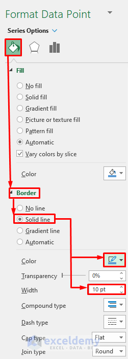
- Similarly, for the gray segment, select the segment >> Data Format Point ribbon >> Fill & Line Group >> Border semi group >> Solid line option >> Outline color icon >> choose Gray, Accent 3 >> Width option >> 6 pt.
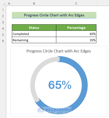
Finally, you will have a unique progress circle chart like never seen before. And, for instance, it should look like this. Besides,, if you change the completed percentage, the progress circle would also change accordingly.
Read More: How to Make a Progress Monitoring Chart in Excel
Download Practice Workbook
You can download and practice from our workbook here for free!
Conclusion
To conclude, in this article, I have shown you all the detailed steps to make a unique progress circle chart in Excel which is not commonly seen. I would suggest you go through the full article carefully and practice several times on your own. I hope you find this article helpful and informative. If you have any further queries or recommendations, please feel free to comment here.
<< Go Back to Progress Chart in Excel | Excel Charts | Learn Excel
Get FREE Advanced Excel Exercises with Solutions!
