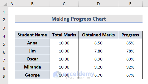
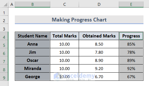
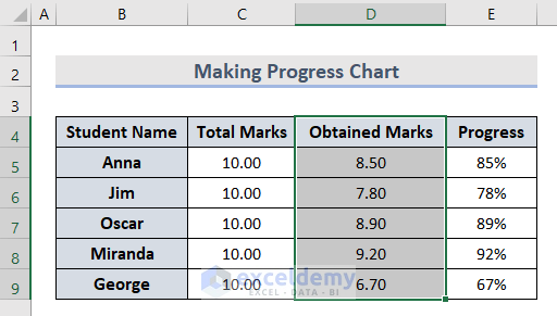
The dataset showcases 5 students’ marks:
Method 1 – Using the Excel Charts Feature to Create a Progress Chart
1.1 Bar Chart
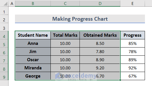
- Select B4:D9.
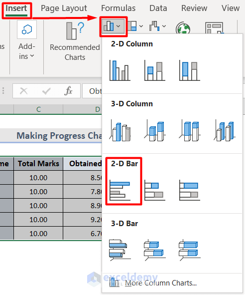
- Go to the Insert tab and select Charts.
- Choose Clustered Bar in Column Chart.
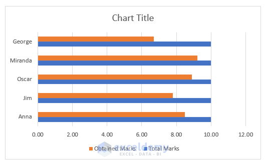
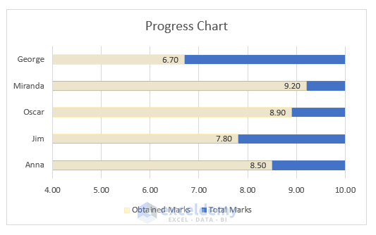
The progress chart is displayed:
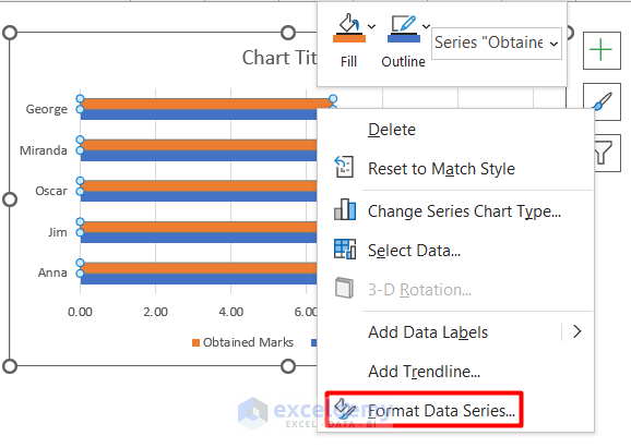
Customize the progress chart.
- Select the Obtained Marks bar.
- Right-click and select Format Data Series.
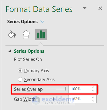
- Set Series Overlap to 100% in the Format Data Series panel.
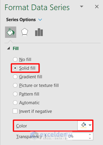
- Change the Fill type and Color.
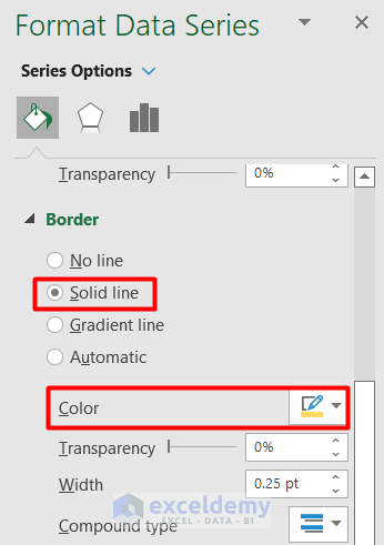
- Change the Border type to Solid line and Color.
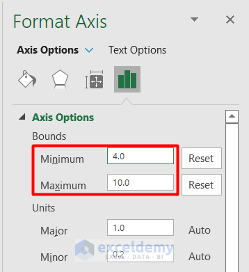
- Select the Horizontal Axis and change the Bounds range. Here, the Minimum is 4 and the Maximum is 10.
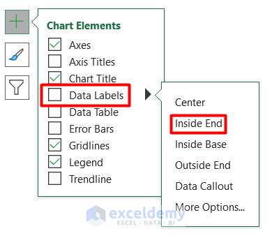
- Choose Inside End in Data Label in the Chart Elements section.
This is the output.
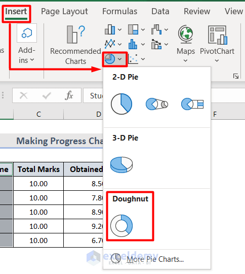
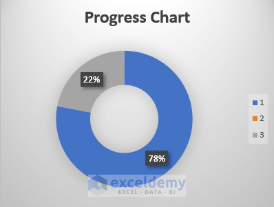
1.2 Doughnut Chart
- Select columns B and E by pressing Ctrl.
- Go to the Insert tab and select Charts.
- Choose Doughnut in Pie Chart.
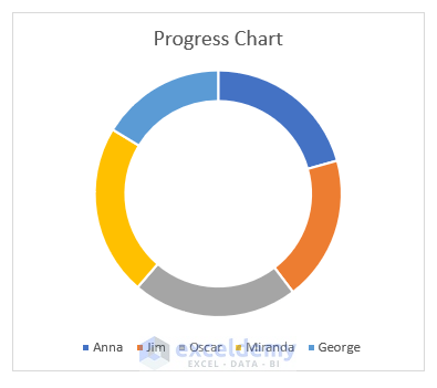
The progress chart is displayed.
- Customize it:
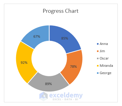
Note: The pie chart works with percentages.
Read More: Progress Circle Chart in Excel as Never Seen Before
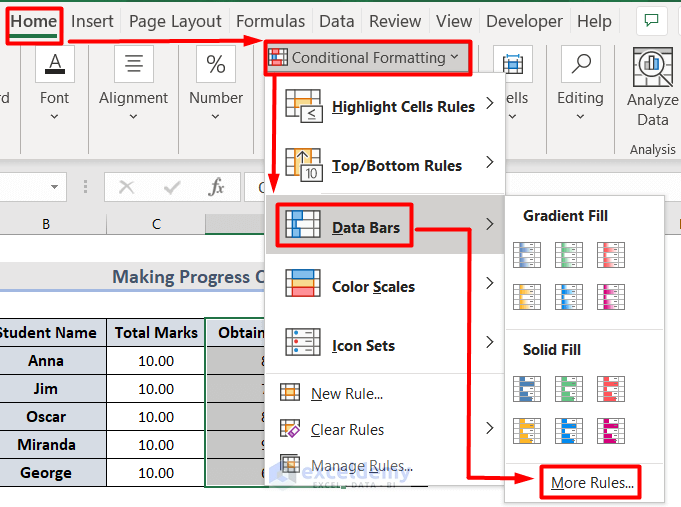
Method 2 – Create Progress Chart with Conditional Formatting in Excel
2.1 Data Bar
- Select the cells to insert the bar.
- Select Conditional Formatting in Styles in the Home tab.
- Go to Data Bars and select More Rules.
- In the New Formatting Rule window, format Type and Value.
- Change the Bar Appearance.
- Click OK.
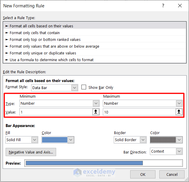
- The data bar is displayed as a progress chart.
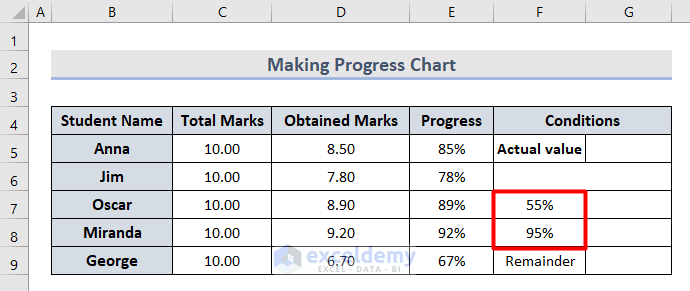
2.2 Doughnut Chart
- Add a new Conditions column to the dataset.
- In F7 and F8, the minimum and maximum range were provided.
- Enter any progress value in G5:
=E6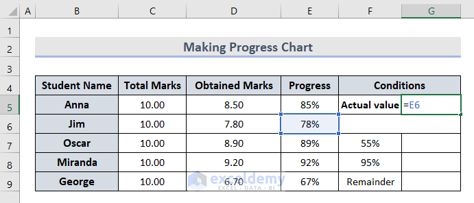
- Use the IF formula based on the conditions of F7 and F8 in G7.
=IF(AND(G5>F7,G5<=F8),G5," ")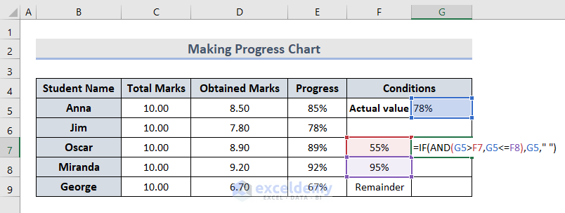
The IF formula is used to calculate if the actual value is greater or less than the minimum or maximum values. The AND function evaluates the value inside the selected dataset to justify whether it is true or false based on the condition.
- Enter the MAX formula in G9 to calculate the remainder from the actual and conditional values.
=MAX(1,G5)-G5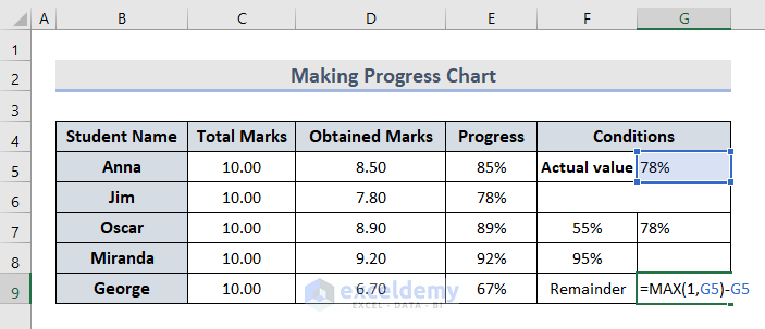
- Select G7:G9.
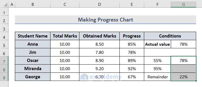
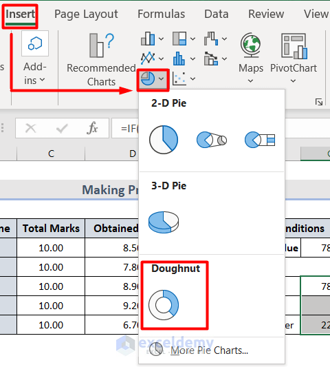
- Go to the Insert tab and select Charts.
- Choose Doughnut in Pie Chart.
The progress chart is displayed.

- Customize it:
Download Workbook
Download the sample file and practice.
Things to Remember
- The progress chart does not show any change over time.
- In the case of conditional formatting for the doughnut chart, you can only see one cell value result at a time.
- The progress chart displays values on one metric.
- The progress chart does not show blank cells information.
Related Articles
<< Go Back to Progress Chart in Excel | Excel Charts | Learn Excel
Get FREE Advanced Excel Exercises with Solutions!
