What Is a Progress Chart?
A progress chart visually represents the completion status of a specific task. By using a progress chart, you can easily determine how much of the task is finished and how much is still in progress. This information allows you to plan your next steps effectively. Progress charts can take various forms, including bar charts, pie charts, or doughnut charts.
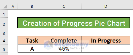
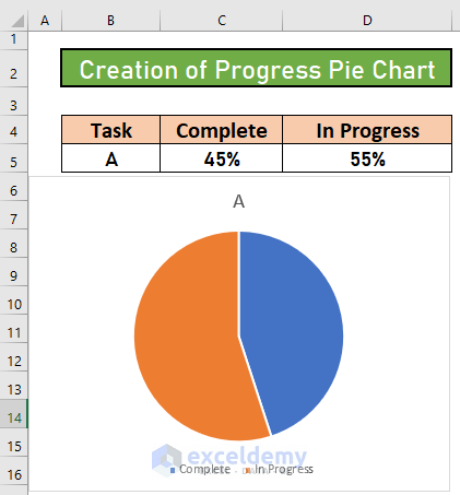
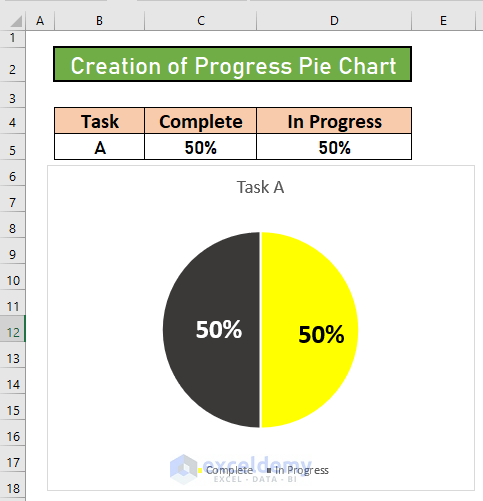
Dataset Overview
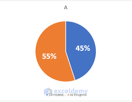
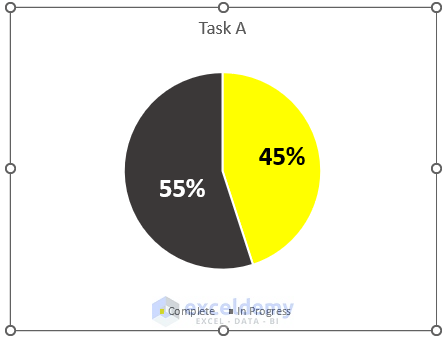
Let’s consider an example where we have a task labeled as Task A. This task is partially complete, with a progress of 45%. We’ll demonstrate how to create a dynamic pie chart to represent this information.
Step 1 – Prepare the Dataset
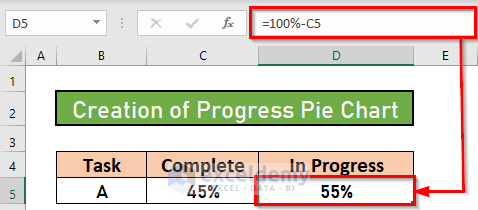
- Open your Excel workbook.
- Navigate to cell D5.
- Enter the following formula:
=100%-C5
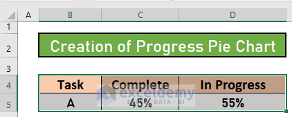
- Press ENTER. Excel will calculate the in-progress portion, assuming the entire task is 100%.
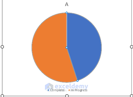
Step 2 – Create the Pie Chart
- Select the range B4:D5 (where your data resides).
- Go to the Insert tab.
- Choose the Pie or Doughnut chart option.
- Select a 2-D Pie chart style.
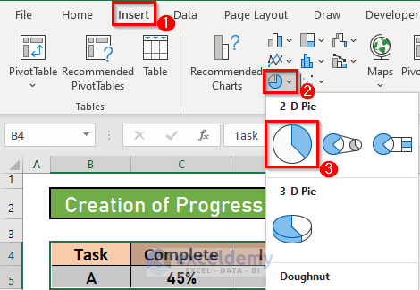
- Excel will generate the pie chart based on your data.
Step 3 – Add Data Label
- Click on any portion of the pie chart.
- Right-click to open the Context Menu.
- Choose Add Data Label.
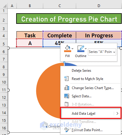
- Excel will add data labels to the chart.
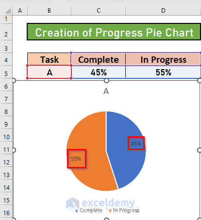
- Customize the labels as needed.
Read More: How to Make Progress Chart in Excel
Step 4 – Format the Chart
To edit the chart title:
- Hover over the chart area.
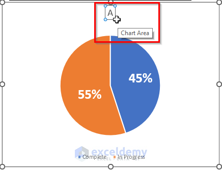
- Click to select it.
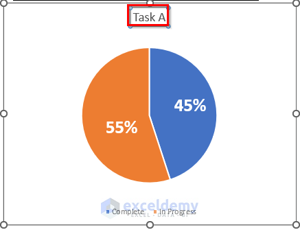
- Provide a suitable title (e.g., Task A).
- To change pie slice colors:
- Click on any slice.
- Right-click to access the menu.
- Go to Fill and choose a color.
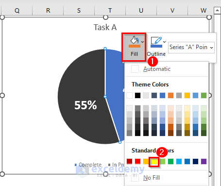
- Excel will change the color of the pie. Your progress chart will now look visually appealing.
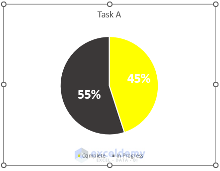
Final Output
With further adjustments, your progress chart will resemble the screenshot below. Remember that this chart is dynamic; if you modify the percentage in your original dataset, the chart area will adjust automatically.
Things to Remember
- A progress pie chart effectively illustrates the completed portion of any task.
- If desired, you can create a 3D pie chart.
- Use these charts to plan for future activities based on task progress.
Download Practice Workbook
You can download the practice workbook from here:
Related Articles
- How to Make a Progress Monitoring Chart in Excel
- Progress Circle Chart in Excel as Never Seen Before
<< Go Back to Progress Chart in Excel | Excel Charts | Learn Excel
Get FREE Advanced Excel Exercises with Solutions!
