If you ask me which tool is best for visualizing data, you will always get the same answer from me which is a scattered plot. Because you can plot many variables and add different data in this plot. In this article, I am going to share with you how to create a scatter plot with 4 variables in Excel.
How to Create a Scatter Plot with 4 Variables in Excel: 3 Simple Steps
A scatter plot is a chart or diagram where the relationship between two or more numeric values can be drawn. It is different from other charts because it plots values on both horizontal and vertical axis. It automatically draws independent variables on the horizontal axis and the dependent variables on the vertical axis which makes it easier to work with. On the other hand line charts and others plot variables on a horizontal axis only.
In the following article, I have described 3 easy and quick steps to create a scatter plot with 4 variables in Excel.
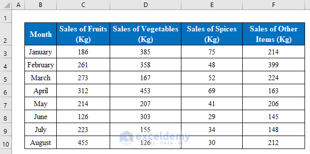
Suppose we have a dataset of a shop’s monthly sales of 4 types of products. Now we will make a scatter plot with these 4 different types of products.
1. Insert a Scatter Chart from the Dataset
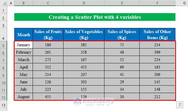
Firstly we will choose the whole dataset to create a scatter plot with 4 variables in Excel.
- Here I have selected cells (B5:F12).
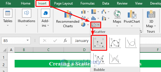
- Select a “Scatter Chart” from the “Insert” option.
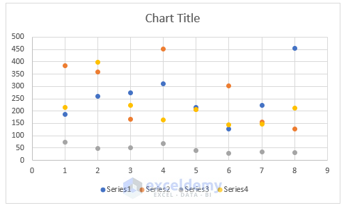
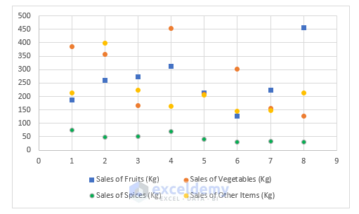
- A scatter chart will be ready with the values from the table.
Read More: How to Create a Scatter Plot in Excel with 2 Variables
2. Change Series Names According to Dataset
Secondly, we will change the names according to the dataset.
- While selecting the diagram right-click the mouse button to get options.
- Choose “Select Data” from the options.
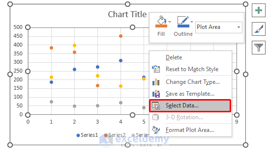
- A new window will appear named “Select Data Source”.
- Choose “Series 1” and click “Edit”.

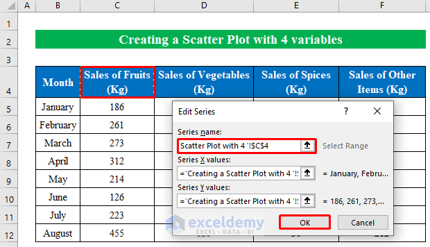
- A new window will pop-up asking for the “Series name”.
- Choose the series name “Sales of Fruits” from the dataset as our first series table consists of data “Sales of Fruits”.
- Hit the OK button to continue.
- Thus name all the series from your data list.
- Press OK to continue.
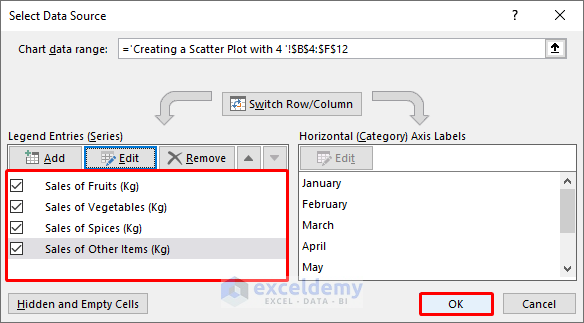
- Now our scatter diagram will look like the following screenshot.

Read More: How to Create a Scatter Plot in Excel with 3 Variables
3. Create and Format the Scatter Plot with 4 Variables
This is the last step where we will change format and color according to our choice to create a scatter plot with 4 variables in excel.
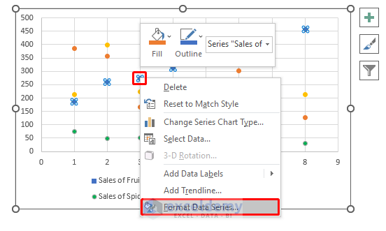
- Select a point from the diagram and right-click the mouse button.
- Choose “Format Data Series” from the options.
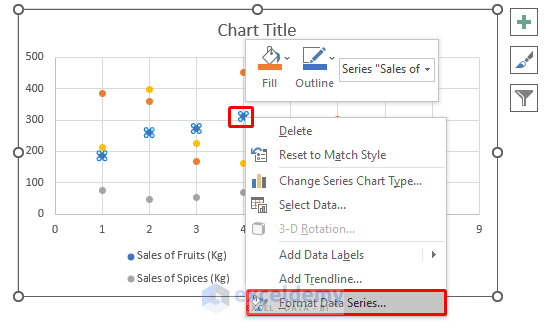
- From the right pane go to “Marker” and press “Built-in”.
- From the drop-down list of types choose an icon of your choice.

- This way the points with changed shapes will look like the following.

- To change color open the “Format Data Series” just like the previous steps.
- Go to “Fill” option and choose a color.

- After removing unnecessary data the final scatter diagram will look like the following screenshot.
- In this final step, we will add lines between the points for better visualization.
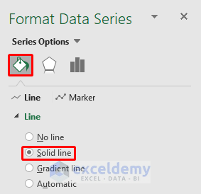
- Choosing points from the data table open the “Format Data Series”.
- From the “Line” options press “Solid Line”.
- Thus our spreadsheet will draw a line between the points in the chart.
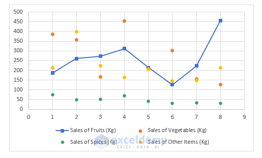
- Now we will draw lines for all 4 variables.
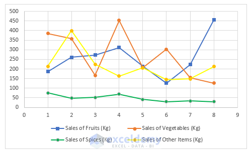
- This way our final scatter plot will look like the following screenshot.
Read More: How to Add Text to Scatter Plot in Excel
Things to Remember
- If you want to add variables lying in a different position on the spreadsheet, you just have to copy the list and then select the scattered chart. After that go to the paste option and choose “Paste Special”. This way you can add variables placed in a different location in your worksheet.
Download this practice workbook to exercise while you are reading this article.
Conclusion
In this article, I have tried to cover all the simple methods to show creating a scatter plot with 4 variables in Excel. Take a tour of the practice workbook and download the file to practice by yourself. Hope you find it useful. Please inform us in the comment section about your experience. We, the Exceldemy team, are always responsive to your queries. Stay tuned and keep learning.
Related Articles
- How to Make a Scatter Plot in Excel with Two Sets of Data
- How to Change Bubble Size in Scatter Plot in Excel
- How to Add Second Vertical Axis in Excel Scatter Plot
<< Go Back To Make Scatter Plot in Excel | Scatter Chart in Excel | Excel Charts | Learn Excel
Get FREE Advanced Excel Exercises with Solutions!
