If you are working as a manager in a call center company then it is a must to forecast call volume. Sometimes it becomes difficult to calculate due ...
Dataset Overview
Suppose we have a dataset containing a number of tasks in a project which is running. Another column shows the percentage completed ...
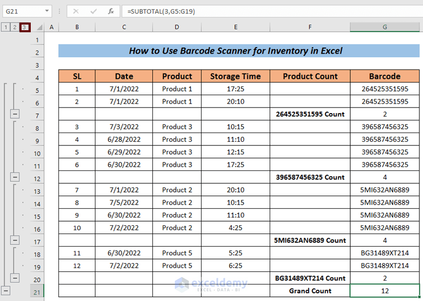
What Is a Barcode?
A Barcode is a machine-readable code consisting of spaces and varying widths of parallel lines representing numers and characters ...
Method 1 - Create an Excel Scatter Plot Color by Group without Condition
We will create three groups (A, B, and C) using the Number of Students and ...