In this article, we’ll show you how to make a Radar chart in Excel. Here, we will explain 2 methods to make the radar chart effortlessly.
What Is a Radar Chart?
A Radar chart, also known as a “Spider chart” or “Polar chart” helps to compare the data of 3 or more 3 variables correlative to a lead point. It is very effective at the time of a direct comparison of the variables and is great for visualizing data. It also points out and shows the strengths and weaknesses of the values. In Excel, you will get 3 varieties of Radar charts, these are a normal Radar, a Radar with Markers, and a Filled Radar chart.
How to Make a Radar Chart in Excel: 2 Methods
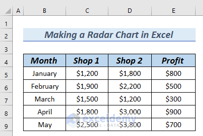
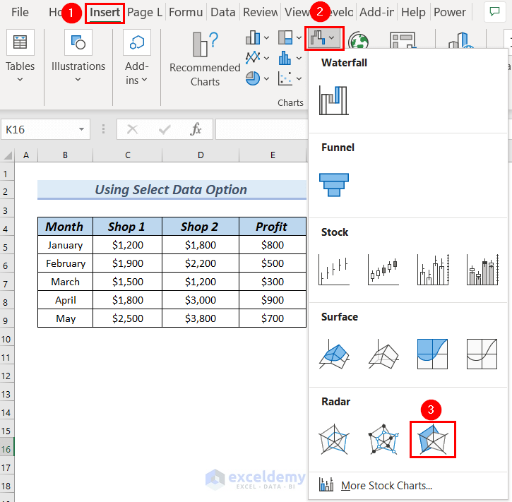
The following table has Month, Shop 1, Shop 2, and Profit columns. Using this table, we will make Radar chart in Excel. To do so, we will go through 2 easy methods. Here, we used Excel 365. You can use any available Excel version.
1. Using Radar Chart Feature to Make a Radar Chart in Excel
In this method, we want to make a Radar chart with markers. To do so, we will select data to make a Radar chart and after that, we will format the chart to make it more presentable.
Step-1: Inserting Radar Chart with Markers
Here, we will insert a Radar chart after selecting data from a table.
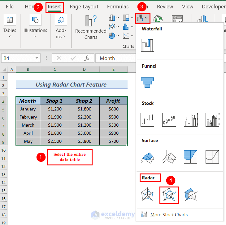
- First of all, we will select the entire data table.
- After that, we will go to the Insert tab.
- Then, click on Insert Waterfall, Funnel, Stock, Surface, or Radar chart group, which is marked with a Red color box.
- Next, from the Radar chart group >> select Radar with Markers, which is marked with a Red color box.
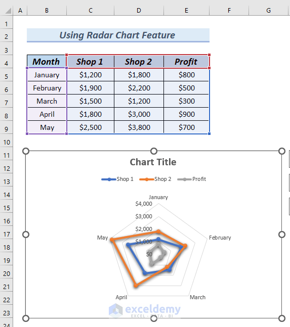
At this point, you can see the Radar chart with markers.
Read More: How to Create Radar Chart with Radial Lines in Excel
Step-2: Formatting Radar Chart with Marker
In this step, we will format and customize our Radar chart with markers.
- First, we will click on the Chart Title and will edit the title.

- Moreover, we will click on the chart >> go to the Chart Design tab.
- Along with that, we will select a Chart Design.
Here, you can select a Chart Design according to your preference.

Therefore, you can see the Radar chart with Chart Design.
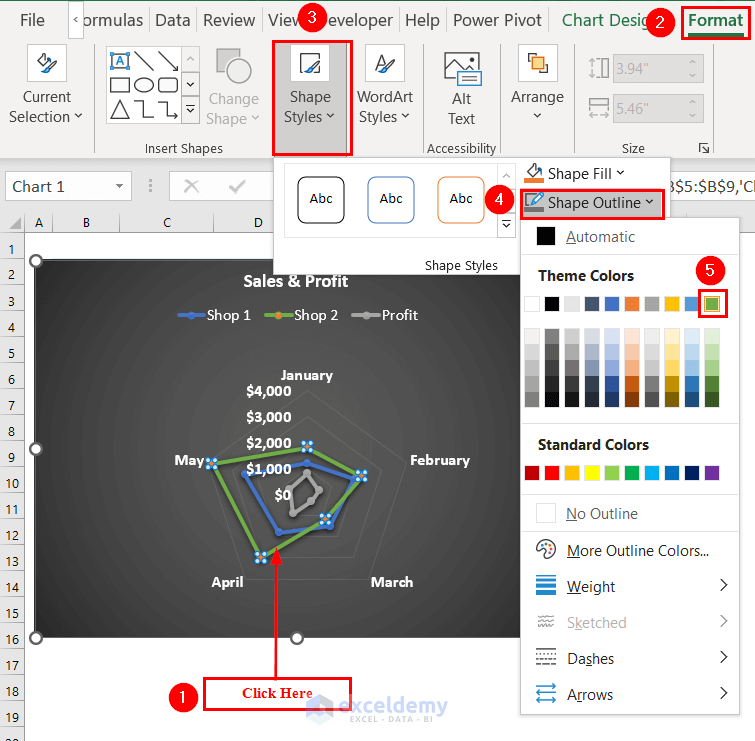
Now, we want to change the color of the series of the Radar Chart.
- To do so, we click on the first line series, which is the series for Shop 2.
- Afterward, we go to the Format tab.
- Then, select the Shape Styles option.
- Next, from Shape Outline >> we selected a color.
Here, you can choose any color according to your preference.
- In a similar way, we changed the series color for Profit.
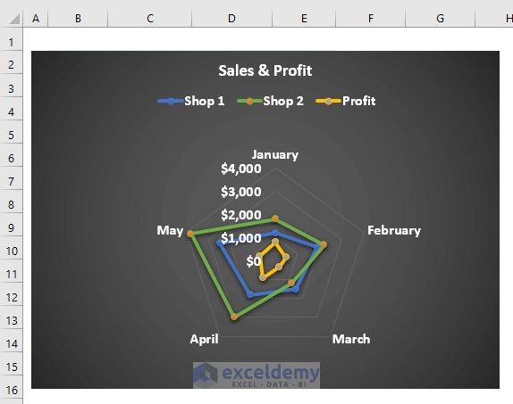
Finally, you can see the complete Radar chart. So, now you know how to make a radar chart in Excel by using the chart design option.
Read More: Color Rings on Radar Chart in Excel
2. How to Make a Radar Chart in Excel with Filled Data
In this method, we want to make a Filled Radar chart. Along with that, in the chart, we want to see only the Month and Profit column. To do so, we will first insert a Filled Radar chart, and after that, we will select the Data range for the Chart.
Step-1: Inserting Filled Radar Chart
- First, go to the Insert tab.
- After that, click on Insert Waterfall, Funnel, Stock, Surface, or Radar chart group, which is marked with a Red color box.
- Next, from the Radar chart group >> select Filled Radar chart, which is marked with a Red color box.
- Later, you will see a chart box has been created.
- At this point, we will right-click on the chart box.
- Afterward, we will click on Select Data from the Context Menu.

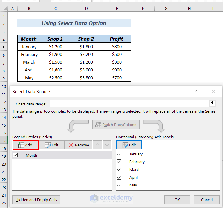
A Select Data Source dialog box will appear.
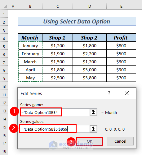
- After that, we will click on Add to add the Month column’s data.

Next, an Edit Series dialog box will appear.
- Afterward, we will select cell B4 as the Series name.
- Along with that, in the Series values box, we will select from cells B5 to B9.
- Then, click OK.
Now, in the Select Data Source dialog box, you can see under the Edit box, the number is showing instead of the Month name.
- Later, to add the Month name to the Radar chart, we will click on the Edit box.

An Axis Labels dialog box will appear.
- Next, in the Axis labels range box select from cells B5 to B9. This will add the Month name to the Radar chart.
- Afterward, click OK.

- After that, you can see the Month under the Legend Entries (Series), along with that, you can see the Month name under the Edit box.
- Then, we will click on Add to add the Profit column’s data.
An Edit Series dialog box will appear.
- Afterward, we will select cell E4 as the Series name.
- Along with that, in the Series values box, we will select from cells E5 to E9.
- Then, click OK.

Therefore, you can see the Month and Profit under the Legend Entries (Series).
- Next, click OK.

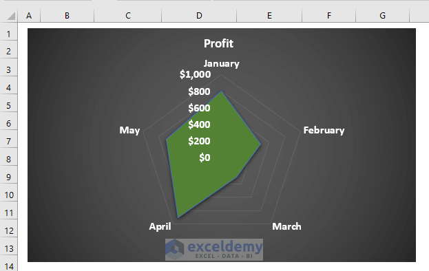
As a result, you can see the Filled Radar chart representing the Profit and Month columns.

Read More: How to Create a Circular Radar Chart in Excel
Step-2: Formatting Filled Radar Chart
In this step, we will format and customize our Filled Radar chart to make it more presentable.
- To do so, we followed Step-2 of Method-1.
Finally, we can see the Filled Radar chart.
Read More: How to Create Excel Radar Chart with Different Scales
Practice Section
You can download the above Excel file to practice the explained methods.

Download Practice Workbook
Conclusion
Here, we tried to show you 2 methods on how to make a Radar chart in Excel. Thank you for reading this article, we hope this was helpful. If you have any queries or suggestions, please let us know in the comment section below.
Related Articles
- What Is Radar Chart in Excel
- How to Create Pie Radar Chart in Excel
- How to Create Excel Radar Chart Max Value
- How to Include Standard Deviation in Excel Radar Chart
- How to Create Radar Chart and Fill Area in Excel
- How to Create Polar Area Chart in Excel
- How to Make a Wind Rose in Excel
<< Go Back To Excel Radar Chart | Excel Charts | Learn Excel
Get FREE Advanced Excel Exercises with Solutions!
