While working with Microsoft Excel, when we want to display demographic or regional capacity information, we may use the Radar Chart. This represents multidimensional data in a two-dimensional chart using this style of graphic. And, the standard deviation is significant because it reveals the degree of dispersion of a dataset’s values. But likewise, the other excel charts do not have any default feature to include the standard deviation in the radar chart. In this article, we will demonstrate the procedures to include standard deviation in Excel radar charts.
What Is Standard Deviation?
In statistics, the standard deviation is a crucial indicator of central tendency and dispersion. The standard deviation is calculated using the formula below:
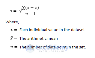
One of the values is the mean or average of the numbers, and n is the overall sample size in this calculation. The standard deviation is a measurement of how much each value in a sample deviates from the average. It is the square root of the variance, in a nutshell. The average of a dataset is a squared variation from the mean or average is called variance.
How to Include Standard Deviation in Excel Radar Chart: Step-by-Step Procedures
Radar charts are employed to compare two or more objects or groups based on a variety of traits or qualities. And, we utilize the standard deviation to assess estimating mistakes. We can enable error bars in charts where a standard deviation is a default option. Excel enables you to add error bars to the following charts if you wish to display, for instance, standard deviations in a chart:
- 2D Area Diagram
- Bar Chart
- Column Chart
- Line Graph
- X and Y Scatter Plot
- Bubble Chart
But, we can not enable standard deviation on radar charts. Still, we can include standard deviation in the radar chart by using excel functions. Let’s follow the instructions to add standard deviation in the excel radar chart.
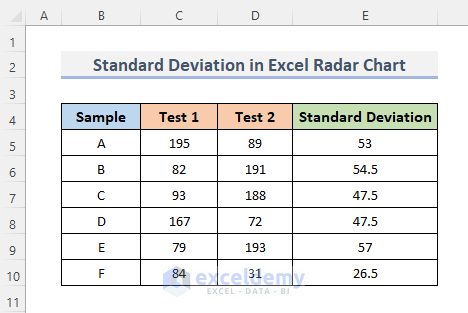
Step 1: Create Dataset for Excel Radar Chart
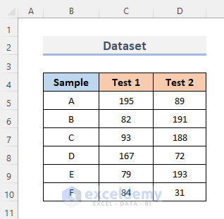
First, we need to create a dataset. As we know, the datasets are the continuous cell range holding data for analysis.
- To begin with, we insert some Sample data; A, B, C, D, E, and F in column B.
- Then, suppose we put some tests on those sample data. Keep the record of the test result in Test 1 and Test 2, subsequently in columns C and D.
Read More: How to Create Excel Radar Chart with Different Scales
Step 2: Excel STDEV.P Function to Calculate Standard Deviation
Now, we will calculate the standard deviation in our dataset to include them in the radar chart. The standard deviation of any data collection can be calculated using the STDEV function in Excel. The standard deviation displays how far one value differs from another in terms of digits.
Here, we will use the STDEV.P function in Excel which estimates the standard deviation for a collection of data in a sample. STDEV.P uses the “n” method to calculate standard deviation, ignoring logical values and text. The main purpose of the STDEV.P function is to get the standard deviation of the population.
Let’s look at the sub-procedures to add standard deviation in the dataset to include the standard deviation in the Excel radar chart.
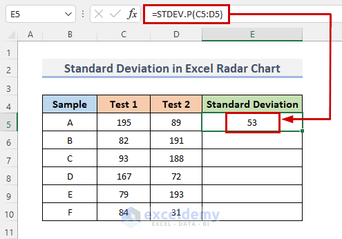
- Firstly, we insert a new column into our dataset to calculate the standard deviation.
- Secondly, select the cell where we input our formula. In our case, we select cell E5.
- Thirdly, type the formula into that selected cell.
=STDEV.P(C5:D5)- Further, press Enter to see the result.
- After that, drag the Fill Handle down to duplicate the formula over the range. Or, to AutoFill the range, double-click on the plus (+) symbol.
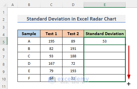
- Thus, we can see the result of the standard deviation of all the samples.
Step 3: Insert Radar Chart in Excel
A chart can provide a sharper view of a set of data values. Now, we will insert a radar chart. It enables us to understand the characteristics of two or more variables and determine whether they are connected or disconnected.
- First of all, select the whole dataset.
- Then, go to the Insert tab from the ribbon.
- After that, under the Charts category, click on the Insert Waterfall, Funnel, Stock, Surface, or Radar Chart drop-down menu.
- Next, select Radar with Markers which is the 2nd option under the Radar group.
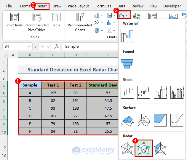
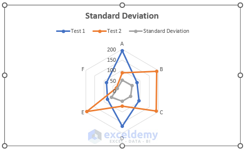
- This will display the Standard Deviation radar chart.
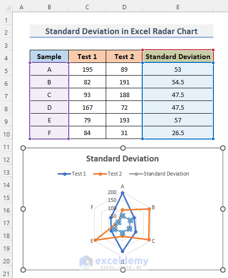
Note: You can customize the chart as per your requirements. For this, go to Chart Design which you can find in the ribbon after clicking on the chart area.
Final Output
This is the final chart after including the standard deviation in the Excel radar chart. The gray spider/radar chart portion is the standard deviation in the radar chart.
Read More: What Is a Radar Chart in Excel?
Things to Keep in Mind
- Radar charts never attempt to compare more than three groups. Additionally, avoid trying to show more than ten aspects on one radar. Make sure there are no more than two variables being used. If not, it will be difficult for a user to comprehend and draw conclusions.
- The data must be arranged schematically.
- To prevent having too many intervening axis values, work on-axis values.
- To make the spider web larger, legends should be removed; nevertheless, legends may be added by adding shapes.
- One of the simplest things to change to make the chart easier to read is the text’s size. In the ‘Formatting’ section, complete all of them.
Download Practice Workbook
You can download the workbook and practice with them.
Conclusion
The above procedures will assist you in Excel. Hope this will help you! Please let us know in the comment section if you have any questions, suggestions, or feedback.
Related Articles
- How to Make a Radar Chart in Excel
- How to Create Excel Radar Chart Max Value
- How to Create Radar Chart and Fill Area in Excel
- Color Rings on Radar Chart in Excel
- How to Create Radar Chart with Radial Lines in Excel
- How to Create Pie Radar Chart in Excel
- How to Create a Circular Radar Chart in Excel
- How to Create Polar Area Chart in Excel
- How to Make a Wind Rose in Excel
<< Go Back To Excel Radar Chart | Excel Charts | Learn Excel
Get FREE Advanced Excel Exercises with Solutions!
