Method 1 – Using Insert Charts Feature to Plot Excel Radar Chart with Different Scales
Steps:
- Select the cell range B4:D9.
- From the Insert tab → Insert Waterfall, Funnel, Stock, Surface, or Radar chart group → select Radar.
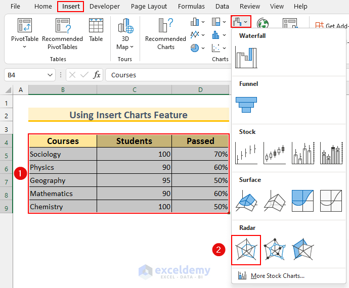
- A basic Radar Chart will pop up with 2 variables on the same scale.
- Use a different scale for the percentage passed variable.
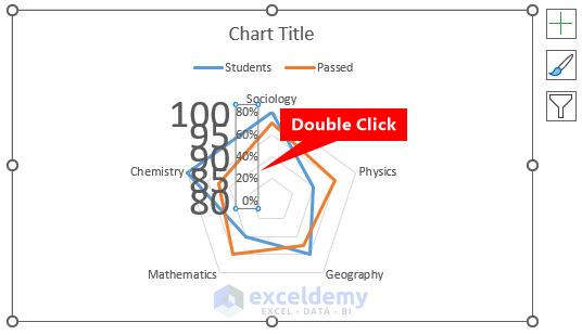
- Double-click on the Orange dot (i.e. the Passed variable).

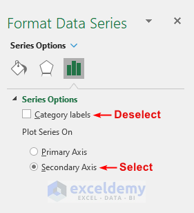
- It will bring up the Format Data Series box.
- Deselect Category Labels.
- From the Plot Series On option → select Secondary Axis.
- See the second variable is on a different scale in the Excel Radar Chart.
- The Axis Labels are in the same location. Using some tricks, we can make it look better.
- Select the Axis Labels for the first variable.

- Increase the font size to your satisfaction.
- See the second variable’s Axis Labels.
- Double-click on it.
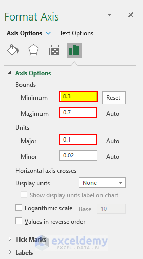
- The Format Axis box will pop up.
- Set the Minimum Bound to 0.3. This will automatically change the Maximum Bound and Major Unit. If it does not change then modify it manually.
- Our steps will yield a result similar to this.

- We added a Chart Title, changed the font colors, moved the Legend, added background colors, and resized the Radar Chart to make it easier to read.

Method 2 – Applying VBA to Create Excel Radar Chart with Different Scales
Steps:
- Press ALT+F11 to bring up the VBA window.
- Do it by selecting Visual Basic from the Developer tab.
- From Insert → select Module.
- Type the following code.
Sub Radar_Chart_Different_Scales()
    ActiveSheet.Shapes.AddChart2(317, xlRadar).Select
    With ActiveChart
        .SetSourceData Source:=Range("VBA!$B$4:$D$9")
        .FullSeriesCollection(2).AxisGroup = 2
        .ChartGroups(2).HasRadarAxisLabels = False
        .HasTitle = True
        .ChartTitle.Text = "Applying VBA"
        .Axes(xlValue, xlSecondary).MinimumScale = 0.3
        .Axes(xlValue, xlSecondary).MaximumScale = 0.7
        .Axes(xlValue).TickLabels.Font.Size = 28
        .FullSeriesCollection(2).AxisGroup = 1
        .FullSeriesCollection(2).AxisGroup = 2
        .Axes(xlValue, xlSecondary).MinimumScale = 0.3
        .Axes(xlValue).MajorUnit = 5
        .Axes(xlValue).MinimumScale = 80
    End With
End Sub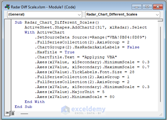
VBA Code Breakdown
- Calling our Sub procedure Radar_Chart_Different_Scales.
- Insert a Chart in the Active Sheet.
- Use the VBA With statement to set the properties of the Chart.
- Data range is B4:D9, you need to change it according to your needs.
- Add a Title to the Chart.
- Create a Radar Chart with different scales.
- ave the Module.
- Put the cursor inside the first Sub procedure and press Run.
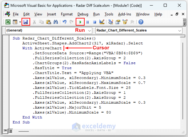
- Execute and it will create a Radar Chart with different scales.

- Enlarge the graph to make it better.

Download Practice Workbook
Related Articles
- How to Create Excel Radar Chart Max Value
- How to Create Radar Chart and Fill Area in Excel
- How to Create Radar Chart with Radial Lines in Excel
- How to Create Pie Radar Chart in Excel
- How to Create a Circular Radar Chart in Excel
- How to Make a Wind Rose in Excel
<< Go Back To Excel Radar Chart | Excel Charts | Learn Excel
Get FREE Advanced Excel Exercises with Solutions!

how about 6 scales?
Hello Charlie,
To create a radar chart with 6 different scales, you can apply the same method shown in the article for multiple scales. Each axis in a radar chart can represent a separate scale.
You just need to ensure that your data is set up accordingly with six distinct series and adjust the axis limits for each. If you need help with a specific part of the process, feel free to ask!
Regards
ExcelDemy