If you want to compare a set of data, Excel provides you with an option to compare in a smart way. Pie Radar Chart in Excel helps you to visualize your data even better. In this article, I’m going to share the details about the Pie Radar Chart step by step so that you may use them whenever necessary. Let’s get a glimpse of what our Pie Radar Chart looks like:
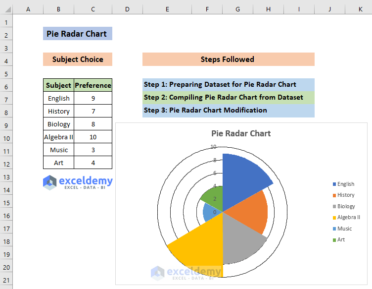
How to Create a Pie Radar Chart in Excel: 3 Suitable Steps
Step 1: Preparing Dataset for Pie Radar Chart
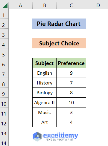
In this example, we have the preference of subject data of a certain student. We have the subject names “English”, “History”, “Biology”, “Algebra II”, “Music” and “Art” alongside the preference. We’ll use the Pie Radar Chart to compare this data.
Now, Let’s look at the steps:
- Our dataset looks like this:
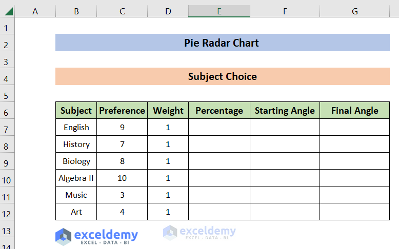
- Make Columns named “Weight” as the relative weight of a subject (in our case, all subjects carry the same weight, so their values are the same (1)), “Percentage” for angle calculation of the chart, “Starting Angle” and “Final Angle” to indicate the starting and ending of the Subjects in the chart:
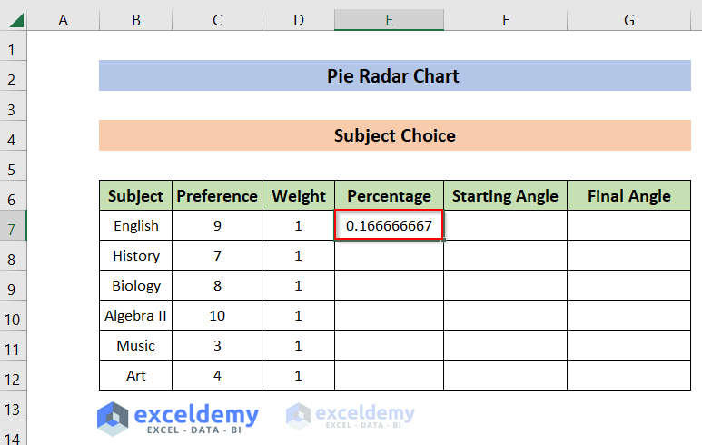
- Type the following formula in cell E7 and Hit ENTER. This shows the output in cell E7.
=D7/SUM($D$7:$D$12)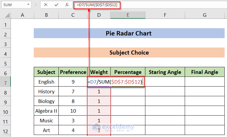
This output is the ratio of D7 and the summation of all the Weights ranging from D7 to D12. We’ll use this value of E7 to calculate the percentage of area that a particular subject (English in this case) will occupy. You may know more about the SUM function from here.
The output of the formula is:
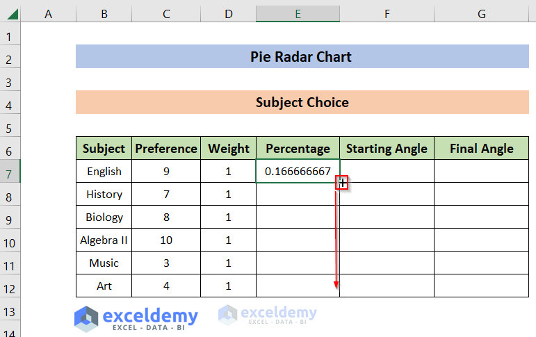
- Hold and drag down the AutoFill icon from the bottom right edge of cell E7 all the way to cell E12. This will automatically imply the formula we’ve used in cell E7 and make necessary adjustments to all the cells from E8 to E12.
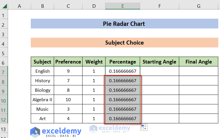
We can see the output in the “Percentage” column. We’ll get all the output in this way.
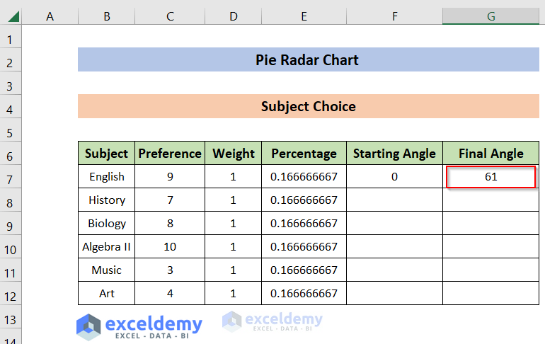
- Now, type 0 at cell F7 and the following formula in cell G7 and Hit ENTER to get the Final Angle:
=SUM($E$7:E7)*360+1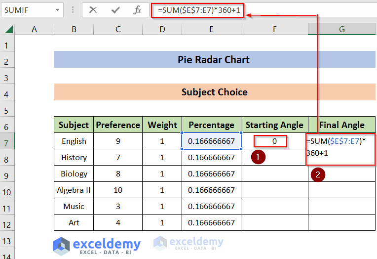
- The output looks like this:
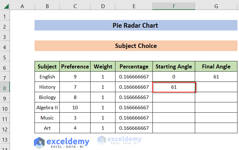
- Now, type the following formula in cell F8 and Hit ENTER to get the Starting Angle :
=F8This will return the Final Angle of the previous row as the input argument of the cell F8.
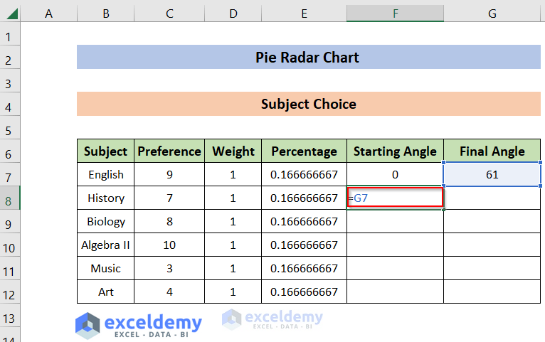
- The output looks like this:
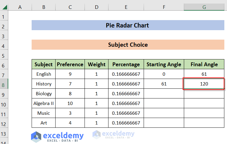
- Now, type the following formula in cell G8 and hit ENTER to get the Final Angle:
=SUM($E$7:E8)*360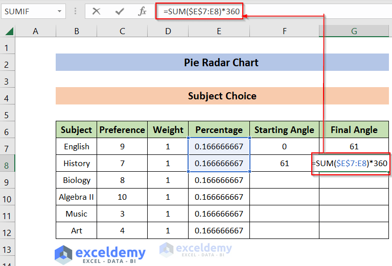
- The output looks like this:
- Hold and Drag down the AutoFill icon from the bottom right edge of cell G8 all the way to cell G12. I’ve described the mechanism of AutoFill previously in this article.
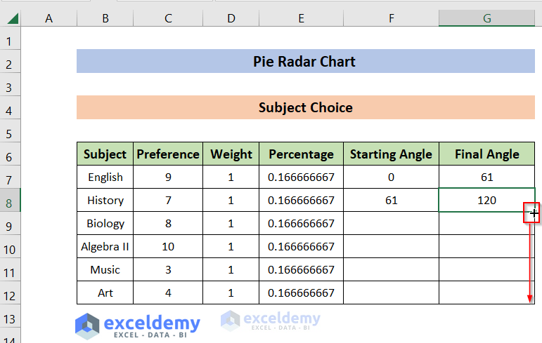
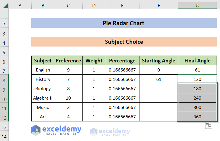
We can see the output in the “Final Angle” column. We’ll get all the output in this way.
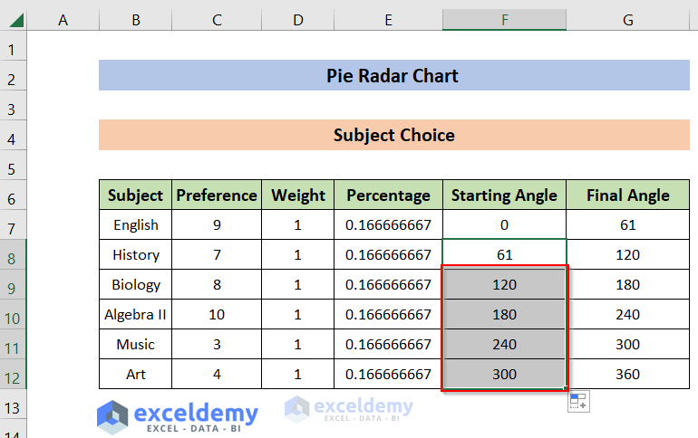
- Now hold and Drag down the AutoFill icon from the bottom right edge of cell F9 all the way to cell F12 to get the corresponding Starting Angle.

We can see the output in the “Starting Angle” column. We’ll get all the output in this way.
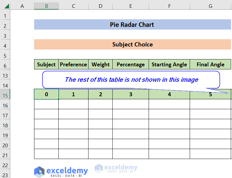
- Now, we’ll create angles ranging from 1 to 360 with an increment of 1. The table looks like this (the first few columns are shown here):
- Now, type the following formula in cell B16 and hit ENTER to get the corresponding “Preference” value in cell B16:
=IF(AND(B$15>=$F7,B$15<=$G7),$C7,0)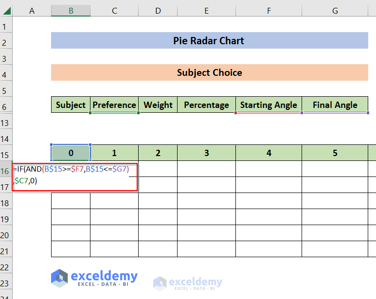
- The output looks like this:

- Now Copy (use the fill handle to copy) this formula to all the cells ranging from C16 to MX16 (to cover all the angles from 0 to 360 degrees). The output looks like this:

- Now, repeat the process at cell B17. Adjust the corresponding formula like this:
=IF(AND(B$15>=$F8,B$15<=$G8),$C8,0)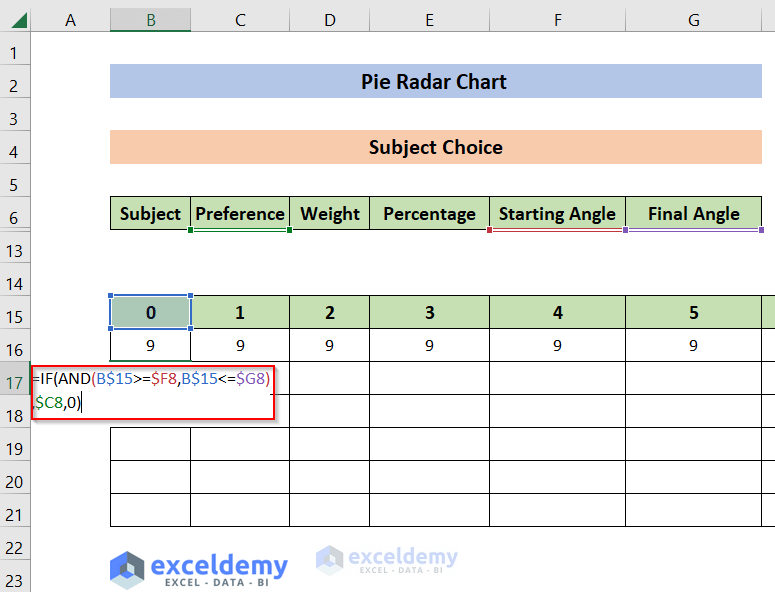
- The output looks like this:

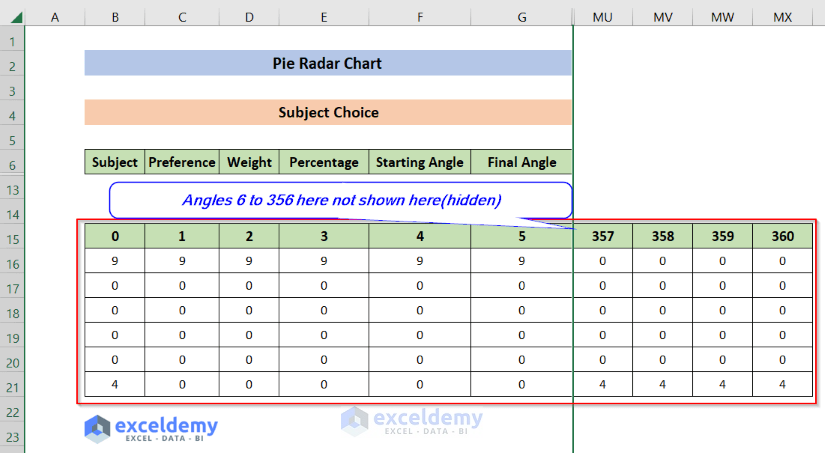
- Fill in all the corresponding rows and columns in this way. The final output looks like this:
 Read More: How to Create a Circular Radar Chart in Excel
Step 2: Compiling Pie Radar Chart from Dataset
In this step, we’ll generate a Pie Radar Chart for our dataset. This is the core part of our task.
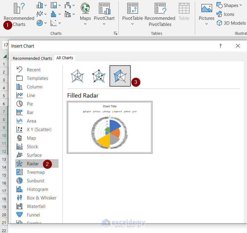
- Select the range of cell B7:B12(Subject Names) and I6:NE4(0:360 angles). After that, navigate to the “Insert”.
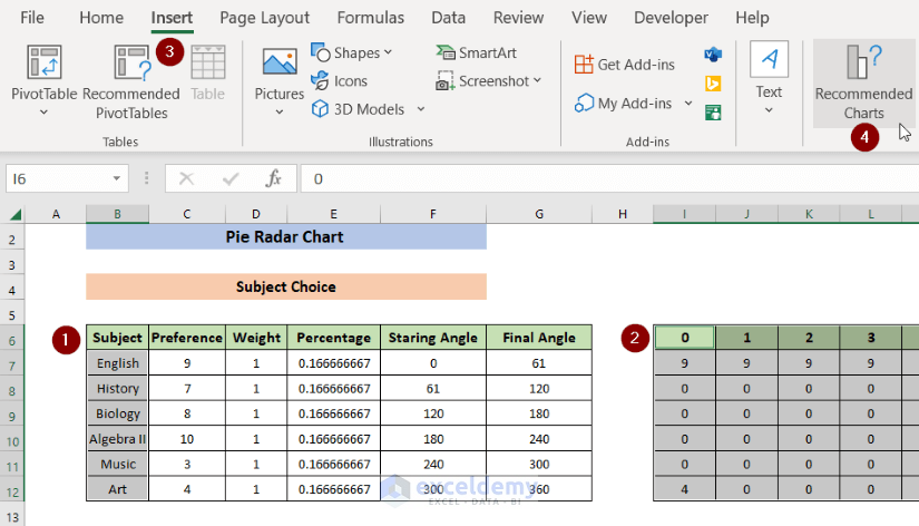
- After that, select the Radar Chart with the “Filled Radar” option. I’ve attached a figure for your convenience.
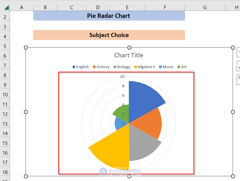
- Now we’ll customize the chart according to our use. Delete the “Data Labels” to get a clearer view of the chart.
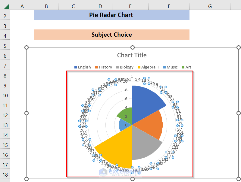
- The chart now looks like this:
Read More: How to Make a Radar Chart in Excel
Step 3: Pie Radar Chart Modification
At this stage, we’ll get a chart, but in a very basic mode. We need to modify it further to get the digestive format. I’ve shown the process here:
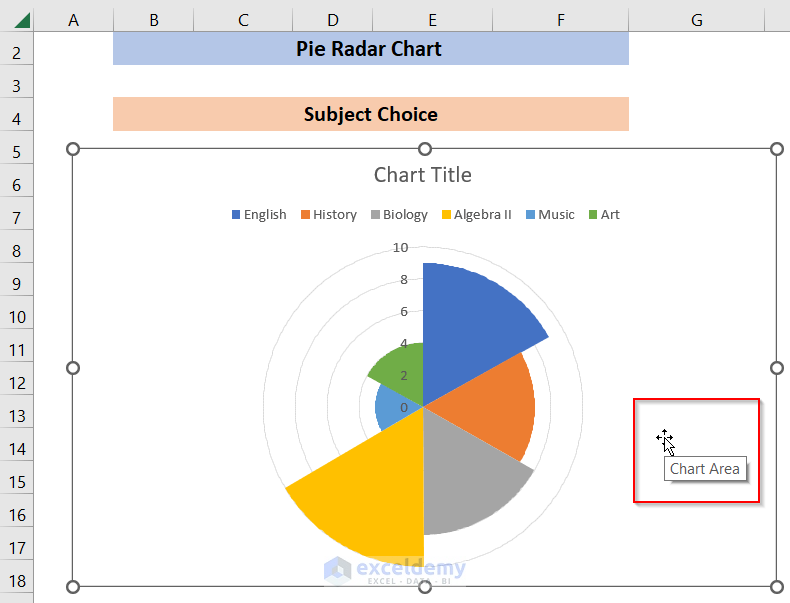
- Place the Mouse Cursor in the chart area to actively select the Chart Area.
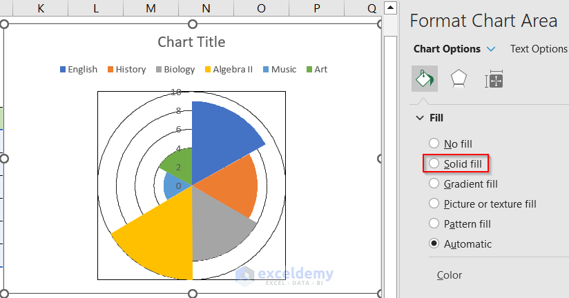
- Now Right Click the Chart Area and navigate to Chart Options from the Format Chart Area. Select the Solid Fill option from the Fill menu.
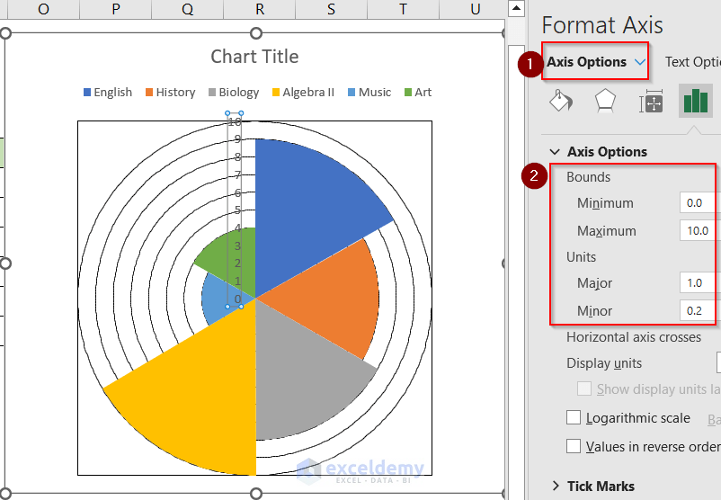
- Now navigate to Axis Options of the Pie Radar Chart and set the values accordingly.
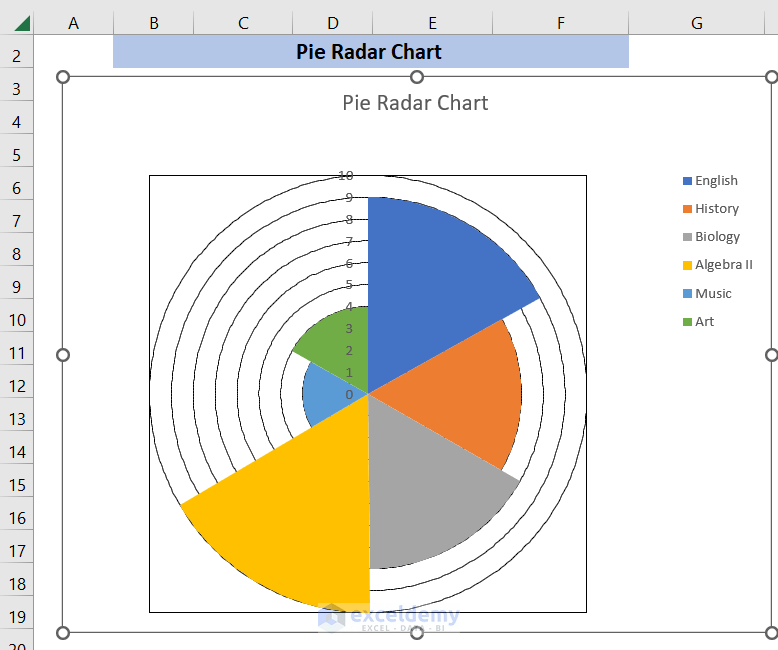
- Now, set the Chart Title and the positions of the LEGENDS accordingly. You may add various options like adding different portions to the chart to customize it. The final Pie Radar Chart looks like this:
Read More: What Is a Radar Chart in Excel?
Download Practice Workbook
You can download the file from the link below to practice yourself:
Conclusion
If you’re in this segment, I thank you for your interest in this content. I’ve demonstrated a detailed process of how to create a Pie Radar Chart in Excel. I hope you get the necessary solution. Having said that, if you face any problem regarding this article or have any queries, please feel free to leave a comment in the comment box below, our team will try to solve that for you. Have a good day!
Related Articles
- How to Include Standard Deviation in Excel Radar Chart
- How to Create Excel Radar Chart with Different Scales
- How to Create Excel Radar Chart Max Value
- How to Create Radar Chart and Fill Area in Excel
- Color Rings on Radar Chart in Excel
- How to Create Radar Chart with Radial Lines in Excel
- How to Create Polar Area Chart in Excel
- How to Make a Wind Rose in Excel
<< Go Back To Excel Radar Chart | Excel Charts | Learn Excel
Get FREE Advanced Excel Exercises with Solutions!
