If you are searching for the solution or some special tricks to create color rings on a Radar chart in Excel then you have landed in the right place. There are some quick ways to make color rings on a Radar chart in Excel. This article will show you each and every step with proper illustrations so, you can easily apply them for your purpose. Let’s get into the main part of the article.
Color Rings on Radar Chart in Excel: 4 Examples
In this section, I will show you 4 quick and easy methods to create color rings on a Radar chart in Excel on the Windows operating system. You will find detailed explanations of methods and formulas here. I have used the Microsoft 365 version here. But you can use any other versions as of your availability. If any method doesn’t work in your version then leave us a comment.
1. Simple Radar Chart with Color Ring
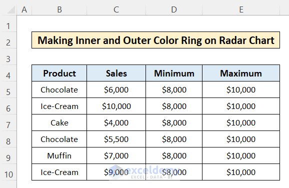
To make a simple Radar Chart with a color ring, you can follow the steps below-
📌 Steps:
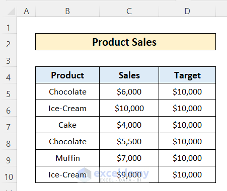
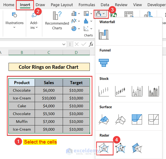
- First, select the column of cells to insert into the radar chart.
- Then, go to the Insert tab, click on the shown icon, and select the Radar Chart
- Then, you will see a Radar chart created. Resize and place it in the worksheet.
- Here, you are seeing that Colors are different for columns and of the same width.

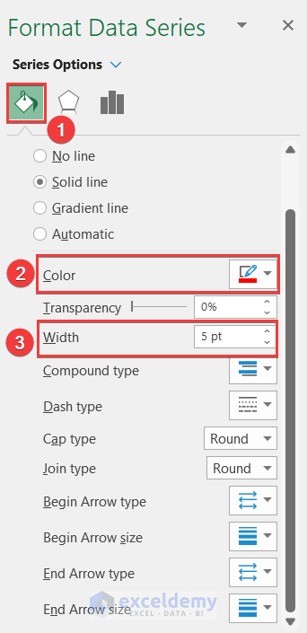
- Now, you can change the color of the Target line to make a color ring. For this, right-click on the Target You will see a list of options will appear.
- Here, you can change the color from the Fill and Outline
- Alternatively, you can go to the “Format Data Series” option.

- Now, a window will appear on the right side of the worksheet.
- Here, go to the Fill & Line
- Then, select the color to apply and specify the width of the Target So, that you can recognize it from others easily.
- Also, here you can change the transparency.
- Now, the target curve will look like a color ring
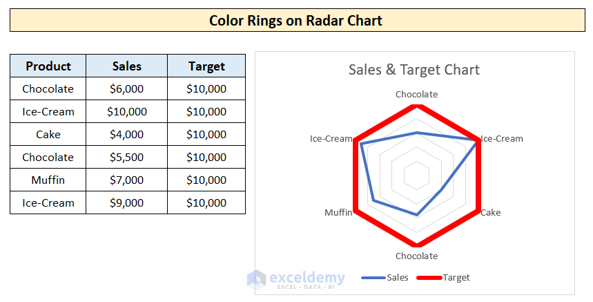
Here, you haven’t created the color ring with a specific range. So, you can’t compare perfectly where the sales data meets the target ring. But you will get a brief idea about the dataset comparison.
Read More: How to Create Excel Radar Chart with Different Scales
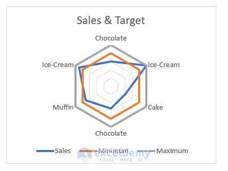
2. Inner and Outer Color Rings on Radar Chart
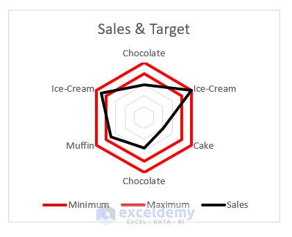
You can create an inner and an outer ring to specify the minimum and the maximum value of the target. So, you can easily identify the position of the sales data compared to the target range. To do this follow these steps-
📌 Steps:
- First, make a dataset with the minimum and the maximum value of the target range.
- Then create a Radar chart with the data following the steps shown in the previous method.
- Now, the Radar chart will be like as shown here.
- Here, you can see the color of the minimum and the maximum ring in different colors.
- Now, if you want to highlight the minimum and maximum ring with the same color, double-click on the radar chart.
- Then, you will see the “Format Chart Area” window will appear on the right side of the worksheet.
- Then, click on the “Chart Options” and select the Series “Minimum” option
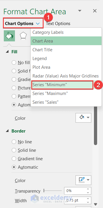
- Now, similarly, as before, go to the Fill & Line option and change the color to Red.
- Also, do the same steps for the Maximum ring line.
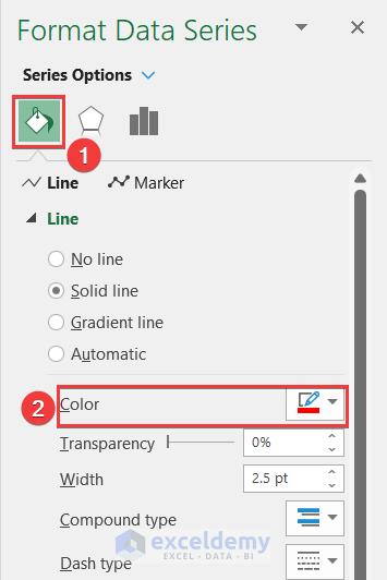
- Alternatively, you can do the same thing by right-clicking on the radar lines individually.
- Change the fill and outline color to Red for both maximum and minimum radar lines in the chart.

- Now, you have the Radar Chart with Minimum and Maximum Color rings on a Radar Chart.
Read More: How to Create Excel Radar Chart Max Value
3. Solid Color Ring on Radar Chart
Also, you can make a solid color ring that covers a data range with its’ thickness. To do this, follow the steps below:
📌 Steps:
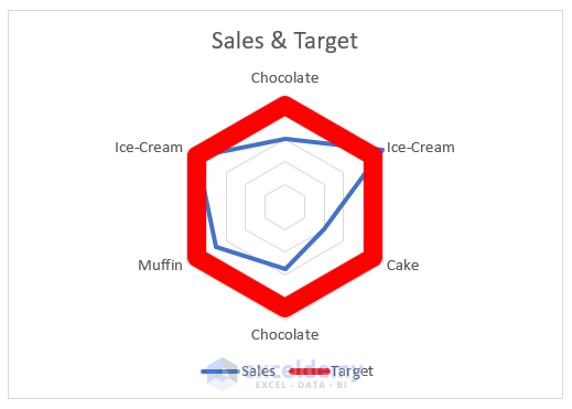
- First, make a column with the mid-value of the target range. Suppose, your target range is $8000 to $10000 then you will insert $9000 as the mid-value of the target.
- Now, a simple radar chart will be created showing the mid-value of the target range and the sale data.
- Then, you have to increase the width of the target line till it fills the range of $8000 to $10000.
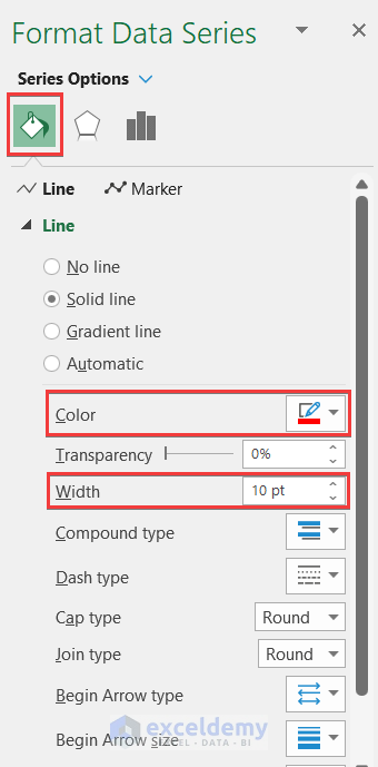
- To increase the width of the target line, go to the “Format Data Series” and click on the Fill & Line option.
- Then, change the color to Red and increase the width to 10Pt.
Here, you have to check whether the target line width is reaching the gridline of $8000 and $10000 or not. If you increase the size of the chart, you have to increase the width of the line and reverse to decrease the size.
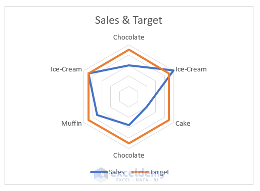
- Now, you have the radar chart as shown below. But, you are seeing that the target line is above the sales line. So the sale line has got hidden and you can’t find the endpoint of the sales line.
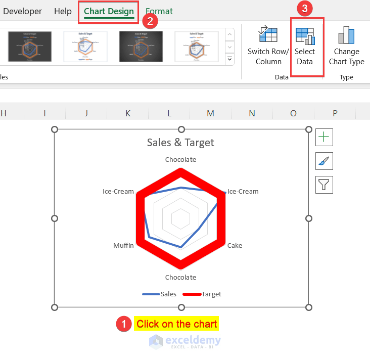
- To solve this problem, go to the Chart Design tab by double-clicking on the radar chart.
- Then, go to the Select Data option
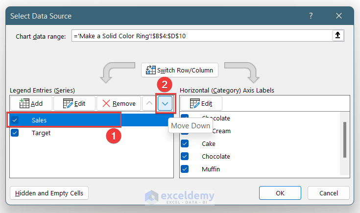
- Now, a window named Select Data Source will appear.
- Here, you have to drag down the Sales data in the list.
- For this, click on the Sales data and then click on the Down As a result, the Sales data will come down in the list.
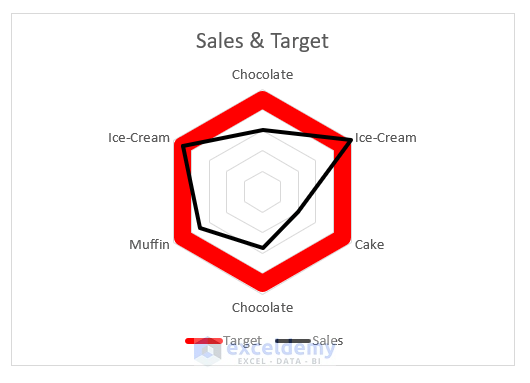
- Then, change the color of the sales line to black.
- Now, the Radar chart is as like as shown below.
Read More: How to Make a Radar Chart in Excel
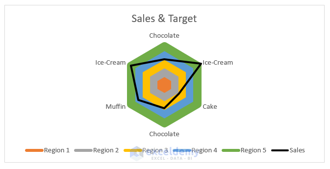
4. Different Color Rings for Data Ranges on Radar Chart
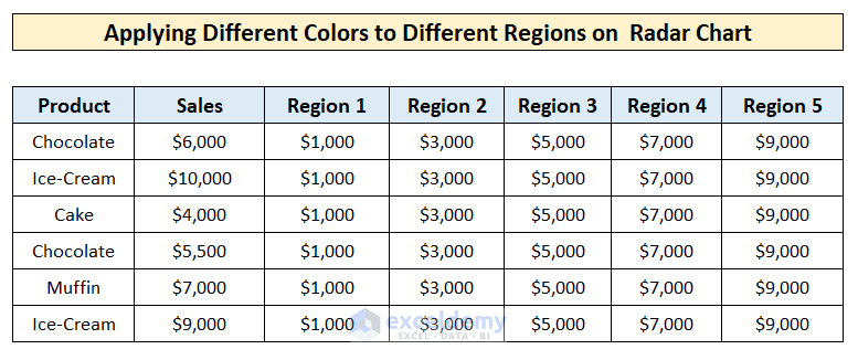
Also, you can apply different colors to different data ranges of a radar chart. Suppose you have 5 data ranges between $0 to $10000 and each group is in the $2000 range. And you want to apply different colors for each group. So, you can easily identify where the sales point is from the Radar chart. To do this, follow the steps below:
📌 Steps:
- First, create columns having the value of the mid-value of the data ranges. Here, Region 1 is giving the value of the first data range from $0 to $2000. So, the mid-value of this range will be $1000.
- Taking the full dataset, create a simple Radar Chart using the steps shown in the first method.
You can’t create a Radar chart with more than 5 columns of Data.
- So, create a radar chart by taking the dataset excluding Region 5.
- Now, add Region 5 by going to the Chart Design >> Select Data.
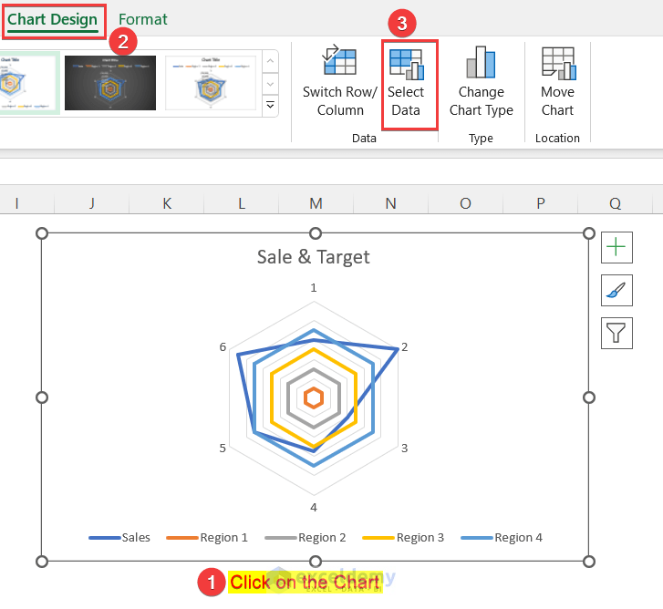
- Then, click on the Add option in the Select Data Source window.
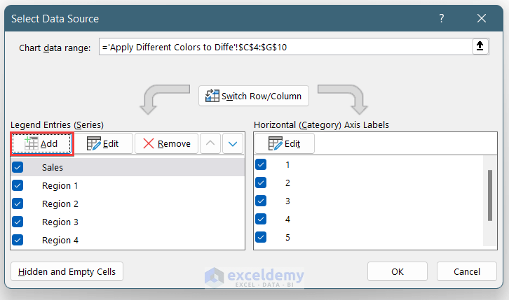
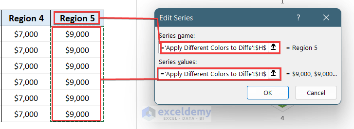
- Select the H5 cell in the Series named box and select H5:H10 cells in the Edit Series box.
- Then, press OK.
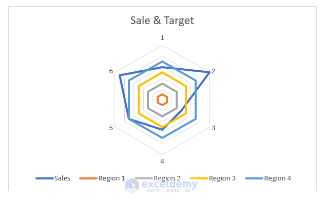
- Now, the Radar chart is like the screenshot below.
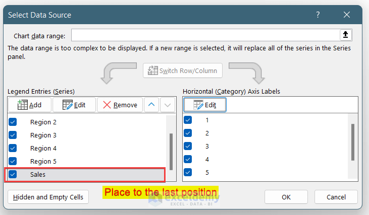
- Now, drag down the Sales data series in the list. So, it will be shown above others in the Radar Chart.
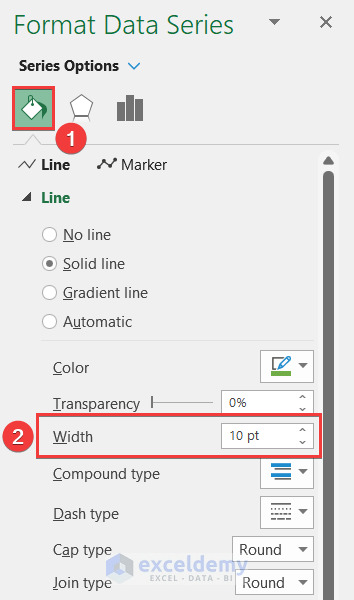
- Now, click on the chart again. Go to the Format Data Series option on the right side of the Window.
- Then, click on the Series Options menu and select Series Region 5.

- Now, keep the color the same or change it to your choice.
- Change the width till it fills the range of it in the chart.
- Similarly, do the same thing and make the same width for the other regions.
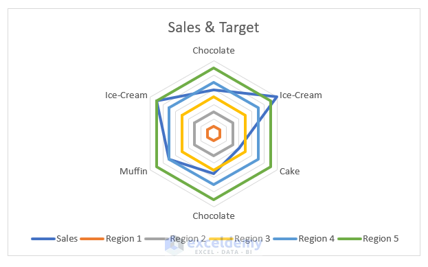
- And, change the color of the Sales Radar line to black so it will highlight more on others.
- As a result, your radar chart will be the same as shown below:
Read More: How to Create Radar Chart with Radial Lines in Excel
Things to Remember
- In method 1, by the simple color ring, you can’t show a data range.
- Increase the Width in methods 3 and 4 till they reach the nearby grid line.
- After making solid color regions, if you resize the chart then, you may need to increase or decrease the width of the lines.
- Excel doesn’t allow to creation a radar chart with more than five columns at a time.
Download Practice Workbook
You can download the practice workbook from here:
Conclusion
In this article, you have found how to create color rings on a Radar chart in Excel. I hope you found this article helpful. Please, drop comments, suggestions, or queries if you have any in the comment section below.
Related Articles
- What Is Radar Chart in Excel
- How to Include Standard Deviation in Excel Radar Chart
- How to Create Radar Chart and Fill Area in Excel
- How to Create Pie Radar Chart in Excel
- How to Create a Circular Radar Chart in Excel
- How to Create Polar Area Chart in Excel
- How to Make a Wind Rose in Excel
<< Go Back To Excel Radar Chart | Excel Charts | Learn Excel
Get FREE Advanced Excel Exercises with Solutions!
