The focus of this article is to specify the Maximum value in a Radar Chart. However, I have shown how to create a Radar Chart and add Chart Elements. Besides, you can learn how to make the chart attractive to the readers with the help of Formatting. So, let’s begin with what is a Radar Chart and how to create it and specify the max value in Excel.
What is a Radar Chart?
A Radar Chart is a type of chart that denotes multiple criteria in one single diagram. In case, you want to compare more than 1 feature you can use a Radar Chart. It is also known as Spider, Web, or Polar Chart.
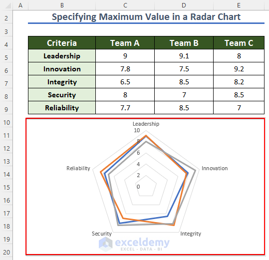
For example, 3 students got the same marks on a test. But you have to compare them based on their Punctuality, Attendance, and Behavior. Now, the following are the ratings of these qualities.
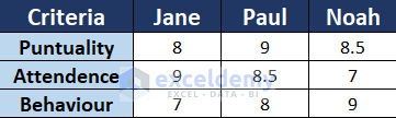
It is hard to analyze who is the best among the 3. But if you use a Radar Chart it will be easy to understand who is better in which criteria.

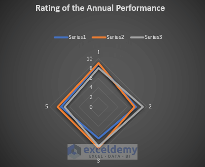
This is a Radar Chart that shows the criteria on the 3 edges and from this chart, you can easily compare each quality of the 3 students.
Specify Maximum Value in a Radar Chart in Excel: Step-by-step Procedures
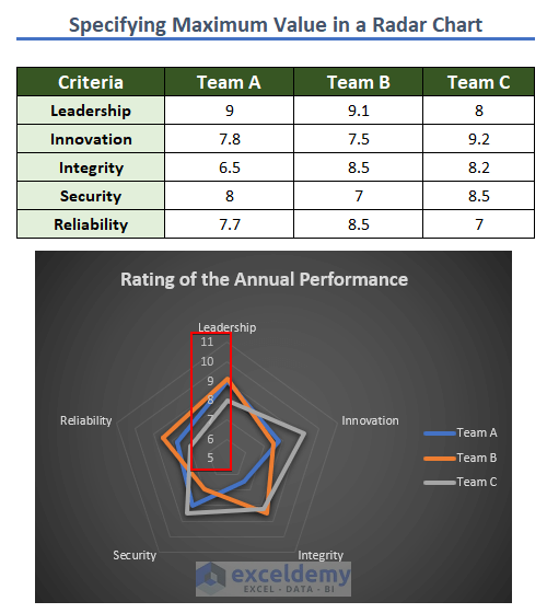
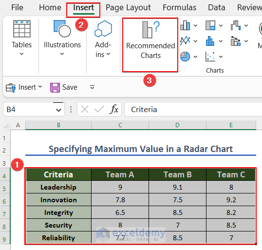
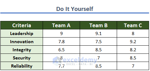
To explain this article, I have taken the following dataset. This is a dataset of the Rating of the Annual Performance of 3 teams, Team A, Team B, and Team C.

Step-01: Insert Radar Chart
First and foremost, you have to insert a Radar Chart.
- Firstly, select the whole dataset.
- Then, click on the Insert tab from the Ribbon.
- Afterward, choose the Recommended Charts option.
- Therefore, the Insert Chart dialog box will open.
- Next, click on the All Charts option.
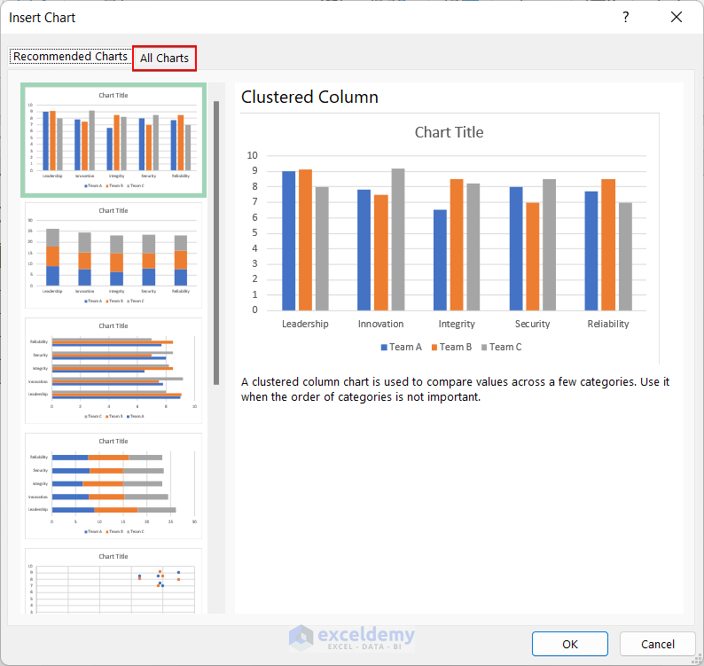
- Go for the Radar one among the All Charts list.
- Later, choose the first one marked on the snapshot and hit OK.
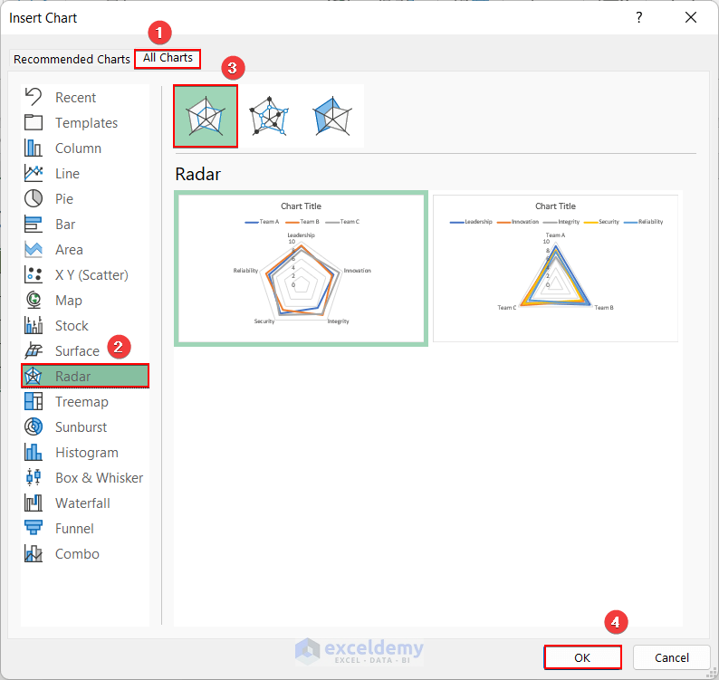
- As a result, you got the Radar Chart for the dataset.
Read More: How to Create Radar Chart with Radial Lines in Excel
Step-02: Add Chart Elements
You can add some Elements to the Radar Chart to make it more usable. In this step, we will add Chart Title and Legend to the Radar Chart.
- First, left-click on the chart.
- Then, a “+” sign will appear at the top right corner of the chart.

- Click on the “+” sign.
- Later, put a tick on the Chart Title from Chart Elements.
- Thus, the Chart Title will appear above the Radar Chart.
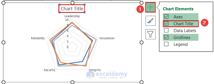
- Now, edit the title. Give a relevant name according to your dataset.

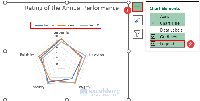
- In addition, you can insert Legend into the chart.
- Initially, select the Radar Chart.
- Next, click on the “+” sign.
- In conclusion, give a tick beside the Legend. Thus, you added the Legend Element to the chart.
Step-03: Format Radar Chart
Besides, you can modify the chart by adding some formatting. In this step, you can learn how to make the chart look attractive.
- In the beginning, select the Chart Design tab.
- After this, click on the Add Chart Element option.
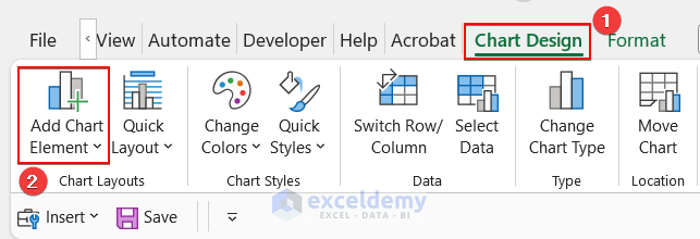
- Hence, these options will appear.
- From the options, choose Legend and select the Right option.
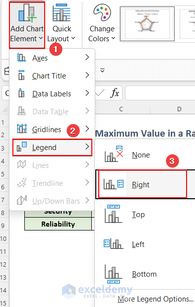
- As a consequence, the Legend is shifted to the Right side of the chart.

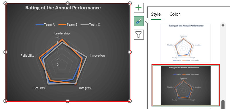
Additionally, you can change the Style of the Radar Chart.
- First, Left-click on the chart and select the marked symbol shown in the image.
- This will take you to the Style option.

- Scrolling down, you can select any Style according to your choice.
- So, I have selected the style shown below.
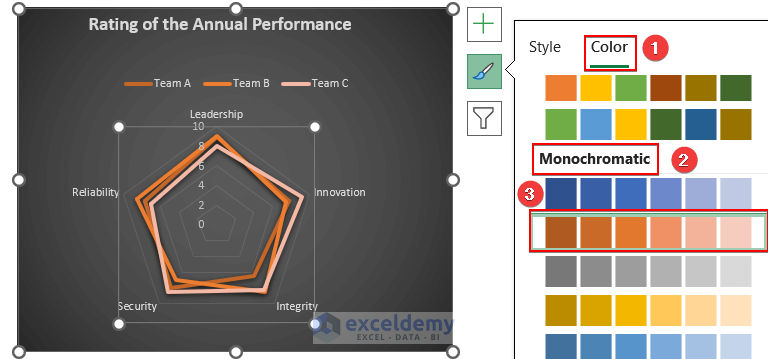
- Later, to add color, select the Color option.
- Now, you can select the Colorful or Monochromatic option.
- First, I have selected the 3rd row as the Colorful option.

- Later, I have shown how the Monochromatic Color option looks.
Read More: Color Rings on Radar Chart in Excel
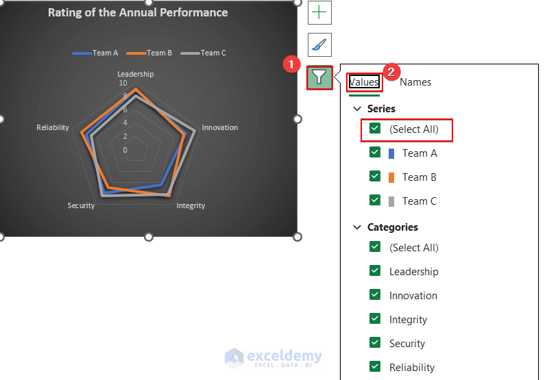
Step-04: Filter Rader Chart
In order to analyze the dataset, you may need to filter the chart. Here, some Filter Radar Chart Options are shown.
- To begin, select the Radar Chart.
- Next, choose the Filter Icon marked on the picture.
- From Values, you can filter either Series or Categories. Even you can filter both.
- For example, from Series, I have filtered only Team A.
- Then, press Apply.
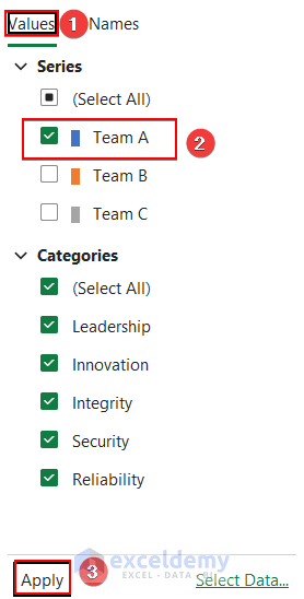
- This leads the chart to show only the values of Team A in different Categories.

- Furthermore, you can turn off the Security option from the Categories.
- Then, click on Apply.
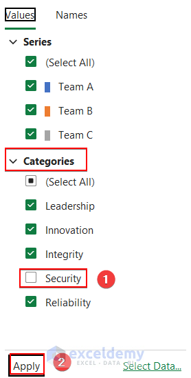
- Ultimately, you filtered the other 4 categories by turning off Security.

- In addition, you can filter the Names by clicking on the Names option.
- Select None from Series and Categories.
- Finally, click on Apply.
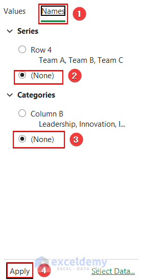
- Clearly, the name of the Series and Categories is hidden.
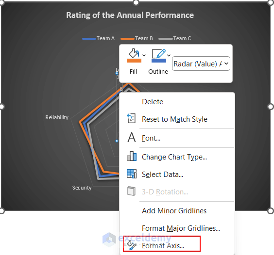
Step-05: Specify Max Value in Excel Radar Chart
To specify the Bound Maximum value, follow the steps carefully.
- Early on, click on the values marked on the snapshot.

- Next, right-click on the values.
- The options will show like the image given below.
- Now, select Format Axis from the options.
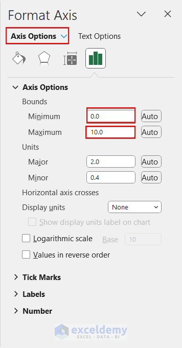
- So, in Axis Options, under Bounds, the Maximum value is set as 10 and the Minimum value is 0.
- Reset the Maximum value to 11 and the Minimum value to 5.
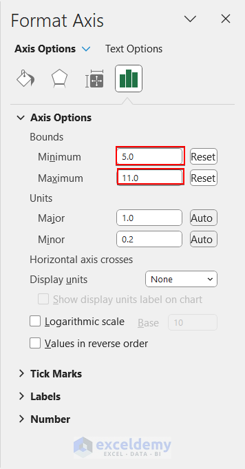
- Consequently, the Maximum Value of the Radar Chart is specified.

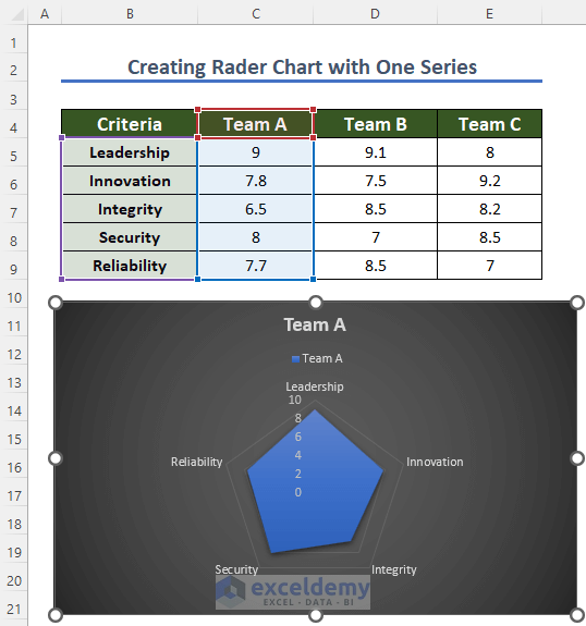
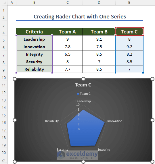
How to Create Radar Chart with One Series
You can also create a Radar Chart with a single series. Explore the steps to know how to do this.
- In the first place, select the Criteria Column and any Team Column.
- Here, I have selected Team B.

- Later, select Insert and click on the Recommended Charts.
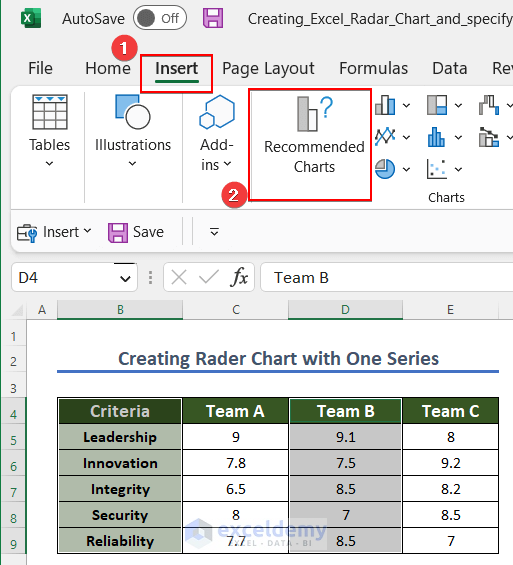
- Moreover, from the All Charts option select Radar.
- Finally, select the Filled Radar marked in the image and hit OK.

- As a result, a Radar Chart with one Series is created.
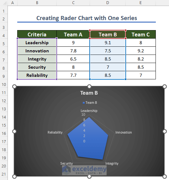
- Interestingly, you have to only hover the mouse over the Selected Column and shift it to any other Column such as Team A or Team B to create the chart with that column.
- In consequence, you can create a Radar Chart with each Column of the dataset.
Read More: How to Create Excel Radar Chart with Different Scales
Things to Remember
- Don’t use more than 2 It will make the chart complicated to understand.
- Increase the size of the chart to make each line and value prominent to the reader.
- Keep in mind that, axis ranges are consistent otherwise the chart will be ambiguous.
Practice Section
Here, we have provided a practice sheet for you to practice.
Download Practice Workbook
You may download the following Excel workbook for better understanding and practice it by yourself.
Conclusion
I have demonstrated how to create an ideal Radar Chart and specify the Maximum Value of the chart step by step. In every step, I have added a detailed snapshot of the step. I hope you can Create a Radar Chart with the help of this article very quickly. If you have any questions regarding this topic, please comment below. I will try to help as soon as possible.
Related Articles
- How to Include Standard Deviation in Excel Radar Chart
- How to Create Pie Radar Chart in Excel
- How to Create a Circular Radar Chart in Excel
- How to Create Polar Area Chart in Excel
- How to Make a Wind Rose in Excel
- How to Create Radar Chart and Fill Area in Excel
- How to Make a Radar Chart in Excel
<< Go Back To Excel Radar Chart | Excel Charts | Learn Excel
Get FREE Advanced Excel Exercises with Solutions!
