While working in Microsoft Excel sometimes we need to fill the area of the radar chart to make it more lucrative. But it might seem difficult to you. Today in this article, I am sharing with you how to create a radar chart with fill area in Excel. Stay tuned!
Create Radar Chart with Fill Area in Excel: 2 Simple Methods
In the following, I have described 2 simple and easy methods to fill the area of a radar chart in Excel.
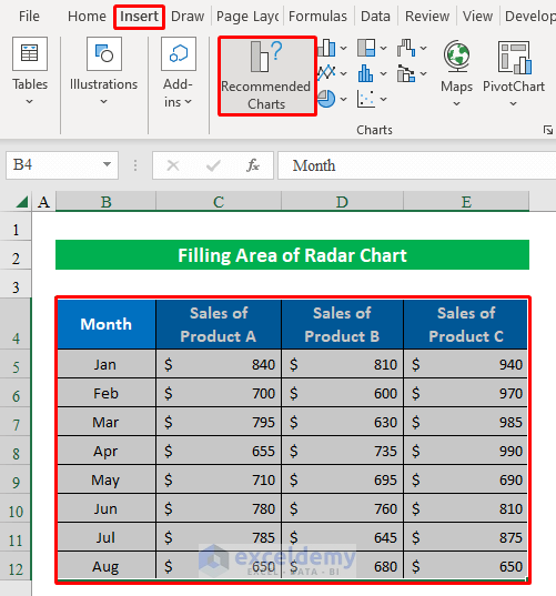
Suppose we have a dataset of Product A, Product B, and Product C month-wise sales. Now, we will plot a radar chart using the data table and then fill different areas of the radar chart using some quick tricks.

1. Format Data Series Feature for Radar Chart with Fill Area
You can simply use the format data series feature of Excel to fill the selected portion of the chart with the desired color. With multiple line color, transparency, and width options, you can fill a specified area of the chart. Follow the instructions below-
Step 1:
- First, let’s start with creating a chart. To do so, select the whole dataset and click “Recommended Charts” from the “Insert” option.
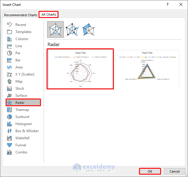
- Second, from the “Insert Chart” window choose “Radar” and your desired chart.
- Hence, press OK.
- In summary, you will get a radar chart created in your worksheet. Without wasting time let’s start filling its multiple areas with the desired color.

Step 2:
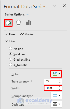
- Just select any data point from the chart and right-click the mouse button to get multiple options. From the options, press “Format Data Series”.

- Now, from the right pane, choose your desired “Color” and change the “Width” to 20.
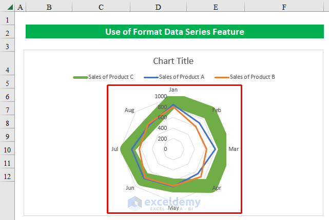
- Thereafter, coming back to the worksheet you will see the chart ring is filled with your choice of color and with a filled area in it.

Step 3:
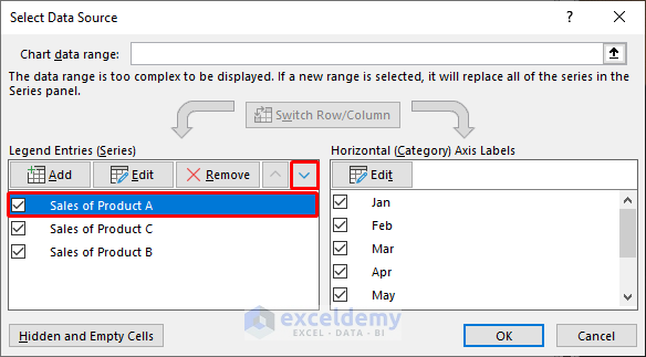
- Now, we will edit the other areas of the chart. To do that, right-click and choose “Select Data” from the appeared options.
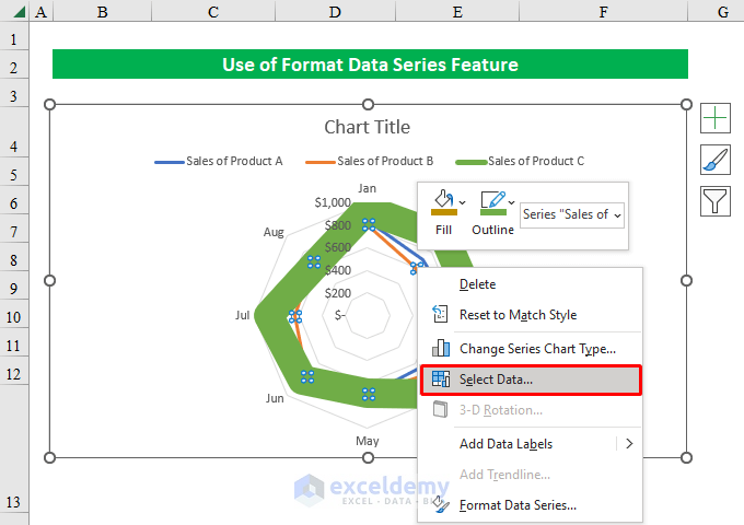
- From the pop-up “Select Data Source” window change the position of the “Sales of Product B” to downwards.

- Similarly, change the “Sales of Product A” position to downwards and hit OK.
- Finally, you will see the other rings appearing inside the chart. Thus you can fill the area of the radar chart in Excel. Simple isn’t it?
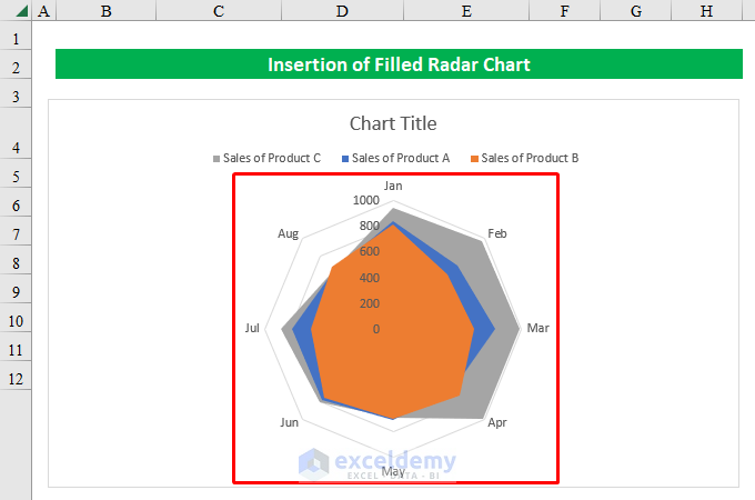
2. Insertion of Filled Radar Chart in Excel
In some situations, you might want to fill all the areas of a radar chart. Well, you can do that too by creating a filled radar chart in Excel. Go through the steps below-
Steps:
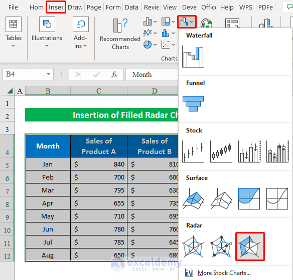
- To start with, select the whole dataset and choose a “Filled Radar Chart” from the “Insert” option.
- Therefore, you will get the filled chart in your workbook.
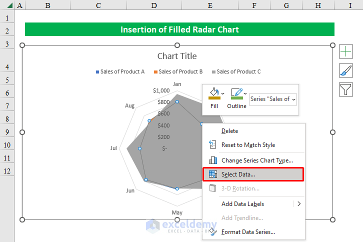
- Now, select any points of the dataset and right-click to get multiple options.
- From the options choose “Select Data”.
- Hence, from the appeared window rearrange entries just like the previous method and press OK.

- In conclusion, you will get a radar chart with filled areas in Excel. Enjoy!
Download Practice Workbook
Download this practice workbook to exercise while you are reading this article.
Conclusion
In this article, I have tried to cover almost all the methods to create a radar chart with fill area in Excel. Take a tour of the practice workbook and download the file to practice by yourself. I hope you find it helpful. Please inform us in the comment section about your experience.
Related Articles
- What Is Radar Chart in Excel
- How to Make a Radar Chart in Excel
- How to Include Standard Deviation in Excel Radar Chart
- How to Create Excel Radar Chart with Different Scales
- How to Create Excel Radar Chart Max Value
- Color Rings on Radar Chart in Excel
- How to Create Radar Chart with Radial Lines in Excel
- How to Create Pie Radar Chart in Excel
- How to Create a Circular Radar Chart in Excel
- How to Create Polar Area Chart in Excel
- How to Make a Wind Rose in Excel
<< Go Back To Excel Radar Chart | Excel Charts | Learn Excel
Get FREE Advanced Excel Exercises with Solutions!
